Page MenuHomePhabricator

MenuSectionOptionWidget not behaving correctly in DropdownWidget. It also needs to be added to demos
Closed, ResolvedPublic

Description

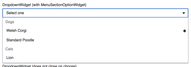
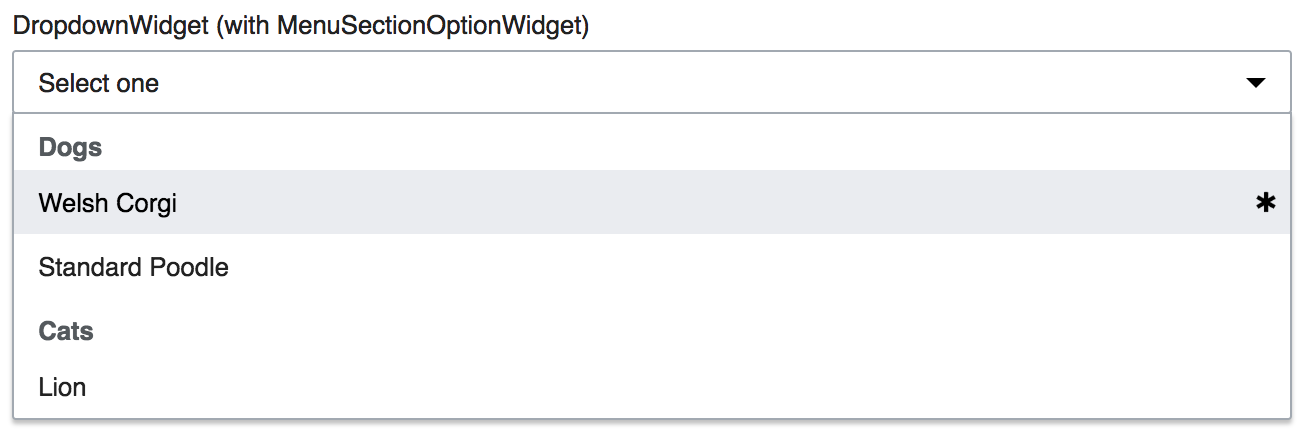
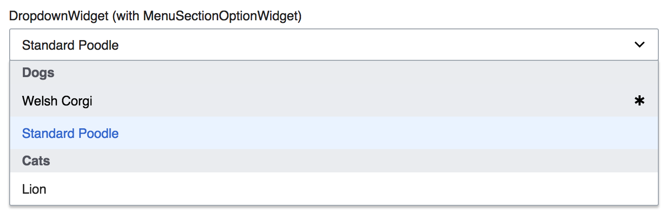
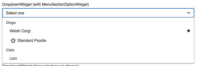
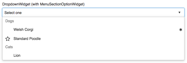
MenuSectionOptionWidget is a bit wonky if you stick it in a DropdownWidget. It doesn't look much like a section header/separator.

Apex (okay-ish)WikimediaUI, former MediaWiki (really weird)
pasted_file (237×674 px, 13 KB)
pasted_file (240×670 px, 12 KB)

Browser implementations (screenshots using this codepen):

ChromeFirefoxEdgeSafari
Windows
w-chrome.png (254×116 px, 31 KB)
w-ff.png (265×119 px, 36 KB)
w-ie.png (242×136 px, 31 KB)
OS X
chrome.png (247×131 px, 23 KB)
ff.png (237×140 px, 28 KB)
safari.png (244×129 px, 23 KB)

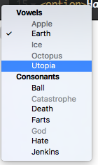
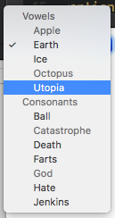
Also see F4695532 and F4695534 from T149452.
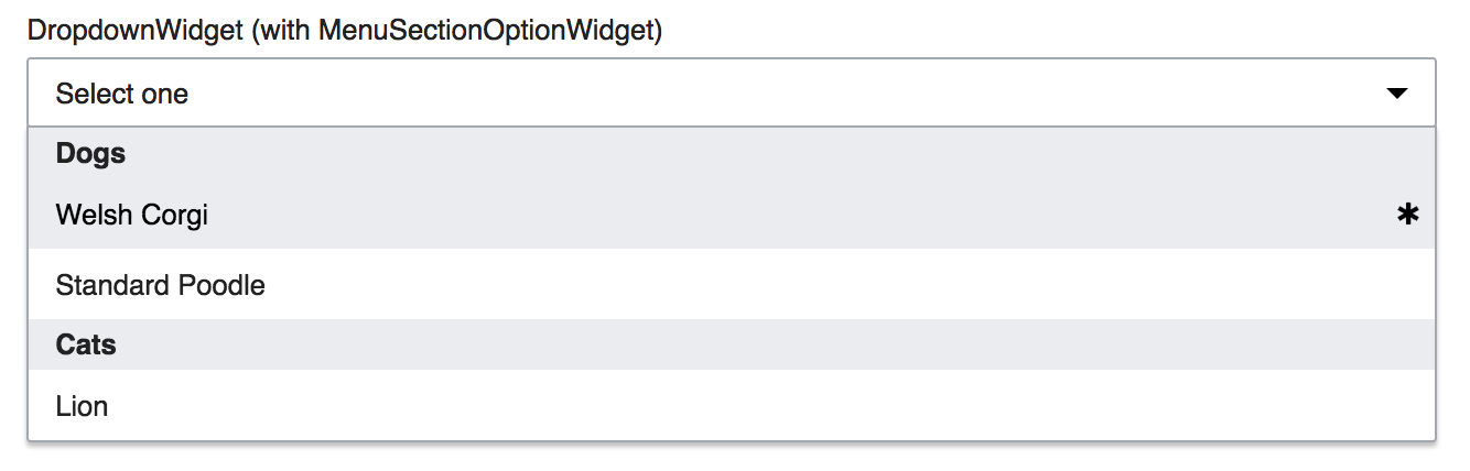
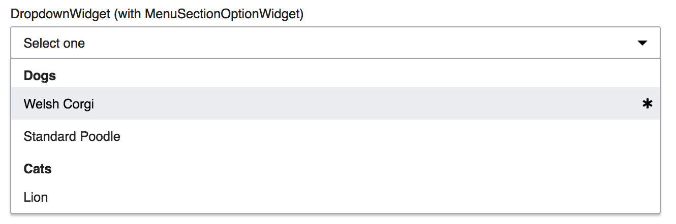

Agreed-on result

WikimediaUI themeApex theme
T92452 MenuSectionOptionWidget indentation WikimediaUI - OOjs UI Demos 2017-10-23.png (221×656 px, 18 KB)
T92452 MenuSectionOptionWidget indentation Apex - OOjs UI Demos 2017-10-23.png (221×657 px, 18 KB)

Event Timeline

KMenger raised the priority of this task from to Needs Triage.
KMenger updated the task description. (Show Details)
KMenger added a project: OOUI.
KMenger subscribed.
matmarex set Security to None.
matmarex subscribed.
matmarex renamed this task from MenuOptionWidget not behaving correctly in DropdownWidget. It also needs to be added to demos to MenuSectionOptionWidget not behaving correctly in DropdownWidget. It also needs to be added to demos.Mar 30 2015, 9:07 PM
matmarex updated the task description. (Show Details)

Change 338315 had a related patch set uploaded (by Prtksxna):
demo: Add DropdownWidget (with MenuSectionOptionWidget)

https://gerrit.wikimedia.org/r/338315

Change 338316 had a related patch set uploaded (by Prtksxna):
MenuSectionOptionWidget: Increase indentation between heading and items

https://gerrit.wikimedia.org/r/338316

Change 338315 merged by jenkins-bot:
demo: Add DropdownWidget (with MenuSectionOptionWidget)

https://gerrit.wikimedia.org/r/338315

This bug needs updating because the option items aren't indented like that anymore if they don't have an icon.

@Pginer-WMF You came across a very similar UI need in T149435, right?

I don't think it's a good idea to have the section titles follow same disabled grey as disabled items of a dropdown. That's unnecessary confusing to the user, even if menu titles aren't used very widely.
[[ doc.wikimedia.org/oojs-ui/master/demos/#widgets-mediawiki-vector-ltr | From the demos ]] –

DropdownWidget (with MenuSectionOptionWidget)‎DropdownWidget (disabled options)‎
T92452 Dropdown w section titles OOjs UI Demos 2017-02-28.png (232×657 px, 25 KB)
T92452 Dropdown w disabled OOjs UI Demos 2017-02-28.png (243×664 px, 27 KB)

It's clear, it's not styled yet. But what would be a clear way of styling such?

@Pginer-WMF You came across a very similar UI need in T149435, right?

There we used the background color to differentiate sections, so that you can recognise them at a glance. A difference in that context is that item elements were taller than the section items too. There are more design details in T149452

Here are the browser renderings of the HTML equivalent (on Windows 10; I wonder how it looks on OSX), for inspiration:

<select>
<optgroup label="Section 1">
<option>A</option>
<option>B</option>
</optgroup>
<optgroup label="Section 2">
<option>C</option>
<option>D</option>
</optgroup>
</select>
Chrome
pasted_file (134×91 px, 3 KB)
Firefox
pasted_file (184×109 px, 2 KB)
Edge
pasted_file (117×102 px, 2 KB)

Change 338316 abandoned by Prtksxna:
MenuSectionOptionWidget: Increase indentation between heading and items

Reason:
Waiting for consensus on the task.

https://gerrit.wikimedia.org/r/338316

This bug needs updating because the option items aren't indented like that anymore if they don't have an icon.

So should I remove the screenshot on the left?

I am happy with @Pginer-WMF's design (similar to FF on Windows). Only on Chrome and Safari on OS X does the heading look disabled, on all other screenshots its bold (correctly so).

I updated the screenshots. The one on the left was from Apex, the right from MediaWiki (back when this was filed, they looked a lot more alike :) ).

Ok, going a little deeper on this. I've exemplified two different approaches with a clear winner for me. Note, “Welsh Corgi” is hovered.

With disabled background-color and same padding as MenuOptionsWithout background-color and reduced padding-bottom (same as labels)
T92452 MenuSectionOptionWidget background and smaller padding - OOjs UI Demos 2017-03-26.png (428×1 px, 42 KB)
T92452 MenuSectionOptionWidget with whitespace OOjs UI Demos 2017-03-26 16-50-31.png (442×1 px, 42 KB)

The advantages of the second approach without background-color are, that we can a) clearer visually identify the element groups with the white space modification and b) we don't interfere with the :hover states of menu-items, which would be counter-intuitive from my perspective.

Change 344888 had a related patch set uploaded (by VolkerE):
[oojs/ui@master] MediaWiki theme: Unify padding on DecoratedOptionWidget and derivates

https://gerrit.wikimedia.org/r/344888

Ok, going a little deeper on this. I've exemplified two different approaches with a clear winner for me. Note, “Welsh Corgi” is hovered.

With disabled background-color and same padding as MenuOptionsWithout background-color and reduced padding-bottom (same as labels)
T92452 MenuSectionOptionWidget background and smaller padding - OOjs UI Demos 2017-03-26.png (428×1 px, 42 KB)
T92452 MenuSectionOptionWidget with whitespace OOjs UI Demos 2017-03-26 16-50-31.png (442×1 px, 42 KB)

The advantages of the second approach without background-color are, that we can a) clearer visually identify the element groups with the white space modification and b) we don't interfere with the :hover states of menu-items, which would be counter-intuitive from my perspective.

Looking at the 2nd solution it is still not clear that "dogs" and "cats" are groups that cannot be selected. As you pointed, solution 1 is also not perfect, but it is worth mentioning that the user would get to the shown status as a result of their actions (by explicitly moving there) which may help in connecting the dots.

In any case, I think both options could benefit from using a lighter color (Base20) in the text of the group titles. This is consistent with them being non-selectable and may help resolving the ambiguities of both cases.

That's not clear in the OS styles either, I remember that I didn't recognize the sections to be unselectable and got frustrated when I encountered them first time. But even more important in this context is, that we use the grey as indicator for :hover – that's already in place. And having those being combined with grey backgrounds as sections (which is not a kind of disabled state, it's just a headline) seems more confusing for the user. I'm not quite sure, if I understand your second sentence in “shown status as a result of their actions”.

Showing the second approach with Base20:

T92452 MenuSectionOptionWidget with whitespace & Base20 - OOjs UI Demos 2017-03-27.png (438×1 px, 42 KB)

@Volker_E, in F7015760, are you proposing to get rid of the indentation altogether? That would be against all the examples we've seen and make it harder to glance through the list.

I'm not quite sure, if I understand your second sentence in “shown status as a result of their actions”.

I was trying to add some context to the issue:

  • When the user opens the drop-down they won't experience the issue in the beginning. This allows to form an understanding on the structure.
  • As the user moves the cursor through the menu, the element background changes on hover but since it is a consequence of they moving the cursor over each option, there is continuity between the user actions and the UI changes.

I think that a static screenshot of the specific problematic situation may not reflect the experience of the user at that point because of the missing context (where the cursor is, what you did to get there and what you saw right away when you opened the menu).

I'm not denying that it is problematic to have similar styling on regular hovered items and group titles, but I found it curious that the proposed solution to avoid them having a similar style on hover is to have them a similar style in their default state. Hence my suggestion to differentiate the styling a bit more.

@Pginer-WMF Thanks for the clarification. Mixing interaction patterns with non-interaction patterns is the choice I'd like not to take. Therefore your feedback on using Base20 color also made sense to me. The heading is now differently padded, bold, has Base20 color and doesn't get cursor: pointer or any other feedback on :hover. So similarity is in the eye of the beholder :P

Some while back we've made the blue shade for the active/selected state becoming reality T143634. Now, that MediaWiki theme has been much further evolved we could revisit the choice of Base80 as :hover background.
One could think of a lighter shade of blue for :hover (although visibility for people with impairments might be taken into consideration, also we've been there half-baked T78082), which then in turn could lead us to the greys used in a sub-heading context.

Indentation on the other side, as done by the browsers, appears to me as a clear, but unnecessary “busy” layout solution.
Do you agree with Base20 usage in F7026721 being sufficient for now?

The heading is now differently padded, bold, has Base20 color and doesn't get cursor: pointer or any other feedback on :hover. So similarity is in the eye of the beholder :P

My point was more like:

  • If they are different, the first example in T92452#3132638 may not be problematic despite the menu item having the same background on hover (since all the other attributes you mention help to make the difference).
  • If they are similar, then the second example T92452#3132638 may have the same issues as the first one in their default mode (since initially groups and items are using the same background color, white in this case).

My criticism on the examples you used on T92452#3132638 is that in both cases you have elements and groups that use the same background on some circumstances: on hover (first example) or by default (second example), but you seem to consider it only problematic in one of the cases.

Some while back we've made the blue shade for the active/selected state becoming reality T143634. Now, that MediaWiki theme has been much further evolved we could revisit the choice of Base80 as :hover background.
One could think of a lighter shade of blue for :hover (although visibility for people with impairments might be taken into consideration, also we've been there half-baked T78082), which then in turn could lead us to the greys used in a sub-heading context.

I'm not sure if by "lighter shade of blue" you mean Accent90 or a new color between Accent90 and Accent50.

I created some examples of menus using the current color palette. Options C and B look good to me. Maybe you could fork and extend the example if you are proposing a different option.

Indentation on the other side, as done by the browsers, appears to me as a clear, but unnecessary “busy” layout solution.

Indentation adds friction to the main scan line when going through the menu. I agree in avoid using them if we can communicate the groups without it.

Do you agree with Base20 usage in F7026721 being sufficient for now?

That's a step forward in my opinion. I think that using a grey background for groups would also help to clarify their purpose, and I'm not sure about the problem of confusion with the hover state to have much weight in practice when using the examples.

I created some examples of menus using the current color palette. Options C and B look good to me. Maybe you could fork and extend the example if you are proposing a different option.

Nice! This is great for getting a feel for what we are talking about. I noticed though, that neither the screenshots in the description, nor your codepen, has disabled items. Those seem to be a cause of some confusion. Could you add those to your examples too?

I've updated the screenshots and linked to the codepen that was used to take them. If it makes sense you could use the same list for your examples.

In the previous screenshots I had made the mistake of taking them with System PreferencesGeneralAppearanceGraphite instead of Blue. I've fixed that too.

Indentation adds friction to the main scan line when going through the menu. I agree in avoid using them if we can communicate the groups without it.

I am not convinced by this, nor can I find a suitable precedent (examples here would help me). The scan line with indentation makes it easier to spot the grouping. Use of indentation/margins is key in showing hierarchy. Not sure why wouldn't apply such a useful tool for achieving our goal.

I am not convinced by this, nor can I find a suitable precedent (examples here would help me).

I just found out that Vector used to do this, in a different context though. That changed and we now have indentation in the sidebar. There is a patch to remove this indentation though, could you folks also take a look at T67444: Vector: Use a consistent indentation for all sidebar links.

Indentation adds friction to the main scan line when going through the menu. I agree in avoid using them if we can communicate the groups without it.

I am not convinced by this, nor can I find a suitable precedent (examples here would help me). The scan line with indentation makes it easier to spot the grouping. Use of indentation/margins is key in showing hierarchy. Not sure why wouldn't apply such a useful tool for achieving our goal.

I agree with you, @Prtksxna. Indentation really helps seeing the hierarchy, and I'm not sure why we would choose not to take advantage of it.

Change 344888 merged by jenkins-bot:
[oojs/ui@master] MediaWiki theme: Unify padding on DecoratedOptionWidget and descendants

https://gerrit.wikimedia.org/r/344888

Found the indentation in the Vector sidebar since it's beginning to be superflous and to result in unnecessarily busy design. With the horizontal separator and the different text color the headings in the sidebar groups (“portals“) is sufficient. Seems that several people were the same opinion at T67444.

My criticism on the examples you used on T92452#3132638 is that in both cases you have elements and groups that use the same background on some circumstances: on hover (first example) or by default (second example), but you seem to consider it only problematic in one of the cases.

My criticism on the examples you used on T92452#3132638 is that in both cases you have elements and groups that use the same background on some circumstances: on hover (first example) or by default (second example), but you seem to consider it only problematic in one of the cases.

I find one case much more problematic than the other – not that the other one were completely perfect:
When the MenuSectionOption headings have exact the same background as the “normal“ menu items around them on :hover, we're mixing the visual interaction feedback pattern (the grey background) with an (one of the) indication(s) for a non-actionable item in the same UI context on visually similar items.
That's a bad idea.

I've forked and updated @Pginer-WMF CodePen with an option 'H' representing the current state of Group layout https://codepen.io/Volker_E/pen/dWMvbw
–next step is to file another task about highlighting/selecting options on menus.

@Pginer-WMF Also, on several occasions recently, most prominently in Gmail, I've seen section option headers with grey background. What they've also had in common with one of approaches is smaller height of the section header element. It might make sense to come up with merging the two ways and unify them in OOjs UI and RCFilters…

@Pginer-WMF You've included the smaller height in your original CodePen examples, example “E” is the closest for me.
Another open consistency question was, that we are currently not using accent backgrounds for :hover, but for user action results. Toolbars' active tools would follow a different pattern when selected, because the selected blue background would be too jarring.

That's the OOjs UI demo example without a :hover background color adaption:

T92452 MenuSectionOptionWidget greyed background - OOjs UI Demos 2017-05-25.png (428×1 px, 44 KB)

Volker_E claimed this task.

After conversation with @Pginer-WMF in Editing design meeting, we came to the conclusion to set this task to “resolved” with the decisions taken and currently available as of v0.21.4. We might revisit this with T166560.

Volker_E reopened this task as Open.EditedOct 6 2017, 2:44 PM

With switching Special:Block over to OOUI T107036 a user was specifically giving feedback on the hard to differentiate the groups:

image.png (1×1 px, 235 KB)

<Shawn__> Volker_E: there is no indentation for groups

<Shawn> Volker_E: I find difficult to distinguish the group (third line from the bottom of the screen capture)
<Shawn
> Volker_E: On frwiki, we have a big text on top of page to explain procedure so I have to scroll down to open "Reason" drop down as it doesn't open upside

Shawn> Volker_E: what do you think about the screenshot I sent ? Do you find groups easily identifiables ?
<Volker_E> Shawn
: so the issue here is the huge amount of dropdown items
<Volker_E> Shawn: when you would see two groups it would become clearer in my opinion
<Shawn
> Volker_E: there are two groups but list is now so huge that I can't make them fit in the viewport
<Volker_E> Shawn__: yeah, sure, that was what I meant with 'see', it's out of the viewport
<Volker_E> also, if we go for indentation, we would cut off more of the dropdown items, resulting possibly in other issues
<Volker_E> the reason the groups weren't bolded and black is to signify that they are not selectable
<Volker_E> we're using the same grey for all unselectable things in OOUI

I strongly agree with having clearer headlines and indentation, as per the examples in the description of this task. AFAIK, the indentation part is a bit tricky to implement, but we could immediately change the color of oo-ui-menuSectionOptionWidget to @wmui-color-base0 (or an alias) from @color-base--subtle.

Screen Shot 2017-10-09 at 6.38.16 PM.png (223×663 px, 26 KB)

@Prtksxna We actually decided against this as the element isn't interactive within an otherwise interactive element. I'd propose, given the in-product example of the massive list that we align closer to the HTML standard treatment and indent them. It's not a widely used element to my understanding and, altough it's a compromise in style measurements, it's negligible given the usage numbers.
Indentation gives a better visual cue on those very long lists versus just boldening and making the section headers dark or black grey.

Change 386117 had a related patch set uploaded (by VolkerE; owner: VolkerE):
[oojs/ui@master] WikimediaUI theme: Visually treat MenuSectionOptionWidget sibling menu items better

https://gerrit.wikimedia.org/r/386117

Treatment proposal from patch above:

WikimediaUI themeApex theme
T92452 MenuSectionOptionWidget indentation WikimediaUI - OOjs UI Demos 2017-10-23.png (221×656 px, 18 KB)
T92452 MenuSectionOptionWidget indentation Apex - OOjs UI Demos 2017-10-23.png (221×657 px, 18 KB)

Note that Apex is unchanged, as it's already going for a default indentation leaving space for pseudo-default checkmark icons.

Change 386117 merged by jenkins-bot:
[oojs/ui@master] WikimediaUI theme: Visually improve MenuSectionOptionWidget MenuOptions

https://gerrit.wikimedia.org/r/386117

This will go into 0.24.1

Indentation gives a better visual cue on those very long lists versus just boldening and making the section headers dark or black grey.

I strongly agree with having clearer headlines and indentation, as per the examples in the description of this task.

We are in agreement then? I think you misunderstood my example to mean that I we should only have bold headings, I infact think we need both, and surely indentation (thanks for the patch) more than the font weight.