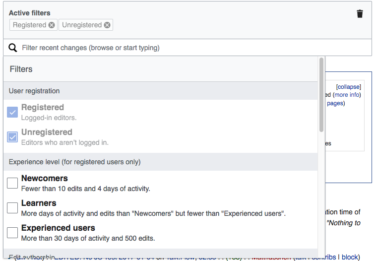
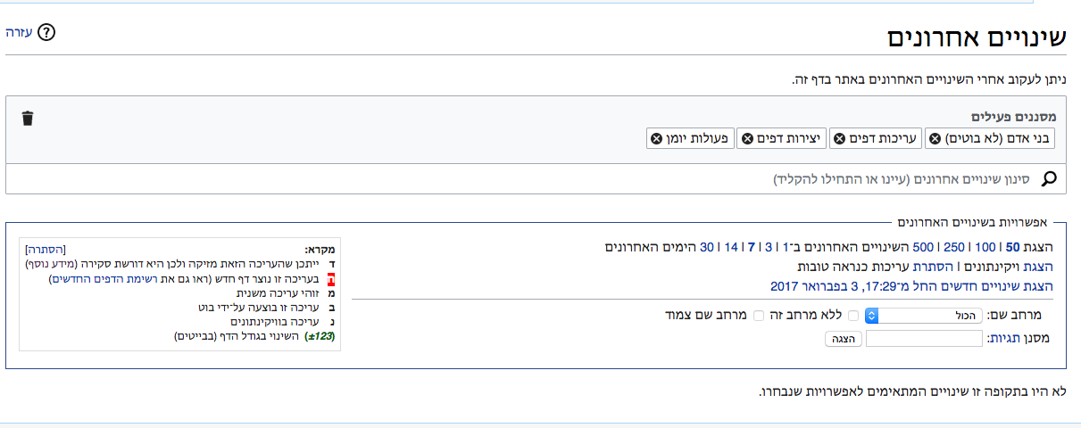
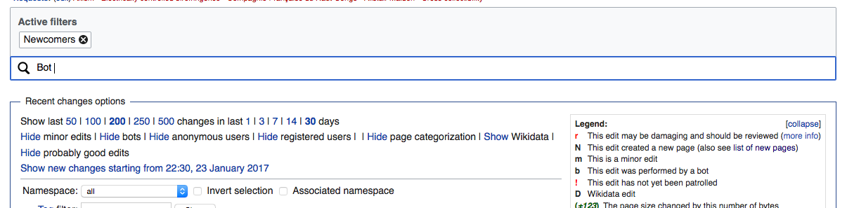
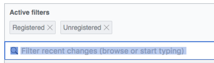
The Filter Search Bar is an input field that enables users to select filters via a structured search (view in prototype). This task details the behaviors of this area:
The Search Bar displays a magnifying glass icon and the following instruction text: “Filter recent changes (browse or start typing)”
Clicking anywhere in the Search Bar puts the input focus there and opens the Dropdown Filter Panel, which begins at its top position.
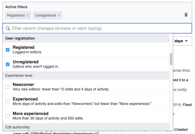
When the Search Bar gets the focus, the page scrolls so that the Active Filter Display Area moves to the top of the viewport (if it was not already closer than 25px) as illustrated in F4687875. This will provide the most room for filters to be shown without the need for the user to scroll multiple elements at the same time.
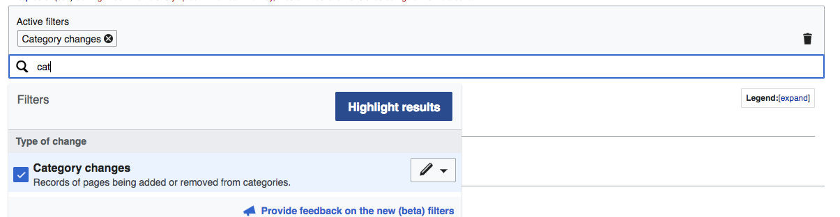
When users type in the Search Bar, the menu Dropdown Filter Panel shows only those options that match the search query.
Filters shown in the search results are also grouped based on their filter groups and the section headers are shown as usual.
- The search looks first for menu items that start with the query text; if there are no results, it falls back to match filters containing the query string anywhere in their name or description.
- [moved this to subtask T159768]
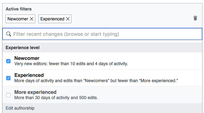
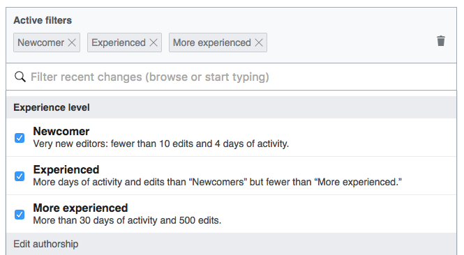
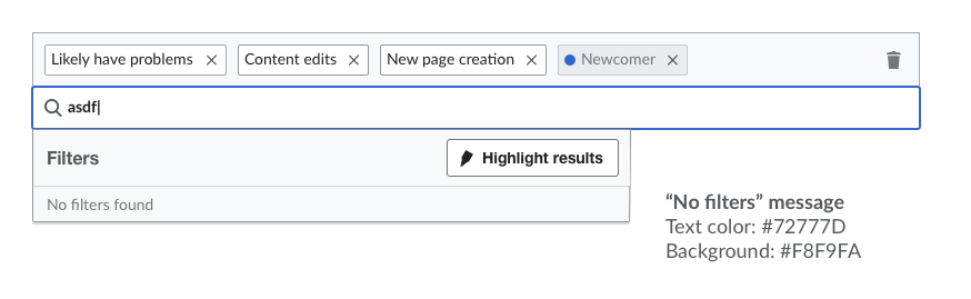
When search finds matches, the first result is highlighted in blue. Pressing enter will select that filter (or unselect it if it is already selected). Up and down arrows will allow to select a different filter from the list of matches. - If there is no result, a “No filters found” result will be shown in the list.
- Search considers the filter names only (i.e., it does not look at the description texts). Filter group names, descriptions are fully searchable - T156215: RC - filters group names and descriptions should be searchable


