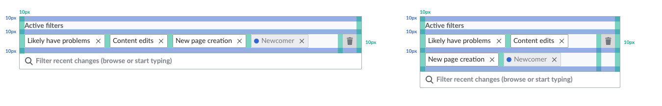
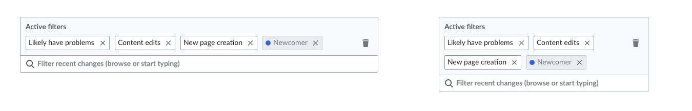
The Active Filter Display Area of the new RC page filtering interface shows a "tag" for all filters that are currently active (view in prototype). This task details the behaviors of this area:
Default State
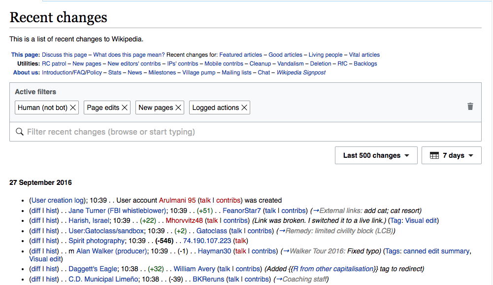
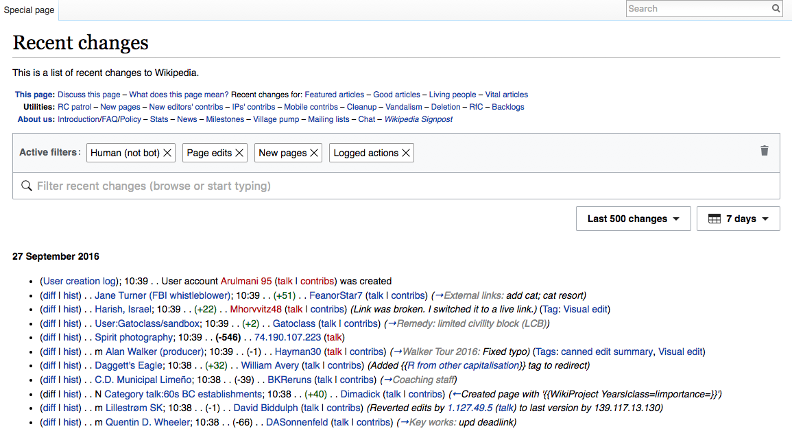
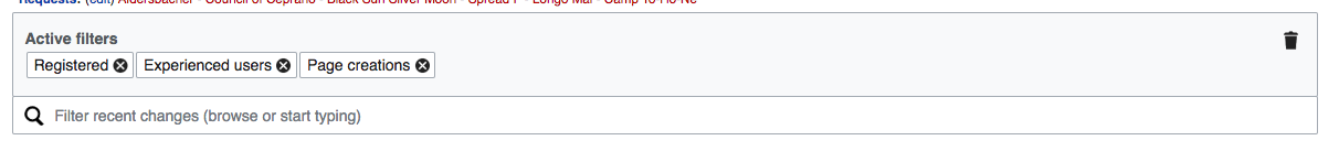
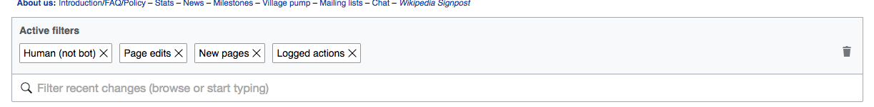
- The following filters are active and tags displayed in this order by default when the page loads or the "Restore Defaults" button (see below) is clicked : “Page edits”, “Human (not bot)”, “New pages," "Log actions". Note: the default filter names were changed to “Human (not bot)”, “Page edits”, “Page creations," "Logged actions".
Adding and Removing
- Selecting or highlighting a filter in the dropdown panel adds a tag to the Display Area.
- Clicking the X in each tag removes the tag from the area and unselects it in the filter/highlight panel.
- Tags can also be added and removed via the Trashcan/Restore Defaults button.
Trashcan / Restore Defaults
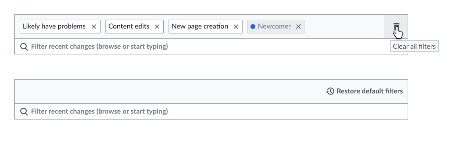
- The Trashcan icon at Right of the Display Area clears all active filters and highlights.
- The Trashcan has a tooltip that says "Clear all filters"
- The Trashcan toggles with the "Restore default filters icon." Clicking this restores the defaults (see above).
- The tooltip for this says "Restore default filters"
- The Restore Defaults icon also displays if the user manually removes all filters.
Actions
- Clicking the highlight area where no buttons or tags are opens the filter dropdown. If the panel is open, clicking closes the panel.
- Clicking a filter tag causes opens the dropdown and scrolls to the filter that was clicked. The filter will display with a blue background.
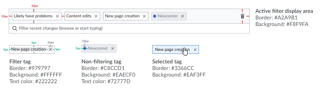
Filter Tags
- Tags in the Display Area indicate the current filtering and highlight status.
- Tags display the filter name as label, and the filter description as a tooltip.
- When an active filter is highlighted, the tags display a circle indicating the color used for highlight.
- When a filter is inactive but highlighted (i.e., highlight only), colored circle is displayed but the tag is grayed.
'No Effect' Display States
Two special display states communicate to users that they've made choices that don't have any effect. There are two variations:
- The user selects all members of a so-called "full coverage" filter group (currently that includes all groups except the ORES filters and the Experience group); functionally, this is the equivalent of no choice at all. In such a case, the tags are all grayed, and a special tooltip is shown explaining that your choices cancel each other out (see T149385 for final tooltip wording).
- Here are the complementary sets where this condition will apply: Unpatrolled/Patrolled, Minor/Nonminor, Registered/Unregistered, My Edit/Edits by Others, Bots/Humans.
- In one of the ORES filter sections, the user selects a filter or filters that constitute a subset of an already selected filter. In such a case, the subset has no effect, so will be grayed out, but the broadest filter is still shown in the "active" state. A special tooltip for the grayed tags is made available suggesting the user may want to try highlighting the redundant filters with a color (see T149385 for final tooltip wording). Here are the filters that are subsets of others:
- Quality filters: May Have Problems is a superset of both Likely and Very Likely Have Problems. Likely Have Problems is a superset of Very Likely.
- Intent filters: May Be Bad Faith is a superset of Likely Bad Faith.
Note that if the user selects a highlight color for a redundant filter of either of the types above, all the filters in the group are shown in the Active state.
Conflict Display States
This functionality has been moved to T156427