Uses
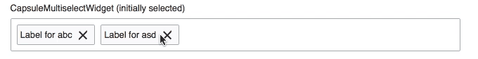
| UsersMultiselectWidget | APISandbox | CategorySelector | MWCategoryWidget | Category lists | Active filter area | |
|---|---|---|---|---|---|---|
| Project | MediaWiki-extensions-Newsletter | MediaWiki-extensions-ApiSandbox | UploadWizard | VisualEditor | ContentTranslation (CX 2) | Edit-Review-Improvements-RC-Page |
| OOUI Widget | MW UsersMultiselectWidget <- MenuTagMultiselectWidget | CapsuleMultiselectWidget | mwe-upwiz-categoriesDetailsWidget <- CapsuleMultiselectWidget | CapsuleMultiselectWidget | MenuTagMultiselectWidget | MenuTagMultiselectWidget |
| Details | T131492 | T111791 | T41597 | T134740 | T149391 | |
| Screenshot | 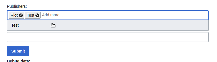 | 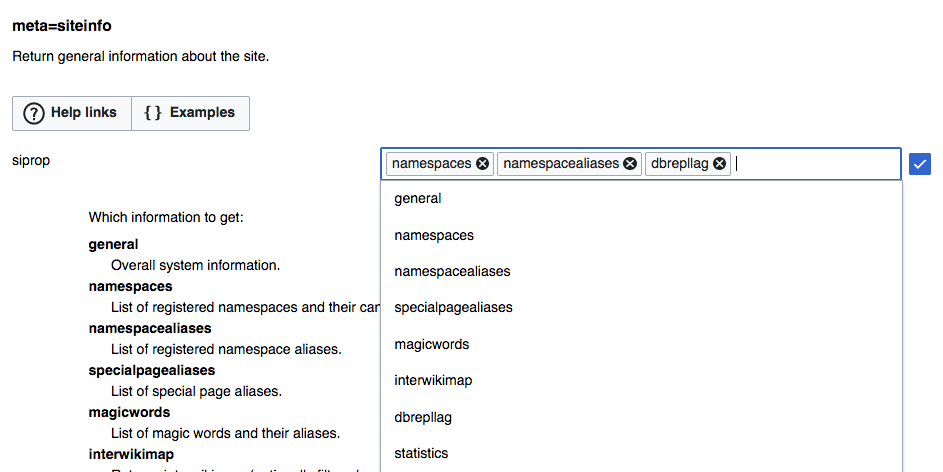 | 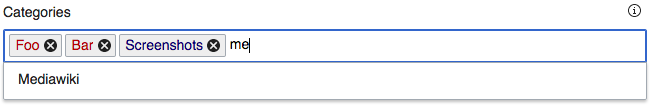 | 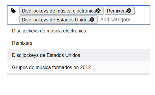 | 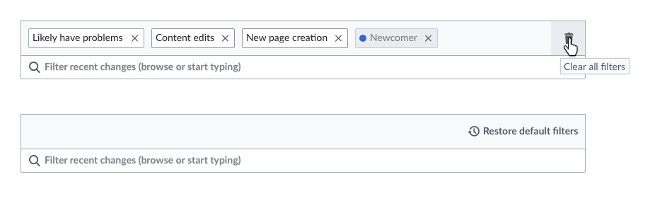 | |
| Add | ||||||
| Edit | (not directly from the widget, need to open the dropdown T67518) | |||||
| Remove | (not directly from the widget, need to open the dropdown) | |||||
| Remove all | ||||||
| Click for more | (opens the category page) | (opens a dropdown with options) | ||||
| Re-order | T108490 | |||||
| Separate input widget | ||||||
Issues
- The circled X to remove the tag is too prominent. The main purpose of the tag is to communicate its content, removing it should be a discoverable action but not the main focus of attention. Using a regular "x" would reduce the visual weight, making it less prominent and more consistent with other components. – See proposal in F5667703. Fixed in v0.19.5
- The vertical space for the tags and the container make the components feel a bit cluttered by so many lines together with not much space around them.While keeping the components compact, they can benefit from some extra space. – Got increased to standard widget 32px height.
- The overhauled tag component is so much bigger that, when part of an input field, it heightens the field to 40+px. All other input field/dropdown components (only exception SelectFieldWidget with drop area) are at 32px height. See M101 – Declined. TagMultiselectWidget offers a variety of ways to construct it's UI and we stay with the multitude of options right now.
- The whole editing pattern is not clearly at stake now, but seems like a major pain: No in-place editing of tags, but changing order on clicking the tag. RCFilters once again has a different take there. – TagMultiselectWidget has improved the editing a lot.
Further issues filed as sub-tasks for now