Page MenuHomePhabricator

Facilitate repetitive use for the new Recent Changes filters
Closed, ResolvedPublic

Assigned To
Authored By
Pginer-WMF
Nov 30 2016, 11:31 AM
Referenced Files
F7813533: save-filled.svg
Apr 28 2017, 1:57 PM
F7813531: save.svg
Apr 28 2017, 1:57 PM
F7813648: push-pin.svg
Apr 28 2017, 1:57 PM
F7660587: RC-quick-links-favorites-only.png
Apr 20 2017, 8:04 AM
F7660721: RC-quick-links-favorites.png
Apr 20 2017, 8:04 AM
F7660848: RC-quick-links-list-with-personal.png
Apr 20 2017, 8:04 AM
F7660312: RC-quick-links-list.png
Apr 20 2017, 8:04 AM
F7608719: RC-quick-links-saving.png
Apr 18 2017, 12:53 PM
Tokens
"Barnstar" token, awarded by RandomDSdevel."Like" token, awarded by Doror."Like" token, awarded by Trizek-WMF.

Description

As part of the designs to improve the filtering system of Recent Changes (T142785), we want to optimise the interaction for repetitive use of filters. That is, making it easy for users to quickly filter regularly for their usual reviewing activities without having to start from scratch each time.

There are different cases that fall under this area:

  • Access filters that the community considered to be often useful for any user. This is currently supported by a list of links the community adds at the top of the Recent Changes page (editable by local admins). For example, the "Mobile contribs" link loads the Recent Changes page with the "mobile edit" tag added.
  • Access filters that the users considered useful for themselves. Users interested on a regular review activity (e.g., help newcomers making good-faith but not good contributions), may find convenient to have a quick access to those sets of filters. Currently it is supported by bookmarking specific sets of filters.
  • Access recently explored filter variants to perform small adjustments and tweaks to the current set of results. As users experiment adjusting their results, they may need to add, remove and add again some filters. Quickly adding back some of the filters they removed recently could facilitate the process. Currently tags make it easy to remove existing filters, but adding them back has only limited support by the browser back/forward button.
  • Access default properties the user considers useful for any exploration. Some filter properties may be obvious for some users at any activity. For example, a user may be always interested in Wikidata edits. Currently this is supported by the preferences page where the default inclusion of some filters can be indicated.

Proposed solution

The concept of "quick filters" as easy to access user-defined sets of filters for a specific review activity can help to support the above needs. Users can quickly switch across different reviewing activities without the need to set all the individual filters again and again.

Possible scenarios illustrate how the general idea can work.

Using quick filters

RC-quick-links-initial.png (768×1 px, 263 KB)
RC-quick-links-favorites.png (768×1 px, 276 KB)
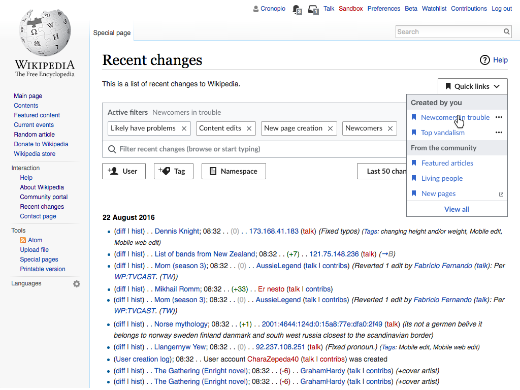
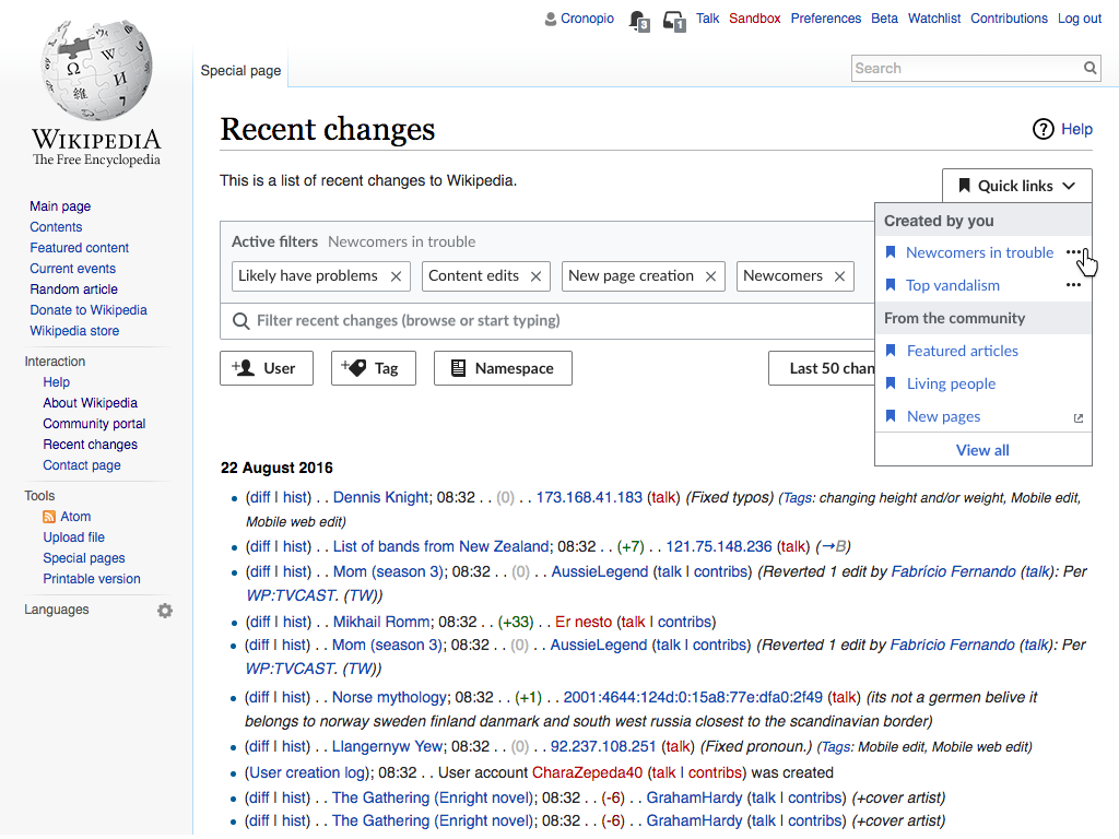
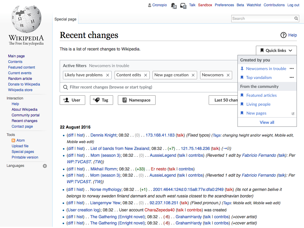
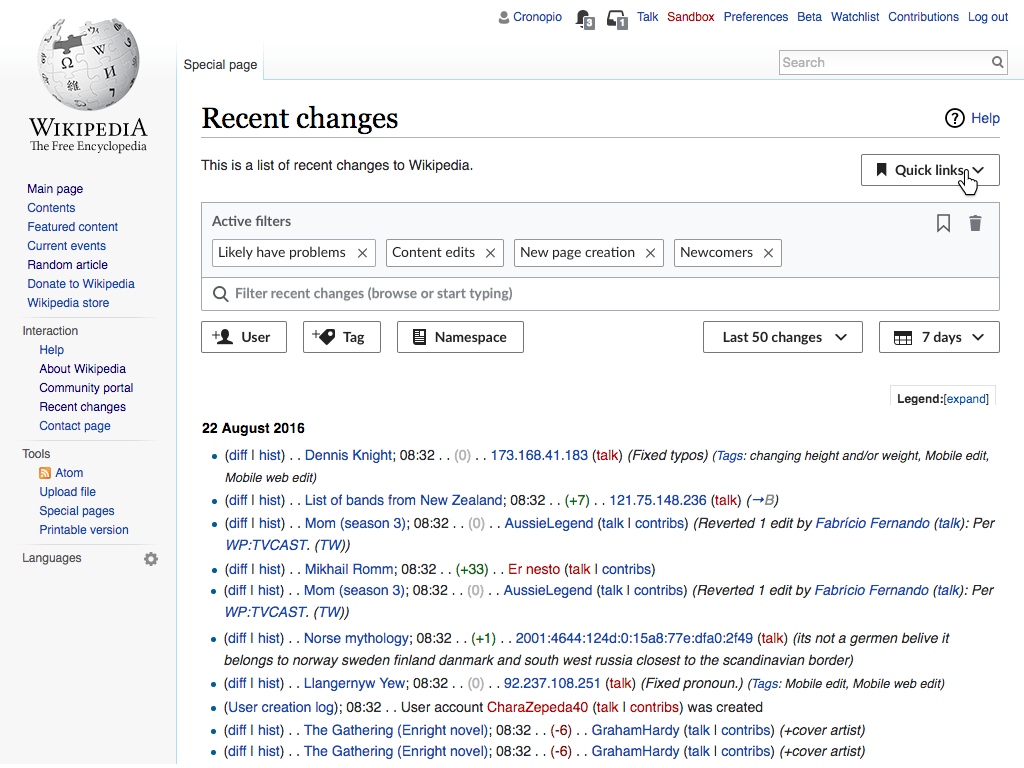
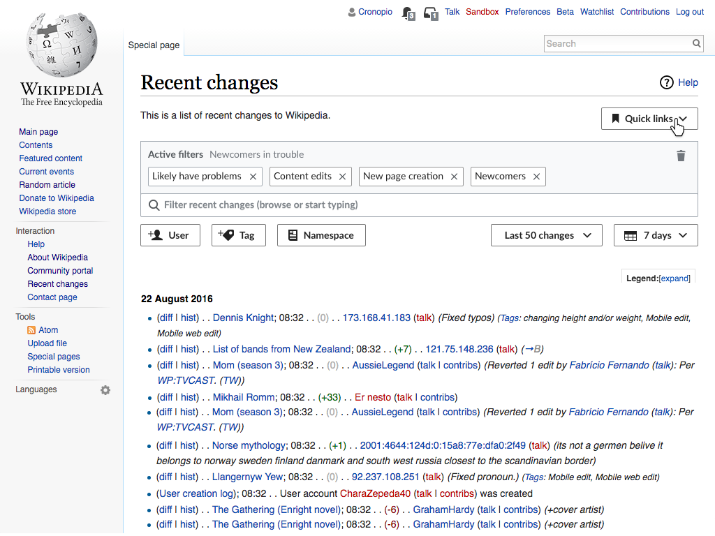
  • Quick filters are presented as user-defined items in the list of quick links (more details below on how users create them).
  • A quick filter is defined by (a) a name and (b) a set of filters (or highlights).
  • When a quick filter is selected, all the filters associated, and only those, became the active filters.
  • The Active filter panel shows the name of the active quick filter.

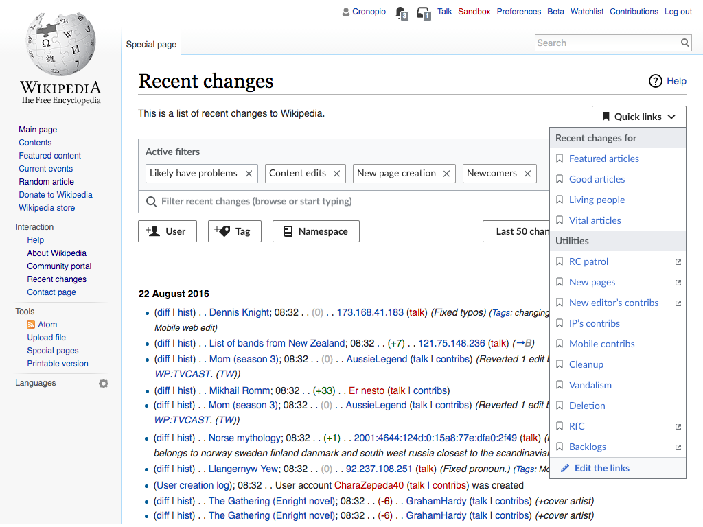
Using community defined tools (T164548)

RC-quick-links-list.png (768×1 px, 275 KB)
RC-quick-links-favorites-only.png (768×1 px, 271 KB)
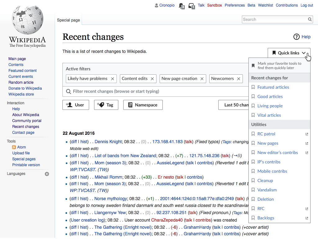
  • The set of links defined by the community is organised as a list.
  • Users can mark their favorite tools for easy access later. A clarifying message appears at the top of the list to introduce the concept (the message is no longer shown when the user already saved a community or personal link).
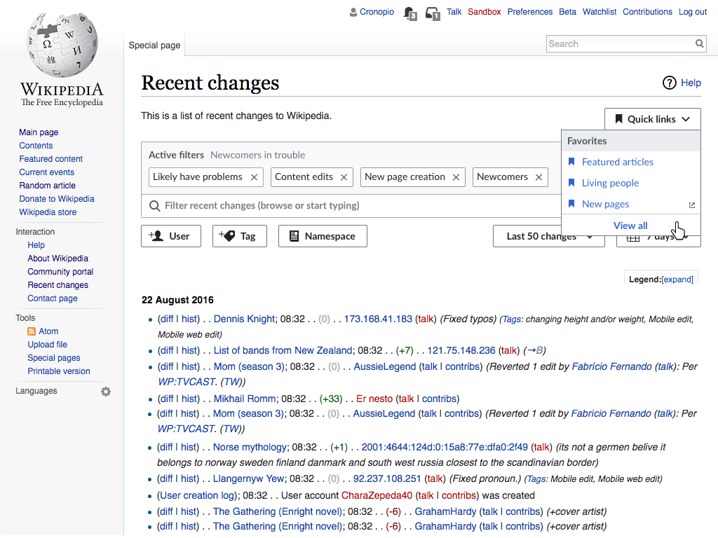
  • When the user marks community links, those are the only ones shown the next time the drop-down is opened. These are presented under a "favorites" category, with access to the full list.
RC-quick-links-favorites.png (768×1 px, 277 KB)
RC-quick-links-list-with-personal.png (768×1 px, 274 KB)
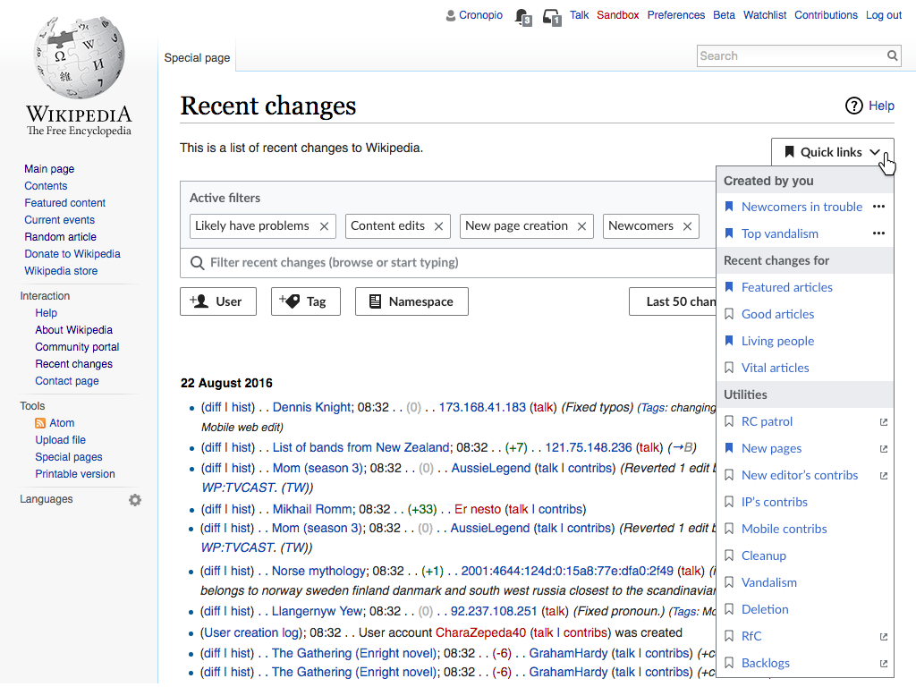
  • When the user has both marked some community links and created personal ones, those will be presented in the compact version of the drop-down in separate categories.
  • When expanded, the personal links will remain in a category on top, while the community ones will be presented as a longer list with each link in their corresponding community defined category.

Creating new links (T164128)

RC-quick-links-save.png (768×1 px, 263 KB)
RC-quick-links-saving.png (768×1 px, 269 KB)
RC-quick-links-saved.png (768×1 px, 264 KB)
RC-quick-links-favorites.png (768×1 px, 276 KB)
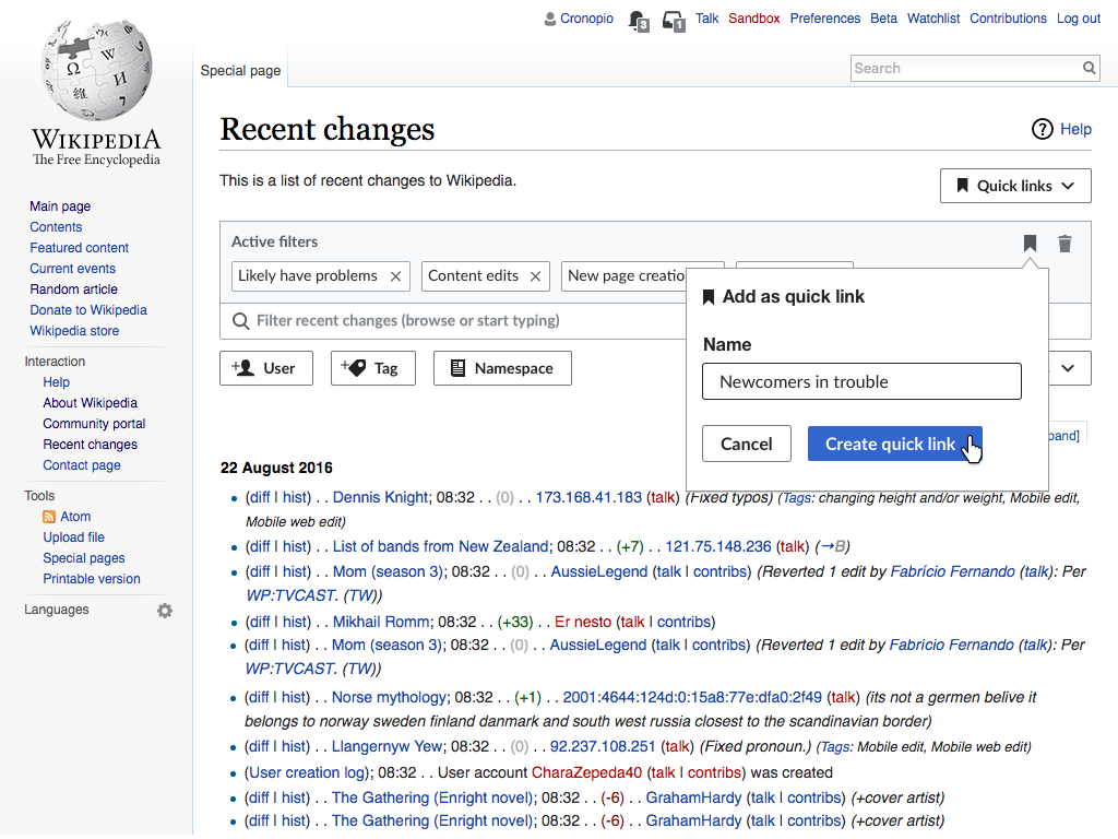
  • When the initial filters are modified, an option to "add as quick link" (as well as an option to clear the filters) become available.
  • The "add as quick link" option, creates a new quick filter based on the current active filters and let's the user name it. The recently created link will become the one selected.

Changing defaults

RC-quick-links-default-initial.png (768×1 px, 276 KB)
RC-quick-links-default-options.png (768×1 px, 272 KB)
RC-quick-links-default-marked.png (768×1 px, 276 KB)
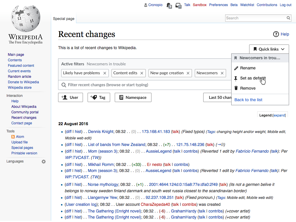
  • A quick filter can be defined as default. That will make it to be selected when the Recent Changes page is initially accessed and when the user clicks on the "restore default filters" option after clearing the filters.
  • Only one filter can be set as default. Thus, setting one as default would make any other previous default filter no longer be the default.
  • Other options are available from the filters menu to allow users to rename, delete and unset as default.

Filter suggestions

RC-quick-links-suggestions.png (768×1 px, 221 KB)

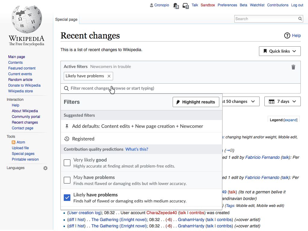
  • The filter panel includes a new "suggested filters" section. This section provides quick access to some filters that may be relevant. A suggestion may involve more than one filter to be added.
  • Filters recently removed are suggested for users to quickly add them again if needed. This will facilitate the back and forth exploration. Only a few of the recent filters removed will be suggested, and the suggestions will never include a filter that is already among the active ones.
  • The default filters will be also suggested when they are not present in the active filters. This makes it easy to add default filters that were removed, but also to update quick filters that were created before the defaults were changed.

Related Objects

Event Timeline

There are a very large number of changes, so older changes are hidden. Show Older Changes

Do you plan to investigate more, or can we just add that to the filters documentation?

Do you plan to investigate more, or can we just add that to the filters documentation?

I captured how things are done as a starting point on how to improve these processes. I plan to investigate more and explore several options to support those cases: similar to what I did for the education features (T150836) and their sub-tickets. I expect this ticket to get more details in the form of mockups/prototypes, discussions, etc.

I illustrated a proposed solution with possible scenarios. I'll add more details into the ticket description.

I updated the description, and the documented scenarios to reflect updates related to the received feedback. Mainly about avoiding the concept of "feeds", and supporting a simplified workflow (without options to update existing filters but allowing to create and delete them instead).

I like this concept and think users would find it useful. My main note on the current design is that I'd like to find a solution that wouldn't require us to slide all the page results over to make room for the Quick Filters navigation. I see that this design is using a left-nav pattern, but I'd like to explore other ideas.

My main concern with the solution pictured now is that with the Quick Filters nav displayed, the Dropdown Filter Menu would mostly cover the search results area. We saw in testing that covering the results created a lot of usability problems—which were solved when we narrowed the width of the Dropdown Menu so that we could partially reveal the results. I wouldn't want to do anything to erase that win. Enabling users to close the navigation doesn't really answer; it's just one more click they have to make to arrange the work area properly.

Furthermore, my sense is that the menu doesn't "earn" this prominent placement, for two reasons: 1) the narrowing of results happens all the way down the page, even though the Quick Filters menu will likely be short—so it creates a long strip of unusable space, which may make the results harder to read (depending on screen width); and 2) in any given work session, it seems likely that users will switch filter settings only a few times at most, so having quick and constant access to that menu doesn't seem like a priority.

For these reasons, I'd like us to consider using something like a dropdown menu—which might default to the last-used setting. (The menu might, for example, be placed next to the filter Search bar, which could be shortened to match the width of the Dropdown Menu. That's just an idea, but it would make sense, since that's the zone where users will go when they want to make settings.)

I like this concept and think users would find it useful. My main note on the current design is that I'd like to find a solution that wouldn't require us to slide all the page results over to make room for the Quick Filters navigation. I see that this design is using a left-nav pattern, but I'd like to explore other ideas.

Based on the ideas for organising the community defined review-related links (T159345), we can integrate in the same system the user-defined filters. This takes advantage of the overlap between both concepts and avoids increasing the complexity by adding new elements.

Quick links provides initially a community defined set of links. Users can mark some of those as their favourites for quick access later.

RC-quick-links-initial.png (768×1 px, 263 KB)
RC-quick-links-list.png (768×1 px, 270 KB)

When the default active filters are modified, users are provided an option to save them.

RC-quick-links-save.png (768×1 px, 263 KB)
RC-quick-links-saving.png (768×1 px, 269 KB)
RC-quick-links-saved.png (768×1 px, 264 KB)
RC-quick-links-favorites.png (768×1 px, 276 KB)

The above illustrates the general idea for the workflow. Some additional considerations:

  • We may want to add feedback on different places to better connect the steps (e.g., highlighting the "quick links" dropdown once a new item is added to the list).
  • User-defined links will have an extra menu ("...") to allow users to rename them. We probably want to avoid using drop-down inside the dropdown, so we can explore using a separate dialog or expanding options in-place.
  • Community-defined links that lead to a different page will be marked, and open in a new browser tab. This will help to distinguish those reviewing activities that occur in the same context (Recent Changes) from those occurring in a different one.

I know this is still in design, but just a couple of quick questions to consider --

The Petty Engineer™ Questions:

  • What would a 'rename' operation look like? Is the same popup opening up (the one that was used to choose a name on save?) and if so, is it going to open again under the bookmark icon, or does it move to overlay on top of the expanded-menu where the option is located?
  • What's the initial state of the input box when you save a new set? Is it empty (waiting for the user to insert a new name) or is it prefilled with some placeholder "Saved filters X" string? What happens if the user approves the operation when the input is empty? Do we prevent the save, or do we save with a placeholder/prefilled name and let them change the name later? (I know this is a petty question, but it'll be super helpful for implementation)
  • Do we need some validation? What happens if the user tries to save with an existing name? Do we let them (we can, technically, it'll just be confusing to them) or do we check and reject? If we reject -- how will that be done? Do we prevent save, or do we change the name to add some X at the end (example - "existing title (1)" or something like that) or do we just not care, and hope the user knows what they're doing, or change the title themselves if it's duplicate.
  • Do we want to decide on a cap for how many custom links do we allow people to save? I'm not sure if that's relevant, but I can see people playing around and saving a bunch, only marking a couple as "favorites" and having the rest just sitting there. If the number grows, I want to see if we need to switch the storage (probably not, but still, verifying :)
  • In the pictures, it seems that the bookmark icon (btw, it doesn't exist in OOUI, we should add it in) is sometimes transparent and sometimes blackened. I assume it's black when we have an already-saved set, and empty when the set isn't saved yet. That might be a slight technical challenge to keep track of if we have a large set of saved filters; my bigger concern is performance, because it basically means that every time a user changes *anything* (including a single highlight) we need to go over all saved sets and compare them to the current system. I'm slightly worried about performance, so in the first iteration, at least, we might just have a single icon (filled or not) without regards to whether the current collection of filters is already saved. Is that okay?
  • Just to verify - we save the highlight state, too, right?

General product interaction -

  • I was personally confused about "Created by you" vs "From the community". It makes it sound like both sets are the same type of thing (filter searches, I thought) except one was saved by me, and the other is a set that the wiki community created. That's not the case (although it can be a cool feature for future development... ;) -- but I think the wording is confusing. I much prefer the version that says "Recent changes for" and "Utilities" but it seems to only be used in one of the screenshots. I think the other terminology is confusing.
  • This is super cool. Seriously. I love it.

I know this is still in design, but just a couple of quick questions to consider --

Thanks for all your detailed comments. They are very relevant and useful (even those for which we have not a clear answer yet, since it is important to identify them as aspects to keep in mind as we move forward).

The Petty Engineer™ Questions:

  • What would a 'rename' operation look like? Is the same popup opening up (the one that was used to choose a name on save?) and if so, is it going to open again under the bookmark icon, or does it move to overlay on top of the expanded-menu where the option is located?

This is not clear yet. When filters are saved I decided to remove the bookmark action from the active filters area since the functionality to "unsave" them seems much less important compared to all the other information that is already provided in a busy area. So I'm not inclined to keep the bookmark icon (or making it reappear) just to be used as an anchor for a rename popup. Using a modal dialog (similar to the popup, but not attached to any element) can work in this case.

Renaming the filters in-place could work too, however we are displaying the actions in a different view inside the quick links drop-down (to avoid drop-downs inside drop-downs), so we need to check that such transition would feel natural.

In summary, renaming is a secondary workflow (we expect filters to be added and used more often than they are renamed). Since the options to represent it are affected by how the primary patterns work, I think it makes sense to evaluate those first (i.e., check if users find the way to add and access links intuitive).

  • What's the initial state of the input box when you save a new set? Is it empty (waiting for the user to insert a new name) or is it prefilled with some placeholder "Saved filters X" string? What happens if the user approves the operation when the input is empty? Do we prevent the save, or do we save with a placeholder/prefilled name and let them change the name later? (I know this is a petty question, but it'll be super helpful for implementation)

I'm inclined to have it empty since I'm not sure we can anticipate which is the review activity the user plans those filters to be used for (if anyone has ideas on this, let me know!). The action to actually create the filter should be only available when the user provides a non-empty name. I'm thinking on preventing saving the filters unless a name is given: we want to use this to capture users review activities and encouraging users to provide a descriptive name seems reasonable to me.
The described behaviour should be working that way in the prototype.

  • Do we need some validation? What happens if the user tries to save with an existing name? Do we let them (we can, technically, it'll just be confusing to them) or do we check and reject? If we reject -- how will that be done? Do we prevent save, or do we change the name to add some X at the end (example - "existing title (1)" or something like that) or do we just not care, and hope the user knows what they're doing, or change the title themselves if it's duplicate.

I'd not go with blocking the process (preventing you to save a filter because one year ago you decided to use the same name). Adding something at the end in case of duplicates seems good to me (I'd be ok for users renaming it later to the exact name if they want to). I think that provides enough flexibility while avoiding accidental collisions.
Currently the prototype is not supporting anything about this (we'll just try not to ask users to create the same thing twice).

  • Do we want to decide on a cap for how many custom links do we allow people to save? I'm not sure if that's relevant, but I can see people playing around and saving a bunch, only marking a couple as "favorites" and having the rest just sitting there. If the number grows, I want to see if we need to switch the storage (probably not, but still, verifying :)

I'd not start with a specific limit. The idea is for users to capture their review interests. If we identify a big number of saved filters that are not frequently used we can explore what to do about that.

  • In the pictures, it seems that the bookmark icon (btw, it doesn't exist in OOUI, we should add it in) is sometimes transparent and sometimes blackened. I assume it's black when we have an already-saved set, and empty when the set isn't saved yet. That might be a slight technical challenge to keep track of if we have a large set of saved filters; my bigger concern is performance, because it basically means that every time a user changes *anything* (including a single highlight) we need to go over all saved sets and compare them to the current system. I'm slightly worried about performance, so in the first iteration, at least, we might just have a single icon (filled or not) without regards to whether the current collection of filters is already saved. Is that okay?

There are two kinds of content provided through the "quick links" dropdown (more on this below). On the one hand we have links the community defined (which now are displayed on top of the Recent Changes page). These are the links, you can make part of your bookmarks or not. On the other hand, you have the filters you saved which are always part of your bookmarks. thus, there won't be saved filters with different statuses.

  • Just to verify - we save the highlight state, too, right?

Yes. That should be working that way in the prototype.

General product interaction -

  • I was personally confused about "Created by you" vs "From the community". It makes it sound like both sets are the same type of thing (filter searches, I thought) except one was saved by me, and the other is a set that the wiki community created. That's not the case (although it can be a cool feature for future development... ;) -- but I think the wording is confusing. I much prefer the version that says "Recent changes for" and "Utilities" but it seems to only be used in one of the screenshots. I think the other terminology is confusing.

Here we are dealing with two types of content that have their similarities and differences. We are trying to present them together under the perspective that they represent (kind of) the same thing: specific review activities (some may be happening in the same page/tool, some may happen in a different one). While all saved filters (capturing a specific intent for reviewing a meaningful subset of contributions) fit in the definition, there is more diversity in the community links. For example, in Recent Changes on English Wikipedia we have a "mobile edits" link that leads to Recent Changes with the "mobile edit" edit tag as a filter (acting as a community-defined saved filter), we also have the "New pages" link that goes to a specialised tool focused on reviewing new pages (not a "saved filter" but sill a review activity), and an "about" section linking to general help or the Wikipedia Signpost which does not seem directly connected to a review activity.

So despite the diversity of community links the idea is to group them under a unifying purpose. How to communicate this is also not an easy task, and we need to observe how users understand these divisions and the kind of language they use to describe them.

  • This is super cool. Seriously. I love it.

Thanks!

@Mooeypoo and @Pginer-WMF, note that I've tagged this task to RC Page, instead of the new Integrated Filters project board. That means I'm thinking it can be worked on sooner rather than later—possibly before user testing. If you think that's a bad idea—that we need to get user feedback before beginning work—then speak up. But in general, I'd like to get this feature out there, since I think it adds important functionality to the tools we already have and makes them more useful.

FYI, I'm going to start a subtask of this for "Eliminate RC page filter preferences for New Filters users (and migrate them to the page settings)" or some such. I'm not sure exactly how that will work. But the idea is that with this functionality, users should be managing their default settings on the page, instead of in Preferences.

Actually, @Pginer-WMF, I see now this is very much a "Design this feature" task. To start building, we probably need a "Build this" task. And the first step in that, yet another subtask, will be to move the community links into a menu. Do you want to write those two tasks up? Do you think we're ready to get to work on this?

@Mooeypoo and @Pginer-WMF, note that I've tagged this task to RC Page, instead of the new Integrated Filters project board. That means I'm thinking it can be worked on sooner rather than later—possibly before user testing. If you think that's a bad idea—that we need to get user feedback before beginning work—then speak up. But in general, I'd like to get this feature out there, since I think it adds important functionality to the tools we already have and makes them more useful.

I'd prefer to test the general idea first before building it. I'm not concerned about adjusting pieces later such as the icons or the padding for menu items, but confirming that we are going in the right direction seems useful, especially if we consider this to be important functionality.

Having said that, if there is some technical work that does not depend on how the functionality is presented to users, this can be done earlier.

Actually, @Pginer-WMF, I see now this is very much a "Design this feature" task. To start building, we probably need a "Build this" task. And the first step in that, yet another subtask, will be to move the community links into a menu. Do you want to write those two tasks up? Do you think we're ready to get to work on this?

I'm not sure I understand the purpose of having "design X" and "build X" tickets with the same scope since both of them will get design input (plus the risk of information getting out of sync). I'd expect build-focused tickets to have a much smaller and focus and scope as sub-tickets for specific parts. So creating a sub-tasks for "move the community links into a menu" makes perfect sense to me, but I'd do it as a sub-ticket of this one, not as a sub-task of a new ticket. The current one can be renamed to become just "Facilitate repetitive use for the new Recent Changes filters".

I'm not sure I understand the purpose of having "design X" and "build X" tickets with the same scope since both of them will get design input (plus the risk of information getting out of sync). I'd expect build-focused tickets to have a much smaller and focus and scope as sub-tickets for specific parts. So creating a sub-tasks for "move the community links into a menu" makes perfect sense to me, but I'd do it as a sub-ticket of this one, not as a sub-task of a new ticket. The current one can be renamed to become just "Facilitate repetitive use for the new Recent Changes filters".

It makes sense it large products (like the "RCFilter dropdown" etc) to split them apart for implementation and design. If the process takes a couple of iterations, it can be easier to have a "implement X" and "implement Y" tasks so that the process (with QA and product checks) are more streamlined.
In this specific case, we can start implementing the 'save filters' behavior before (and separately from) implementing the community tools. There are also a couple of small things that may prove a bit challenging Engineering-wise that we might want to iterate over (so they may not appear in the mvc) -- if that's the case, it might be useful to have a couple of separate tasks for that, again, for product and QA to follow up on.

I'm going to start with basics here (saving filters aspect) as a working MVP - and I'll create the smaller implementation tasks (as child tasks) as I go. That sounds good?

@Pginer-WMF can you upload the three icons -

  • The filled bookmark
  • The "empty" (blank?) bookmark
  • The 'pin' icon

I can't find any of those in ooui; I've been temporarily using the 'bookmark' icon in ooui but it looks radically different and doesn't have a 'blank' variant.

@Pginer-WMF can you upload the three icons -

Yes, I've added the SVGs below:

  • The filled bookmark

  • The "empty" (blank?) bookmark

  • The 'pin' icon

I can't find any of those in ooui; I've been temporarily using the 'bookmark' icon in ooui but it looks radically different and doesn't have a 'blank' variant.

For the bookmark I used the same icons that are used int he mobile app for saved pages. I'm not sure if they are anywhere else in the codebase, but I added the svgs above in any case.

Pginer-WMF renamed this task from Design ways to facilitate repetitive use for the new Recent Changes filters to Facilitate repetitive use for the new Recent Changes filters.May 1 2017, 7:45 AM

Change 350763 had a related patch set uploaded (by Mooeypoo; owner: Mooeypoo):
[mediawiki/core@master] Add a 'saved queries' quick filters feature

https://gerrit.wikimedia.org/r/350763

@Mooeypoo, please change wording of the Save dialog box to: “Save filters as a quick link”

@Pginer-WMF, please clarify. From the images below, Moriel concluded that your intention was for the icon to be outlined BEFORE the user clicks on it, but filled after. I think the icon is more visible filled, and it seems right to me to just keep it consistent with the trashcan, which is filled. What do you think?

RC-quick-links-save.png (768×1 px, 263 KB)
RC-quick-links-saving.png (768×1 px, 269 KB)

This reminds me - we should also have a title (the little popup that shows text when you hover the icon) for the save button, just like we do for the trash icon -- I'm using the same text as the popup title, so let me know if you want me to change that, @jmatazzoni

This reminds me - we should also have a title (the little popup that shows text when you hover the icon) for the save button, just like we do for the trash icon.

A tooltip, you mean? Good idea. Let's use: Save filter settings as a quick link

One more suggestion for @Pginer-WMF: I watched Moriel's code in action, and it seemed to me some kind of confirmation would be helpful after the user hits Save. Can you spec one out for this?

One more suggestion for @Pginer-WMF: I watched Moriel's code in action, and it seemed to me some kind of confirmation would be helpful after the user hits Save. Can you spec one out for this?

Do you mean confirmation as in "do you really want to save this" or as in "yes, this was really saved"?

Moriel and I briefly talked about the idea about putting (some part of) the widget in the pending state while we save the settings (which takes nonzero time, because we have to save it back to the server using an AJAX request).

Do you mean confirmation as in "do you really want to save this" or as in "yes, this was really saved"?

"Yes this was really saved." Right now, you click Save and see no visible change. So just an indication that it happened.

If you look at the prototype, @Pginer-WMF has added a blue glow that comes and goes on the Quick links menu. It's a step in this direction, but I'm not sure users will notice it, since you'd kind of have to be looking at the menu to notice it. Pau, any other ideas for this?

@Pginer-WMF, please clarify. From the images below, Moriel concluded that your intention was for the icon to be outlined BEFORE the user clicks on it, but filled after. I think the icon is more visible filled, and it seems right to me to just keep it consistent with the trashcan, which is filled. What do you think?

The filled/unfilled state has another purpose: it shows you whether your current selection matches an already-saved filter.

This ticket captures an initial proposal, that I'd like to refine based on input from users, and add more detailed specifications for the ticket. With the decision to postpone the integration of the community-defined links, there are even more moving parts we need to think about (are we going to show an empty menu? an empty state invite for users to add their filters?).

While I think it is great to work on the technical infrastructure for this, I think it is early to aim for completing all the user-facing details (as the above questions show), and picking simpler areas from the pending work we have would reduce the back-and-forth and confusion in my opinion.

Regarding the specific questions:

@Pginer-WMF, please clarify. From the images below, Moriel concluded that your intention was for the icon to be outlined BEFORE the user clicks on it, but filled after. I think the icon is more visible filled, and it seems right to me to just keep it consistent with the trashcan, which is filled. What do you think?

We have been iterating on this since the mockups were created, getting those out of sync with the prototype. Initially the idea was to keep the empty/filled metaphor consistent with the community-defined links. However, user-defined filters could not remain unbookmarked so we decided to represent them without the bookmark in the "quick links" menu, and make the save action to use a filled bookmark in the active filters area to align it with the trash can next to it and the quicklinks icon.

This reminds me - we should also have a title (the little popup that shows text when you hover the icon) for the save button, just like we do for the trash icon.

A tooltip, you mean? Good idea. Let's use: Save filter settings as a quick link

I'd propose "Save filters as a quick link" instead. I'd like to avoid talking about "settings", and consider the "filters" the first-class elements that users can save to support their review activities.

One more suggestion for @Pginer-WMF: I watched Moriel's code in action, and it seemed to me some kind of confirmation would be helpful after the user hits Save. Can you spec one out for this?

We want to make the saving action to feel as fluent as possible. If it feels fluent users will be more likely to keep sets for filters for later. So I'm more inclined to try a more subtle indication connected to the place where those are stored. If users already made the association between those elements that use the same icon, we may not need more than that. If we find out that users are confused about where the saved filters went, we can definitely explore making the feedback more prominent (e.g., showing a tooltip from the quick links menu).

@Pginer-WMF, please clarify. From the images below, Moriel concluded that your intention was for the icon to be outlined BEFORE the user clicks on it, but filled after. I think the icon is more visible filled, and it seems right to me to just keep it consistent with the trashcan, which is filled. What do you think?

The filled/unfilled state has another purpose: it shows you whether your current selection matches an already-saved filter.

I don't think we need to match already-saved filters. I think it is fine for users to bookmark two reviewing activities that happen to have the same filters. A user that wants to create a filter for an editathon she is organising may end up picking the same filters she did for a previous even, but preventing her to create one for the current one is forcing her to find the old one, deleting it and creating the new one. Also from previous conversations it seems there were some complexities related to comparing stored and current filters that we may avoid this way.

@Pginer-WMF, please clarify. From the images below, Moriel concluded that your intention was for the icon to be outlined BEFORE the user clicks on it, but filled after. I think the icon is more visible filled, and it seems right to me to just keep it consistent with the trashcan, which is filled. What do you think?

The filled/unfilled state has another purpose: it shows you whether your current selection matches an already-saved filter.

Negative. The icon itself is toggled off (invisible) when the saved query already exists. The filled/unfilled version, at the moment, only serves to show when the popup is opened. In the future when we add "favorite" (to minimize the list when it's long) then the items will have the clip icon representing whether they are favorited or not, but that's not available in the current MVP.

@Pginer-WMF, please clarify. From the images below, Moriel concluded that your intention was for the icon to be outlined BEFORE the user clicks on it, but filled after. I think the icon is more visible filled, and it seems right to me to just keep it consistent with the trashcan, which is filled. What do you think?

The filled/unfilled state has another purpose: it shows you whether your current selection matches an already-saved filter.

I don't think we need to match already-saved filters. I think it is fine for users to bookmark two reviewing activities that happen to have the same filters. A user that wants to create a filter for an editathon she is organising may end up picking the same filters she did for a previous even, but preventing her to create one for the current one is forcing her to find the old one, deleting it and creating the new one. Also from previous conversations it seems there were some complexities related to comparing stored and current filters that we may avoid this way.

I know we talked about this being complicated, but the complications were solved technically, and it is now behaving like the examples above. The only the that's missing (and will come in a subsequent commit, to allow for this MVP to move forward) is displaying the title of the saved query in the filter area. That should be relatively straight forward now that the "does it exist at all" method is done. Edit: This is now in the MVP patch; it was fairly straight forward to do once the challenge of checking if the query exists at all was done.

Since we solved the engineering issue that existed -- should we keep this behavior, or do you still want to take it out?

Change 350763 merged by jenkins-bot:
[mediawiki/core@master] RCFilters UI: Add a 'saved queries' quick filters feature

https://gerrit.wikimedia.org/r/350763

Change 352729 had a related patch set uploaded (by Mooeypoo; owner: Mooeypoo):
[mediawiki/core@master] Followup I5cede8: Fixup SavedQueries styling and event

https://gerrit.wikimedia.org/r/352729

Change 352732 had a related patch set uploaded (by Mooeypoo; owner: Mooeypoo):
[mediawiki/core@master] Followup I5cede8: Make the SavedQueries popup larger

https://gerrit.wikimedia.org/r/352732

Change 352729 merged by jenkins-bot:
[mediawiki/core@master] Followup I5cede8: Fixup SavedQueries styling and event

https://gerrit.wikimedia.org/r/352729

Change 352732 merged by jenkins-bot:
[mediawiki/core@master] Followup I5cede8: Make the SavedQueries popup larger

https://gerrit.wikimedia.org/r/352732

Since we solved the engineering issue that existed -- should we keep this behavior, or do you still want to take it out?

The key question is whether the current behaviour will help users in reducing replicating unnecessary links, or will limit them. I think it is fine to keep the current behaviour (especially if we show the name of the matching link). If we observe issues related to attempts to create multiple links for the same set of filters we can reconsider later.

@Mooeypoo I went to the current status of the feature on beta, and made some notes. Given the current status, I imagine many may be already clear and just left for later to focus on the proof of concept, but capturing those was useful to identify which design aspects I need to provide. I'll be adding those next, but let me know if there are other design aspects that you found missing and would be helpful during development.

Closing this overall design task. Please put refinements and other related features into separate tickets.