Currently, most Recent Changes pages display multiple rows of links at the top of the page, right below the page name and above the filtering tools. These links are defined by community members and vary considerably from wiki to wiki. As part of the New filters for edit review redesign of Recent Changes, this task proposes a way to manage these links so as to preserve and even improve their utility while displaying them in a manner that's more in keeping with their function on this page.
The problem
- On many wikis, this bank of links has grown quite large. On Czech Wikipedia, for example, there are almost 90 links up there.
- A substantial portion of the links are completely unrelated to the Recent Changes page or even to patrolling. Many collections have become bulletin boards or alternate navigation bars that promote destinations as disparate as Signpost, Wkivoyage, and the general Wikipedia FAQ.
- And yet the links are right under the page title—arguably the most significant spot on a Web page—where they create confusion about what the page is and how it's used. At a minimum, they add noise and visual complexity to a page that's already complex and slated to gain a lot more new tools as we merge functions in from other review pages (like Watchlist).
Goals for a proposed solution
- The links will continue to be readily available to users who find them useful.
- They should be moved to a position that is easily accessible but appropriate to their secondary functionality on this page.
- The selection and wording of links should continue to be editable and under the control of community members.
- Given the large number of links, and the fact that most of those who do use them probably use only a small subset of those available, we can improve these users' experience by letting them promote their favorite links so that they become more easily accessible.
Proposed solutions
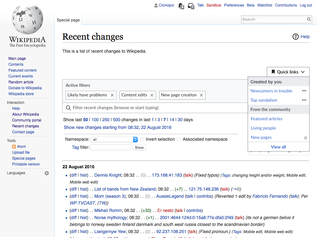
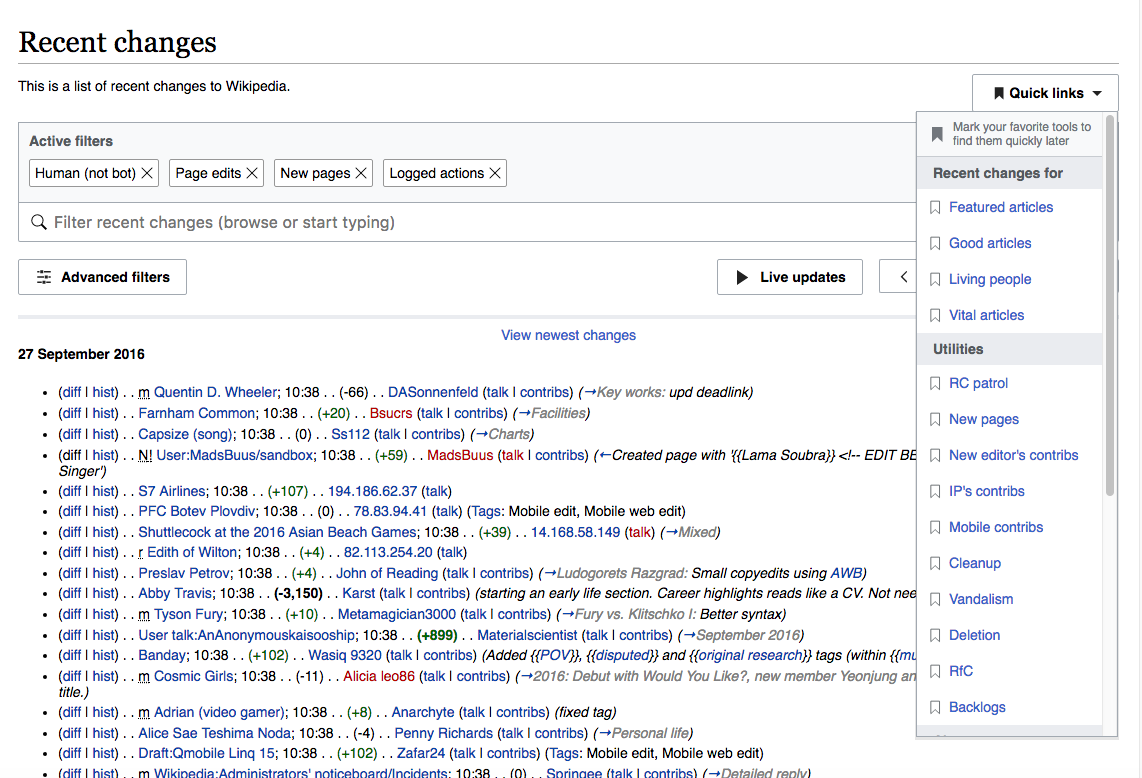
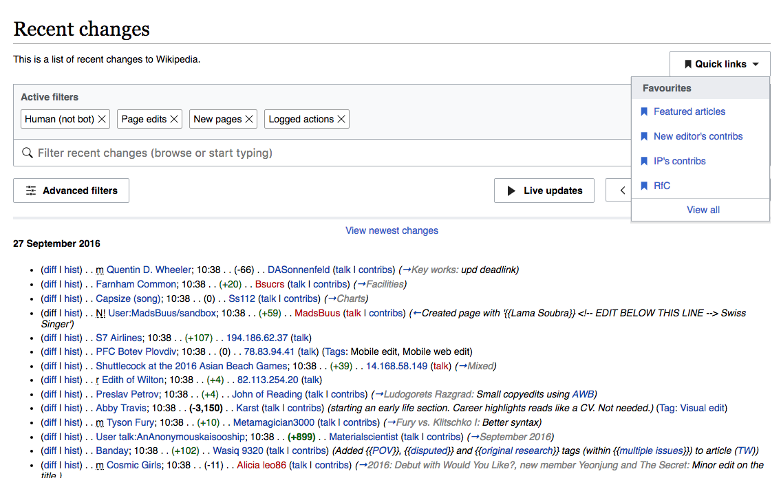
Solution #1: Quick links menu
- The links will be moved to a "Quick links" menu, prominently placed at top-right of the page. In this way, the links will be readily available for use, but the page will be significantly de-cluttered.
- The menu will be linear, with sub-groupings for the different categories. .
- Contents of this menu will continue to be edited by the community, though possibly via a somewhat different mechanism from now.
- A "favoriting" function will enable users to promote their favorites to a section near the top of the menu.
- In addition to the community-defined links, the Quick Links menu will also display filter presets saved by individual users. In this way, users will have one location for all their most useful links.
- Note: to adapt the current links for presentation in a linear menu may require the community to re-create them using a new methodology, as yet undefined. This could be an advantage, in that it will be an opportunity to evaluate whether it's desirable to bring all the links over.
- The screenshots below show the elements of this solution. You can also experience it in this prototype. (Note that the prototype is a mockup only; some things work and some don't, and not all functions are fully developed.)
 |  |
 | 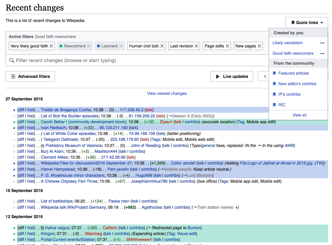 |
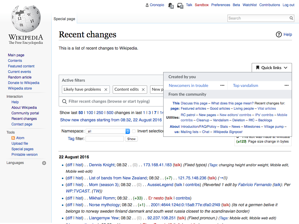
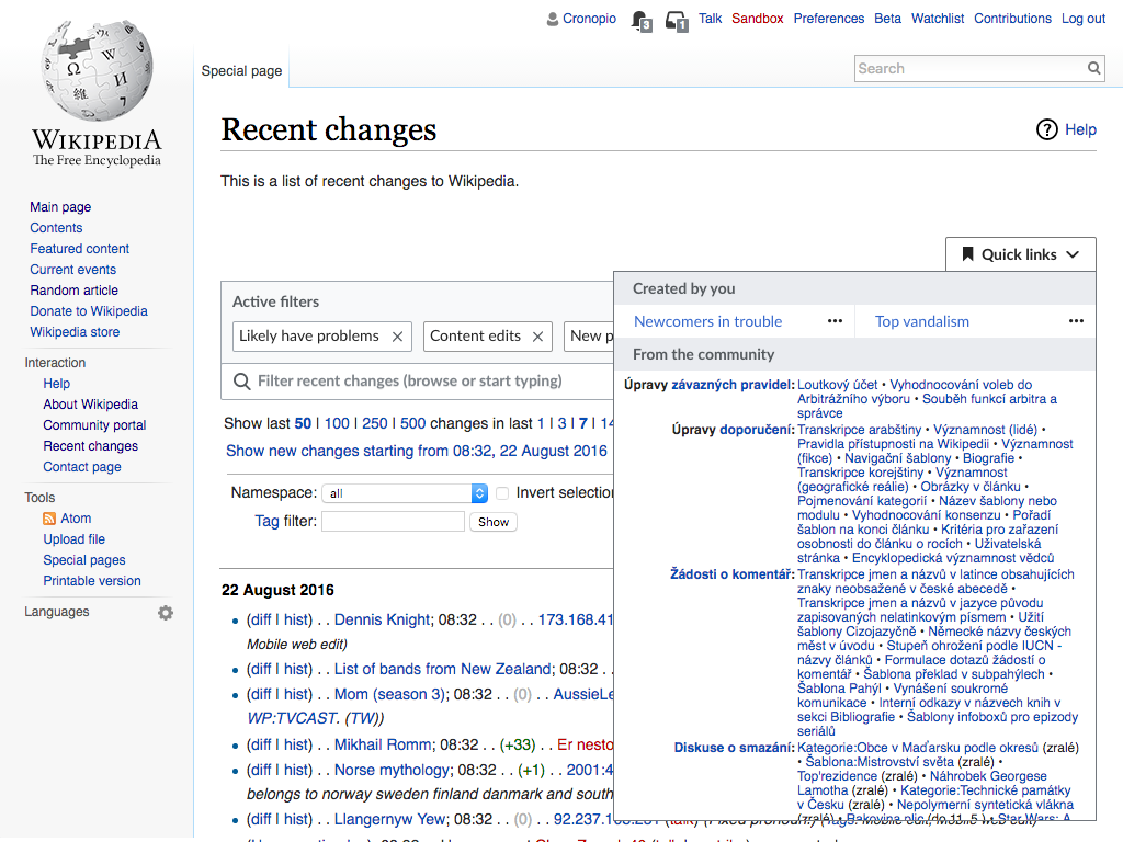
Solution #2: Quick links dropdown panel
- This solution is the same as #1 with one exception: instead of being rearranged in a linear menu, the links are displayed inside a dropdown panel that preserves their current structure.
- Contents of this menu will continue to be edited by the community, in the same manner as now.
- This solution may be easier than #1 to implement, since it may be able to simply ingest the current HTML.
- There are some, however, who will see this as a disadvantage, since communities will not have an incentive to slim down their link collections.
- Obviously, there will also be no opportunity to create Favorites.
- User defined filter presets will still be presented in a "Created by you" section (now displayed in two columns).
- See illustrations below.

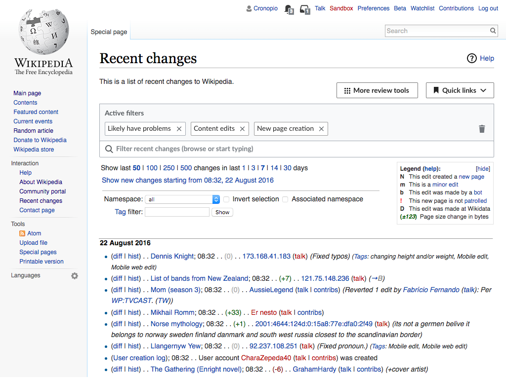
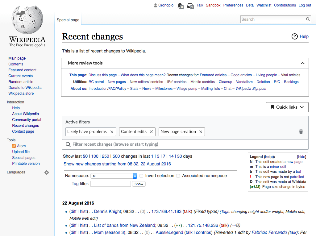
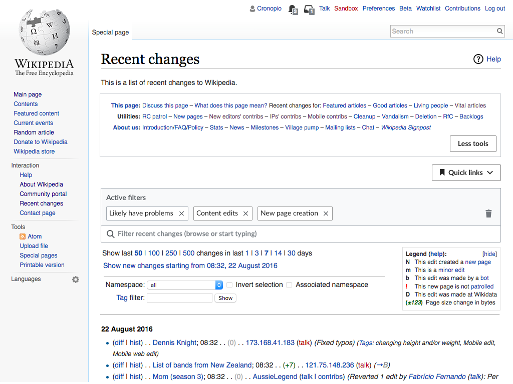
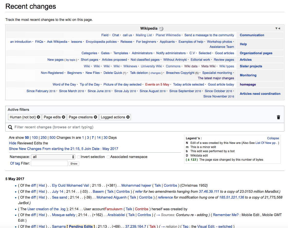
Solution #3: Collapsible panel
- Related links would be placed within a collapsible panel, so that users could choose whether to view it or not.
- The default would be collapsed, with a header reading something like "Useful Links."
- User-defined filter presets will be in a separate Quick Links menu (which may be renamed "Saved settings").
- This is the simplest solution to achieve technically and for communities.
- The screenshots below show the collapsible panel (without the Quick links menu) currently in use on the Arabic Wikipedia
 |  |