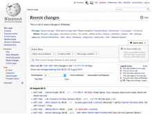
This is about users being able to save filter selections for themselves; the task for defining saved filters wiki-wide is T164548: Move links at top of Recent Changes to a Quick Links menu
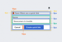
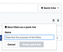
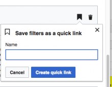
Save filters dialog
Behaviour
- Initially the dialog gets the input focus to its input filed showing a placeholder.
- When the input field is empty, the main action is disabled.
- When the input field has content, the main action is enabled.
- Clicking on "cancel" or outside the panel, cancels the operation and makes the panel disappear.
Layout
The layout is based on three different sizes (16px, 8px, and 4px) keeping a 2x proportion. 16px is used as font-size. The rest of the distances is illustrated below:
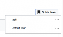
Quick links menu
Behaviour
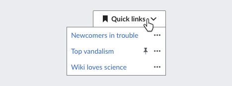
- Clicking on the "Quick links" button, shows the list of quick links. Clicking on the button again or anywhere outside the list closes the list.
- Clicking on a list item will load the associated filters.
- Clicking on the "..." menu will lead to more options for the item (more on this later).
- Items on the list are hovered with whichever is the standard color (there are separate UI-Standardization discussions on whether it should be grey or blue).
- The "..." icon is initially in "Base20" dark grey (#54595d) color, changing to "Base10" (#222) when hovering its active area.
Layout
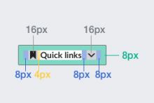
- The drop-down button should follow the standard layout for buttons with icons and indicators (check "ButtonWidget (icon)" and "ButtonWidget (indicator)" in the widget demo )
- Menu items use an 8px space padding around the content (text in 14px font size, and "accent50" blue #36c color).
- The "more" menu ("...") has an active area bigger than the image in order to avoid accidental clicks.
- Default filter shows the pin icon next to the "more" menu.
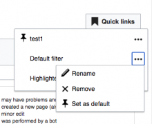
Quick links options menu
Behaviour
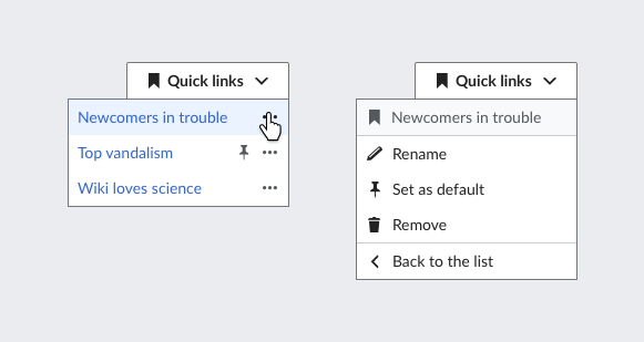
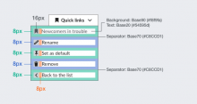
- When clicking the "..." option for a quick link, the contents of the quick links panel change to show the options for the current quick link.
- A header is shown with the name of affected quick link, the options provided and a way to return to the list.
Layout
- Items in the list use 8px as spacing unit with a 16px icon.
- The header uses a light grey as background and a separation line at the bottom.
- The last option is the action to return to the list, also with a line separator.
Renaming a quick link
Behaviour
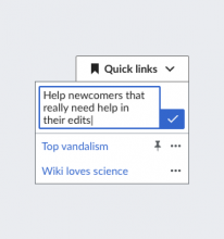
- When renaming the quick link item becomes an editable input box, focused and with the content as an input selection.
- The confirmation button will be disabled until the user changes the text.
- Clicking elsewhere in the list panel should exit the editing mode. Clicking outside should both exit the editing mode and close the panel.
Layout
- We can allow the text to expand for longer names (always limited to the maximum length we support), making the confirmation button aligned to the bottom of the text area. If this is too complex technically, we can just keep the initial size fixed for the input field.


