Page MenuHomePhabricator

Build user interface for the Dropdown Filter Panel
Closed, ResolvedPublic

Description

The Dropdown Filter Panel enables users to select filters and filter highlighting (view in prototype). Find the authoritative version of interface text at T149385. This ticket describes the Panel’s behaviors:

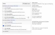
rc-filter-panel-states.png (645×1 px, 140 KB)

rc-filter-panel-layout.png (257×687 px, 25 KB)

Basic Display and Behavior

The filter panel is composed of a main header (containing the label “Filters” and a button for “Highlight results”) and a list of filters organized into sections. The name of each section grouping appears in a section header.

  • Rolling over an unselected filter turns its background light gray. Selected filters have no rollover state.
  • Clicking anywhere outside the panel closes the panel.
  • Functionally, the filters here comprise groups of OR filters connected by ANDs. I.e., the logic goes like this: (a1 or a2 or a3) AND (b2 or b3)
  • Clicking anywhere within the area defining an individual filter changes the filters checked status.
  • When a filter or highlight is selected, it goes into effect immediately so that users can get a “preview” of results. When a filter or highlight is activated, the corresponding tag is added to or removed from the active Filter Display Area (T149391) and the results area is updated (the contributions list can be displayed as disabled for a few seconds while contents are updated).
  • When a filter is selected, the section header for the section it’s in turns bold.
  • In its page's default state, the following filters are active and shown as checked in the Filter Panel: Page edits, New pages, Human (not bot), Log actions.

‘Excluded’ Display States

Selecting a filter to include one property inevitably excludes other properties. The “Excluded” display state communicates to users the properties (filters) their positive choices have eliminated. When a filter type is excluded, its background, text, and highlighter menu turn gray. Note that the excluded filters can still be selected, which will change their display state to active (this will cause other display changes in the Active Filter Display Area -- see T149391). There are three variations for how this works. :

1. For simple groups where the options are mutually exclusive, selecting one or more options grays out the others in the group.

  • Here are the complementary sets where this condition will apply: Unpatrolled/Patrolled, Minor/Nonminor, Registered/Unregistered, My Edit/Edits by Others, Newcomer/Experienced/More Experienced, Bots/Humans.

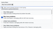
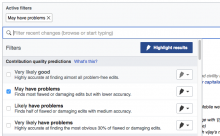
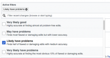
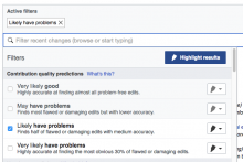
2. Behavior for the ORES filters (and potentially other filters where some options are a sub-set of one another) is a little more complicated because these groups contain filters that not only look for opposite values but also overlap one another. Here are all the possible combinations:

  • Quality Filters
    • If I select: Very Likely Good, everything else grays.
    • If I select: May have problems, Very likely Good grays.
    • If I select Likely Have Problems, May Have Problems and Very likely Good gray.
    • If I select Very Likely Have problems, then the other three options gray
  • Intent Filters
    • If I select: Very Likely Good Faith, everything else grays.
    • If I select May be Bad Faith, Very likely Good Faith grays.
    • Likely Bad Faith, then May be bad faith and Likely Good Faith gray.

3. Conflicts between Unregistered and the Experience filters happens because the Experience filters find only registered users.

  • If Unregistered is not selected and any Experience filter is selected
    • The Unregistered and Registered filters (in the User Registration group) becomes greyed out to communicate that they have no effect.
  • If no Experience filter is selected and the Unregistered filter is selected
    • The Experience filters are greyed out to communicate that they have no effect.

‘What’s This?’ Links

rc-filter-panel-layout copy.png (363×569 px, 56 KB)

[MOVED ALL THIS TO SUBTASK T159186]
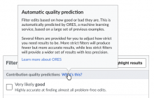
The ORES section headers (“Quality” and “Intent”) include a “What’s this?” link.

    • Clicking the “what’s this?” link opens a popup with information about the filters. The popup will remain visible until the user clicks outside.
  • The popup contains a link to get more information about ORES that will open in a new window/tab.
  • Find the authoritative texts for the two pop-ups T149385.
Related Objects

Event Timeline

There are a very large number of changes, so older changes are hidden. Show Older Changes

Change 320332 had a related patch set uploaded (by Mooeypoo):
[super-atomic-WIP] Adding filters to RecentChanges

https://gerrit.wikimedia.org/r/320332

Change 327419 had a related patch set uploaded (by Mooeypoo):
[wip] Create active/inactive behavior for complementary filters

https://gerrit.wikimedia.org/r/327419

Change 320332 merged by jenkins-bot:
Adding new interface for review filters to RecentChanges

https://gerrit.wikimedia.org/r/320332

Change 331094 had a related patch set uploaded (by Catrope):
mediawiki.rcfilters: Add the remaining MW core filters

https://gerrit.wikimedia.org/r/331094

Change 331095 had a related patch set uploaded (by Catrope):
RCFilters: Clean up focus handling in capsule widget

https://gerrit.wikimedia.org/r/331095

Change 331095 merged by jenkins-bot:
RCFilters: Clean up focus handling in capsule widget

https://gerrit.wikimedia.org/r/331095

Change 331094 merged by jenkins-bot:
mediawiki.rcfilters: Add the remaining MW core filters

https://gerrit.wikimedia.org/r/331094

Change 327419 merged by jenkins-bot:
Create active/inactive behavior for complementary filters

https://gerrit.wikimedia.org/r/327419

This comment was removed by Mooeypoo.

excluded-filters-current.png (526×760 px, 83 KB)

The excluded filters do not seem to currently follow the color specification (F4695532):

  • Text: #54595D
  • Background: #F8F9FA

(1)

Rolling over an unselected filter turns its background light gray. Selected filters have no rollover state.

Not done yet.

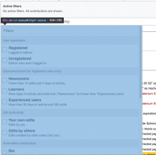
(2) The filter panel (div.oo-ui-popupWidget-popup) is 650x595 vs 650x350 in the mockup

Screen Shot 2017-01-26 at 3.38.41 PM.png (640×643 px, 93 KB)

(2) The filter panel (div.oo-ui-popupWidget-popup) is 650x595 vs 650x350 in the mockup

Screen Shot 2017-01-26 at 3.38.41 PM.png (640×643 px, 93 KB)

Related to this, the intent was not to set a specific height for the panel. The idea was to use most of the available space, but not covering it all in order to let the user see part of the content behind. The way to support this in the prototype was to set the height of the viewport ( max-height: 70vh; in CSS parlance), but other approaches may be possible.

Added from @Pginer-WMF notes; the following should be corrected:
(1) Selecting a tag should (a) highlight the tag in blue, (b) open the panel, (c) scroll the list of filters in the panel to show the affected one and (d) highlight the filter in the list. Currently it only opens the panel (b), but nothing else.

(2) Filter name font size is a bit too big. It should be closer to 16px (now it is closer to 17px).

(3) Checkboxes should be smaller (UI Standardisation issue: https://phabricator.wikimedia.org/T86003 )

(4) When searching, the size of the panel does not adjust to the contents unless the user scrolls. Typing "Registe" makes the filter panel to have one option ("Registered") and a lot of empty space, but once you scroll you have the panel to become one item tall.

@Mooeypoo - any comments on the following?

(2) Filter name font size is a bit too big. It should be closer to 16px (now it is closer to 17px).
(3) Checkboxes should be smaller (UI Standardisation issue: https://phabricator.wikimedia.org/T86003 )

@Mooeypoo - any comments on the following?

(2) Filter name font size is a bit too big. It should be closer to 16px (now it is closer to 17px).

I'll add that to my list to fix.

(3) Checkboxes should be smaller (UI Standardisation issue: https://phabricator.wikimedia.org/T86003 )

Yeah, that's totally an OOUI issue. We are using OOUI checkboxes, out of the box.

By the way, this:

(4) When searching, the size of the panel does not adjust to the contents unless the user scrolls. Typing "Registe" makes the filter panel to have one option ("Registered") and a lot of empty space, but once you scroll you have the panel to become one item tall.

Should be fixed.

Change 340532 had a related patch set uploaded (by Mooeypoo):
[mediawiki/core] RCFilters UI: Correct filter name font-size

https://gerrit.wikimedia.org/r/340532

Change 340532 merged by Mooeypoo:
[mediawiki/core] RCFilters UI: Correct filter name font-size

https://gerrit.wikimedia.org/r/340532

@Mooeypoo, will the following be corrected?
(1)

Rolling over an unselected filter turns its background light gray. Selected filters have no rollover state.

(2)

PrototypeCurrent UI
rc-filter-panel-states.png (645×1 px, 140 KB)
Screen Shot 2017-03-02 at 11.56.17 AM.png (517×669 px, 88 KB)

@Mooeypoo, will the following be corrected?
(1)

Rolling over an unselected filter turns its background light gray. Selected filters have no rollover state.

(2)

PrototypeCurrent UI
rc-filter-panel-states.png (645×1 px, 140 KB)
Screen Shot 2017-03-02 at 11.56.17 AM.png (517×669 px, 88 KB)

I can implement it. @Pginer-WMF is the grey the same one used for the 'muted' filters? I'm using Base90 AAA which is the lightest grey, so if we need any other color I don't have any lighter to go. Unless you want to go same or darker?

Change 341096 had a related patch set uploaded (by wikigit):
[mediawiki/core] RCFilters UI: Add hover effect on filter list items

https://gerrit.wikimedia.org/r/341096

Change 341096 merged by jenkins-bot:
[mediawiki/core] RCFilters UI: Add hover effect on filter list items

https://gerrit.wikimedia.org/r/341096

Change 341111 had a related patch set uploaded (by wikigit):
[mediawiki/core] RCFilters UI: Adjust styles for filter list elements

https://gerrit.wikimedia.org/r/341111

Change 341111 merged by jenkins-bot:
[mediawiki/core] RCFilters UI: Adjust styles for filter list elements

https://gerrit.wikimedia.org/r/341111

I can implement it. @Pginer-WMF is the grey the same one used for the 'muted' filters? I'm using Base90 AAA which is the lightest grey, so if we need any other color I don't have any lighter to go. Unless you want to go same or darker?

I wanted to avoid using the same grey as we used for "muted" filters to avoid the confusion with those (thinking the current is "muted" or thinking that clicking on it will make it "muted"). In the prototype I was using #fbfbfb which is not in the standard palette. We can either (a) make such customisation for our case, or (b) don't change the color on hover. I'm inclined to (a) in this case since the the little contrast provided by the color could only in the worst case make it unnoticed which would be the same as (b).

In any case, the color change will affect only the non-muted filters. Muted filters should keep their color unchanged when hovered.

@Mooeypoo, will the following be corrected?
(2)

PrototypeCurrent UI
rc-filter-panel-states.png (645×1 px, 140 KB)
Screen Shot 2017-03-02 at 11.56.17 AM.png (517×669 px, 88 KB)

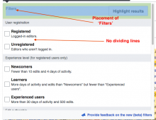
Regarding the lines, I've been using Base80 (#EAECF0). The list could also work without it, but the lines add a subtle additional guidance to visually group the elements of the list.
Regarding the placement of the filters label, in addition to the vertical alignment (which seems to be fixed already) there is a need for some horizontal alignment:

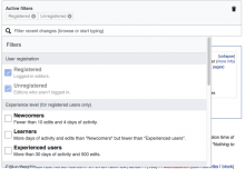
The padding (in green in Elena's screenshot) should be the same distance as the one used for filters. You should be able to trace a straight vertical line through the left edges of "filters" label, filter group labels and the checkboxes of the filters. In the spec this distance was defined as ~10px (@Volker_E encourages the use of a 8px grid, so we may want to approach that as a unit with the selection of appropriate Ems). In any case, those paddings should not be different.

@Pginer-WMF I like that you've been considering not putting lines in between upfront. From all other interfaces that we currently have, I'm leaning towards no dividing lines, as it not only aligns with interfaces elsewhere, but it also makes the groups clearer IMO. The user additionally gets a visual feedback of an item by the background-color change on desktop.

Yes, to the 8px (multipliers & in rare cases 4px) based margin & padding measurements!

I fixed the hover color (in an upcoming commit), but the margin/spacing for the title is a bit complicated; the title "Filters" is vertical-align: middle to the highlights button that's on the right. We're using OOUI button which has set dimensions (especially the height) - so if we do vertical align, it goes by those dimensions rather than a fixed spacing.

I could switch it to a fixed space from the top, but then it won't be on the middle to the button, which seems like is the way the prototype has it - the other option is to make the highlight button smaller, but that's overriding the ooui styles (which may be fine for this case, but I just want to make sure)

@Pginer-WMF - if you want me to make the button smaller, how smaller would you like it? Otherwise, should I leave it as-is (I fixed this on Friday to be vertical aligned, it may look better now?)

Change 341360 had a related patch set uploaded (by wikigit):
[mediawiki/core] RCFilters UI: Change hover background for filter items

https://gerrit.wikimedia.org/r/341360

What's not done yet:
(1) From the specs:
Selected filters have no rollover state.

Presently, the selected filters will have the same roll-over state as unselected filters.

(2) From Pau's comment:

You should be able to trace a straight vertical line through the left edges of "filters" label, filter group labels and the checkboxes of the filters.

The present layout

Screen Shot 2017-03-06 at 12.35.14 PM.png (215×662 px, 21 KB)

Screen Shot 2017-03-06 at 12.36.33 PM.png (307×935 px, 66 KB)

Change 341360 merged by jenkins-bot:
[mediawiki/core] RCFilters UI: Change hover background for filter items

https://gerrit.wikimedia.org/r/341360

I fixed the hover color (in an upcoming commit), but the margin/spacing for the title is a bit complicated; the title "Filters" is vertical-align: middle to the highlights button that's on the right. We're using OOUI button which has set dimensions (especially the height) - so if we do vertical align, it goes by those dimensions rather than a fixed spacing.

I could switch it to a fixed space from the top, but then it won't be on the middle to the button, which seems like is the way the prototype has it - the other option is to make the highlight button smaller, but that's overriding the ooui styles (which may be fine for this case, but I just want to make sure)

@Pginer-WMF - if you want me to make the button smaller, how smaller would you like it? Otherwise, should I leave it as-is (I fixed this on Friday to be vertical aligned, it may look better now?)

Centering the "Filters" label vertically is good. It works well currently.
The other comment I had is about horizontal alignment. If you look at the distance at the left of the "Filter" label to the edge of the panel, it should be the same as the distance at the left of the checkboxes.

Elena illustrates this in T149452#3077331

(1)

Here are the complementary sets where this condition will apply: Unpatrolled/Patrolled, Minor/Nonminor, Registered/Unregistered, My Edit/Edits by Others, Newcomer/Experienced/More Experienced, Bots/Humans.

There are no Unpatrolled/Patrolled filters. Should they be implemented?

(2)
Quality and Intent filters combinations do not work as described

  • Quality Filters:

If I select: May have problems, Very likely Good grays.
If I select Likely Have Problems, May Have Problems and Very likely Good gray.

When May have problems is selected, everything else is greyed out; when Likely Have Problems is selected, everything else is greyed out.

  • Intent Filters:

If I select May be Bad Faith, Very likely Good Faith grays.

When May be Bad Faith is selected, everything else is greyed out.

(3) Conflict states (#3) are still broken.

There are no Unpatrolled/Patrolled filters. Should they be implemented?

Oh! Yes, they should. That would include pending revisions, done with FlaggedRevisions. Polish Wikipedia uses FlaggedRevisions.

@Trizek-WMF - re Unpatrolled/Patrolled filters

  • as far as I know there are no plans to add them as new filter options
  • Unpatrolled/Patrolled filters are present as an old-fashioned type Show/Hide links; I saw such links being present on cawiki (production) and ruwiki betalabs
  • enwiki betalabs does not display Unpatrolled/Patrolled links at all (does not matter if 'New filters' beta feature is on or off. (filed as a regression bug T160682: It is unclear what the 'Hide patrolled pages from new page list' setting applies to)

Patrolled/Unpatrolled (the group is called "Review status") should be in the new dropdown filter panel for users who qualify to see them (as per the rules of the particular wiki). The functionality should already be present, as per this closed ticket T152061 Is it not?

Sorry if that wasn't clear. That ticket is part of a series for each filter group in the Dropdown panel, but I guess it doesn't say that. It does, however, link to T149385, which provides the proper wording and group name, so I'm guessing that @SBisson did know it was meant to be in the panel. Stephane, when you did T152061, did you fix it so that these filters would appear in the dropdown or just on the page as of old?

Sorry if that wasn't clear. That ticket is part of a series for each filter group in the Dropdown panel, but I guess it doesn't say that. It does, however, link to T149385, which provides the proper wording and group name, so I'm guessing that @SBisson did know it was meant to be in the panel. Stephane, when you did T152061, did you fix it so that these filters would appear in the dropdown or just on the page as of old?

I did this task Dec 1st (merged Dec 6th) 2016. I would have loved to add it to the new UI at the same time but that only became possible last week or so. The same goes for all the new filters (6 or 7) I've added around that time.

"Review status" was added to the new UI as part of Matt's filter registration work. It seems to be conditional to the user having patrol rights just like the old "show/hide patrolled edits". I have never tried it but I can investigate if it's not visible when it should.

Sorry for the confusion - Patrolled/Unpatrolled filters (Review status group) are fully functioning in cawiki betalabs. Seeing 'Hide patrolled pages from new page list' setting in REcent changes preferences on enwiki betalabs made me think that there is some sort of regression.

Thanks to @Catrope explanation, all is clear now - enwiki betalabs does not have Patrolled/Unpatrolled because enwiki does not have patrol new edit functionality. The bug that I filed is an old issue unrelated to our current development - I corrected the title - T160682: It is unclear what the 'Hide patrolled pages from new page list' setting applies to

To illustrate the #2 from comment above:

Quality Filters:
If I select: May have problems, Very likely Good grays.
If I select Likely Have Problems, May Have Problems and Very likely Good gray.

Current implementation- all grey except the selected filterPrototype - subset filters are not greyed
Screen Shot 2017-03-16 at 1.26.14 PM.png (378×666 px, 62 KB)
Screen Shot 2017-03-16 at 2.32.05 PM.png (443×716 px, 89 KB)
Screen Shot 2017-03-16 at 2.34.03 PM.png (366×686 px, 59 KB)
Screen Shot 2017-03-16 at 1.26.31 PM.png (451×674 px, 83 KB)

Change 343137 had a related patch set uploaded (by Mooeypoo):
[mediawiki/core] RCfilters UI: Change mute display for included filters

https://gerrit.wikimedia.org/r/343137

Change 343137 merged by jenkins-bot:
[mediawiki/core] RCfilters UI: Change mute display for included filters

https://gerrit.wikimedia.org/r/343137

Sorry for the confusion - Patrolled/Unpatrolled filters (Review status group) are fully functioning in cawiki betalabs. Seeing 'Hide patrolled pages from new page list' setting in REcent changes preferences on enwiki betalabs made me think that there is some sort of regression.

Is there is a confusion for two of us, that may mean people will get confused as well.

I don't have Patrolled/Unpatrolled Filters on cawiki betalabs.

You have to have the Patroller right to see them. Even Roan, who's a bureaucrat, didn't have it until he turned it on for himself. Which is to say I don't think it just comes with various things automatically..

You have to have the Patroller right to see them. Even Roan, who's a bureaucrat, didn't have it until he turned it on for himself. Which is to say I don't think it just comes with various things automatically..

Thanks. I note it to upgrade the filters list documentation.

Re-checked all specs - especially recently implemented excluded/subset/conflict states. I marked all specs green as fully implemented and functioning.

QA recommendation: Resolve.

jmatazzoni claimed this task.

I love the green checkmark system. Very easy to follow. Thank you @Etonkovidova! Resolving this.