Page MenuHomePhabricator

Adjust the layout of translation list items in the dashboard
Closed, ResolvedPublic

Description

Content translation dashboard shows different lists of articles in their views (suggestions, in progress translations, and published articles). All of these items have a very similar structure.This ticket proposes some layout and typography adjustments to better align the list of items on these views with the design guidelines.

Mockups showing the final outcome for two example views:

SuggestionsIn progress
cx-dashboard-reviewed.png (768×1 px, 165 KB)
cx-dashboard-reviewed-inprogress.png (768×1 px, 103 KB)

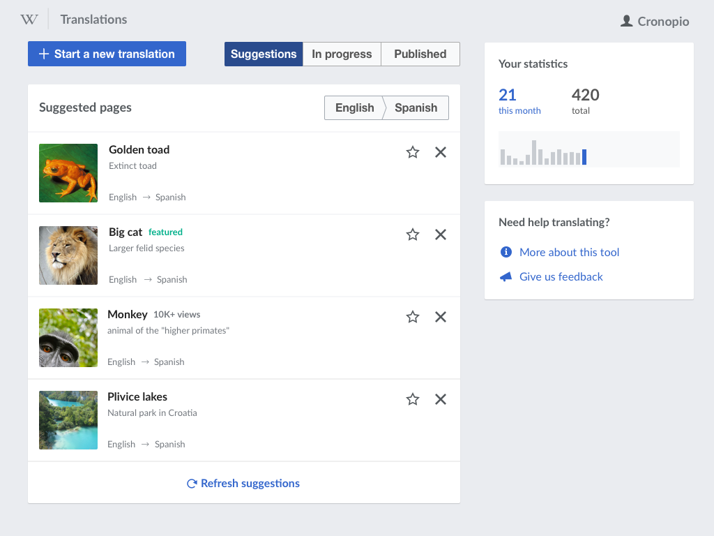
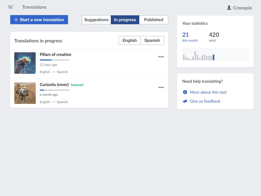
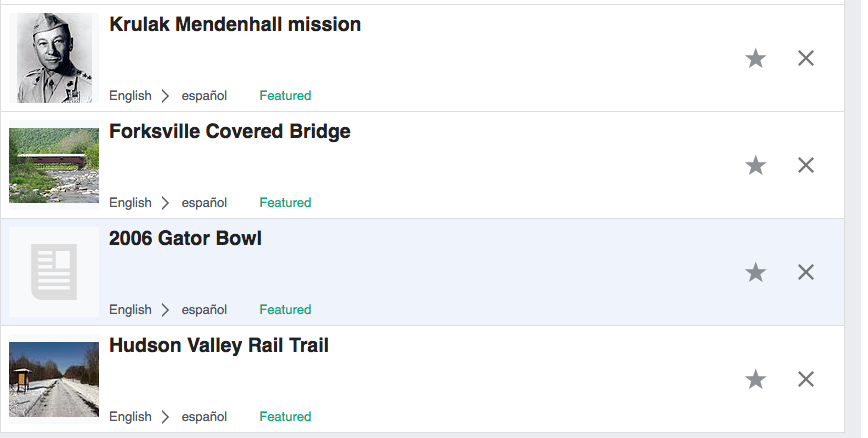
Proposed adjustments:

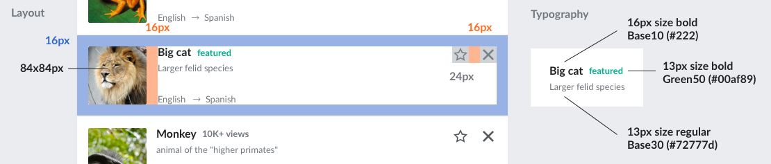
  • More padding around the list item. A 16px distance will be used around the list item contents, and also between the image and the text elements.
  • Adjusting the images. 84px images, using 2px rounded corners.
  • Smaller font size for the title (16px) and slightly larger for other information (13px).
  • Tags such as "featured" shown after the title without a tag treatment. Only text (in different colors) is used.
  • Icons for actions are placed at the top-right corner of the element. They have a 24px active area, but their shape is shown at 20px.
    • An outlined star is used for items that are not in the "for later" list, while a filled star is used for those added.

The mockup below shows annotations to clarify some key aspects of the layout and typography:

cx-list-item-notes.png (237×1 px, 93 KB)

Event Timeline

  • Why is the accompanying text like “Extinct toad” and second “English -> Spanish” grey? It's already a smaller font-size, I don't think it needs less contrast too. More general is, that we're already in English > Spanish, but I can see why it is useful to repeat it per page list item.

Since we reduced the contrast with the title size, I think it makes sense to have some contrast between the title (the main element) and the metadata.
I have not a strong opinion between using Base30, or Base20, but I'd not go darker than that.

Thanks @Pginer-WMF for the further explanation. It was more of a “guts feeling” (“content first“, users might be interested in the tagline, especially when they've been translating many different articles. But as we're also going for level AA only in T92452, it's not necessary to point at this specifically. Long story short, with the explanation, I'm supporting using Base30.

Change 361725 had a related patch set uploaded (by Petar.petkovic; owner: Petar.petkovic):
[mediawiki/extensions/ContentTranslation@master] CX2: Adjust the layout of translation list items

https://gerrit.wikimedia.org/r/361725

Hey @Pginer-WMF, please give me images needed for star outline.

Hey @Pginer-WMF, please give me images needed for star outline.

If it's possible to use the OOJS UI icons from their repo the icons named "Star" and "unStar" are the ones to use. Using Base20 (#54595D) as the color for the outlined star, and Accent50 (#3366CC) for the filled one.

If you need the SVGs (and PNGs) in the specific colors, I attached them below:

star-base20.png (24×24 px, 722 B)


unstar-accent50.png (24×24 px, 462 B)

@santhosh may want to weigh in on the preferred approach for using the icons here.

Change 361911 had a related patch set uploaded (by Petar.petkovic; owner: Petar.petkovic):
[mediawiki/extensions/ContentTranslation@master] Move featured tag on translation list items

https://gerrit.wikimedia.org/r/361911

Change 361725 merged by jenkins-bot:
[mediawiki/extensions/ContentTranslation@master] Adjust the layout of translation list items

https://gerrit.wikimedia.org/r/361725

Change 361911 merged by jenkins-bot:
[mediawiki/extensions/ContentTranslation@master] Move featured tag on translation list items

https://gerrit.wikimedia.org/r/361911

I've adjusted the size of the star icons to fit better with the size of the "X" icon next to them:


star-base20.png (24×24 px, 820 B)


unstar-accent50.png (24×24 px, 586 B)

Change 362191 had a related patch set uploaded (by Petar.petkovic; owner: Petar.petkovic):
[mediawiki/extensions/ContentTranslation@master] Change action icons for list items in dashboard

https://gerrit.wikimedia.org/r/362191

Change 362191 merged by jenkins-bot:
[mediawiki/extensions/ContentTranslation@master] Change action icons for list items in dashboard

https://gerrit.wikimedia.org/r/362191

Pginer-WMF triaged this task as Medium priority.Jun 30 2017, 9:55 AM

@Pginer-WMF - it seems that all specs are in place. Please take a look to confirm. In the mockup 'featured' is in lower case - is it a change from 'Featured' label that is currently used?

cx-testing

  • smaller images (according to the specs - 84px)
  • a smaller font for the article titles (1em vs 1.5 em)
  • re-positioned 'x' and the star icons
  • re-positioned 'Featured ' label
    Screen Shot 2017-07-13 at 11.59.26 AM.png (603×884 px, 106 KB)

To compare - wmf.7 enwiki

Screen Shot 2017-07-13 at 12.01.43 PM.png (438×868 px, 97 KB)

@Pginer-WMF - it seems that all specs are in place. Please take a look to confirm. In the mockup 'featured' is in lower case - is it a change from 'Featured' label that is currently used?

Using "Featured" instead of "featured" seems ok to me. Enforcing capitalisation tends to be problematic in terms of localisation. So I'm ok in whichever form seems more solid across languages.