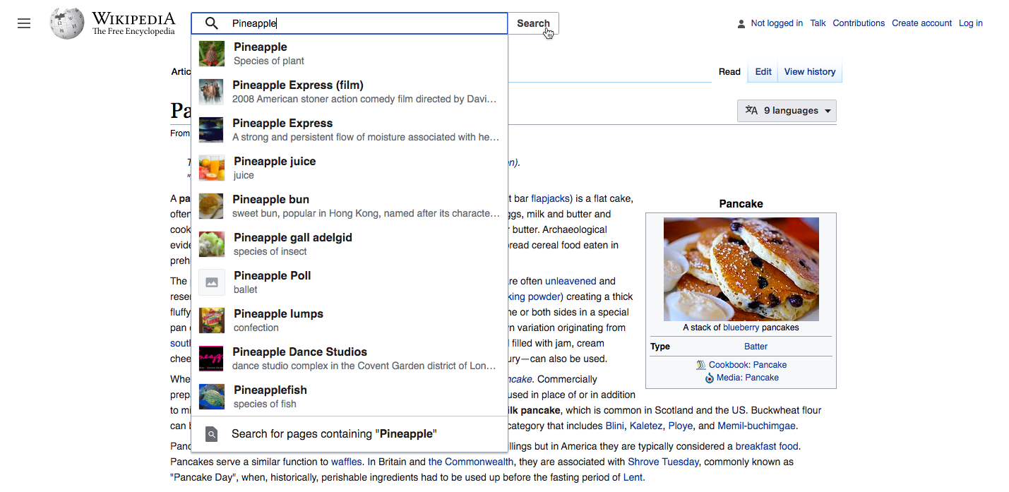
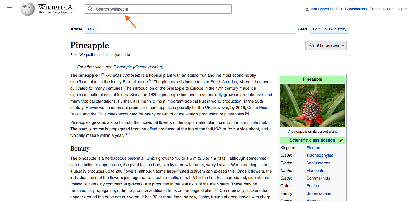
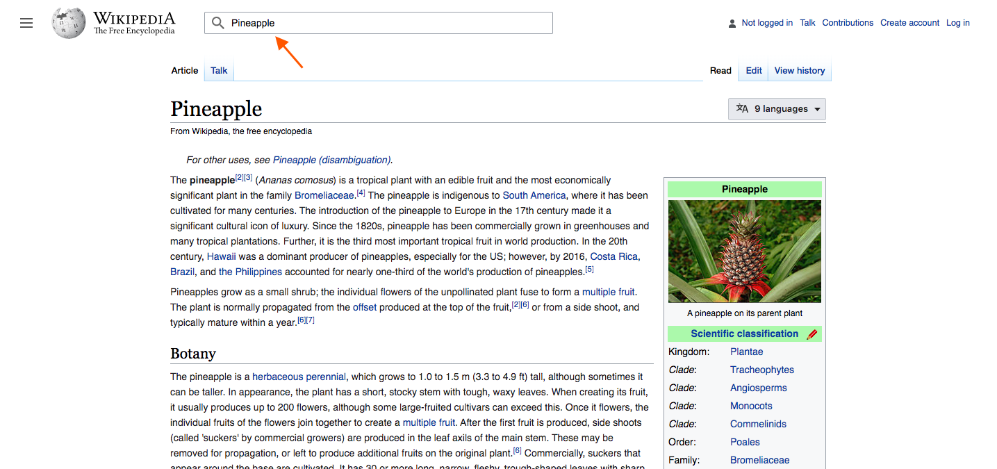
Design specifications for the new Vue.js search experience. Demo is available here: https://di-searchland-3.web.app/Pancake
Overview & terminology
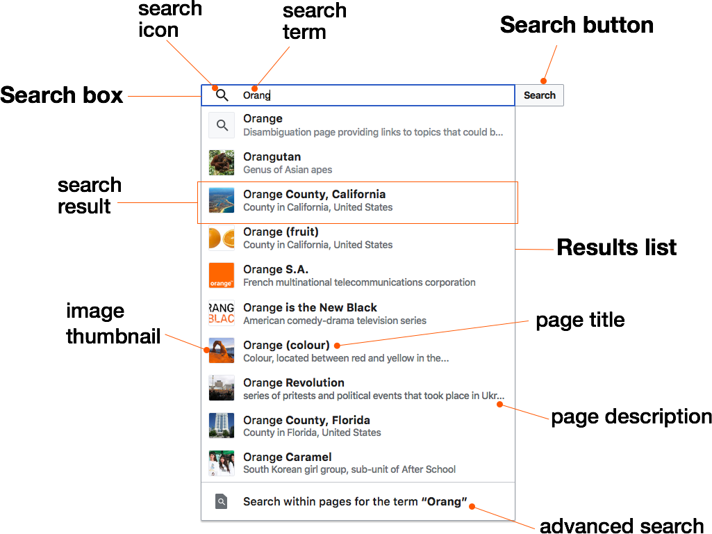
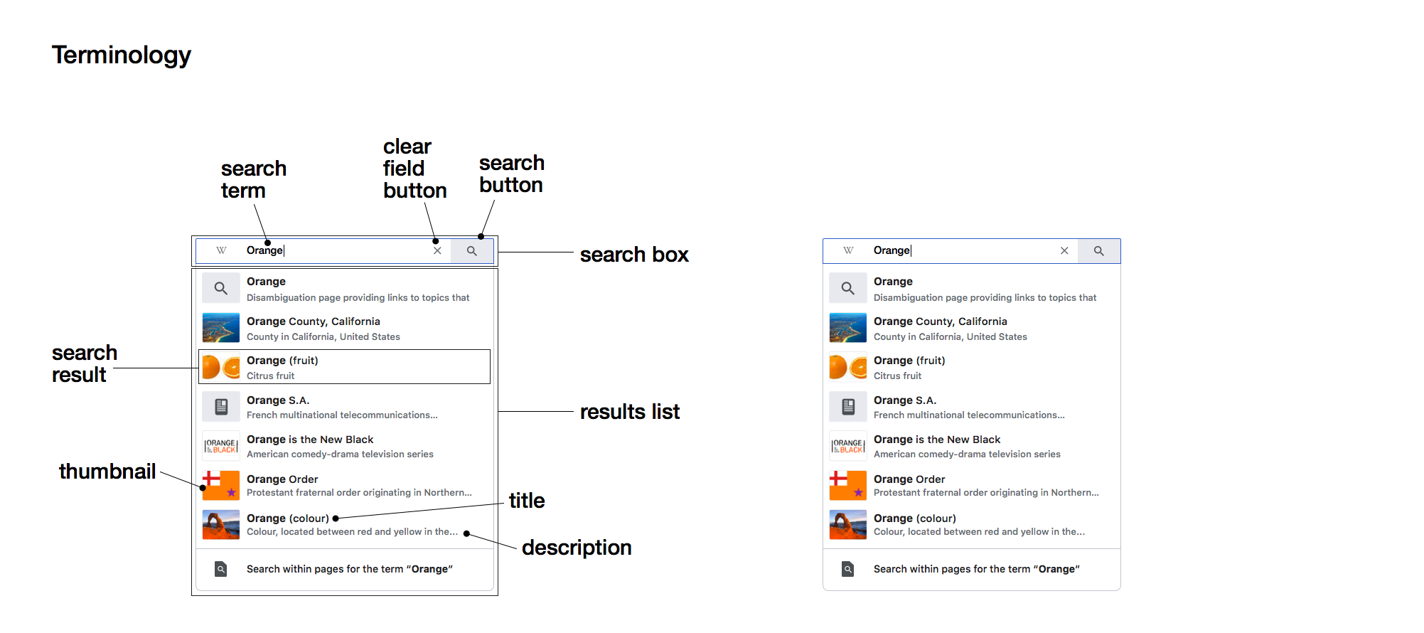
There are three main elements in the search component:
- Search box (input)
- Search button
- Results list
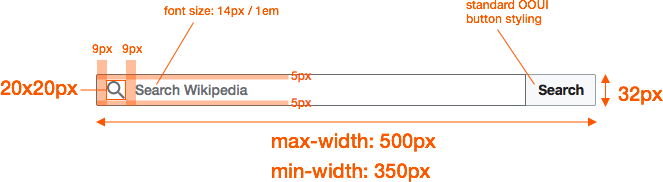
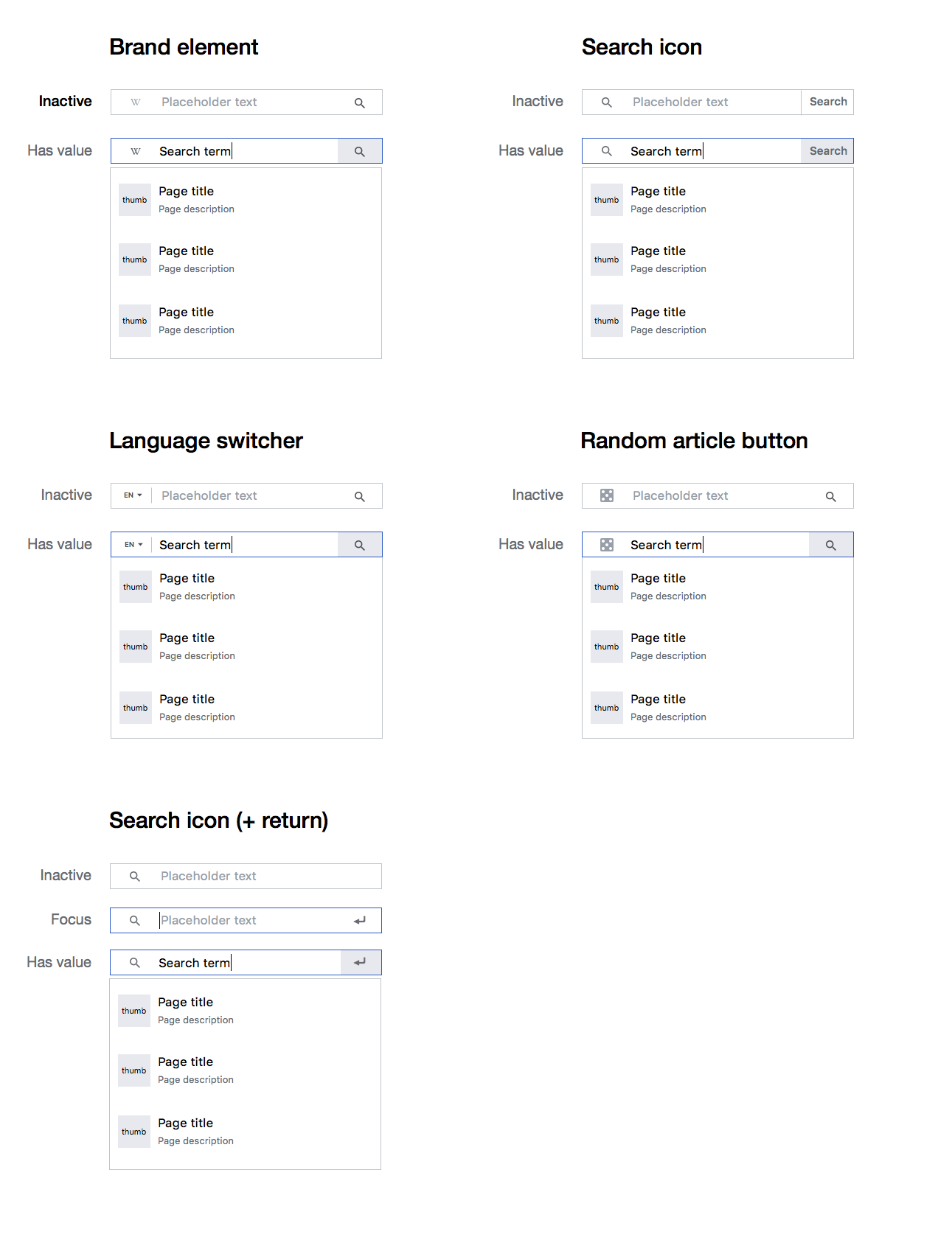
Search box + search button
The search box follows OOUI guidelines in terms of styling and interactivity. Please refer to either OOUI or the demo for additional details.
Specs
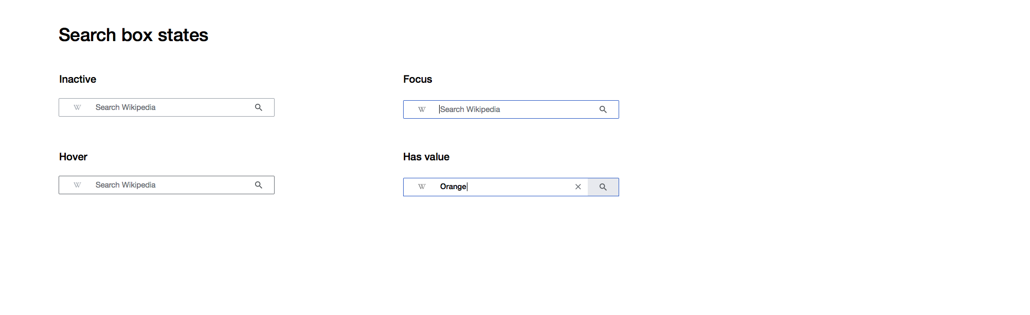
Note: when the search box is inactive there's a border that wraps around the search box + the search button. It's a bit difficult to show in static mocks so please refer to the interactive demo.
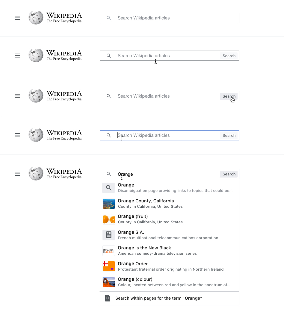
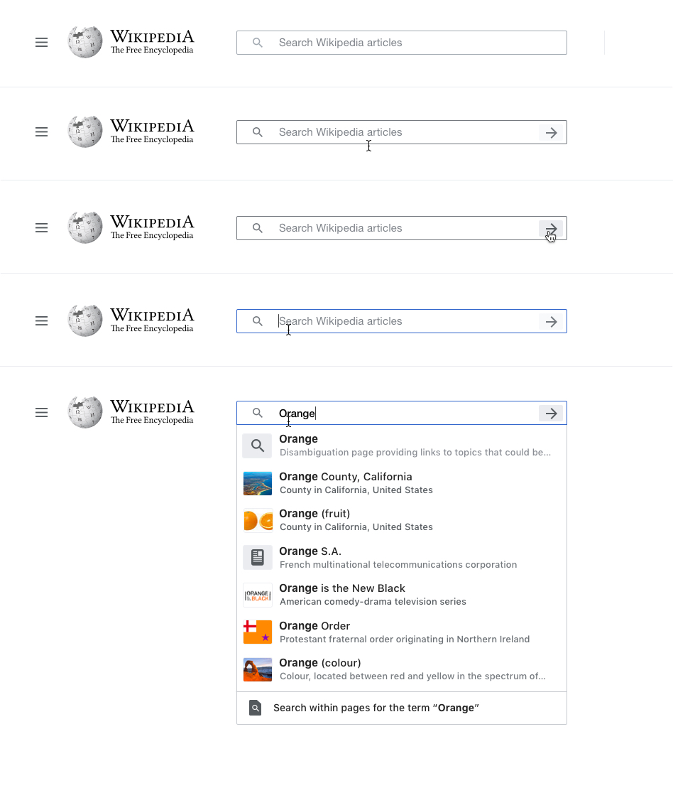
States
| state | image | notes |
|---|---|---|
| inactive |  | bounding border #A2A9B1 |
| hover search box |  | search button becomes visible (OOUI/"Normal"), search box border darkens (#72777D) |
| hover search button |  | search button background lightens (#FFFFFF) / text lightens (#404244), search box border initial |
| active & focus | 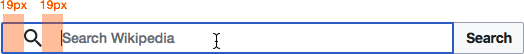 | search box border (2px / #3366CC), search icon opacity (1), search box grows 20px wider from the left |
| has value | 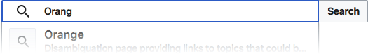 | search box text color #000 / bottom-left corner border radius (0) |
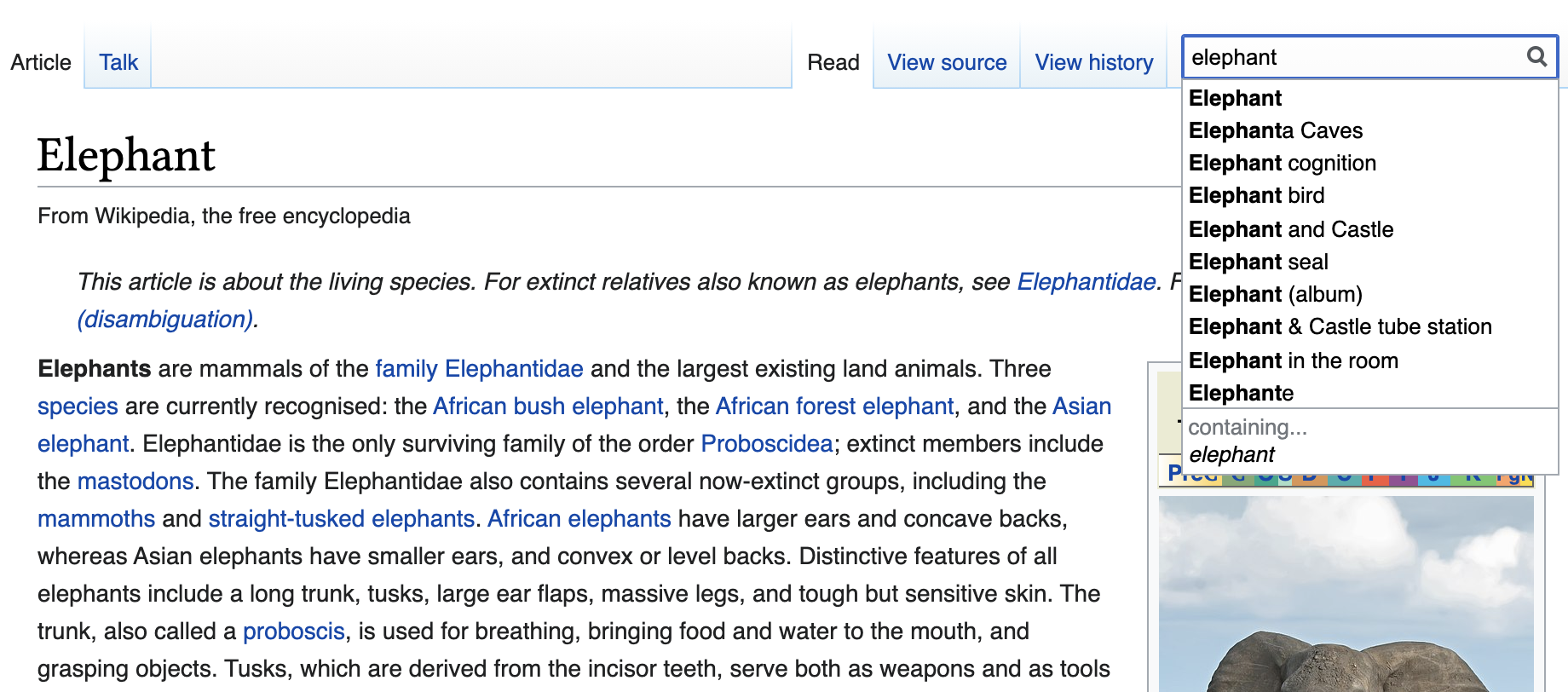
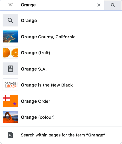
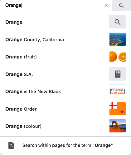
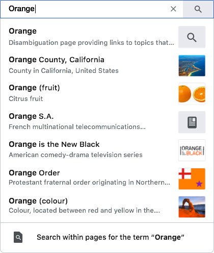
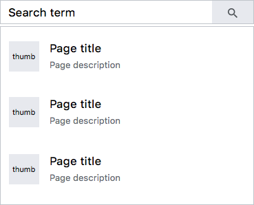
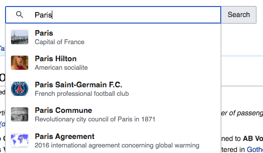
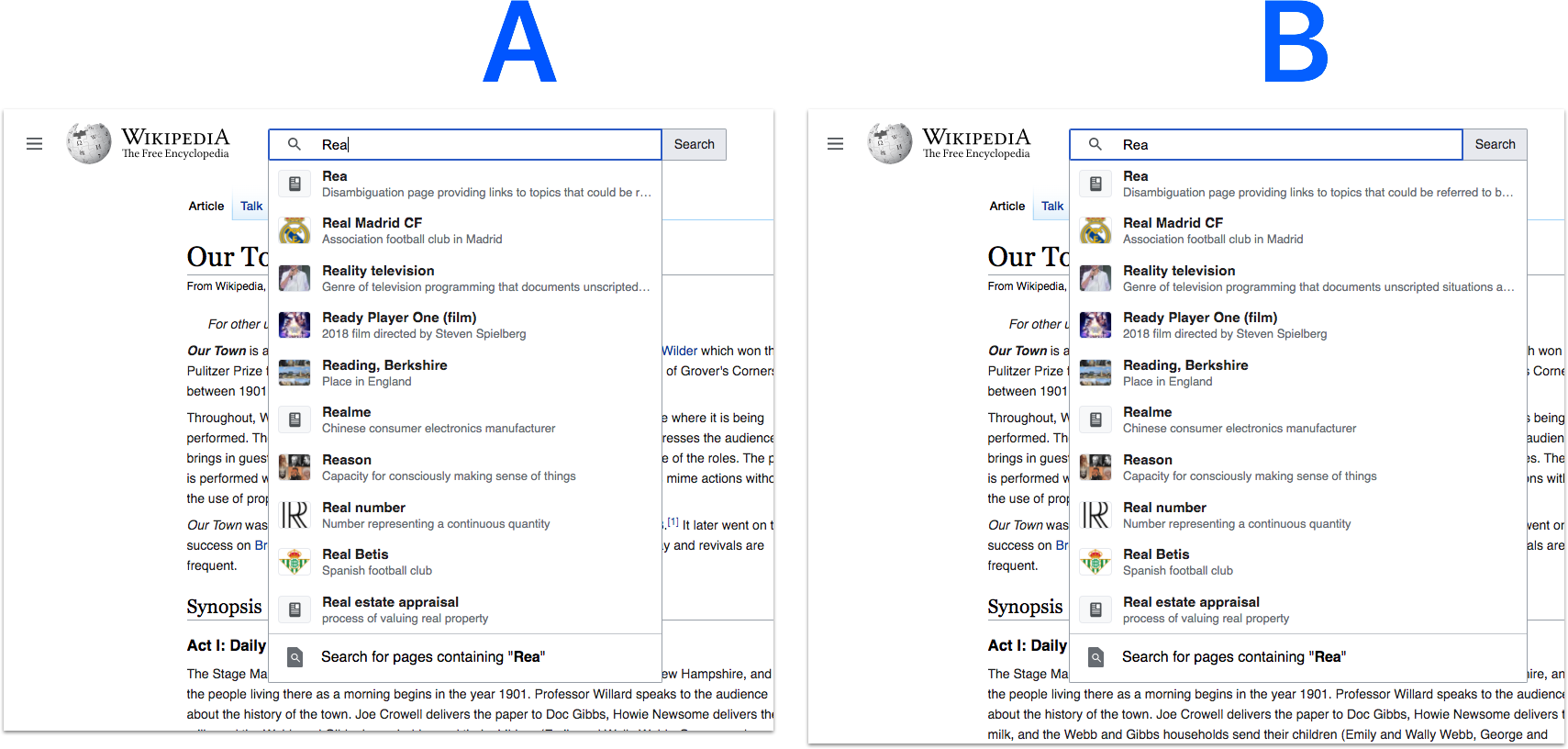
Results list
The results list follows OOUI guidelines in terms of styling and interactivity. Please refer to either OOUI or the demo for additional details.
Specs
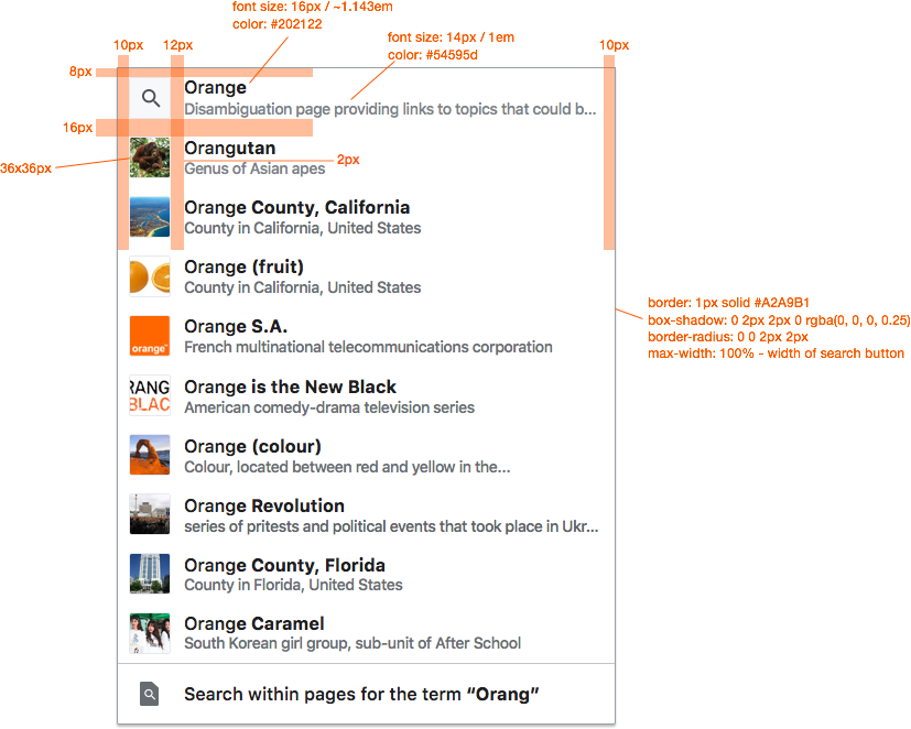
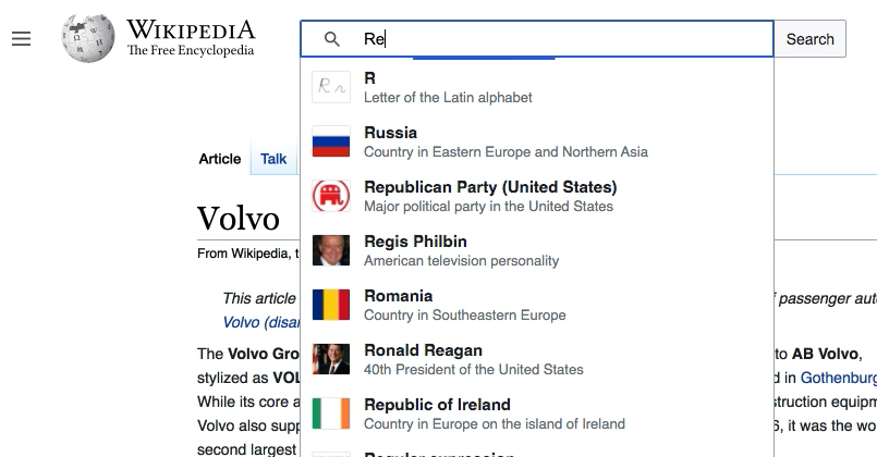
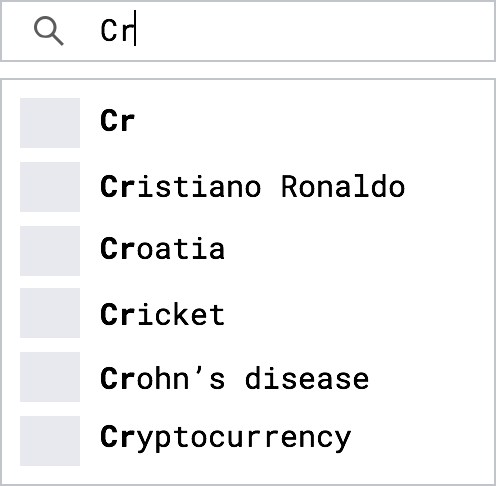
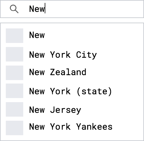
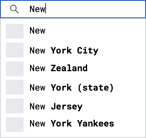
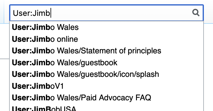
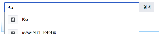
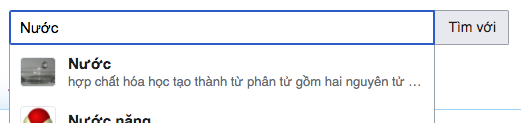
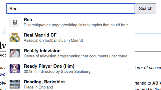
Styling of page title
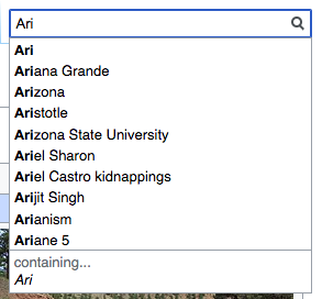
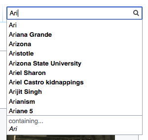
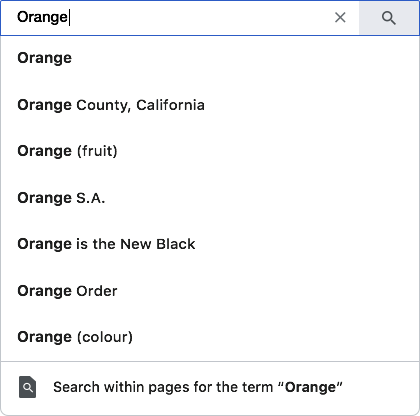
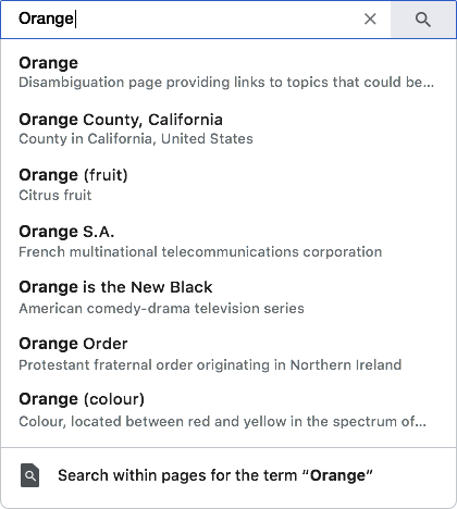
The part of the page title that does not match the search term will be bolded, e.g.
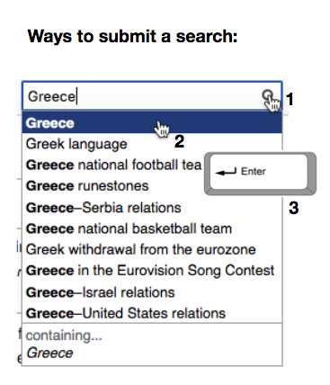
Keyboard support
Keyboard support should match the current experience on Wikipedia. This can also be seen on the demo.
- up/down keys to navigate to different search results
- the text in the search box should update to reflect whatever result is currently selected
- enter key to submit a search
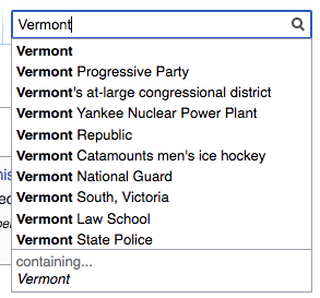
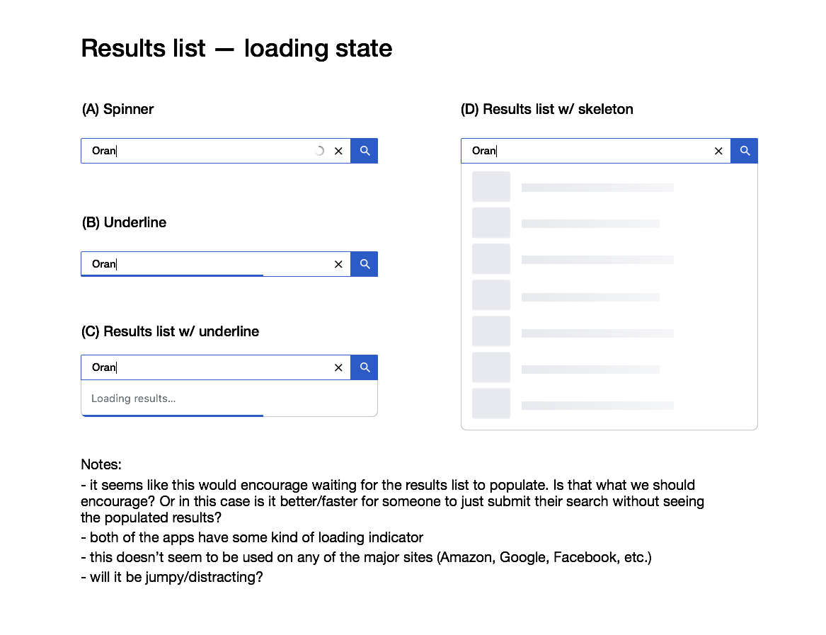
States
| hovering search result |  | background darkens (#EAECF0) |
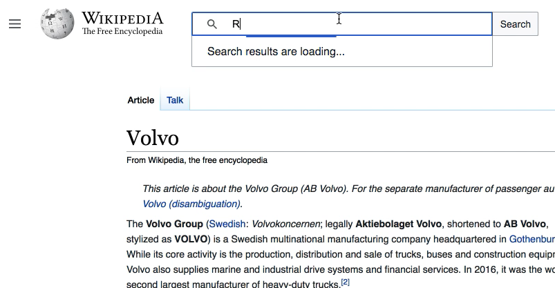
| initial load |  | demo: https://di-searchland-2.web.app/ |
| subsequent loads (if needed) | 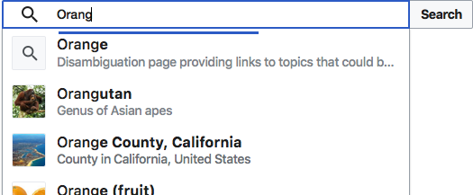 |


