Add “Progress indicators” to Design Style Guide “Components” section.
Take into account T75972: Loading indicators / Progress indicators are inconsistent.
Agreed upon design properties
- Indicators use Accent 50 for representation of system activity and progress, see also T278126
Types
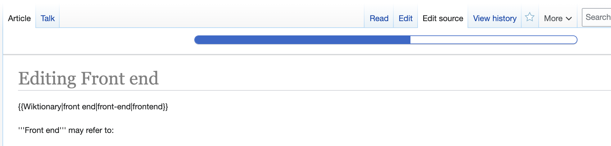
Progress bars (elevated)
as application loading indicator, best example VisualEditor's current use of OOUI's ProgressBarWidget.
Progress bars (part of dialogs and menus)
best example TypeaheadSearch

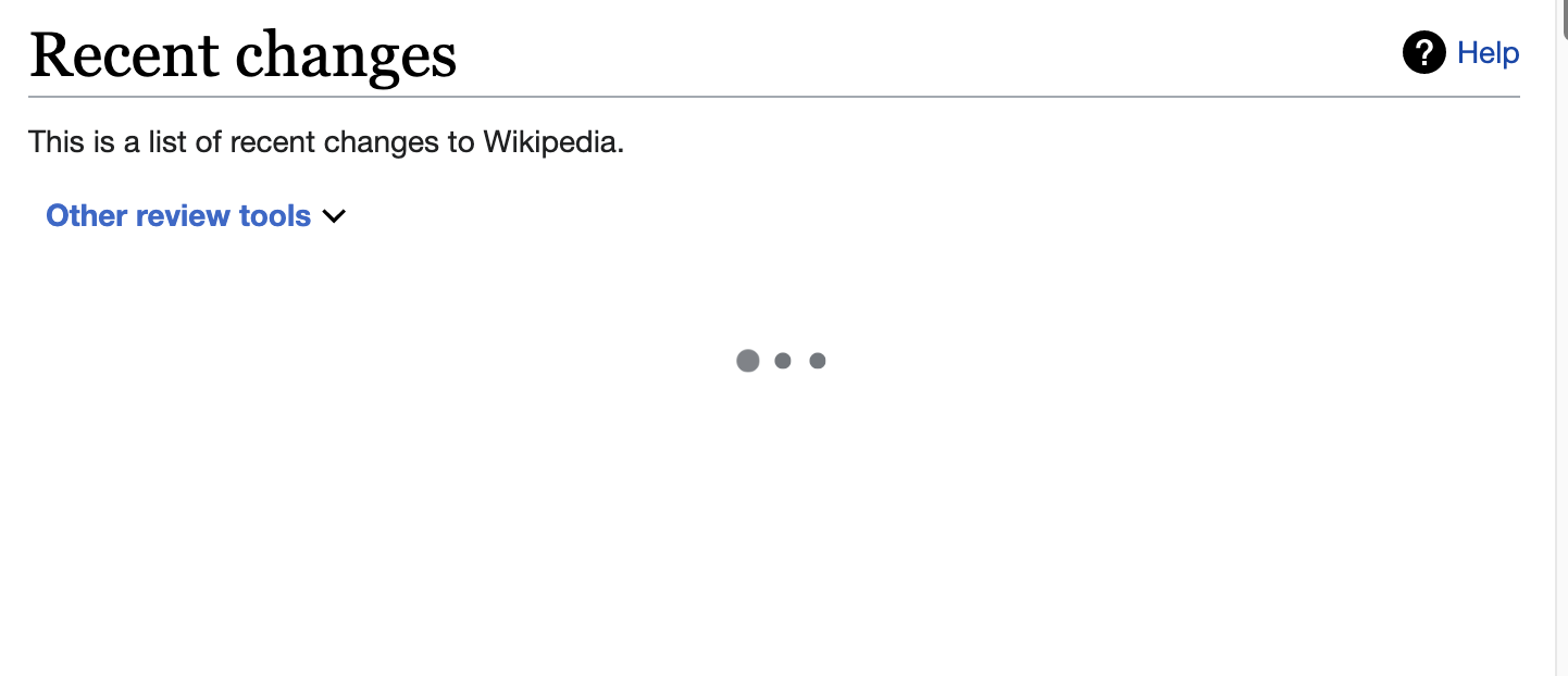
Progress indicators within views
best example Special:RecentChanges/RCFilters (CodePen with dots indicator example at 16px)
Comparable components of other DS
- https://spectrum.adobe.com/page/progress-bar/
- https://material.io/components/progress-indicators
- https://www.lightningdesignsystem.com/components/progress-indicator/
Relevant information
T217154: Structure of a “Component” page
Open questions
- Design for a standard pending progressbar type, f.e. on slow bandwith/connections for when the progress bar gets stuck in one position. A quick and dirty way was implement in OOUI's “Progress bar (pending)”
- Progress bar or dots for in-menu or dialog applications? Latest quest was Typeahead search on Desktop Improvements with a new sub-type. See also T168760
- Label/helper text not implemented


