Background
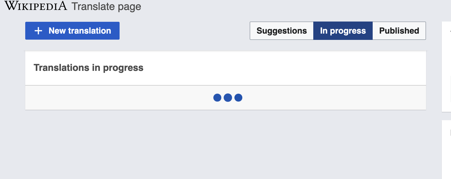
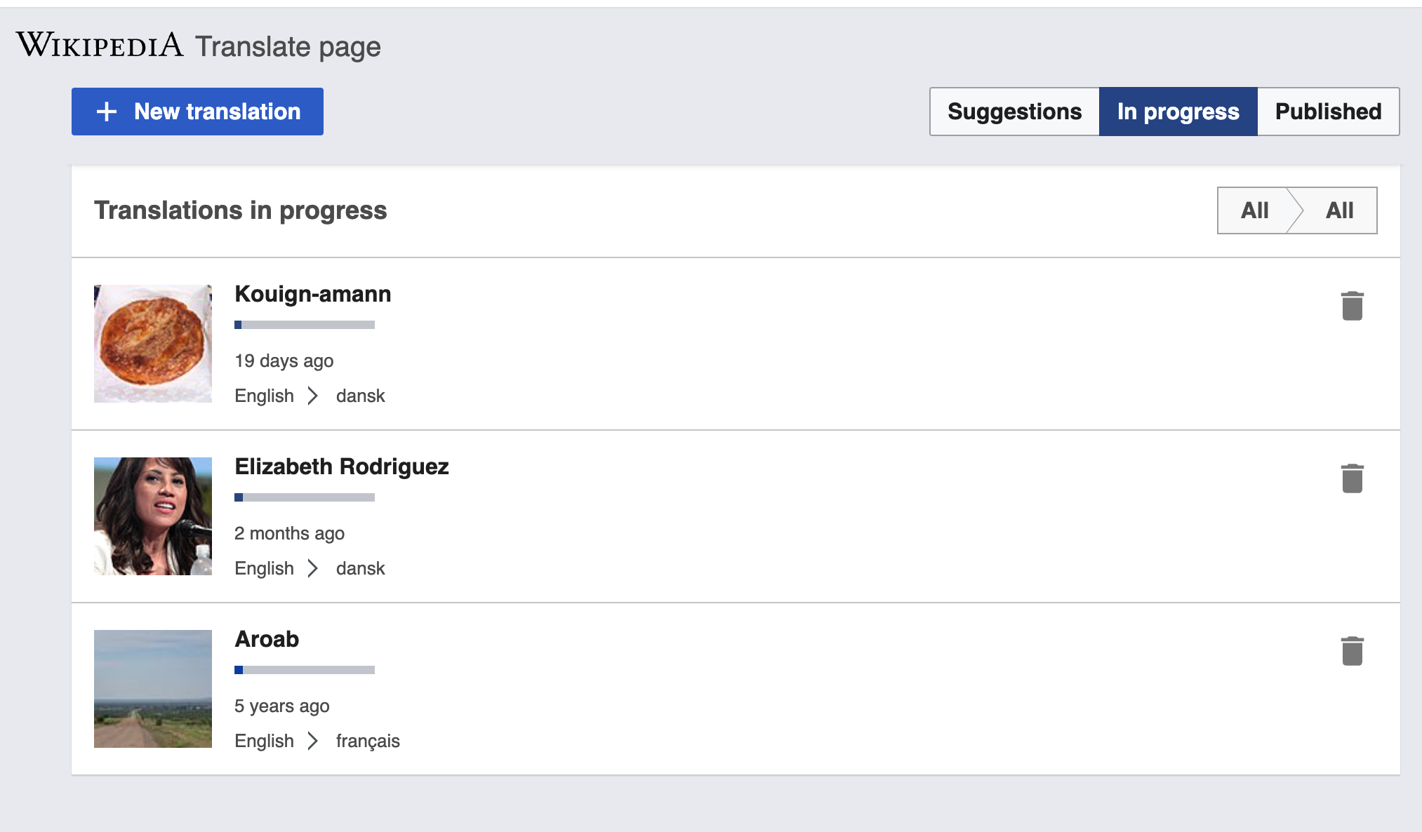
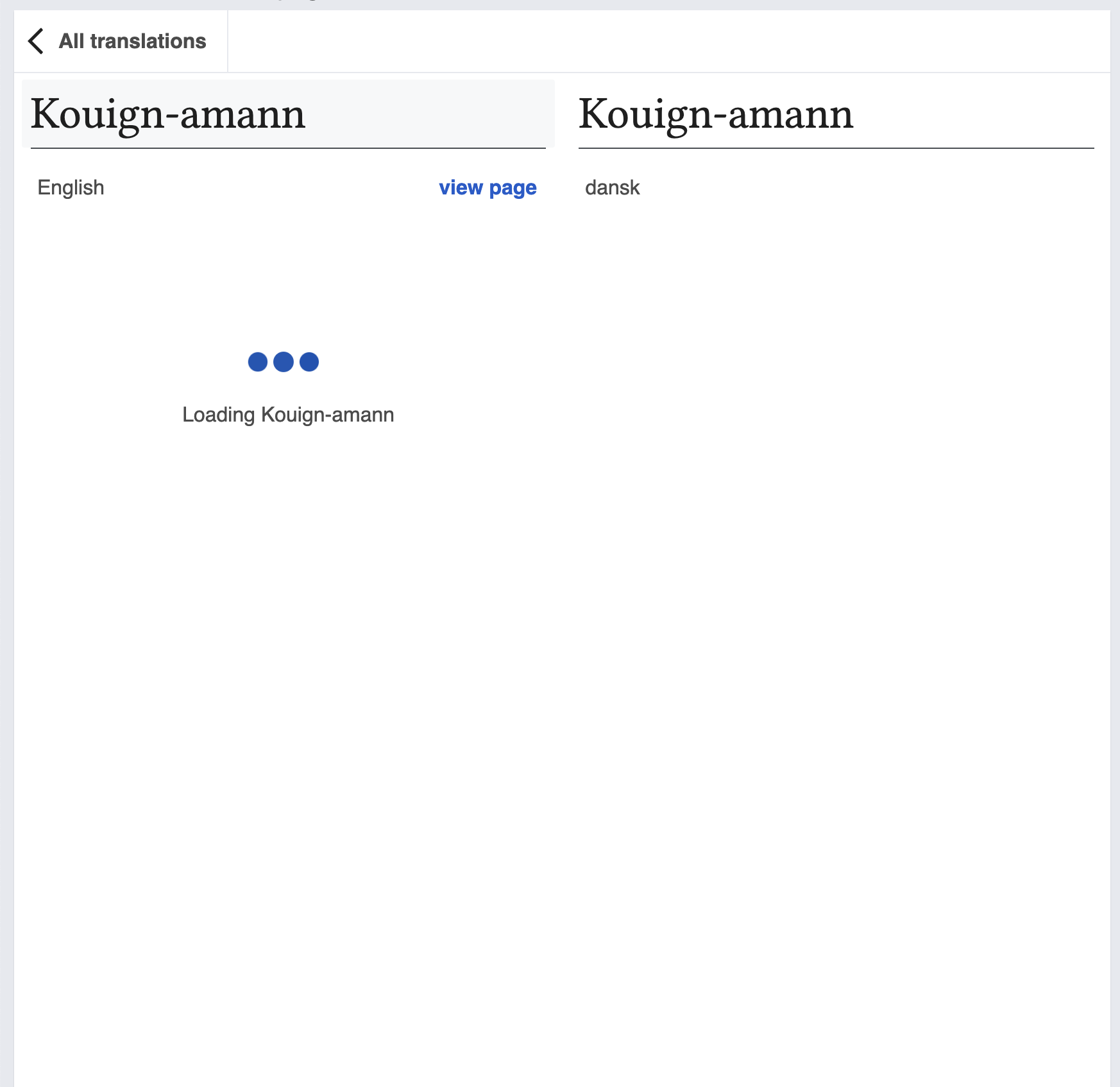
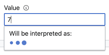
A loader-type animation displaying three dots that progressively change in size is currently used within some components and areas in Wikimedia products to indicate that something is loading or a process is in progress.
We should collect and analyze existing use cases in order to define the recommendations and styles (sizes, colors, animation) of this potential Codex component.
Description
The ProgressIndicator (name TBC) is aimed at communicating to users that the system is actively working to retrieve information or complete a task, thus managing their expectations by indicating that waiting is required.
This loading element is usually displayed in page areas of different sizes, as well as within components.
Find a code prototype of the element in this Codepen.
User stories
- As a designer and developer, I want to be able to reuse a loading animation component to indicate that the system is actively working on a task requested by a user
History
- This component has been identified/documented in different tasks:
T266028: Add “Progress indicators” to DSG
T289989: Add loading spinner component.
Known use cases
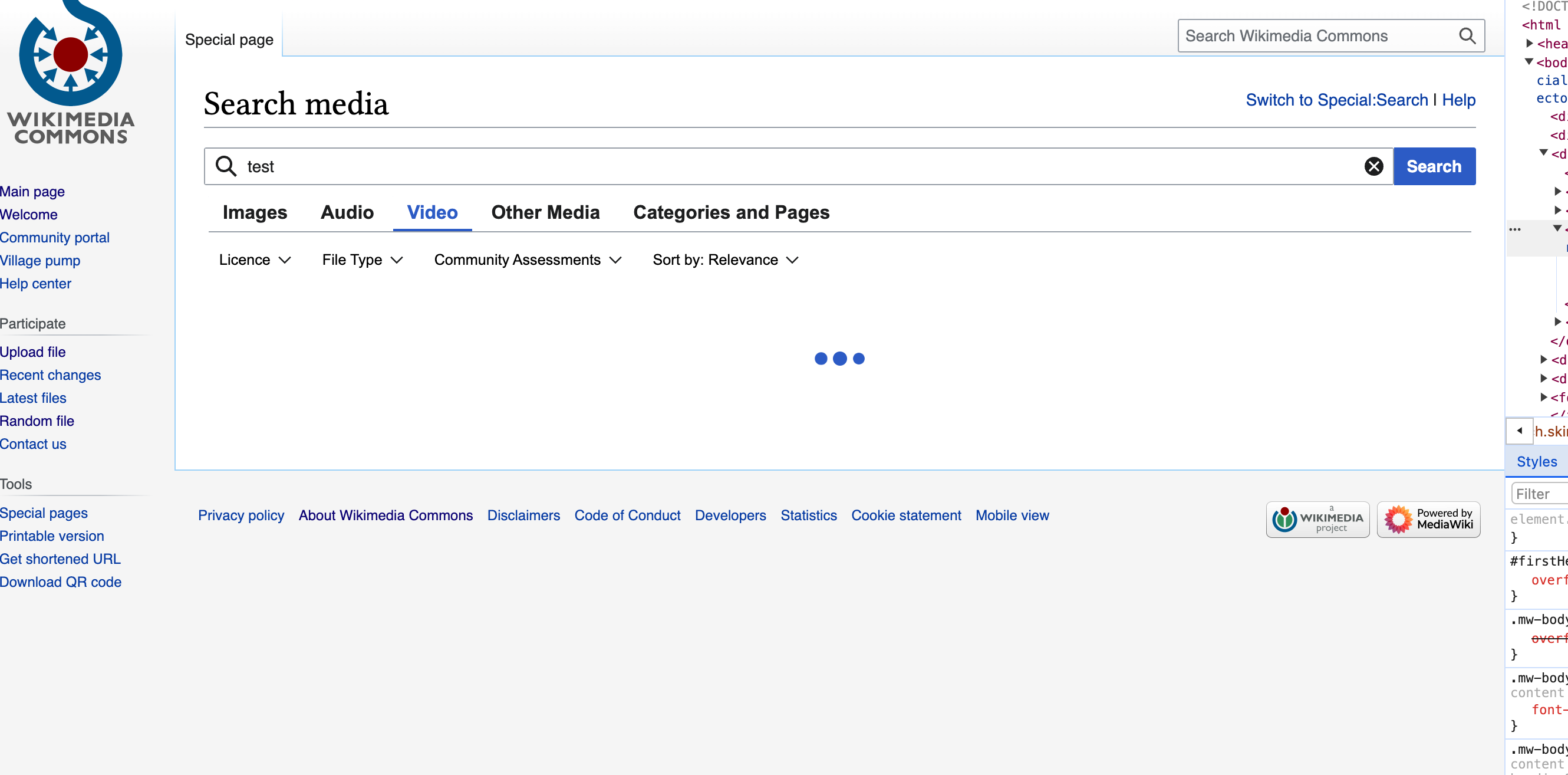
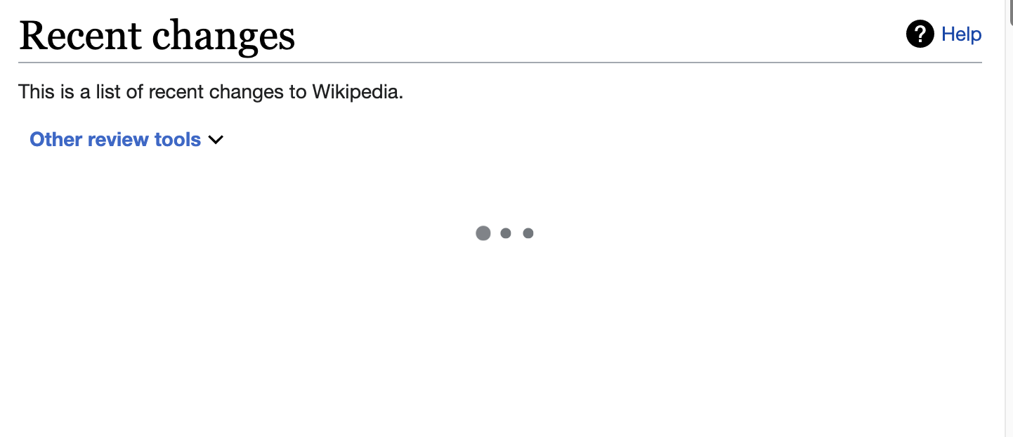 | Special:RecentChanges/RCFilters |
| Watchlist/RC filter loading panel | |
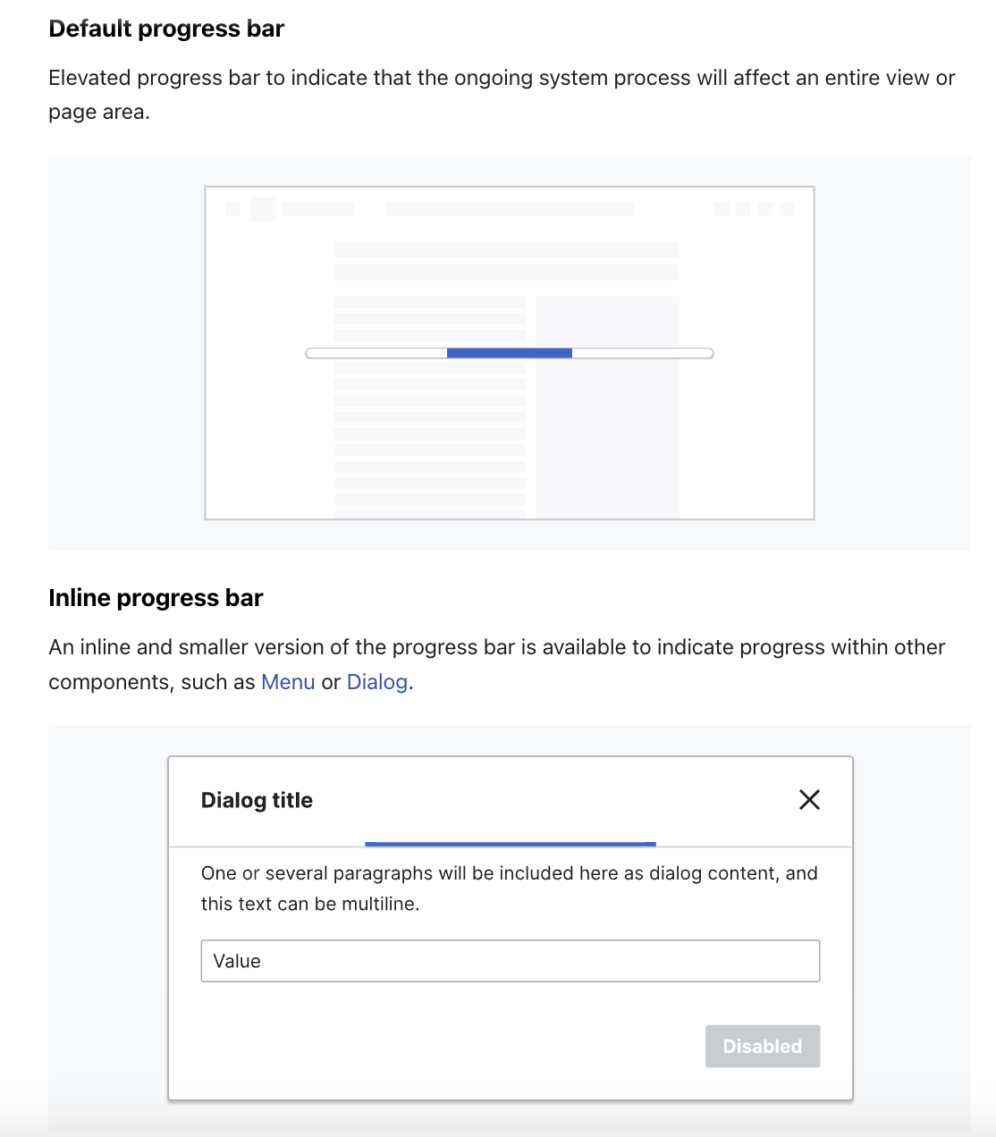
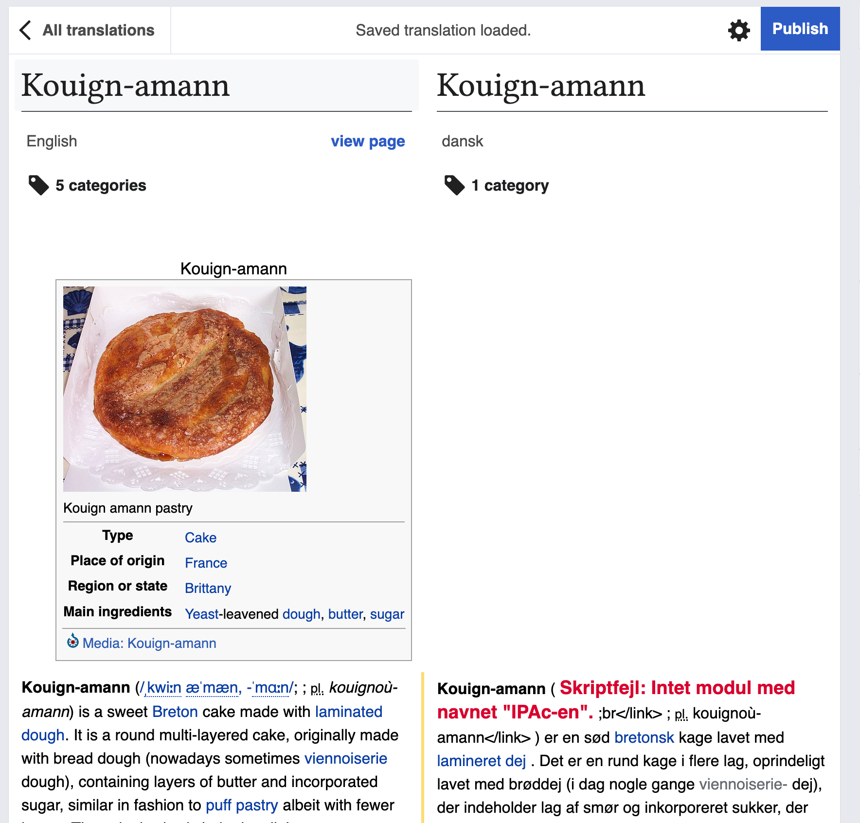
 | Wikibase Date input component: the loader indicates that the input is being processed. As documented in this component's Guidelines, we will not use a ProgressIndicator for Menu loads; instead, we will use an Inline ProgressBar. |
Existing implementations
These artifacts are listed for historical context. The Figma spec, linked below, is the source of truth for the new component.
Wikimedia community:
- Design style guide: -
- OOUI: -
- Vue: WiKit's BouncingDots Loader (See demo, see source, see design specifications)
External libraries:
- Add links to any examples from external libraries
Codex implementation
Component task owners
- Designer: @SGautam_WMF / @bmartinezcalvo
- Developer: @Volker_E
Open questions
Design spec
A three-dot progress indicator that animates to show loading status. This component maintains consistency across desktop (Vector 22) and mobile (Minerva) layouts.
Core Properties
- Initial size: @size-75 (12x12 pixels at 100% scale)
- Maximum size during animation: @size-100 (16x16 pixels at 133.33% scale)
- Spacing: @spacing-35 (6 pixels between dots)
Animation Specifications
- Type: Bouncing effect with scaling
- Duration per cycle: @animation-duration-medium
- Animation timing function: @animation-timing-function-bouncing
- Animation delay: @animation-delay-medium
- Iteration: @animation-iteration-count-base
Animation Keyframes
- 100% of initial size (12x12 pixels) at 0%, 50%, and 100% of the animation cycle
- 133.33% of initial size (16x16 pixels) at 20% of the animation cycle
Guidelines
Acceptance criteria
Minimum viable product
This task covers the minimum viable product (MVP) version of this component. MVP includes basic layout, default states, and most important functionality.
MVP scope
- List all parts of the MVP scope for this component
Design
- Design the Figma spec sheet and add a link to it in this task
- Update the component in the Figma library. This step will be done by a DST member.
- Include the component's Guidelines in Codex
Code
- Implement the component in Codex
Future work
- If applicable, list future work that should be done for this component after the MVP is implemented as part of this task. You should open new, standalone tasks for all future work.