Page MenuHomePhabricator

Add StepIndicator component to Codex
Open, Needs TriagePublic

Description

Background

We need to implement StepIndicator component in Codex.

Description

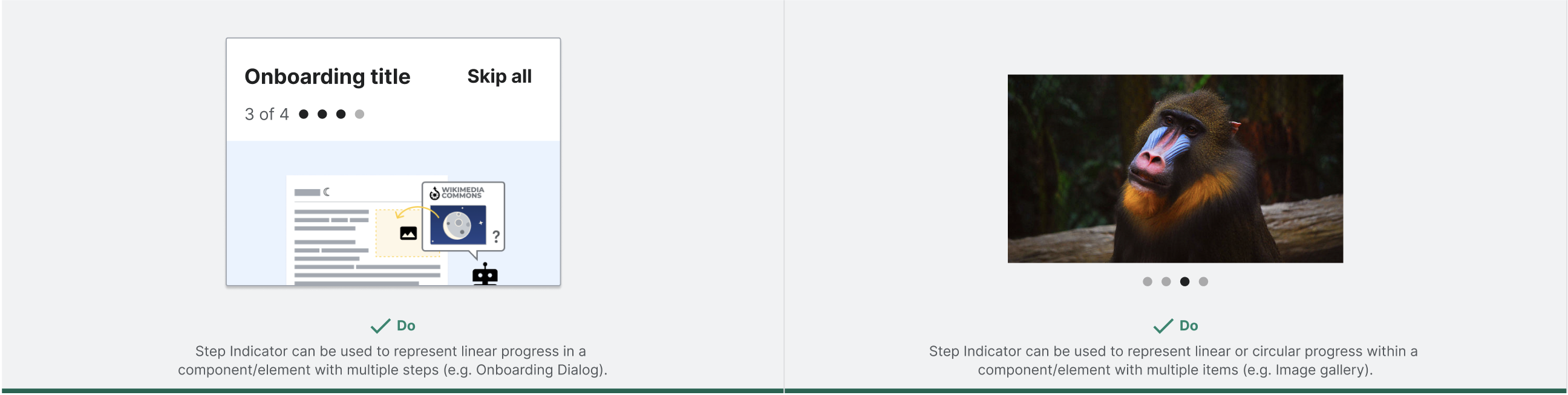
The StepIndicator component is a combination of bullets with numbers to indicate the different steps or elements where the user can horizontally navigate. We will reuse the StepIndicator component to navigate within steps in some process dialogs like the Onboarding Dialog, as pagination in components like the Table or to represent the number of images in an Image gallery.

User stories

  • As a user, I need the StepIndicator component to navigate within steps in components with different steps.

History

Describe or link to prior discussions related to this component

Known use cases

The StepIndicator component is currently being used in the Onboarding Dialog T332767 in the following use cases:
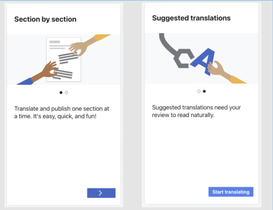
Screenshot 2023-02-07 at 12.39.01.png (1×1 px, 132 KB)
image.png (714×928 px, 422 KB)
Onboarding Dialog in GrowthOnboarding Dialog in Section Translation

Existing implementations

These artifacts are listed for historical context. The figma spec, linked below, is the source of truth for the new component.

Existing implementations:
Add any existing implementation if applicable.

External libraries:

  • Add links to any examples from external libraries

Codex implementation

Component task owners

  • Designer: add the main designer's name
  • Developer: add the main developer's name

Open questions

  • Component’s name: in order to make this component more reusable, we will rename this component from "Stepper" to "StepIndicator".
  • Dots color: we will create new color tokens for the dot's colors (T339269)
  • Maximum number of dots: we will implement a maximum number of visible dots as property so users can decide when to use it. We will include some recommendations in the spec about how to use this prop.
  • Number’s text size: we will use the 14px text size in both desktop and mobile.
  • Component’s props: we will not include the text-only prop, but might want to remove the dots when space is limited.
  • Active/Completed steps: it’s not needed to visually differentiate between active and completed steps.

Design spec

Anatomy
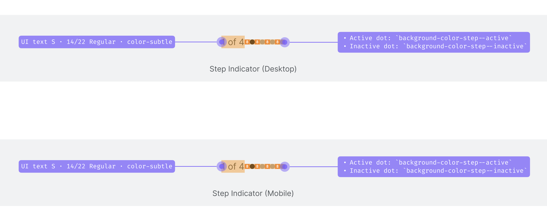
  • Text to represent the number of dots in the following format: 1 of 4
  • Dots to represent the active (filled dot) and inactive (empty dots) steps
Style
  • Text (on both desktop and mobile):
    • 14/22 Regular: @font-size-small @line-height-small @font-family-system-sans @font-weight-normal
    • color-subtle
  • Step dots:
    • Size @size-50 (8px)
    • Colors (colors will be created in T339269):
      • Active dot: background-color-step--active #202122
      • Inactive dot: background-color-step--inactive #C8CCD1
Interaction

The step's dots will have the following states:

  • Active: background-color-step--active #202122
  • Completed (same color as active): background-color-step--active #202122
  • Inactive: background-color-step--inactive #C8CCD1
Documentation

The configurable demo should include the following configurable properties:

  • label: users can show/hide the text with numbers
  • totalSteps: users can select the number of visible steps in the component (minimum 2 steps)
  • modelValue: users can choose which is the active step
  • progressType (or other name): users will select here the type of progress (linear/circular) described in the spec. We could display the linear one as default and then the circular with a ToggleSwitch
  • maximum number of visible dots: we need a prop to display the max number of visible dots, since as documented in the spec, the number of visible dots can be limited to a certain number (e.g. just 5 visible dots and the rest within a scrollable smaller dot).

Other standalone demos could include:

  • We need to represent the use of StepIndicator. So we could create a standalone demo using this with linear progress for OnboardingDialog and another standalone demo using it with circular progress for an Image gallery.
    Captura de pantalla 2023-06-22 a las 12.29.11.png (654×2 px, 454 KB)

Acceptance criteria

Minimum viable product

This task covers the minimum viable product (MVP) version of this component. MVP includes basic layout, default states, and most important functionality.

MVP scope

  • List all parts of the MVP scope for this component

Design

  • Design the Figma spec sheet and add a link to it in this task
  • Update the component in the Figma library. This step will be done by a DST member.

Code

  • Implement the component in Codex

Future work

  • If applicable, list future work that should be done for this component after the MVP is implemented as part of this task. You should open new, standalone tasks for all future work.

Event Timeline

Restricted Application added a subscriber: Aklapper. · View Herald Transcript

This component will be used to navigate within Onboarding Dialog stepps, but it could be also used to navigate within a table pagination or within different images in an image gallery. So we have 2 different use cases:

  1. Stepper: horizontal steppers are often used to guide users through a multi-step process, like the one in the Onboarding Dialog.
  2. Navibale bullets: navigation controls that allow the user to move forwards and backwards through the sequence (e.g. image gallery or pagination in a table). It typically includes navigable arrows or bullets.

Is this Stepper component navigable or is it just a visual representation of the steps in a process?

What are the arguments for building this component? Growth has created an initial implementation in OnboardingPaginator.vue. My perception is that this component is quite complicated to abstract and make valid for several use cases. The main reasons I see are:

  • Its positioning is always relative to another element
  • Its color and background color may vary based on the surface it is placed.
  • Tightly coupled with translated text

Is this Stepper component navigable or is it just a visual representation of the steps in a process?

Not sure if I understood the question, but if it refers to the bullets being clickable, I find them too small. Do we have an specification for the minimal size of clickable icon-only elements? 32pxx32px?

@Sgs Thanks for raising these points! I think we can narrow down the potential features of this component to a minimum viable product that will work for the onboarding dialog and be extendable in the future if we need to add more features to support more use cases.

The stepper component could take in these props:

  • modelValue (number) - the current step
  • totalSteps (number) - the total number of steps
  • label (string) - textual representation of the steps, e.g. "1 of 3"

The label, as you mentioned, is tricky - in MW we'll have to use a message with params for the current step number and total number of steps. We could set something like this up in Codex as well, so that you can just pass in the structure of the text (in English, "%1 of %2"), but that seems unnecessary for MVP and wouldn't be useful inside MW since we have the Messages API. At least at first, we could just require the user to pass in the full string ("1 of 3") since the parent component will already be aware of both numbers.

In terms of positioning, I think it's acceptable that this component will need to be positioned by the parent—this is true of other components as well (e.g. inline progress bar), and we can develop the component in isolation and then show examples of it in context.

For MVP, we could implement one color palette, then expand on that in the future if needed.

If we do want the bullets to be clickable, they could just emit the update:modelValue event with the step number associated with that bullet to change the modelValue. But I agree that they are too small to be relied upon for navigation. Maybe we can suggest that people create a primary way to navigate through steps other than the bullets (e.g. the navigation buttons at the bottom of the onboarding dialog)? Then we can enable navigation by clicking the bullets for anyone who expects that and wants to use them.

All above sounds like a good plan for a MVP.

As per the label I was not suggesting is a bad thing to have it as a prop, just "annoying" in case one would want to customize the positioning of the label relative to the dots. Personally, I would leave the text out of the component and let consumers place it where they want. But an optional label seems also reasonable.

Then we can enable navigation by clicking the bullets for anyone who expects that and wants to use them.

This makes me wonder about a11y requirements. Should we backup the dots with some specific aria attributes or a title? Also, if click navigation is supported, should we support keyboard arrow navigation?

This makes me wonder about a11y requirements. Should we backup the dots with some specific aria attributes or a title? Also, if click navigation is supported, should we support keyboard arrow navigation?

Good point - ARIA + keyboard nav both seem necessary, although I'm not 100% sure about the details yet (maybe the WAI carousel pattern would be a good place to start). Tagging @Volker_E as well.

bmartinezcalvo renamed this task from Add Stepper component to Codex to Add StepIndicator component to Codex.Jun 22 2023, 10:34 AM
bmartinezcalvo updated the task description. (Show Details)

I find this specification counter intuitive in the sense that the dots size is fixed while the font-size is relative. This lead to a different relation of elements sizes in desktop vs mobile:

ElementMW root fontDot @size-50, 8pxFont size @font-size-small, 0.875emratio dot—font
desktop14px8px x 8px12.25px x 12.25px0.653
mobile16px8px x 8px14px x 14px0.571

Is the different ration between platforms intended? Maybe the dot specification should be expressed with a "font-size" token so the font and dot size ratio remains equal in different platforms and zooming levels?

I find this specification counter intuitive in the sense that the dots size is fixed while the font-size is relative. This lead to a different relation of elements sizes in desktop vs mobile:

ElementMW root fontDot @size-50, 8pxFont size @font-size-small, 0.875emratio dot—font
desktop14px8px x 8px12.25px x 12.25px0.653
mobile16px8px x 8px14px x 14px0.571

@Sgs as specified in the Figma spec, the Stepper will use 14px font size on both desktop and mobile platforms. So the dots will also be the same size on both platforms.

Captura de pantalla 2023-07-10 a las 12.35.19.png (886×2 px, 115 KB)