Background
We need to implement the Tooltip component in Codex.
Considerations (from T280677):
- Reconsider the trigger behavior to be more accessible (see T312899)
- Provide more detailed guidelines on the position and size of the pop-up overlay on Desktop vs Mobile
- Also take into account tooltips elsewhere: MultimediaViewer with jquery.tipsy implementation (see existibng implementations below)
Description
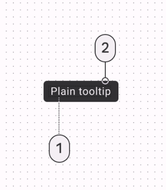
Tooltip component provides additional information when user hovers and/or clicks on it.
User stories
- As a user, I need additional information about a user interface element in order to understand how to use it more effectively.
History
- T312899: Implement accessible tooltips in Vector 2022
- T280677: Revise and extend the info / help tooltip pop-up in our design component library
Known use cases
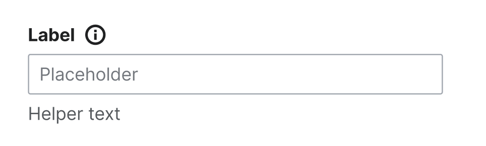 | Tooltip within the Label in a Form Field (it will be implemented in T338282) |
 | Wikifunctions tooltips. They are using the native ones, but they could be replaced with the Codex one once it's implemented. Keep in mind that native tooltips work differently in each browser. |
Existing implementations
These artifacts are listed for context and to inform design and development. The figma spec, linked below, will be the source of truth for the new component.
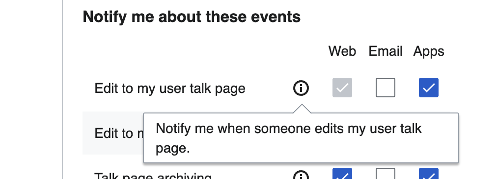
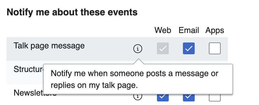 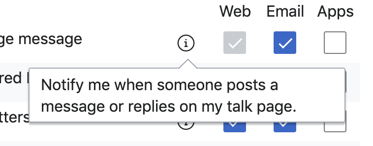 | Tooltips in OOUI, seen on Special:Preferences > Notifications (Desktop and mobile) |
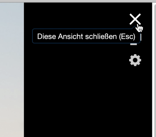 | MultimediaViewer with jquery.tipsy implementation |
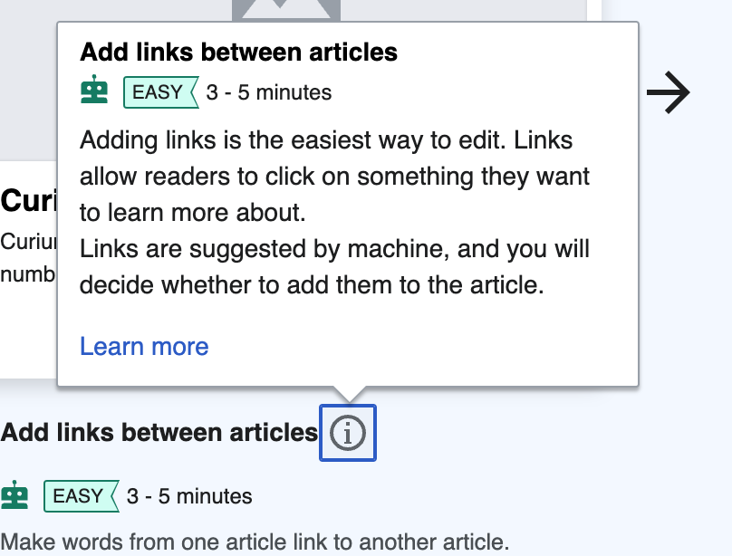
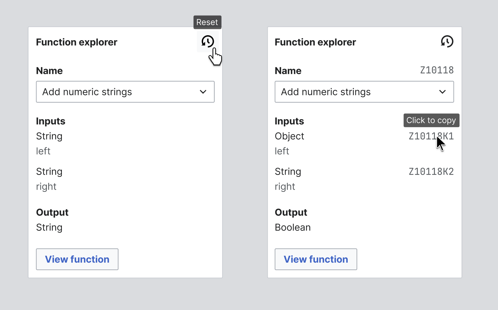
 | Growth implementation in Vue (See related task T340199) |
Wikimedia community:
- Design style guide: -
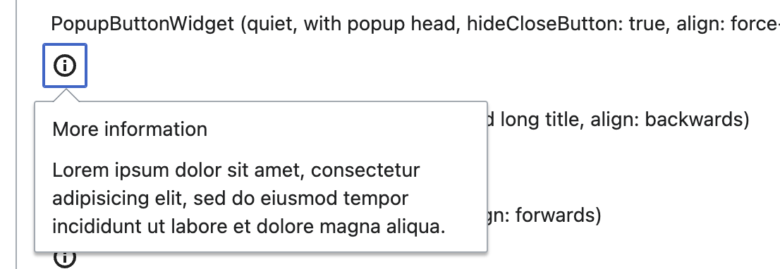
- OOUI: https://doc.wikimedia.org/oojs-ui/master/demos/?page=widgets&theme=wikimediaui&direction=ltr&platform=desktop#PopupButtonWidget-quiet-with-popup-head-with-icon-align-force-left
- Vue: -
External libraries:
Codex implementation
Component task owners
- Designer: add the main designer's name
- Developer: add the main developer's name
Open questions
- Do we want to implement both the small dark tooltip and the big white one within the same Tooltip component? Or do we want to separate them into Tooltip and Popup?
Right now, we will be prioritizing the Tooltip (small, simple component) first.
Design spec
Details for the design of the Tooltip can be found in T364638.
Documentation
Designer should describe how the component should be documented, including configurable and standalone demos.
Acceptance criteria
Minimum viable product
This task covers the minimum viable product (MVP) version of this component. MVP includes basic layout, default states, and most important functionality.
MVP scope
- List all parts of the MVP scope for this component
Design
- Design the Figma spec sheet and add a link to it in this task
- Publish the component in the Figma library. This step will be done by a DST member.
Code
- Implement the Vue component in Codex
- Implement the CSS-only component in Codex (optional -- TBD as part of refinement)
Future work
- If applicable, list future work that should be done for this component after the MVP is implemented as part of this task. You should open new, standalone tasks for all future work.