Background
Description
Tables are visual grids that present information in rows and columns to facilitate the comparison of data.
User stories
As a designer, I would like to have a configurable table component in Figma that I can reuse to save design time and ensure consistency with the Wikimedia design guidelines.
As an engineer, I would like to have a configurable Vue table component that I can reuse to save implementation time and ensure consistency with the Wikimedia design guidelines.
History
Describe or link to prior discussions related to this component
Known use cases
| product, page or domain | component instance |
| Abstract Wikipedia's Function pages | Table with selection, gloabl actions, custom column width and pagination |
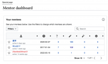
| Mentee Overview table in the Mentor Dashboard | Contains filtering, sorting, pagination actions |
| Metrics Platform Instrument Configurator | referenced from wireframes |
| Wikidata Mismatch Finder's results page (WiKit table) | Inline components, linearization under custom breakpoint |
| Global user contributions | Pagination, custom row background color, vertical rulers, custom row width |
| Multiblock | Inline actions |
Existing implementations
These artifacts are listed for historical context. The Figma spec, linked below, is the source of truth for the new component.
- OOUI: add the relevant OOUI widget name(s) here, if applicable. See OOUI demos.
- Vue: WiKit's Simple Table (Vue 2). See Projects using Vue.js.
External libraries:
- Add links to any examples from external libraries
Codex implementation
Component task owners
- Designer: Sarai
- Developer: Anne
Open questions
Design spec
The latest version (v9) of the Table component MVP designs can be found in Figma:
Anatomy
The Table's MVPs will display:
- Table header (optional): The table header can contain an optional caption and custom actions related to table items, filtering and search included in a default slot.
- Column headings: Cells at the top of a column with bolded text to create hierarchy. They allow grouping the data within specific categories.
- Row headings (Optional): Cells at the beginning of a row, with bolded text to create hierarchy. They allow grouping the tabular data within specific categories.
- Cells: Containers at the intersection of columns and rows. A slot in table cells allows reusers to include any sort of Codex component within them. That is, either for purely informative purposes (e.g. Chips to communicate status), data modification (e.g. a Select to modify a status) or perform actions (e.g. open a Tooltip or Dialog with further information).
- Footer (Optional): Structural element that can contain variable content, from simple text to Pagination options.
Style
- Default white background
- Subtle borders
- Sorting icon (T350477)
- Rows only display horizontal rulers by default, but users can enable vertical rulers
- Width: The Table component has a default width of 100%. By default, columns distribute the total available space equally between them. Nevertheless, it should be possible for users of the Table to adjust the width of the Table columns and distribute the available space more intentionally to improve the readability of the content.
Interaction
- Selection: Rows can either be selected individually, using a checkbox that precedes them, or selected as a group using a checkbox included within the Table's header when selection is enabled.
- Sorting: Allows the reordering of the content of columns in an ascending or descending way, based on the type of content (e.g. quantitatively, alphabetically).
- Horizontal scroll: The default responsive behavior of tables. They will display a horizontal scroll bar when they cannot fit within the available width without compromising their internal spacing. The scroll only applies to the body of the table: header and footer should remain fixed.
- Inline actions: A slot in table cells allow reusers to include any Codex component within them. That is, either for purely informative purposes (e.g. Chips to communicate status), data modification (e.g. a Select to modify a status) or perfom actions (e.g. open a Tooltip or Dialog with further information).
- Pagination: Set of interactive and textual elements that allow users to navigate through tabular data that has been divided into pages/views.
- Empty state: Tables will make it possible to display an empty state message in case the information is missing/cannot be retrieved.
Documentation
Designer should describe how the component should be documented, including configurable and standalone demos.
Acceptance criteria
Minimum viable product
This task covers the minimum viable product (MVP) version of this component. MVP includes basic layout, default states, and most important functionality.
MVP scope
The Table's MVP will include:
- Optional table header with an optional Caption and a slot that allows including custom elements such as buttons (global actions) or text.
- Column headings
- Column sorting
- Row headings
- Row selection
- Cells that can include any sort of formatted text and/or icons, or components
- An optional footer with a slot that can include any sort of content and components
- The table displays a horizontal scroll bar when it cannot fit within the available width without compromising its minimum internal spacing
[] We implement a version of the Table that includes custom pagination elements to facilitate reusage(Not part of the MVP)- Users can customize the size of the Table columns
- Users can add vertical rulers to the Table
- The table is fully accessible (we ensure compliance with AA level)
- CSS-only version of Table
Design
- Design the Figma spec sheet and add a link to it in this task
- Update the component in the Figma library. This step will be done by a DST member.
Code
- Implement the component in Codex
Future work
- Consider as part of CSS-only part of MVP removing table example from 'uidesign/design.html'
- Loading state
- Expansion/collaps of rows


