Summary
There are several open questions blocking the completion of the design of the Table component. Answering these questions will require research and prototyping on the implementation end. This task covers investigating and answering these questions so design can move forward and so we have a better idea of how the Table component will be built.
Resolved questions
1. Column and table width
- What happens when the table is too wide to fit into the viewport?
- Once columns have become as narrow as possible (determined by the browser's table sizing algorithm), the entire table will overflow its container and will be visible via horizontal scroll
- How will the width of individual columns be determined? Is this configurable?
- By default, tables will use the auto table-layout, which sizes columns according to the table sizing algorithm
- If desired, users can pass in width and/or minWidth properties for columns. If they do, the fixed table-layout will be used and the styles will be set according to the props. See demos: width, min-width
2. Cell content
- Should we have a single slot for cells, or multiple slots?
- A single dynamic, scoped slot, as demonstrated here. Multiple slots are unnecessary, overly complicated, and confusing.
- How will data/content be passed into the table component? Props, slots, subcomponents, etc? How do we cover a simple use case with text-based data while enabling a complex use case with multiple components per cell?
- The Table component will have a prop called columns, an array of column definitions (id, label, sortable, width, minWidth)
- Another prop, data will be an array of row data. Each row property corresponds to a column ID
- You can pass in these 2 props and the Table component will output everything in a table
- You can customize the display of cells via the dynamic, named slots
- You can pass in columns then use the default slot for the table body
- You can omit both columns and data and pass in all table sub-elements
- We'll highlight the props + item slots path as the default/ideal for most cases
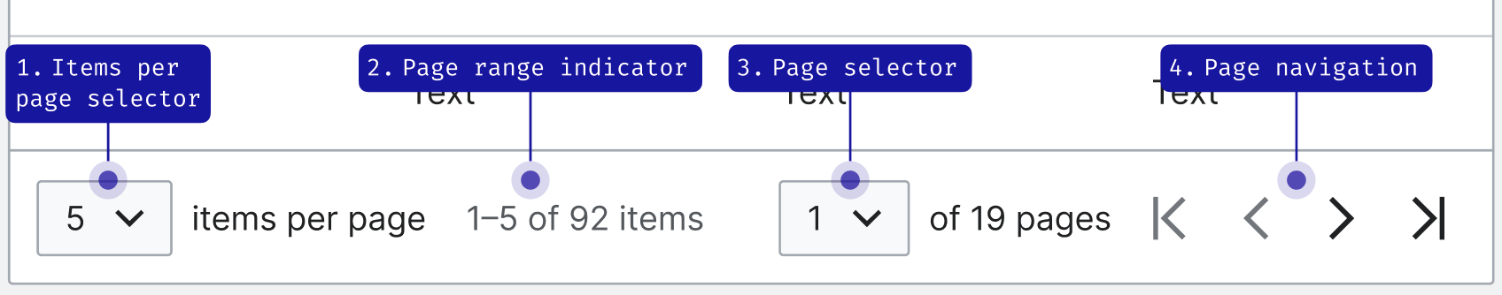
3. Pagination
- A general Pagination component is not being designed right now - should pagination live in the Table component, or should we create an internal Pagination component that could later be generalized and made public?
- For ease, we could create an internal Pagination component that will be used in the Table component but nowhere else, and not exported for use. This could eventually be generalized and exported for use.
- How should pagination look across languages? In RTL contexts?
- Previous/next will flip for RTL.
- All strings will need to be translatable, and most of them will require the use of arguments, e.g. $1-$2 of $3 items. We should make these strings as simple as possible to reduce the risk of human error.
- How will pagination work on the implementation end? Will the Table component handle showing the right items, or will it require the parent component to respond to user action and provide only the rows that should be displayed in the proper order?
- We can handle this in the Table component. We'll need props for page (current page) and itemsPerPage. Since the user can control both of these, we should probably bind them via v-model so they can be updated both ways. The table component can then determine which rows to show. In cases where the data prop is not used, the parent component can respond to events and provide the correct items to show.
- This will work when all rows are passed in at once via the data prop - we will also need to consider how to support tables where only the current page's rows are provided, and other pages' rows would need to be fetched via an API.
- We will also need to enable users to build their own pagination in the table footer if they wish to
4. Sorting
- How will sorting work on the implementation end? Will the Table component provide handling for sorting, or only emit events to alert the parent component that the user has triggered a sort?
- For MVP, we will require the parent component to handle the actual sorting behavior. In the future, we may add an option to use sorting functionality built into the Table component (but the option to handle sorting yourself must still be available)
- Will sorting by multiple columns be supported?
- Yes, this can be supported by allowing the sort prop to be an array of objects (see the Vuetify implementation)
5. Accessibility
- Should a caption be required?
- Yes, but it can be visually hidden
- How should the "select all" checkbox for row selection work? E.g. when it's selected, then a row is unselected, should the "select all" box be indeterminate?
- It should be indeterminate, according to our Checkbox guidelines