Page MenuHomePhabricator

Table: Add initial WIP component
Closed, ResolvedPublic5 Estimated Story Points

Assigned To
Authored By
AnneT
Mar 4 2024, 4:14 PM
Referenced Files
F42621586: Screenshot 2024-03-14 at 15.23.09.png
Mar 14 2024, 2:27 PM
F42621530: Screenshot 2024-03-14 at 15.19.48.png
Mar 14 2024, 2:27 PM
F42602649: image.png
Mar 13 2024, 6:53 PM
F42602643: image.png
Mar 13 2024, 6:53 PM
F42602623: image.png
Mar 13 2024, 6:53 PM
F42602595: image.png
Mar 13 2024, 6:53 PM
F42553167: Screenshot 2024-03-11 at 20.22.38.png
Mar 11 2024, 7:36 PM
F42552868: Screenshot 2024-03-11 at 20.08.04.png
Mar 11 2024, 7:36 PM

Description

For this task, we will add a WIP version of the Table component with basic features and demos, in order to enable the development of all MVP features.

Component scope

The initial component will have the following features:

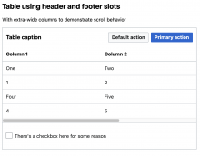
  • Table caption, which is visible by default but can be visually hidden
  • columns prop for column definitions
  • data prop for table data
  • Row headings
  • Horizontal scrolling when the table becomes wider than its container
  • Slots:
    • Default (to override any combination of the thead, tbody, or tfoot)
    • Item (dynamic, scoped slot)
    • Header
    • Footer
  • Styles as defined in the component spec sheet
  • Unit tests

Demos/documentation

The user-facing demo page will be built as part of another subtask of the Table epic. For development purposes, in this task, we will create a simple demo for the Sandbox page, plus a separate page in the Sandbox just for Table demos. As part of this task, table demos relevant to the features included here will be built.


Acceptance criteria

  • A new WIP Table component is added
  • The following Table features are implemented:
    • Caption (can be visually hidden)
    • Props for columns and data
    • Row headings
    • Horizontal scrolling
    • Default slot
    • Item slot
    • Header slot
    • Footer slot
    • Styles
  • Unit tests
  • Sandbox demo + demo page

Event Timeline

AnneT set the point value for this task to 5.Mar 4 2024, 4:18 PM

Some of this work has been completed in the prototype, but I think a few things will take time:

  • Refining styles, especially with the inclusion of all possible slots
  • Setting up unit tests
  • Setting up the Sandbox demos
  • Discussing implementation in code review
CCiufo-WMF triaged this task as Medium priority.Mar 4 2024, 4:58 PM

Change 1009620 had a related patch set uploaded (by Anne Tomasevich; author: Anne Tomasevich):

[design/codex@main] Table: Add initial, WIP component

https://gerrit.wikimedia.org/r/1009620

@Sarai-WMDE could you please check out these demos and let me know if you have any design feedback? Thanks!

AnneT changed the task status from Open to In Progress.Mar 11 2024, 7:11 PM
AnneT claimed this task.

Hey @AnneT. Thanks so much for sharing! The demos are fantastic. Here are some findings after reviewing them. Some comments have to do with the lack of clearer specifications in Figma, so my apologies for that:

  1. Color: Both the caption and <thead>/<th> text should display the color @color-emphasized (current), but the default color of text within <td>s and the footer should be @color-base.
  1. Line height: The caption text should display a line-height of 1.25 (@line-height-xxx-small). <th>,<td> and footer text should display a line-height of 1.375 (@line-height-xx-small). Regarding the later value, this ensures that the right line-height is applied to 16px base text. I assume that this value will be overridden by .vector-body in a 14px context to the correct @line-height-medium.
  1. Height of header container: In the designs, we applied a min-height of 64px to the Table header to make sure it maintains a consistent size regardless of the presence of actions or not. I'm now unsure of how to achieve this, or which token we should use (min-height, size?).
  1. Header elements' alignment: It'd be great if the items within the header were vertically aligned in the center:

Screenshot 2024-03-11 at 20.08.04.png (158×1 px, 33 KB)

  1. Header elements spacing: There should be a minimum gap of 16px between the caption text and the adjacent elements.

Screenshot 2024-03-11 at 20.22.38.png (178×1 px, 36 KB)

  1. Heading and cell padding: In Figma, we applied a vertical padding of 12px to all cells (current is 16px). (Note: This might be subject to change, but the change would ensure the alignment of the demo with the current specs).
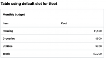
  1. Footer padding: The vertical padding of the footer container should be 12px too. In the designs, we also applied a min-height of 56px to the footer, to keep it consistent regardless of its content. I have the same doubts regarding appropriateness as with number 3 here 🤔

Smallest presentational detail (to keep in mind when creating the public docs): The recommendation is to right-align (or left-align, in RTL languages) numerical values within cells, and also the corresponding column heading. We'll document this in the component guidelines, but would be great to apply the rule when demos display comparable numerical values (e.g. cost, average viewers, episodes, etc.; but not dates or IPs).

Thanks for this feedback, @Sarai-WMDE! I've implemented items 1-6. For the header min-height, I added a component-level token. There are 2 items I haven't addressed yet:

  1. Footer padding: The vertical padding of the footer container should be 12px too. In the designs, we also applied a min-height of 56px to the footer, to keep it consistent regardless of its content. I have the same doubts regarding appropriateness as with number 3 here 🤔

This one I'm not sure about because we don't have a size token equal to 56px in a 16px base font-size context...any ideas on how to handle this? Can it just be 64px too?

Smallest presentational detail (to keep in mind when creating the public docs): The recommendation is to right-align (or left-align, in RTL languages) numerical values within cells, and also the corresponding column heading. We'll document this in the component guidelines, but would be great to apply the rule when demos display comparable numerical values (e.g. cost, average viewers, episodes, etc.; but not dates or IPs).

I'm so glad you brought this up, because it made me realize that there isn't an easy way to do this! Technically you could write styles targeting td:nth-child( n ) depending on which column it is, or use the item slot to add a wrapper span and a class, but neither solution is ideal. I think we should build this into the table component by adding another property in the column definition for isNumber or alignEnd - setting it to true will cause all of the cells in that column to be aligned right. If someone has different types of data in the same column (e.g. some numbers, some text), they'd have to handle it on their own. Do you think that makes sense, or have any other ideas?

Side note: based on a good suggestion from Eric, I added a ToggleSwitch to the Table demo page so you can view the tables at full width or a restricted width (to test scroll).

Sorry for the late reply!

This one I'm not sure about because we don't have a size token equal to 56px in a 16px base font-size context...any ideas on how to handle this? Can it just be 64px too?

Yes. After trying this out in Figma, I believe that the footer looks fine at 64px min-height too. We'll see if the change survives design review, but for now I'd say we can reuse that component token :) I believe that, if we make this adjustment, then the footer's vertical padding should be increased to 16px too, for consistency.

I'm so glad you brought this up, because it made me realize that there isn't an easy way to do this! Technically you could write styles targeting td:nth-child( n ) depending on which column it is, or use the item slot to add a wrapper span and a class, but neither solution is ideal. I think we should build this into the table component by adding another property in the column definition for isNumber or alignEnd - setting it to true will cause all of the cells in that column to be aligned right. If someone has different types of data in the same column (e.g. some numbers, some text), they'd have to handle it on their own. Do you think that makes sense, or have any other ideas?

Both your suggestion and the solution itself sound great. The initial plan was to just document this as a recommendation, but if we can make following the guidelines easier (by providing a prop), then that's perfect. In the data type combination scenario (which might not be too common?) the presence of text would also get in the way of performing vertical comparison, potentially removing the need to optimize for it. But, in any case, it sounds really fair to have to apply some customization in that situation. alignEnd is a very clear prop name, imo.

Change 1010920 had a related patch set uploaded (by Anne Tomasevich; author: Anne Tomasevich):

[design/codex@main] Table: Set min-size on footer

https://gerrit.wikimedia.org/r/1010920

Change 1010921 had a related patch set uploaded (by Anne Tomasevich; author: Anne Tomasevich):

[design/codex@main] Table: Make it possible to align cell content to the right

https://gerrit.wikimedia.org/r/1010921

@Sarai-WMDE I implemented both of these things, but wanted to get your feedback on the results.

Here's what it looks like when you set the footer min-height to 64px (demo):

image.png (1×1 px, 85 KB)

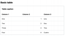
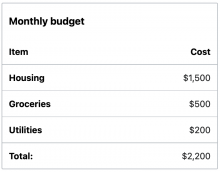
And here's some examples of numbers aligned to the right (see demo for more):

image.png (744×1 px, 52 KB)

image.png (742×1 px, 63 KB)

image.png (1×1 px, 199 KB)

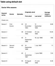
While these are somewhat convoluted examples, I do think we should ensure that most tables just look "right" with no need for further styling, and these look pretty awkward and confusing to me. Any ideas for how we could make this better?

Hey @AnneT. Thanks for the quick changes! Here are the fixes I believe we need:

Regarding the footer: Looks like we just need to apply box-sizing: border-box to .cdx-table__footer in order for the padding to be included in the min-height. The result:

Screenshot 2024-03-14 at 15.19.48.png (746×1 px, 72 KB)

Regarding the alignment of numbers: The heading of said columns should also be aligned right for consistency. I really hope this is feasible. Sorry for not making this clearer or providing a visual example in my previous message. The result:

Screenshot 2024-03-14 at 15.23.09.png (620×792 px, 43 KB)

I'm not too concerned about the awkward looks of the "Table using default slot" example. I think data structure in that example would improve a lot if vertical rulers were applied!

Regarding the footer: Looks like we just need to apply box-sizing: border-box to .cdx-table__footer in order for the padding to be included in the min-height

Omg, I even did this for the header but forgot for the footer...thank you!

Regarding the alignment of numbers: The heading of said columns should also be aligned right for consistency.

No worries at all, it makes sense that the th should align with the column content! I've updated this in my patch.

Change 1009620 merged by jenkins-bot:

[design/codex@main] Table: Add initial, WIP component

https://gerrit.wikimedia.org/r/1009620

@Sarai-WMDE is there a use case for aligning the text in a cell to the center? Eric brought up a good point in my patch to introduce a way to align text to the end: perhaps we should include a prop called align that defaults to "start" but has option start, end, and center. Thoughts?

@Sarai-WMDE is there a use case for aligning the text in a cell to the center? Eric brought up a good point in my patch to introduce a way to align text to the end: perhaps we should include a prop called align that defaults to "start" but has option start, end, and center. Thoughts?

That makes sense. The use cases behind the center alignment of text would include the creation of hierarchy (specially for complex tables with sections) or to display values that are expressed with a common separator (e.g. resolution values, 1440x800, or ratios, 4:3, etc.). Would the prop modify the alignment of any elements within cells? I'm asking because probably the most common use case might be to center-align components.

Would the prop modify the alignment of any elements within cells? I'm asking because probably the most common use case might be to center-align components.

Possibly - this is starting to sound like a separate feature to me. I suggest we open a new Table subtask to cover it. I'll do so and tag you - thanks for your help here!

Change 1010920 merged by jenkins-bot:

[design/codex@main] Table: Set min-height on footer

https://gerrit.wikimedia.org/r/1010920

AnneT removed a project: Patch-For-Review.
AnneT updated the task description. (Show Details)

Change 1012737 had a related patch set uploaded (by Catrope; author: Catrope):

[mediawiki/core@master] Update Codex from 1.3.4 to 1.3.5

https://gerrit.wikimedia.org/r/1012737

Change 1012737 merged by jenkins-bot:

[mediawiki/core@master] Update Codex from 1.3.4 to 1.3.5

https://gerrit.wikimedia.org/r/1012737