Page MenuHomePhabricator

Add Tabs/Tab (Tabbed layout) component to Codex
Closed, ResolvedPublic

Description

Codex Tabs and Tab (Tabbed layout) component

A layout for arbitrary content consisting of multiple panels (only one of which is visible at a given time) and a horizontal row of labels for navigation. This is a common pattern and it is used widely across Wikimedia products.
Ideally the Codex version of this component should blend in seamlessly with prior implementations (OOUI, etc), featuring only user-experience improvements as changes.

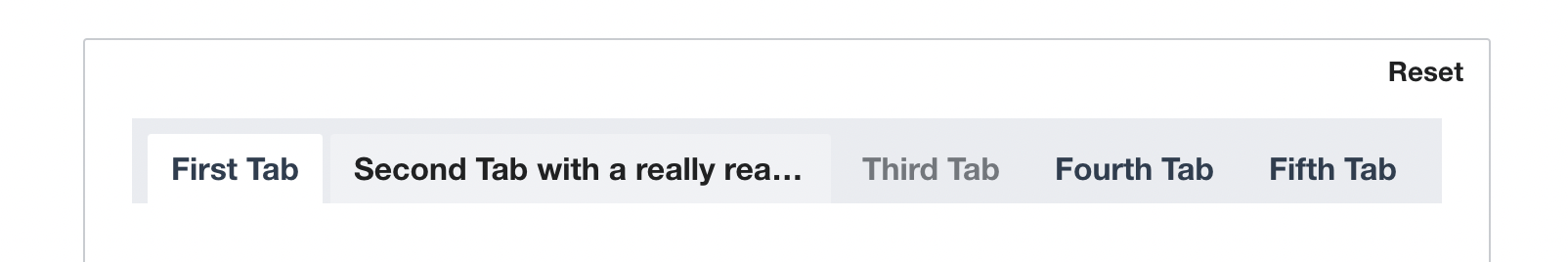
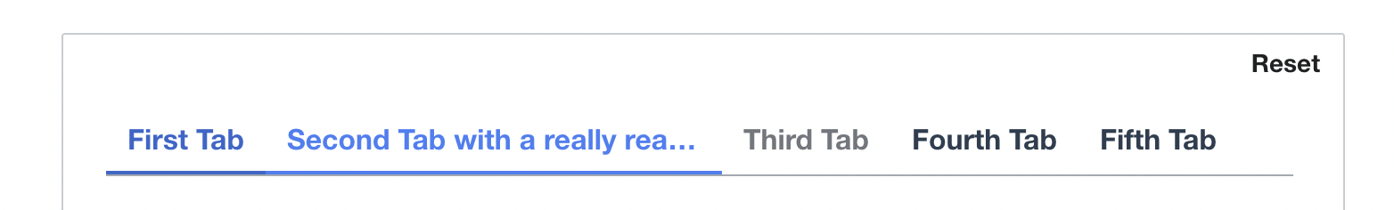
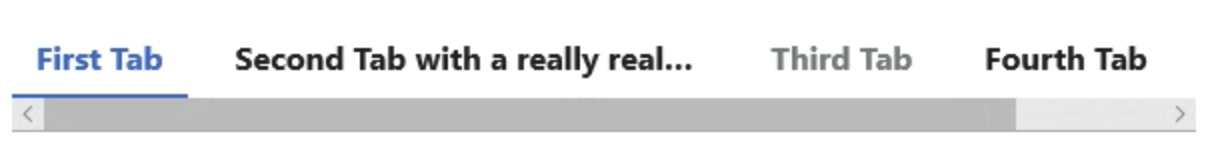
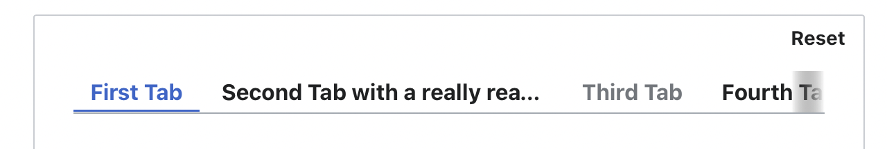
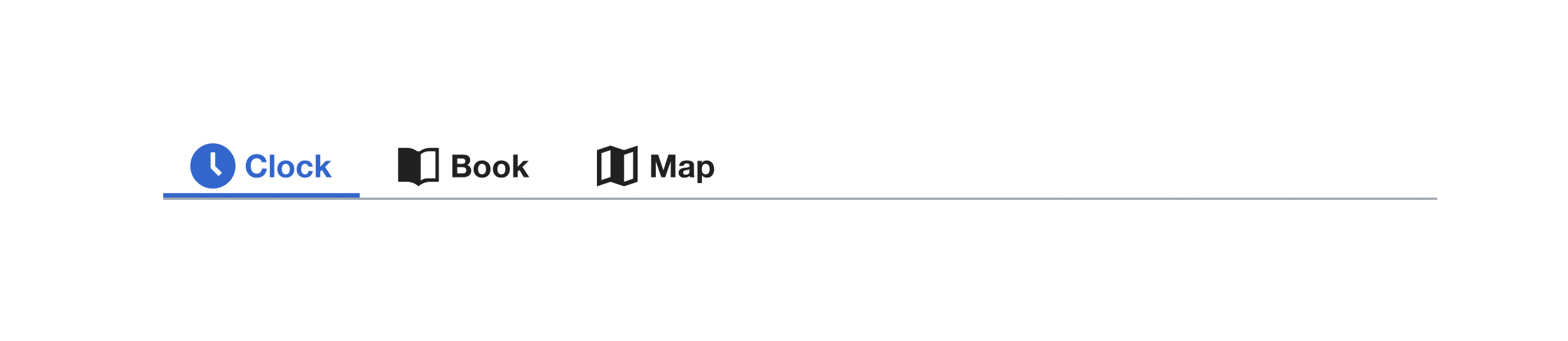
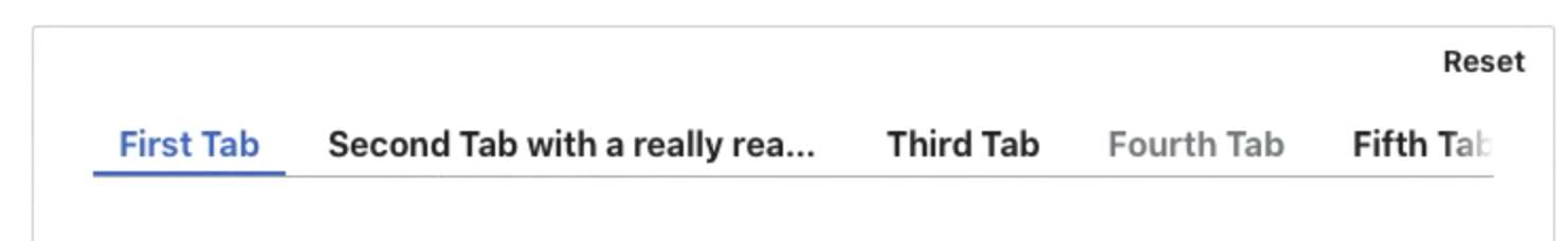
Screenshots (from Figma)

Framed user-interface variant

Screen Shot 2022-03-14 at 9.58.48 AM.png (110×1 px, 13 KB)

Quiet user-interface variant

Screen Shot 2022-03-14 at 9.58.41 AM.png (96×1 px, 12 KB)

To do

Design

  • Finalize Figma design for this component (include disabled states for both styles if necessary)
  • Publish component in our Codex library

UX

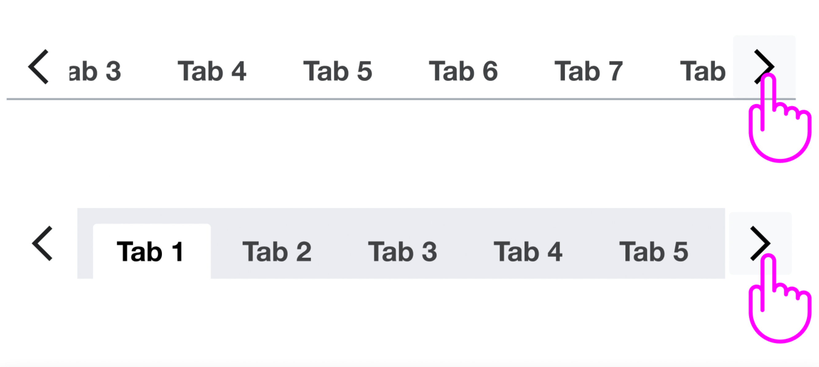
  • Ensure scrolling behaviour meets expectations.

Code

  • Implement Vue 3 compatible version of Tabs and Tab components
  • Replace 'frameless' with 'quiet' in code and documentation

Design Review (see https://phabricator.wikimedia.org/T303321#7834644 for more details)

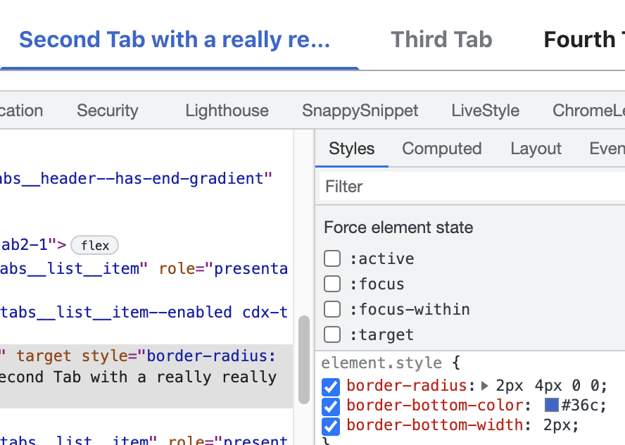
  • Fix Tabs hover styles in Chrome (patch; live demo)
  • Adjust Tabs header spacing to match Figma specs (patch, live demo)
  • Ensure both framed and frameless outline styles use rounded corners (top left and top right corners only) (patch, live demo)
  • Separation between tabs should be 4px in both normal and framed tabs (patch, live demo)
  • Limit gradient-indicator width to 24px
  • Fix 1px of separation between tabs and gray line in Safari
  • 1px separation between tabs and gray line when you resize the component (Safari and Chrome) we'll track this in T307491
  • Fix gray gradient when the tabs are scrollable in both Quiet and Framed tabs (Safari)

QA & Release

  • QA and accessibility testing
  • Inclusion in Codex release

Event Timeline

There are a very large number of changes, so older changes are hidden. Show Older Changes

Change 778356 had a related patch set uploaded (by Eric Gardner; author: Eric Gardner):

[design/codex@main] Tabs: Design review follow-up adjustments

https://gerrit.wikimedia.org/r/778356

@egardner I've reviewed the last patches of the demo and I've updated the task description checking all the corrections done.

I've added a new correction about the separation between tabs since both normal and framed tabs should have a separation of 4px (currently only framed tabs have this separation while normal tabs are glued).

Captura de pantalla 2022-04-08 a las 12.15.55.png (268×1 px, 129 KB)

Captura de pantalla 2022-04-08 a las 12.16.01.png (236×1 px, 115 KB)

Uncovering from all Tabs design refinement patches, from my POV we have to ensure that a single Tab's interaction area height is 32px for affordance requirement reasons.

Volker_E updated the task description. (Show Details)

Also, we've inherited frameless from OOUI Tabs, but have there opted for the more common in case of Buttons. We should also follow the “quiet” label here.
Additionally, I think we should be explicit in the CSS class and add a --quiet modifier.

I was reviewing the last patch in Safari and I've realized that there is 1px of separation there between tabs and gray divider. I'm going to add it to the Design Review checklist to fix it.

Captura de pantalla 2022-04-14 a las 9.34.07.png (168×1 px, 168 KB)

STH renamed this task from Design Tab component to Add Tab component to Codex.Apr 15 2022, 8:56 PM
STH changed the task status from Open to In Progress.
STH triaged this task as High priority.
STH renamed this task from Add Tab component to Codex to [Ready for Development] Add Tab component to Codex.Apr 15 2022, 9:30 PM

This particular issue has been addressed in the latest patch – tabs beyond the viewport should automatically scroll into view once they become active.

Thanks, that helps. However, I still think the tabs scrolling UX is unclear. There are no scroll bars, there's no indication that you can scroll except for the gradient, and unless you're using a touch screen or track pad it's hard to discover how you can scroll.

@Catrope I agree, for a more accessible tabs we should indicate the scroll with something more than the gradient, also not sure if all laptops or mouses could make the horizontal scroll without buttons. For this reason, I presented during the beginning of the task this other proposal where we combine both arrows and horizontal scroll. I think this would be the most accessible solution for any user and device.

Captura de pantalla 2022-04-26 a las 12.39.40.png (1×2 px, 2 MB)

What if we combine both (arrows and scroll)? With this solution our tabs component will be more accessible. We can build it adding Quiet Neutral buttons (icon only) as previous and next controls.

Captura de pantalla 2022-03-16 a las 11.54.30.png (732×1 px, 309 KB)

Change 778323 merged by jenkins-bot:

[design/codex@main] Tabs: Fix broken header hover styles in Chrome

https://gerrit.wikimedia.org/r/778323

Catrope renamed this task from [Ready for Development] Add Tab component to Codex to Add Tab component to Codex.May 4 2022, 5:09 PM

Another issue I just found: the tabs list doesn't specify its own line-height, and in the demo it has line-height: 1.7; because the VitePress styles apply that to all <ul> elements. We may want to consider setting our own line-height, maybe setting it to 20px like we do in MenuItem. I think that would ensure that the tabs list is the same height as shown in the Figma spec (right now it's taller).

A few of the complications resolved in the latest patch (also showing the nifty thin-line solutions path):

  • Need to ensure all changed properties are on the Tab link element (with role="tab" assigned), as the browsers have troubles to render state changes consistently, so no Blue500 borders on li elements anymore
  • We can't use border for the bottom border, when we apply an all side border to a Tab. As a single border is rendered when all 4 are unequal 0

image.png (632×888 px, 119 KB)

  • As soon as we can't use borders we have to rely on box-shadows for all selected and focus blue emphasize “outlines”
  • Due to the rendering of inset box-shadows, we need to exacerbate the border-radius to double in order to get rounded borders on focus

Side-note: There might be edge-casey faulty browser rendering results with the border-radius not being applied to an element without positive border-width applied. At least that was an issue in more ancient browser.

On the gradient mixin, ideally we would not point the selector out at all if it's a start or an end gradient, but just have a before and an after selector. Have updated the gradient a slight bit to make the 24px limit possible, but will wait for the arrow approach by you Roan. The mixin is pretty application-specific and inflexible, we should limit its scope or get rid of it completely in my opinion.

Volker_E renamed this task from Add Tab component to Codex to Add Tabs/Tab (Tabbed layout) component to Codex.May 9 2022, 10:02 PM
Volker_E updated the task description. (Show Details)

Several nasty details with the current scrollbar treatment:

  • Safari's 1px space between selected frameless Tab and the Tab border seems to come from overflow-x: auto on ul.cdx-tabs__list, probably in connection with flex. It's unfixable as long as we need to support scrollbars, everything aside of hiding overflow will result in the pixel gap.
  • scrollbar-width: none; is only supported in Firefox > 64 and it's not entirely clear if it does, what it's supposed to do. When we reduce the scrollbar to a 0 we let it only work under certain circumstances enabled (scroll wheel or touch bar available and pointing capabilities given).
  • Edge fails the rendering badly, here Edge 18:
    image.png (152×1 px, 54 KB)
    , IE/Edge on Trident support a proprietary extension -ms-overflow-style: -ms-autohide which makes it a bit more bearable, still not looking professionally done

Change 778356 merged by jenkins-bot:

[design/codex@main] Tabs: Adjust styles to follow design and simplify selector logic

https://gerrit.wikimedia.org/r/778356

Change 790763 had a related patch set uploaded (by Catrope; author: Catrope):

[design/codex@main] Tabs: Apply correct borders on hover/active

https://gerrit.wikimedia.org/r/790763

The spec sheet is ambiguous on whether an already-selected tab should change color when hovered or active. As currently implemented, the answer is no: when you hover or click the selected tab, it doesn't change color. The selected state overrides the hover/active states.

@Volker_E argues that this makes sense because you can't meaningfully interact with the selected tab (clicking it doesn't do anything), but he then wondered whether it makes sense to still show a hand cursor when hovering the selected tab.

Change 790763 merged by jenkins-bot:

[design/codex@main] Tabs: Apply correct borders on hover/active

https://gerrit.wikimedia.org/r/790763

From a question raised by myself, we've agreed in today's DS Design meeting to settle on calling the non-framed Tabs quiet in order to simplify onboarding and not use two terms (quiet and frameless) for nearly equal visual types.

Change 791073 had a related patch set uploaded (by VolkerE; author: VolkerE):

[design/codex@main] Tabs, styles: Rename 'frameless' to 'quiet'

https://gerrit.wikimedia.org/r/791073

Change 791073 merged by jenkins-bot:

[design/codex@main] Tabs, styles: Rename 'frameless' to 'quiet'

https://gerrit.wikimedia.org/r/791073

Apologies if I've missed this in the above comments, has there been any discussion about including an optional icon in the tab?

In WikiLambda we currently have custom tabs with icons that help visually indicate progress.

Screen Shot 2022-05-16 at 1.36.45 PM.png (140×1 px, 22 KB)

@Catrope I've checked the component and the 1px separation between selected tab and gray line in Safari has been fixed.

Captura de pantalla 2022-05-17 a las 11.23.43.png (1×2 px, 724 KB)

But I've found new things to fix now:

  1. When you resize the tabs the 1px between selected tab and gray line appears (in both Safari and Chrome).

Captura de pantalla 2022-05-17 a las 11.28.06.png (266×994 px, 90 KB)

  1. Also, when you resize the tabs in Safari and the scroll appears, a gray gradient appears (it should be white gradient instead gray gradient) in both Quiet and Framed tabs.

Captura de pantalla 2022-05-17 a las 11.26.59.png (216×1 px, 99 KB)

Captura de pantalla 2022-05-17 a las 11.31.11.png (328×1 px, 141 KB)

@Catrope I move the task to Ready for Development so you can fix these corrections.

Apologies if I've missed this in the above comments, has there been any discussion about including an optional icon in the tab?

In WikiLambda we currently have custom tabs with icons that help visually indicate progress.

Screen Shot 2022-05-16 at 1.36.45 PM.png (140×1 px, 22 KB)

I'm cautiously for ability to add icons to tabs labels.
Note, that the icon in the shared screen is not a standard icon and we should only feature icons available in Codex or add them to the library following the icon guidelines if needed.

@Catrope I've checked the component and the 1px separation between selected tab and gray line in Safari has been fixed.

Captura de pantalla 2022-05-17 a las 11.23.43.png (1×2 px, 724 KB)

But I've found new things to fix now:

  1. Also, when you resize the tabs in Safari and the scroll appears, a gray gradient appears (it should be white gradient instead gray gradient) in both Quiet and Framed tabs.

I can't reproduce this on Safari 15.4 (17613.1.17.1.13). Tried to resize window and scroll and switch between framed/quiet a few times, but it always shows the right gradient. What are the exact steps to end up with grey gradient for you?

@Catrope I've checked the component and the 1px separation between selected tab and gray line in Safari has been fixed.

Captura de pantalla 2022-05-17 a las 11.23.43.png (1×2 px, 724 KB)

But I've found new things to fix now:

  1. When you resize the tabs the 1px between selected tab and gray line appears (in both Safari and Chrome).

Already shared this in T303321#7915845:

Safari's 1px space between selected frameless Tab and the Tab border seems to come from overflow-x: auto on ul.cdx-tabs__list, probably in connection with flex. It's unfixable as long as we need to support scrollbars, everything aside of hiding overflow will result in the pixel gap.

overflow-x: scroll would be minimizing the gap, but it introduces layouting issues in all other browsers and results in huge visible scrollbars in default Windows setting.

By the way connected Edge 18 issue with scrollbars, the only somewhat non-visible scrollbar rule that I could identify and it is not convincing on a number of levels

.cdx-tabs__list:not( :hover ) {
  -ms-overflow-style: -ms-autohide;
}

which would only show the scrollbar on old Edges on hover with a reflow.

How do others do it?

  • Vuetify disables overflow (and with it scrollbars) completely with the arrow buttons.
  • Buetify does the same thing as we do, putting overflow-x: auto on the tabs wrapper. Ending up with the same nasty scrollbars on non-macOS as we do.

Apologies if I've missed this in the above comments, has there been any discussion about including an optional icon in the tab?

In WikiLambda we currently have custom tabs with icons that help visually indicate progress.

Screen Shot 2022-05-16 at 1.36.45 PM.png (140×1 px, 22 KB)

I'm cautiously for ability to add icons to tabs labels.
Note, that the icon in the shared screen is not a standard icon and we should only feature icons available in Codex or add them to the library following the icon guidelines if needed.

@JKieserman I agree with @Volker_E these icons look more like process steps than standard icons for tabs. We should study the use case in deep to understand if we need tabs with icons or not. In this case, the icons used in the tabs should reinforce the text so that they are better understood (see example below), they shouldn't indicate process steps or states.

Captura de pantalla 2022-05-18 a las 16.24.26.png (486×2 px, 217 KB)

  1. Also, when you resize the tabs in Safari and the scroll appears, a gray gradient appears (it should be white gradient instead gray gradient) in both Quiet and Framed tabs.

I can't reproduce this on Safari 15.4 (17613.1.17.1.13). Tried to resize window and scroll and switch between framed/quiet a few times, but it always shows the right gradient. What are the exact steps to end up with grey gradient for you?

@Volker_E when you open the tabs in Safari (I have Safari 14.1.2 (16611.3.10.1.6)) and you resize the screen window to make the tabs smaller and let the scroll appear, the gradient of the scroll appears in gray. I send you this video to show you what happens.

@bmartinezcalvo Thanks for the clarification! It might be originated in a very old Safari bug, where Safari doesn't render transparent value carrying gradients correctly.

Change 794048 had a related patch set uploaded (by VolkerE; author: VolkerE):

[design/codex@main] Tabs, tokens, styles: Use `rgba()` over transparent for background color

https://gerrit.wikimedia.org/r/794048

The latest patch in Saf 13:

image.png (228×1 px, 65 KB)

Note, that we would have to define two more theme tokens:

"transparent-light": {
	"value": "rgba( 255, 255, 255, 0 )"
},
"transparent-dark": {
	"value": "rgba( 0, 0, 0, 0 )"
}

and an update to a decision token value:

"base--transparent": {
	"value": "{ color.transparent-light }"
}

Change 794048 merged by jenkins-bot:

[design/codex@main] Tabs, tokens, styles: Use `rgba()` over transparent for background color

https://gerrit.wikimedia.org/r/794048

@Catrope Should we declare this task's requirements achieved from engineering perspective with remaining

I'd suggest so, in order to keep this task resolvable and reviewable.

@Catrope Design Sign-Off done:

  • 1px separation between tabs and gray line when you resize the component (Safari and Chrome) This correction seems to be fixed in the last patch. Also, as @Volker_E comments we'll track this in T307491
  • Fix gray gradient when the tabs are scrollable in both Quiet and Framed tabs (Safari)
bmartinezcalvo updated the task description. (Show Details)
NBaca-WMF subscribed.

Moving Functional Testing of this component out of this current sprint and into the general Team Functional Testing column, in order to focus on current sprint goals, which primarily include preparing Typeahead Search and several other smaller tasks.

A related reason for doing this is to ensure we have time to triage any tickets or followup work that might come from the functional review of this fix.

Will pick up when prioritized for release.

This component has been released; does it still need some amount of QA testing? Moving back into the current sprint board so we can hopefully close it out soon.

Test cases have been documented here. Many thanks to @Volker_E and @bmartinezcalvo for their assistance with clearing up some questions about design.

ldelench_wmf updated the task description. (Show Details)