In T303321#7880251, @bmartinezcalvo wrote:In T303321#7879418, @Catrope wrote:In T303321#7823237, @egardner wrote:This particular issue has been addressed in the latest patch – tabs beyond the viewport should automatically scroll into view once they become active.
Thanks, that helps. However, I still think the tabs scrolling UX is unclear. There are no scroll bars, there's no indication that you can scroll except for the gradient, and unless you're using a touch screen or track pad it's hard to discover how you can scroll.
@Catrope I agree, for a more accessible tabs we should indicate the scroll with something more than the gradient, also not sure if all laptops or mouses could make the horizontal scroll without buttons. For this reason, I presented during the beginning of the task this other proposal where we combine both arrows and horizontal scroll. I think this would be the most accessible solution for any user and device.
In T303321#7781197, @bmartinezcalvo wrote:What if we combine both (arrows and scroll)? With this solution our tabs component will be more accessible. We can build it adding Quiet Neutral buttons (icon only) as previous and next controls.
Description

Details
| Subject | Repo | Branch | Lines +/- | |
|---|---|---|---|---|
| Tabs: Add scroll buttons | design/codex | main | +578 -62 | |
| Tabs, styles: Consistently apply margins to <a> elements | design/codex | main | +8 -4 | |
| docs, Tabs: Update Tabs demos | design/codex | main | +145 -47 |
Related Objects
- Mentioned In
- T303321: Add Tabs/Tab (Tabbed layout) component to Codex
- Mentioned Here
- T303321: Add Tabs/Tab (Tabbed layout) component to Codex
Event Timeline
Change 788759 had a related patch set uploaded (by Catrope; author: Catrope):
[design/codex@main] [WIP] Tabs: Add scroll buttons
I have uploaded a relatively simple change that adds these arrow buttons, which can be tested here.
Open questions:
- Do we need the gradient, in addition to the arrow buttons? My patch has both, but this required adding an extra wrapper div around the tab list. If we don't need the gradient, that div could be removed.
- When all tabs are visible, should the arrow buttons be hidden? Currently, they're shown but disabled.
- When the tab list is scrolled all the way to one side, the arrow button on that side is disabled (for example, in the initial state, you can't scroll to the left, so the left arrow button is disabled). Is that the right way to handle it, or should we instead hide the left arrow button, then show it again when the user scrolls? (I think this would be more difficult to implement, but probably doable.)
I also have questions about how we should manage the focus state, which I'll post in a separate comment below.
@Catrope I need to move the task to the In Design column since I need to review these items and update the proposal in Figma. I like the buttons on left and right but we need to do some improvements in the design.
@Catrope I've created a new version of the Tab component spec sheet to add the arrows on left and right to the scrollable tabs.
Figma spec sheet
I've add the following behaviors:
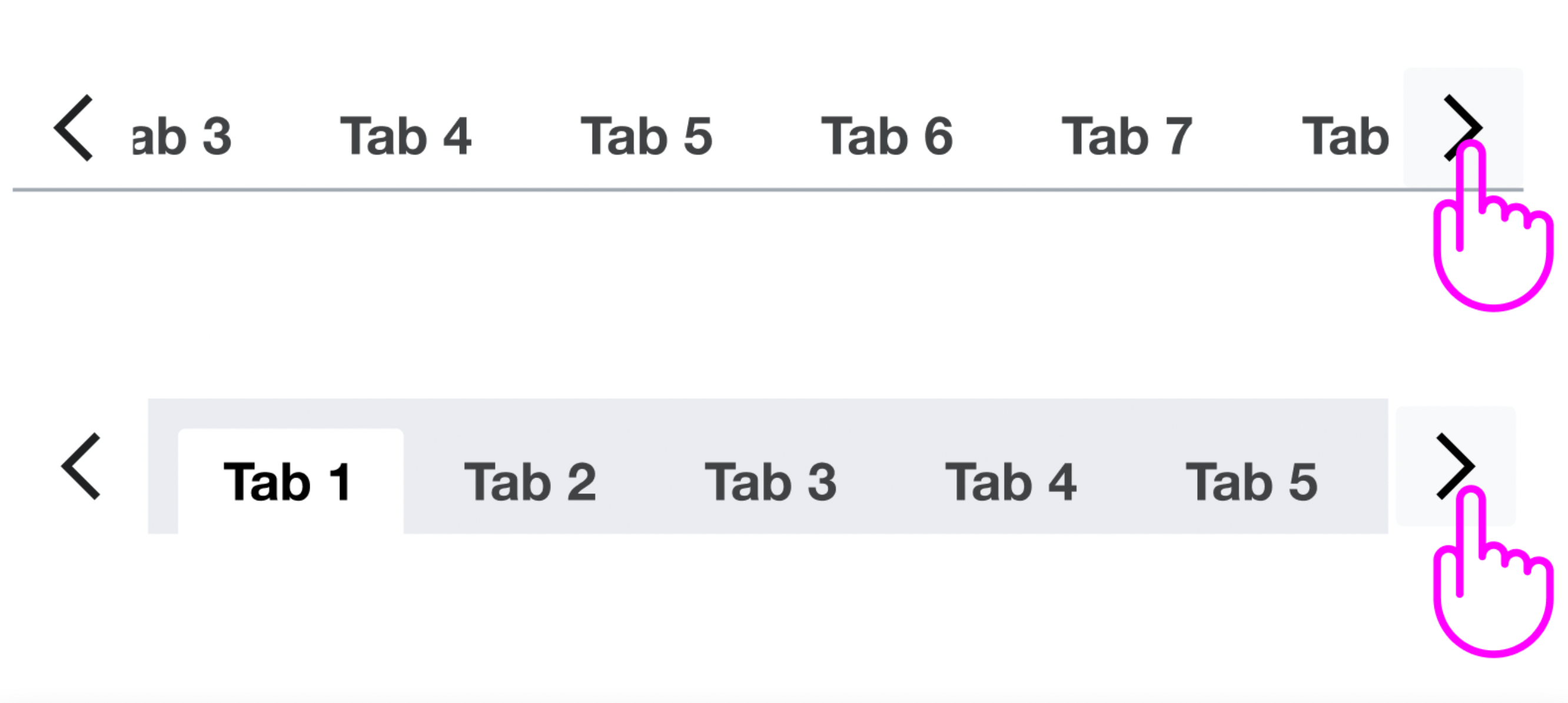
- Added neutral quiet buttons (icon only) on left and right to create the arrows to be able to move to the next and previous tab. Is it possible to add Fill container in the buttons height to adapt them to the tab component height?
- Updated gradient size from 24px to 16px wide. We will continue using the gradient since it improves the scroll experience.

- Left arrow will be visible when we move to the second tab, it won't be visible at the 1st tab. Same with right arrow, it will be visible from the 1st to the penultimate tab but it won't be visible when the last tab is displayed.

- Arrows will be displayed only when the tab component needs scroll. We won’t display the arrows if all the tabs are visible.

- Arrows will be hidden on mobile since we don’t need them to scroll on non desktop devices.

Prototype
Here you can view the component prototype to understand the behavior.
The attached patch implements #1-#4. Demo: https://788759--wikimedia-codex.netlify.app/components/tabs.html . You may need to make the browser window narrower before the tabs list becomes scrollable and the arrow buttons appear. I also recommend testing with the "framed" prop enabled, and testing with the "Swap out tabs" button in the second demo.
 |  |  | ||
Yes, I was able to make that work.
- Updated gradient size from 24px to 16px wide. We will continue using the gradient since it improves the scroll experience.
Before today, the width of the gradient was 15% of the width of the tab list. Volker's patch that landed today changed this to 24px. My patch changes that to 16px per your design, but I'm concerned that that might not be wide enough, since the tabs are 28px apart (12px horizontal padding on both tabs, and 4px margin in between). This can lead to the gradient not being visible at all. For example, in the screenshot below, the gradient is visible on the left but not on the right, because it overlaps entirely with the empty space between "Fourth tab" and "Fifth tab".

- Arrows will be hidden on mobile since we don’t need them to scroll on non desktop devices.
I haven't implemented this yet, because I want to ask the other engineers how we can best detect whether we're on a mobile device (should we use browser detection, or viewport width breakpoints?)
Another TODO: when a tabs list is scrolled out of view (above/below the viewport), and you scroll it into view, sometimes you can briefly see the arrow buttons before they disappear. This happens because the arrow buttons appear based on whether the first/last tab is visible, and that takes into account both horizontal scrolling in the tabs list and where the tabs list itself is relative to the viewport. Passing the tabs list as the "root" element in the IntersectionObserver options would fix this, because then we'd only look at the horizontal scroll position within the tabs list. Doing that would require adding a bunch more code to useIntersectionObserver.ts, which I sketched out in https://gerrit.wikimedia.org/r/c/design/codex/+/789514
A few comments from testing the patch design-wise:
- The quiet arrow icon button hover looks displaced in when frameless.
- The arrow button alignment seems inharmonious to me, both, on position of the arrow (too far down) and the imbalance of bolded frameless Tab and arrow stroke width
- The gradient seems like a good additional indicator to me, we could also consider having a similar stronger indicating box-shadow as Menus currently feature, as it points at the same z-index elevation
- The distance between the arrow button and the gradient (aka the gradient itself seems too small. The first/last letter should already be hidden
@Catrope I agree that now the gradient with 16px width seems to small and doesn't cover the tab in some cases. We can return to the proposal of gradient with 24px (I've created a new Figma version here).
I agree with @Volker_E's comments above, and want to add:
When the arrow button overlaps a tab name and is not hovered, it's difficult to tell where the tab name ends and the button begins. I could see a user tapping on the arrow button by accident when they meant to tap the tab name.

When the arrow button is hovered, the background color seems awkward, both with the frameless and framed designs


I encountered a bug when viewing the first demo on a large screen at 100% resolution, with framed turned on. Initially the tabs had a "next" button, but when I pressed it and the UI scrolled to the end of the tabs, no "previous" button appeared. Instead, a bit of the left margin of the first tab was missing

I noticed a similar issue and discussed it with Volker on Tuesday. I think that it's because the margin is not part of the tab's box for the purposes of "is >95% of the tab visible". He suggested that we could change this margin to a padding, which might mitigate this issue. Alternatively, we could change the 95% threshold to 100% (or 99%), but that may cause a different issue where the only ~5px of the first/last tab is scrolled out of view, so the scroll button still appears but only scrolls a very small amount when clicked (and then disappears).
To really make this better, I think we may have to make the scrolling logic more complex. Right now it just scrolls 100px to the left/right, which will obviously cause issues if the width of the scrolled-out-of-view part of the tabs list (in other words, the total width of all the tabs minus the width of the scrollable container they're in) is close to but not exactly a multiple of 100px. Instead, we could find the first tab that is scrolled completely out of view (or that is <10% visible or some threshold like that), and scroll it into view. This would make the arrow buttons scroll similarly to how the arrow keys already do.
Change 792285 had a related patch set uploaded (by Anne Tomasevich; author: Anne Tomasevich):
[design/codex@main] docs, Tabs: Update Tabs demos
Change 792285 merged by jenkins-bot:
[design/codex@main] docs, Tabs: Update Tabs demos
I was able to mitigate this in my latest patchset by moving the tabs' margins from the <li> elements to the <a> elements, which appears to cause no visual changes, but makes the margins part of the <li> elements' bounding rects, so the scrolling takes them into account. This also fixes a pre-existing issue with the arrow key navigation not scrolling the left margin into view when navigating back to the first tab.
Change 792300 had a related patch set uploaded (by Catrope; author: Catrope):
[design/codex@main] Tabs, styles: Consistently apply margins to <a> elements
Change 792300 merged by jenkins-bot:
[design/codex@main] Tabs, styles: Consistently apply margins to <a> elements
I've implemented this in my latest update. When you click an arrow button, we find the first tab in the specified direction that isn't fully visible, and scroll it into view. To avoid scrolling too little (sometimes only the first/last few pixels of the tab are hidden, and we'd scroll a very short distance), we check if that would result in a scroll distance of less than 25% of the width of the tabs list, and if so, we scroll the next (fully hidden) tab into view instead. This effectively imposes a minimum scroll distance that is responsive to the width of the tabs list. We can tweak this threshold if we want (I think we might want to try 10% instead).
Design sign-off done, I only found the following thing to fix:
- Keyboard navigation: when you move the focus to the next tab with arrow-next, the content of the tab is displayed but the tab scroll doesn't move to this tab. For example, if you move the focus to the last tab the scroll should move too to the last position.

@Catrope I assign to you the task again so you can have a look.
I could not reproduce what Bárbara reported in Chrome, but I could in Firefox. @bmartinezcalvo were you testing in Firefox? Or in Safari?
I also found another bug in Firefox: it puts the tabs list (the <ul>) in the tab order, and draws a red(?!) focus outline around it when it's focused. This doesn't happen in Chrome, where <ul>s are not in the tab order (because they're not supposed to be!)

@Catrope the focus navigation problem is in Safari, when the focus is placed on the first tab and you move the focus to the next tabs the focus is visible until the last visible tab before the scroll (you can view in the following video how the tab6 is displayed but the scroll is not working to show the tab6)
When you move the focus within the tabs the scroll should work (in Chrome is working well, you can view it in the following video)
@Catrope I move the task to Ready for Development so you can have a look at the problem with the scroll when you move the focus within tabs.
Is there a known prioritized upcoming use case or partner that requires this task? If not, I would recommend moving it out of the current sprint board
Tabs are used by MediaSearch and, I believe, WikiLambda, so I think this should be prioritized for the beta release and this can be moved out of the current sprint.
@NHillard-WMF tabs are being used in the Function Page of AW (view Figma here) but this use case doesn't need the scrollable behavior with arrows.
{F35283748}