Page MenuHomePhabricator

A friendly place to share your initial reactions to the first release of desktop improvements.
Closed, ResolvedPublic

Authored By
Reedy
Jul 17 2020, 3:57 PM
Referenced Files
F32022752: narrow-wikisource.png
Aug 10 2020, 6:39 AM
F31987665: photo_2020-08-07_23-31-33.jpg
Aug 8 2020, 4:57 PM
F31987667: photo_2020-08-07_23-34-02.jpg
Aug 8 2020, 4:57 PM
F31987666: photo_2020-08-07_23-35-04.jpg
Aug 8 2020, 4:57 PM
F31986991: test1 - Copy.PNG
Aug 8 2020, 8:51 AM
F31986989: test2 - Copy.PNG
Aug 8 2020, 8:51 AM
F31985004: Screenshot at 2020-08-07 12-30-26.png
Aug 7 2020, 7:32 PM
F31984999: Screenshot at 2020-08-07 12-23-18.png
Aug 7 2020, 7:28 PM
Tokens
"Love" token, awarded by alexhollender_WMF.

Description

Use this Phabrictor ticket for generic discussion around your reactions to the typography refresh. @alexhollender will spin off tasks based on the discourse. Thanks for your input!

Initial topic was:

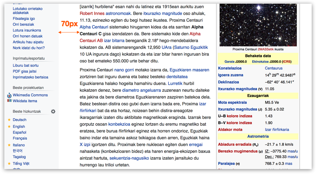
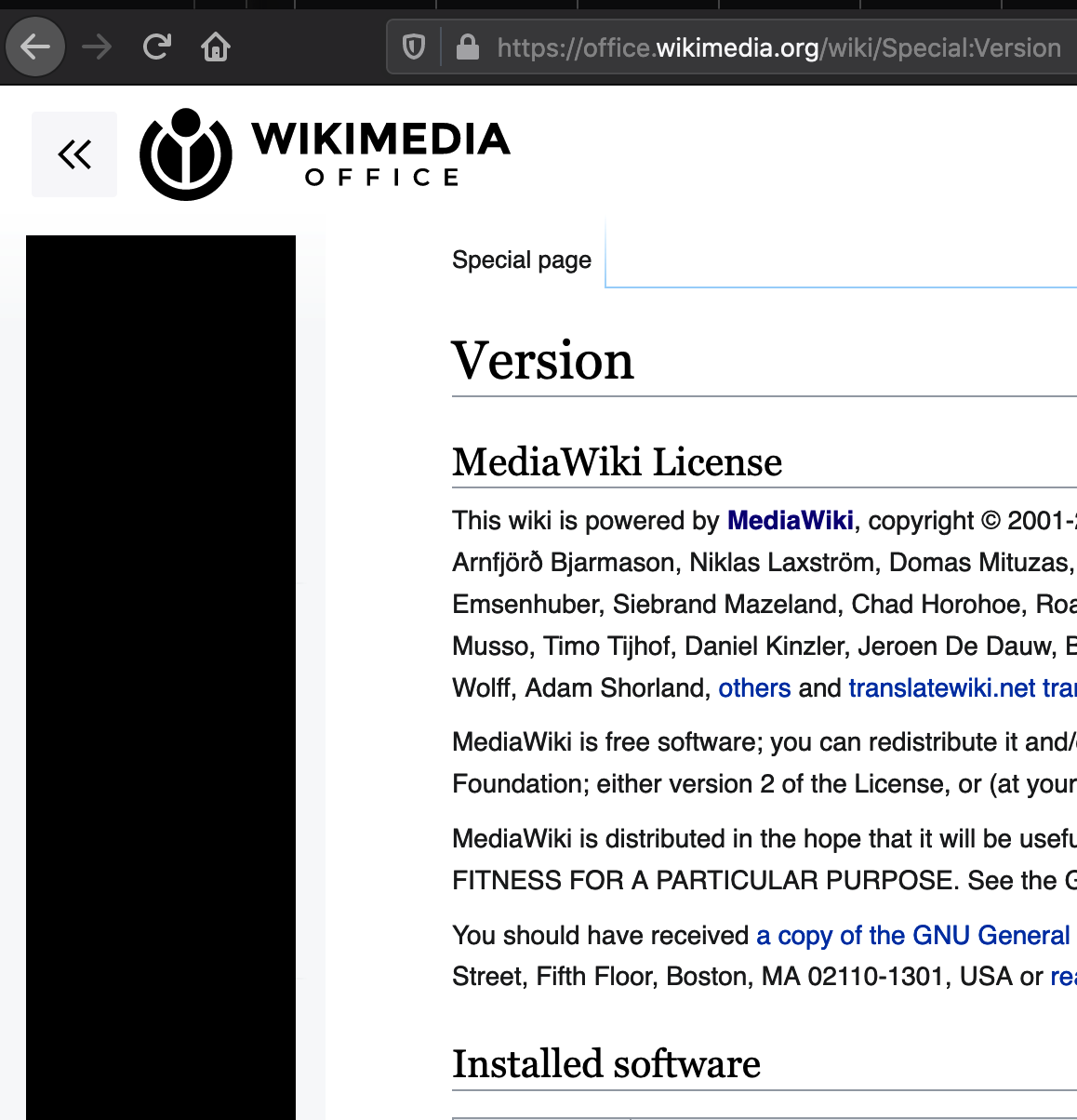
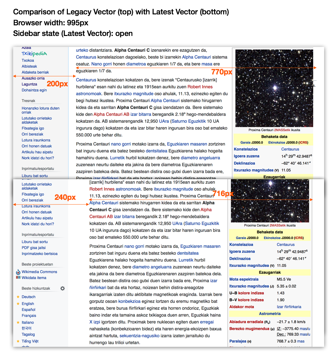
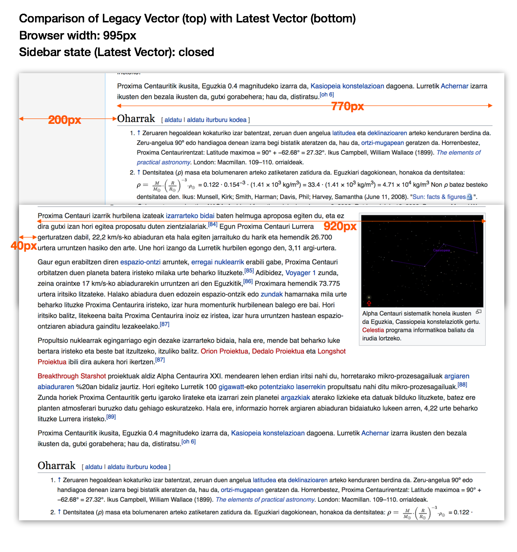
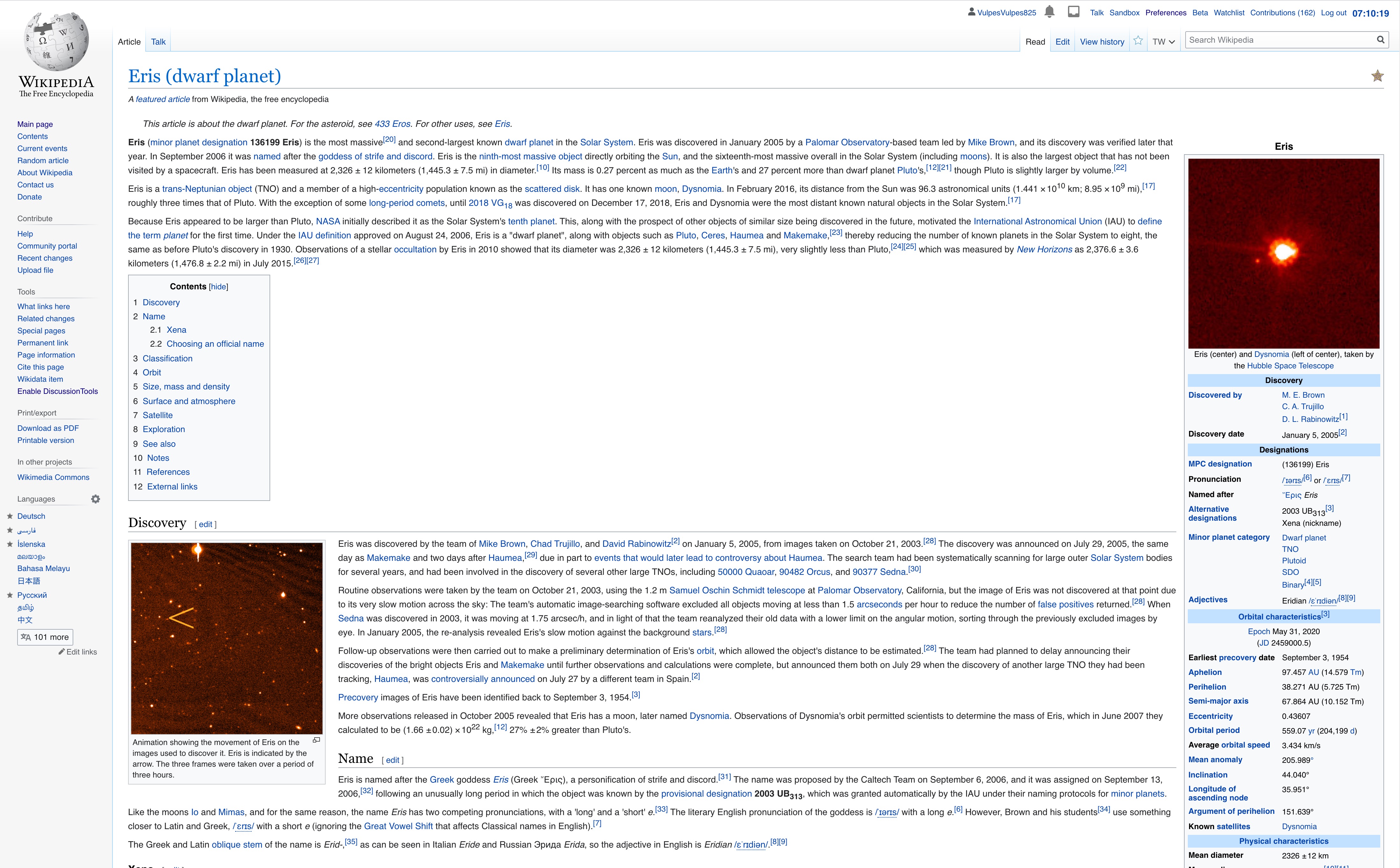
There is currently too much space between the sidebar and the content, particularly on small screens. We could consider making this a percentage based value so it's responsive.

image.png (564×1 px, 513 KB)

Event Timeline

There are a very large number of changes, so older changes are hidden. Show Older Changes

cc @alexhollender - not sure I understand this bug as written but maybe you do?

cc @alexhollender - not sure I understand this bug as written but maybe you do?

Look at the screenshots? :P

Why is there a much much big border on the new one? Why is there no left hand line on the special tab?

New:

Screenshot 2020-07-22 at 00.49.49.png (398×472 px, 45 KB)

Old:

Screenshot 2020-07-22 at 00.49.54.png (350×464 px, 59 KB)

Jdlrobson changed the task status from Open to Stalled.Jul 21 2020, 11:55 PM

Okay to the border on the left? I honestly don't see a problem with the new design or problem that this would give end users. I believe that's by design so I'll let Alex answer. I'd note this seems like a better topic for a Slack conversation or on the associated talk page as there's nothing actionable here right now.

ovasileva triaged this task as Medium priority.Jul 22 2020, 1:46 PM
ovasileva moved this task from Incoming to Needs Prioritization on the Web-Team-Backlog board.

3BC10E56-A651-4300-B87C-D2819A168BBF.png (2×1 px, 1007 KB)

This is a screenshot from the bottom section of a basque Wikipedia article with the new skin.
Is the fact that it’s 1/4 empty intentional?

cc @alexhollender - not sure I understand this bug as written but maybe you do?

Look at the screenshots? :P

Why is there a much much big border on the new one? Why is there no left hand line on the special tab?

@Reedy thanks for your attention to detail and feedback here. I would like to make sure I understand what you mean by the border being bigger. I've attached a side-by-side comparison of the tabs on legacy vector vs. latest vector. Are you referring to the height of the blue gradient borders? Or perhaps the width? I can't seem to find much of a difference between the two (maybe the gradient fades slightly earlier in legacy?).

image.png (427×741 px, 33 KB)

Regarding your other point about the border to the left of the Special pages tab — this is something we're looking into. The reason, so to speak, why that happened is because we removed the blue gradient border from the sidebar, which is what used to provide the lefthand border on the first tab. At some point during this project we will restyle the tabs. Until then we want to make sure we're not over investing in small fixes.

Not sure if this helps illustrate it a bit more. The sidebar on the new one is slightly narrower it seems. The text then starts further to the right.

It's probably not a huge amount of difference in this example, and it's probably at least the lack (or the removal) of the blue line (ie a physical "border")... but it looks like a lot of space as a user. Even more so as there is a grey-er bit (it's not much, but it's noticeable) and a white bit.

Screenshot 2020-07-22 at 21.54.50.png (1×1 px, 258 KB)

Screenshot 2020-07-22 at 21.54.10.png (1×1 px, 210 KB)

If we look at the content alone, you can see it's wrapping earlier because everything is seemingly being shifted to the right. And there's less shown vertically too because things start further down the page. So as a user, suddenly the content is narrower, and everything is apparently moved down and to the right

Screenshot 2020-07-22 at 22.04.53.png (400×246 px, 13 KB)

Screenshot 2020-07-22 at 22.01.33.png (1×2 px, 386 KB)

Screenshot 2020-07-22 at 22.01.25.png (1×2 px, 387 KB)

Ah apologies for the misunderstanding @Reedy — I now understand what you're talking about. I hope my response will also address the question @Wittylama raised as well (T258277#6327805).

First some context to consider: once we've moved the language switcher to the article header the sidebar will be collapsed by default for logged-out users. This means we have to consider the following default experiences: sidebar open/small screen, sidebar open/large screen, sidebar closed/small screen, sidebar open/large screen. Speaking in general terms there will be some awkwardness in some of these cases which is a tradeoff for things being better in other cases.

Regarding the gap between the sidebar and the article text: this is intentional, however it is currently a little large so we will be reducing it. The reason why the gap is there is to allow your eye a moment of rest as it finishes one line and returns to the next (known as a "return sweep" in reading research jargon). This is the same reason why books and newspapers have margins around the text. If there was no margin, or other text, it would cause greater fatigue to your eyes over time. We wrote about this however your question makes me realize that I should address the gap specifically (link) — I will make sure to go back and do that.

Regarding the content being offset to the right, this has always been the case. It is just more noticeable now since we're not filling that space in with gray. We did consider making the sidebar sticky (see this prototype) to make better use of that space, but have decided to defer that until later. The good news is that with the new layout you can collapse the sidebar, thus gaining more space for content on smaller screens.

I hope the two following images provide satisfactory visual examples of how the new layout differs from the old one:

image.png (1×1 px, 998 KB)

image.png (1×1 px, 655 KB)

alexhollender_WMF renamed this task from Excessive border in Vector in non legacy mode to Reduce space between content and sidebar.Jul 22 2020, 10:25 PM
alexhollender_WMF changed the task status from Stalled to Open.
alexhollender_WMF claimed this task.
alexhollender_WMF updated the task description. (Show Details)

I don't know if this is the best place for this (feel free to move this comment to another ticket) or not but the vertical space at bottom of pages seems weird too. Let me give an example:

(A small page in Basque Wikipedia in a wide screen):

image.png (602×1 px, 178 KB)

To illustrate my point, I mark all of the gray area as red:
image.png (903×1 px, 149 KB)

As comparison, this is the new mailman in a large screen:

image.png (903×1 px, 55 KB)

1- The footer is at the bottom of the page
2- The large blank area is just one color, not a combination of white and gray:

image.png (388×916 px, 100 KB)

Jdlrobson renamed this task from Reduce space between content and sidebar to A Friendly place to share your initial reactions to the first relase of desktop improvements..Jul 27 2020, 3:34 PM
Jdlrobson renamed this task from A Friendly place to share your initial reactions to the first relase of desktop improvements. to A friendly place to share your initial reactions to the first relase of desktop improvements..
Jdlrobson updated the task description. (Show Details)

@Ladsgroup I went and made this a generic task so feel free to drop any feedback in here. We'll make new tasks and tweaking existing ones as a result of the input.

To build on my other task that was merged in: the space to the left of the vector tabs is not browser-specific and not because of gadgets.

Here is the login page for fawiki with uselang=en (I have highlighted the newly added space in yellow for you)

image.png (287×663 px, 18 KB)

In comparison, enwiki which doesn't have Desktop Improvements (Vector 2022) enabled shows like this, with no space before the tabs:

image.png (243×504 px, 29 KB)

Obviously, fawiki is in Persian (which is a right-to-left language) so the login page current looks like this (i.e. without uselang=en). and I've highlighted the extra space in yellow again:

image.png (294×754 px, 20 KB)

Another separate issue: I have modified my Vector.css to hide some of the links at the top of the page (like the sandbox link, etc.) and it used to work just fine. But now it results in those links having unequal spacing. Here is how it looks like in English:

image.png (51×552 px, 2 KB)

And in Persian:

image.png (42×569 px, 4 KB)

Pertinent piece of CSS code that I use which doesn't seem to work anymore:

#pt-sandbox, #pt-betafeatures, #pt-mycourses {
	visibility: hidden;
	display: none;
}

The CSS rule that makes them reappear is this (not sure which file it resides in):

#p-personal li {
	display: inline-block;
}

Why is this a bug? Because wherever the latter CSS rule lives is being executed after my own Vector.css which is wrong. My personal CSS should be the last one rendered. Somewhere, we are getting the order of things wrong.

Another unrelated issue: the search box should be aligned to the left (in RTL), but now it has a big margin to its left. Screenshot:

image.png (111×1 px, 19 KB)

And in English (notice the huge margin to the right of the search box:

image.png (111×1 px, 15 KB)

Is there a querystring parameter one could use to temporarily turn off Desktop Improvements (Vector 2022) ? We have useskin= but when I tried useskin=oldvector it didn't work. Can we make it possible, at least for this beta-testing period?

UPDATE

I figured it out. useskinversion=1 will take you back to the legacy vector.

TODO: I think we should document it at mw:Reading/Web/Desktop Improvements

Why is this a bug? Because wherever the latter CSS rule lives is being executed after my own Vector.css which is wrong. My personal CSS should be the last one rendered. Somewhere, we are getting the order of things wrong.

The loading order of Vector.less has not changed, what has changed is the layout - so the scripts/styles you have built on top of have changed, so as a result the gadgets will need to change. There are likely to be further changes to this widget, so I'd suggest updating such scripts to be scoped to .skin-vector-legacy in the mean time.

Longer term it will look like this: https://www.mediawiki.org/wiki/File:Consolidated_user_tools_prototype_for_Desktop_improvements_project.gif

And in English (notice the huge margin to the right of the search box:

Will be fixed in the next feature in the sequence T249363 which is currently in flight.

Another unrelated issue: if you have enough tabs (using gadgets), your page will be rendered in an awkward way. I have both Twinkle and MoreMenu enabled and here is how the tabs look like for me:

image.png (94×984 px, 16 KB)

Why is this a bug? Because Vector should realize there are too many tabs and should push more items into the "More" menu (which in Persian is called "بیشتر") but it fails to do so.

Search looks misaligned:

image.png (84×375 px, 8 KB)

An idea from the discussion in fawiki: Use the free space on the left (in fawiki, right in LTR wikis) for TOC. Similar to Britannica. The app also something similar as well.

I knew that white space generated by narrowing the reading pane would be claimed for a new use very soon, but I was thinking it would be for gadgets and similar tools. The TOC idea is also great. But a higher level discussion is: do we want to promote reuse of that freed-up space on the side of the page, or do we want to promote keeping it empty?

Happy to see all the feedback here. @Jdlrobson We should transform that into a parent-child task. This could lead to a lot of confusion what has been addressed/decided/marked as invalid. Not convinced about a drop-in task for collecting all feedback here.

@Ladsgroup has been making some changes to fawiki gadgets to address some of the above. Vector tabs look much better to me now.

Why is this a bug? Because what he is doing for fawiki may need to be done for other wikis too but I don't think he has started documenting his actions yet.

PS: I hope you found the second line's opening humorous :)

I don't know if this is the best place for this (feel free to move this comment to another ticket) or not but the vertical space at bottom of pages seems weird too. Let me give an example:

(A small page in Basque Wikipedia in a wide screen):

image.png (602×1 px, 178 KB)

To illustrate my point, I mark all of the gray area as red:
image.png (903×1 px, 149 KB)

As comparison, this is the new mailman in a large screen:

image.png (903×1 px, 55 KB)

1- The footer is at the bottom of the page
2- The large blank area is just one color, not a combination of white and gray:

image.png (388×916 px, 100 KB)

The additional white space is caused by this line: https://gerrit.wikimedia.org/g/mediawiki/skins/Vector/+/eeb6182a9112026e3cb9ad270f0548d16bf74981/resources/skins.vector.styles/layout-max-width.less#150

Fifty pixels is a lot of padding!

Currently, the new Vector skin uses max-width 960px for mw-content-container based on the decision in T246420. However, this brings some issues.

  1. This is sometimes too small for a widescreen display.
  2. When a user changes the Thumbnail size in Setting-Appearance bigger than 220px, 960px max-width is sometimes fell too small, as bigger the infobox with image, the less space for words.
  3. Setting different background color for .skin-vector-max-width gives users the impression that something is wrong (It is hard to say, but for me, I feel that the website is intentionally cropped and shift my focus to the different background color rather than the content itself)
In Old Vector Skin

截屏2020-07-29 15.10.19.jpg (2×4 px, 1 MB)

In Current Vector Skin

截屏2020-07-29 15.03.13.jpg (2×4 px, 1 MB)

Removing background color of .skin-vector-max-width

截屏2020-07-29 18.26.49.jpg (2×4 px, 1 MB)

By removing the background color and the border color, it felt more consistent.

In short

It may be best if the background color of .skin-vector-max-width is removed. Also, the max-width of mw-content-container should be dynamically increased based on the thumbnail size user chosen in the setting.

I experienced a bug when enabled the new desktop improvements. I don't know whether it is a bug or my mistake. I am posting screenshots of this thing.

image.png (713×999 px, 91 KB)

image.png (870×1 px, 421 KB)

The problem is the content is limited to a small with area. As you can see in the screenshot on the left side the contents box coming right side images are coming and the text in the article is shrinked to a small area of 350px wide.
So the thing endup like in the screenshot.
image.png (592×1 px, 73 KB)

I am using Firefox 78 on Fedora 32 with KDE Plasma 5.19.3

I don't know how to fix this. If anybody know the solution plz help.

I think I found another case where the order in which CSS files are loaded is wrong. The order in which CSS is loaded must be as follows: MW Core > Skins (e.g. Vector, including Desktop Improvements) > Extensions > Gadgets > User CSS (global CSS first, local CSS last)

How do I know this bug exists? We have some gadgets on fawiki (example) that define an embded font and assign it to certain elements, including the #firstHeading element (i.e. page title). Ever since Desktop Improvements (Vector 2022) was enabled on fawiki, this does not work any more, that is, the first heading is now shown using .Arabic UI Display which is the wiki's default.

@Huji I tried out that gadget and it applies the new font to the body element no problem however the selector div#content h1, div#content h2, div#content #firstHeading, div#content .mw-editsection, .mw-body .mw-editsection-like, div#content #toc h2, div#content .toc h2 doesn't match anything because of the use of the div#content This was reported in the April tech news https://meta.wikimedia.org/wiki/Tech/News/2020/17 - those need to be updated to not use div#content (T248137). Without change this will also break in the old Vector in the distant future.

@Jdlrobson nice catch! I will update all said gadgets. My last comment is not entirely valid anymore.

Do see, however, my previous comment that also was about the order in which CSS is loaded (specifically, user CSS seems not to be the last thing loaded anymore): T258277#6341331

Hi,

i wanted to share a screenshot how an office wiki page looks for me:

Screenshot at 2020-08-07 12-23-18.png (918×1 px, 91 KB)

Screenshot at 2020-08-07 12-30-26.png (899×1 px, 114 KB)

It seems like ~50% of screen estate is just white space. There are really large empty areas on the right and left. When i hide the menu that also just stays white and is not being used for content.

Could we use more of that area for the content?

A few more "this doesn't look quite right"...

photo_2020-08-07_23-34-02.jpg (960×1 px, 99 KB)

photo_2020-08-07_23-35-04.jpg (960×1 px, 118 KB)

photo_2020-08-07_23-31-33.jpg (960×1 px, 130 KB)

The Wikisource proofreading view is very narrow, with its two side-by-side panels for editing:

narrow-wikisource.png (702×1 px, 263 KB)

The Wikisource proofreading view is very narrow, with its two side-by-side panels for editing:

narrow-wikisource.png (702×1 px, 263 KB)

Thanks Sam! Knowing particular pages where this design breaks down (aside from the general case where people don't like it which is to be expected) is really useful. I've created T260091 to start to collate these.

All: some folks on fawiki have shown interest in reading more about the research that is the basis of "narrower reading pane" change. Which paper/book/website would you suggest?

All: some folks on fawiki have shown interest in reading more about the research that is the basis of "narrower reading pane" change. Which paper/book/website would you suggest?

I find this study to be the most straightforward to begin with: https://cdn.tc-library.org/Edlab/eye-tracking%20article.pdf
There is a longer version of it as well: https://link.springer.com/content/pdf/10.1007/11555261_59.pdf
Another study here: http://www.makinggood.ac.nz/media/1266/ling_2006_fonts.pdf
This is a literature review of existing research: https://s3-us-west-2.amazonaws.com/visiblelanguage/pdf/V39N2_2005_E.pdf
The Wikipedia page on line-length: https://en.wikipedia.org/wiki/Line_length

One important note: we have not yet found research that studies line lengths beyond 125 characters per line. With the current layout on Wikipedia someone on a wide screen could easily get 200, 300, or 400 characters per line. Unfortunately that length doesn't seem to have been studied much, so part of our thinking is based on a) inferences we can draw from the range that has been studied, b) looking at other websites. We've written up some thinking here and here.

Reedy renamed this task from A friendly place to share your initial reactions to the first relase of desktop improvements. to A friendly place to share your initial reactions to the first release of desktop improvements..Aug 26 2020, 6:07 PM

I see that some of the screenshots above may be the result of the issue raised in T263950

This has run its course. If you have more feedback please add it to https://www.mediawiki.org/wiki/Talk:Desktop_improvements

[For future reference, please directly link folks to a central on-wiki feedback talk page and don't create one Phab task as a non-actionable catch-all - thanks a lot :) ]