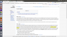
For me, the most disturbing thing about MediaWiki is the fact that it spreads all over my 1920x1080px screen. Being forced to read 1920px content is not the most pleasant thing.
I know UI things require research and stuff, but I propose the following thing: let's wrap the MediaWiki in a centered container.
Having something like:
.container {
    display: block;
    width: 1080px;
    margin: 0 auto;
    padding: 0;
}
We have clear examples of websites which adopted this model, like: Google Design, Facebook (for the News Feed), and tipically every highly accessed website (AFAIK) because things become easier to read, you don't have to tilt your head for every row you read back and forth.
This can also be adapted to different media queries in the CSS and will also have the advantage of developers knowing what layout to expect when they write an extension, a special page or something like that.
See also:
