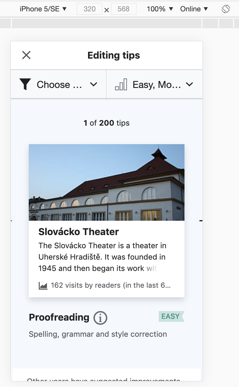
Steps to reproduce
Open the newcomer tasks module on a mobile device with width 320px or lower (e.g., iPhone 5E)
ACTUAL
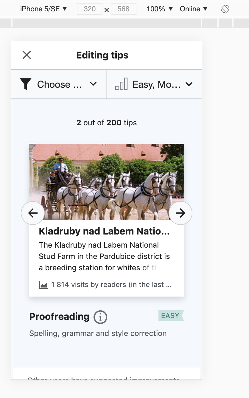
EXPECTED
Layout should be responsive so that arrows remain visible and tappable.
Proposed fix
Using media queries to detect for widths less than 360px.
Proposed result:
@media screen and (max-width: 360px) {
.suggested-edits-previous {
  border: solid 1px #C8CCD1;
  position:fixed;
  left:0;
  margin-left: 16px;
  width:40px;
  height:40px;
  padding-left:2px!important;
  background-color: #F8F9FA;
  z-index: 1000;
  border-radius: 20px;
  margin-bottom: 24px;
}
.suggested-edits-next {
  border: solid 1px #C8CCD1;
  position:fixed;
  right:0;
  margin-right: 16px;
  width:40px;
  height:40px;
  padding-left:2px!important;
  z-index: 1000;
  background-color: #f8f9fa;
  border-radius: 20px;
  margin-bottom: 24px;
}
}