As a Watchlist Expiry user, I want the "watchlist time period" label to be on a separate line, so that I can clearly and easily read applicable text.
Acceptance Criteria
- Make "watchlist time period" in a separate line in MobileFrontend and Minerva
What is the problem?
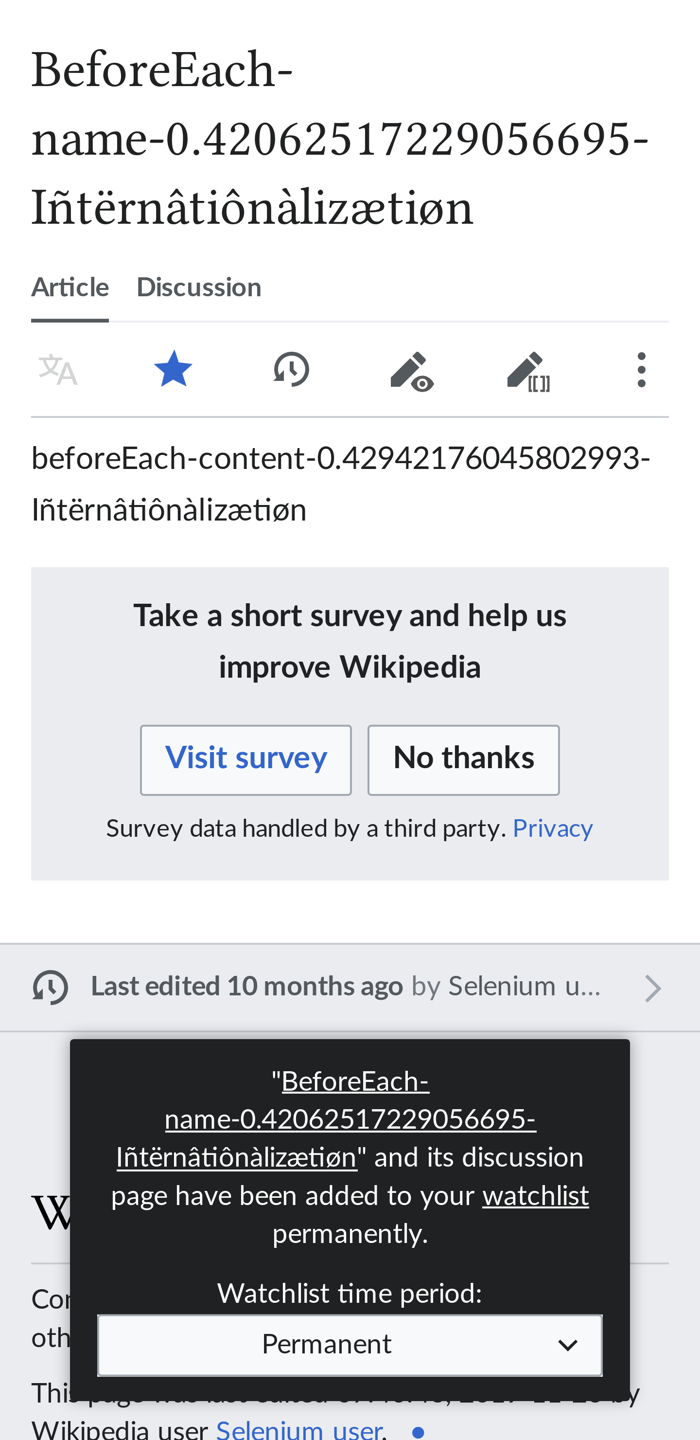
In the watch star popup, there is no gap between the blah and the watchlist expiry label.
For example, it reads:
...have been added to your watchlist permanently.Watchlist time period:
(see screenshot)
It only appears to happen if all the text appears on one line. So, the screen size needs to be wide enough (or the font size small enough) for this to happen.
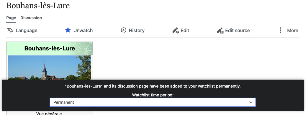
I have not seen this happen on any phones or tablets I have tested so far (either portrait or landscape orientation). So, it may not affect MobileFrontend in practice, but it will probably affect desktop users of Minerva.
If it wraps, the "Watchlist time period" label appears in its own paragraph (see other screenshot).
Steps to reproduce problem
- Visit a page with Minerva skin on (e.g. https://en.wikipedia.beta.wmflabs.org/wiki/Conflict-title-0.5674052665883058-I%C3%B1t%C3%ABrn%C3%A2ti%C3%B4n%C3%A0liz%C3%A6ti%C3%B8n?useskin=minerva)
- Click watch star
Environment
Browser: Firefox, Chromium
Screenshots (if applicable):
Bug appears when all text on one line:

Looks fine when the text is wrapped: