Parent Epic: T289052
As a WD/WB designer and developer, I want to contribute with a new complex dialog component to our component library, and reuse it in the Mismatch Finder, because it will allow users to:
- Get heads-ups and direct feedback on their actions.
Acceptance criteria
- The dialog is implemented according to the Figma specs (which are fully outlined using tokens): it displays the states listed below and presents the described responsive and i18n behaviors
- The dialog follows the accessibility recommendations specified in the component documentation
- The dialog's component-level tokens are created according to the naming convention, and used to style the component (TBD by @Sarai-WMDE )
- The dialog is displayed in Storybook according to the specifications (see below)
- The dialog has browser tests implemented (if needed)
Storybook:
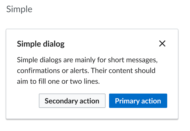
- Structure: the Dialog component has its own section is Storybook, called "Dialog". The section contains a "Simple" section demoing the Simple dialog variant, and a "Complex" section displaying the "Complex" dialog.
- Behavior: users should be able to open and close the dialog (using the close "X" button or its options). (A button could serve as trigger)
- Controls: users should be able to modify the copy of the title, the body and the button labels of the simple dialog
Notes:
- It should be possible to leave the slot for the secondary action (represented by a normal neutral button) empty
- Please note that the dialog component is always displayed on top of an overlay that covers 100% of the viewport's surface
- Responsiveness: Unlike the complex dialog, the simple dialog does not present a different layout on mobile. Their width, though, should never be bigger than 90vw on small screens.