There is a default view for an instance of a user-defined type. It should be improved.
Description
Description
Event Timeline
Comment Actions
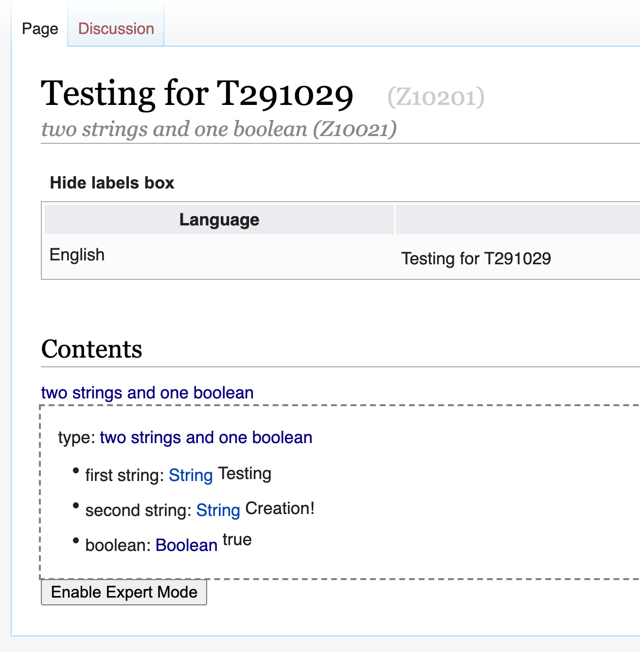
This is the current fall-back display:
If design this is not good enough, do you have specifics of what you'd want changed?
Ideally, this would be a (potentially quite large) design task.
Comment Actions
Here's a more detailed description for the cosmetic changes to the default display on user-defined types (and, in fact, all types without a bespoke component).
Here's a rough sketch: https://jsfiddle.net/L7atseoh/1/
(Note that the example would not be a valid ZObject of type Implementation, it is to illustrate the idea)
Note, this is a sketch, and not to be implemented exactly. Feel free to improve. But here's the rough idea:
Every ZObject that has no bespoke UX component should be displayed as a box (the box does not have to be closed on the right, but has to be on the top, left, and bottom).
The box has a header that has a key - value pair.
The key is displayed above the value (this helps with the mobile display).
In a key value pair, the key is always shown through its label (in the header it is always Z1K1, shown by its label, i.e. "type" in English). The key is displayed in a different style than the value (e.g. in bold and a bit smaller, other choices are also ok - if there is already a style on the page we can reuse, feel free to do so).
Since the value is always a ZObject, the value is displayed inline either through a bespoke UX component, or through this default component.
The header (i.e. the type) should be slightly highlighted, e.g. a grey background.
All other keys of the object are displayed one below the other.
Some bespoke UX should be available out of the box:
- References (display it as a hyperlink, using the label of the referenced object. We skip the box and the type header)
- Strings (display it in the color of normal text, surrounded by quotes. We skip the box and the type header)
- Lists (display them as an extra empty box around the list elements, with a noticeably different background color, e.g. darker than the header background. We skip the standard box and the type header.)
Corollary: if the type is a function call (for a generic type), this should work out of the box (since it is just a ZObject, and should work like everything else)
It would be great if the editing view would follow the display view as closely as possible, but I expect that there will be more things to be decided. Either ask, or move ahead as you see fit and then we'll refine.
If during implementation something works out better, let's discuss or try it out.
Comment Actions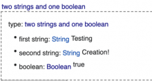
In order to make it a bit better understandable:
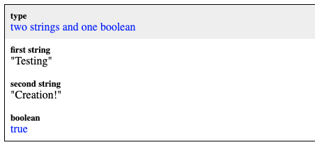
This part of Jameses screenshot above

would be refreshed to look like this:
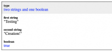
(or like this:
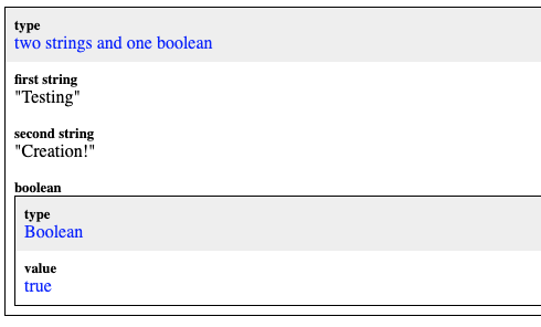
depending on whether the value of the key boolean is a literal or a reference)
I discussed it further with Aishwarya and she greenlighted it, so good to go to be implemented.
Again, these mockups are not meant to be pixel-perfect.