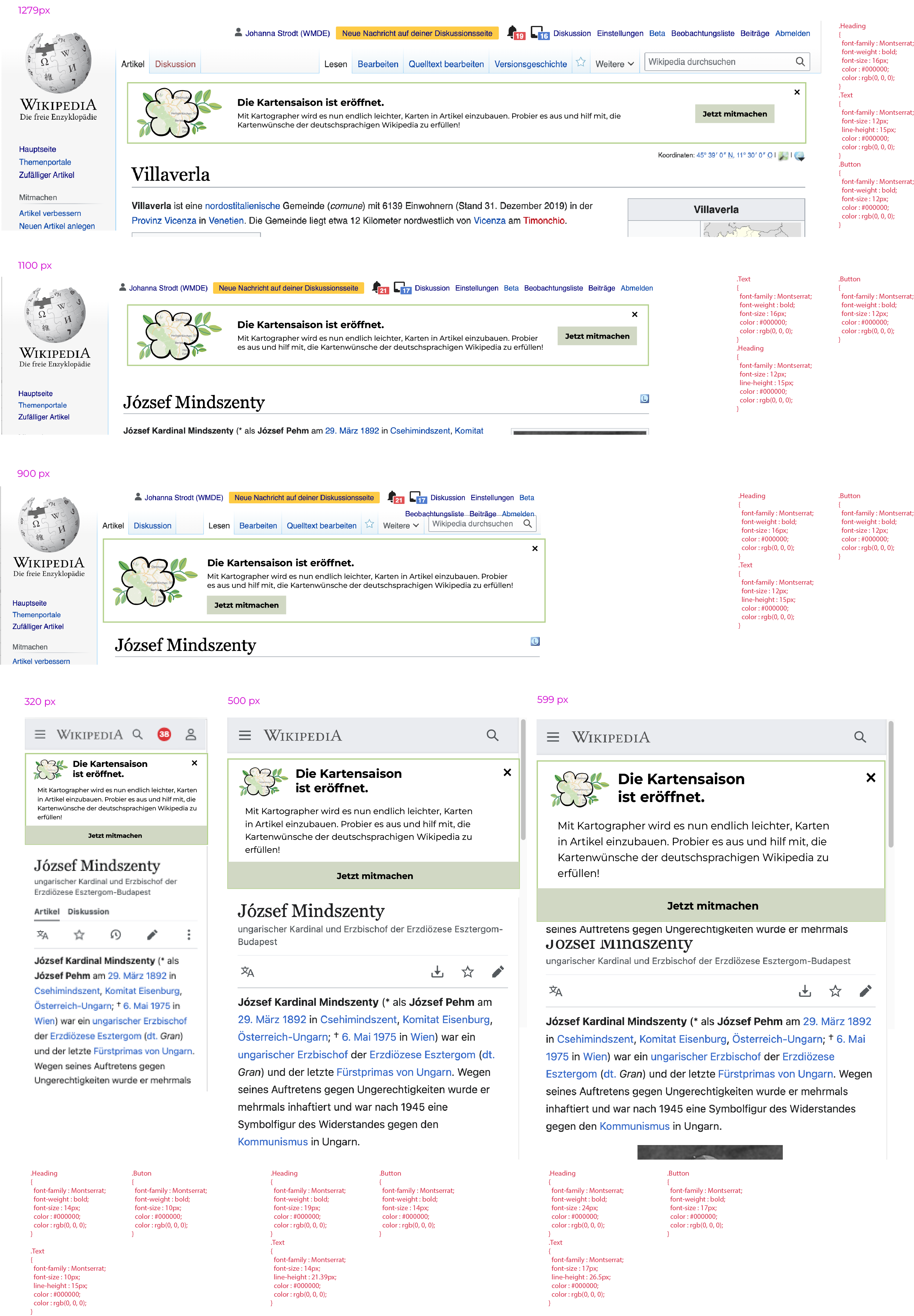
Page MenuHomePhabricator

set up banner for Kartensaison campaign
Closed, ResolvedPublic1 Estimated Story Points

Description

Design

kartensaison banner 5.png (4×3 px, 1 MB)

Images
Bildschirmfoto 2022-05-13 um 14.08.50.png (848×1 px, 575 KB)
https://commons.wikimedia.org/wiki/File:Grafik_für_Banner_Kartensaison_2022.png

Bildschirmfoto 2022-05-13 um 14.11.01.png (66×66 px, 4 KB)

Colors

  • border: #B3D08B
  • button background: #D1D8C4

Text

Fonts:

  • heading & button: Montserrat bold, Arial Black, Verdana bold, sans-serif bold
  • rest: Montserrat, Arial, Verdana, sans-serif

Text:

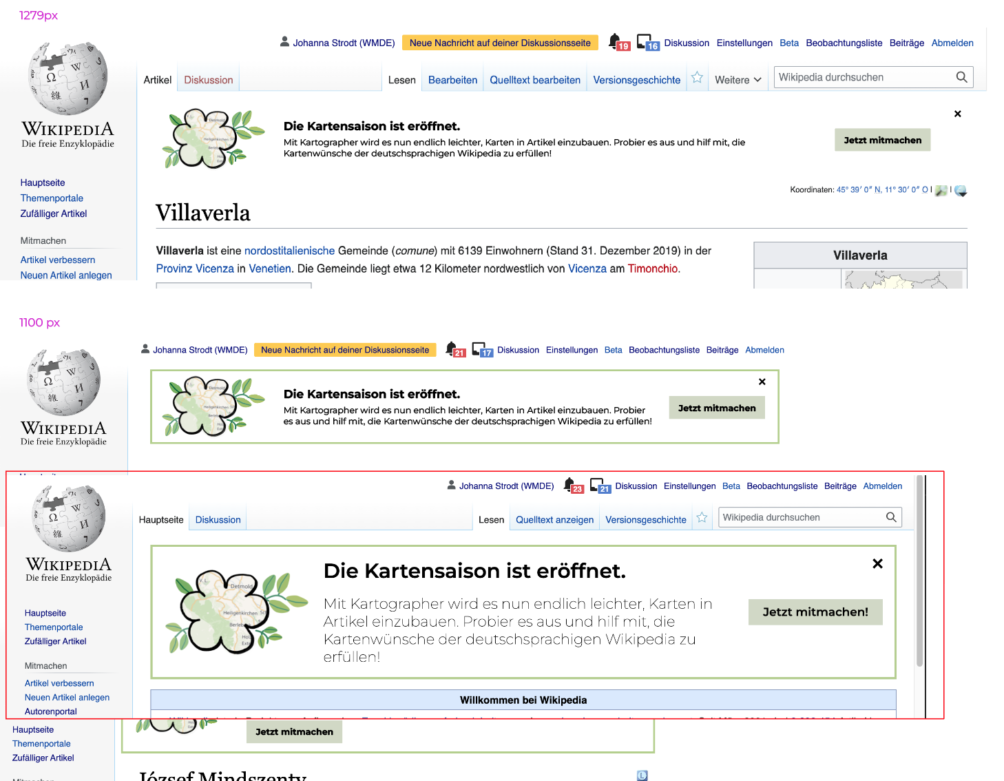
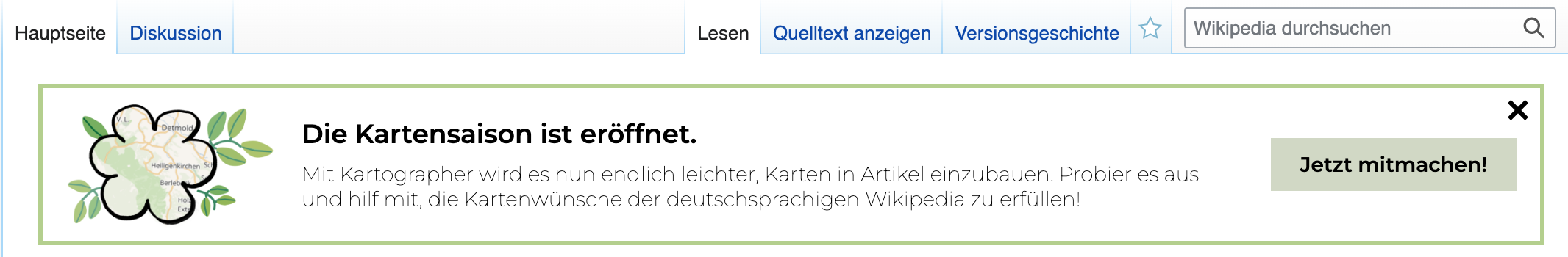
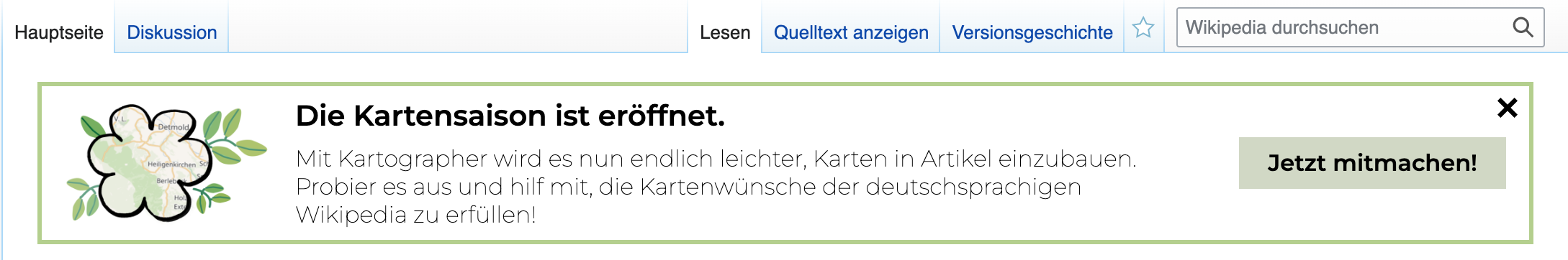
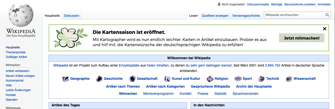
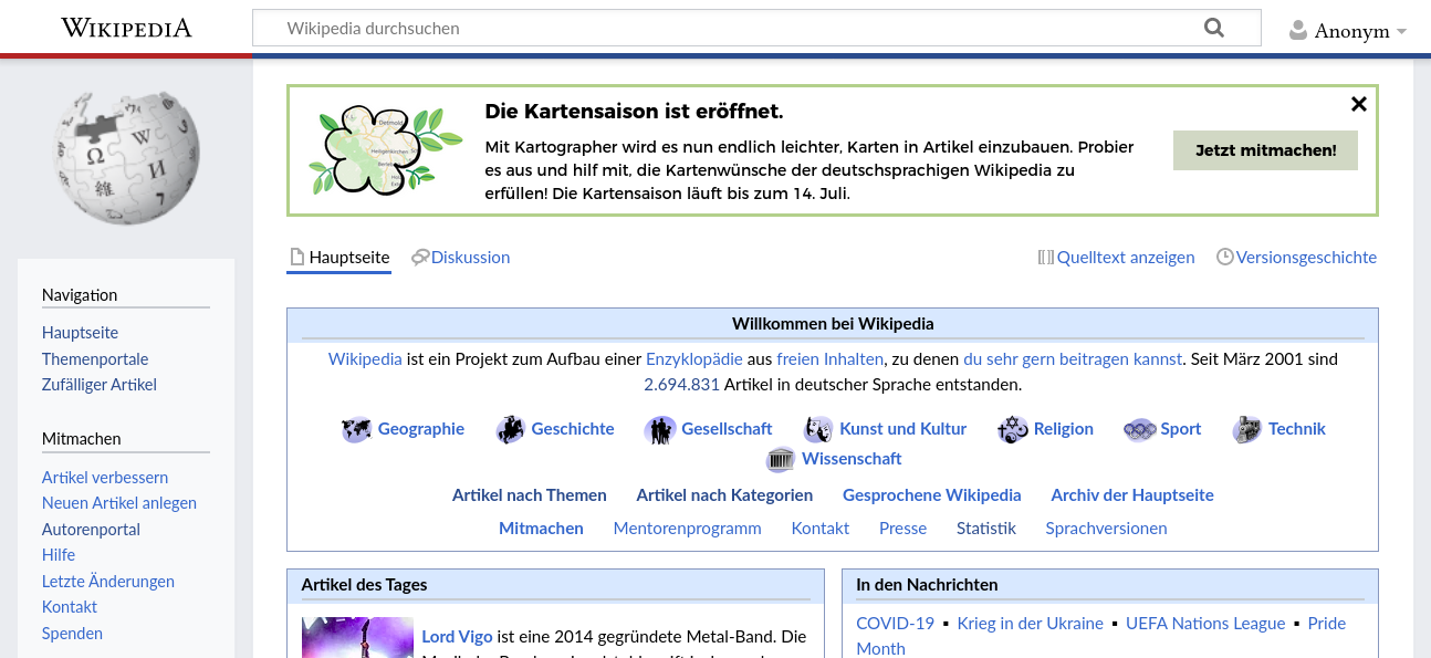
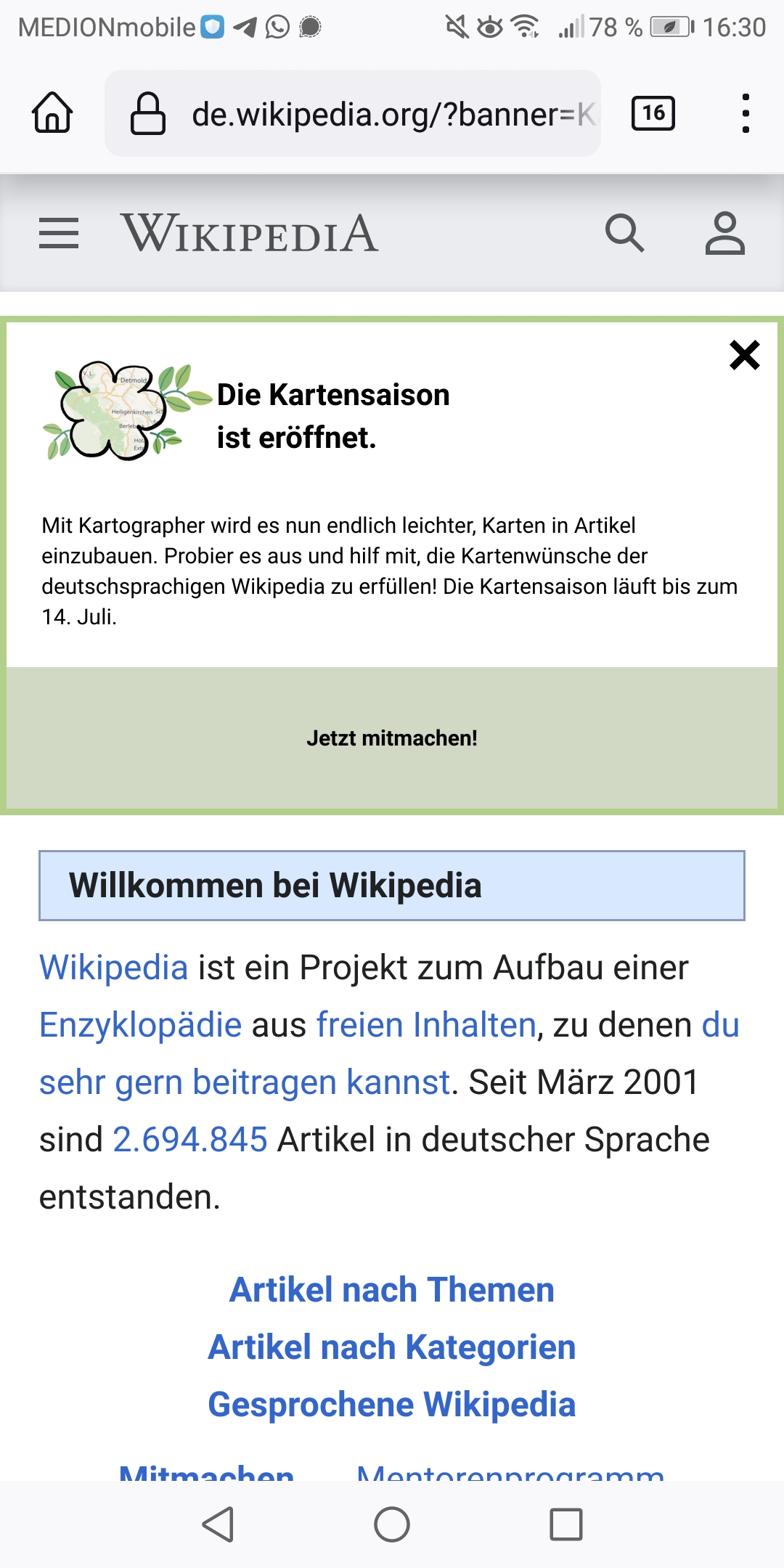
  • Heading: Die Kartensaison ist eröffnet.
  • Text: Mit Kartographer wird es nun endlich leichter, Karten in Artikel einzubauen. Probier es aus und hilf mit, die Kartenwünsche der deutschsprachigen Wikipedia zu erfüllen! Die Kartensaison läuft bis zum 14. Juli.
  • Button: Jetzt mitmachen!

Link target: https://de.wikipedia.org/wiki/Wikipedia:Kartensaison ((to be created))

Logging

Logged Events

  • Banner closed
  • Banner clicked

Timeline

  • banner start: June 20
  • banner end: July 14, 2022

Central Notice

Central Notice request: Kartensaison – creating maps with Kartographer

Central Notice setup

  • Projects: Wikipedia
  • Languages: German
  • Countries (and regions): X
  • Traffic limit: 30%
  • Maximum impression count: 3
  • Users (logged in or anonymous): logged in
  • Devices: desktop, android, iphone, ipad

Related Objects

Event Timeline

JStrodt_WMDE updated the task description. (Show Details)
kai.nissen set the point value for this task to 5.May 23 2022, 9:48 AM

Thank you, @AbbanWMDE! The banner looks quite big. In this case, it's important that it is fairly small.

I made a quick little mock of how this banner looks in comparison to the design:

Bildschirmfoto 2022-05-25 um 13.41.46.png (1×1 px, 479 KB)

The way the banner currently looks is at the bottom, framed in red.

@JStrodt_WMDE Ah, I eyed in the font sizes because the specifications in the original screenshot were a bit weird. Eg, if you look at the .Text element you can see it goes from 12px at 900, 16px at 1100, then back to 12px at 1279. Can you clarify the sizes for me? Or if you send me the original file, or give me access to the Figma I can grab them myself from the document.

kai.nissen changed the point value for this task from 5 to 1.May 30 2022, 10:05 AM

@JStrodt_WMDE I adjusted the text sizes and that should match up to the design now.

I made one small change - I let the text size increase a little on larger screens because there was room for it.

@AbbanWMDE It seems to me that the font weight is different than the one in the mocks. It seems to be thin, but should be regular. Could you have a look?
That's what it looks like on my screen:

Bildschirmfoto 2022-06-02 um 09.05.06.png (350×2 px, 161 KB)

At 1263 x 695, font size and padding look like this, which is good:

Bildschirmfoto 2022-06-02 um 09.05.06.png (350×2 px, 161 KB)

Starting from 1279 x 695, the text gets bigger, making the whole banner look quite packed.

Bildschirmfoto 2022-06-02 um 09.06.36.png (362×2 px, 170 KB)

@JStrodt_WMDE The font weight is a weird one because it's appearing as regular on my machine, and is not so squished in looking. I must have a different version of Montserrat or something, I'll investigate.

Screenshot 2022-06-02 at 13.26.13.png (444×1 px, 179 KB)

Thanks, @AbbanWMDE! I'll hand over to @Timur_Vorkul_WMDE for testing further.

Just a little note regarding font size: As a rule of thumb, the font size should be approximately the same size as the font size in the article content.

We don't follow that rule for the fundraising ones :) Big screen, big fonts.

Those banners are updated with better font weights and reduced sizes now.

Those banners are updated with better font weights and reduced sizes now.

Much better! Thank you.
You may have noticed that I have added a sentence to the copy text. Could you add that as well?

Thanks a lot.

On the big monitor there is no problem as it's all one line. On the small laptop, whenever there are three rows the texts looks pretty packed (gedrängt) for me as well.

image.png (595×1 px, 181 KB)

The Timeless skin has a bigger line spacing and is therefore more pleasant to read.
image.png (595×1 px, 194 KB)

Maybe a slighlty bigger line spacing could help.

On the minerva skin on a mobile phone the top and the bottom padding is too big, and also the spacing between the headline and the text needs to be somewhat reduced:

Minverva mobile.jpg (2×1 px, 510 KB)

Are the other skins besides Minerva also relevant for the mobile phone? There were some minor issues too but I won't list them here as I suppose they are not widely used on mobile phones.

Thanks very much for you work!

  • 1.5 line height on text.
  • Reduced padding on small sizes.
awight subscribed.

The country filter is currently set to limit to Germany, but I don't think that's what we want. From the description:

Countries (and regions): X

Also, the start and end dates need to be updated on the campaign:

banner start: June 20
banner end: July 14, 2022

Thank you!

The country filter is currently set to limit to Germany, but I don't think that's what we want.

I don't know what X means, though? I can turn off geotargeting, which I think means anyone with their language set to de will see it. I'll ask Kai.

The country filter is currently set to limit to Germany, but I don't think that's what we want.

I don't know what X means, though? I can turn off geotargeting, which I think means anyone with their language set to de will see it. I'll ask Kai.

That's what we want, yes!

That's sorted so. I've just left it disabled for now, while we wait for a CN admin to approve the banner request.

Great, thank you! The campaign seems to match the spec now.

@awight @JStrodt_WMDE I've enabled the campaign and set it to go live at 12 our time. Let me know if you want that time changed.