How many times were you able to reproduce it?
Every time
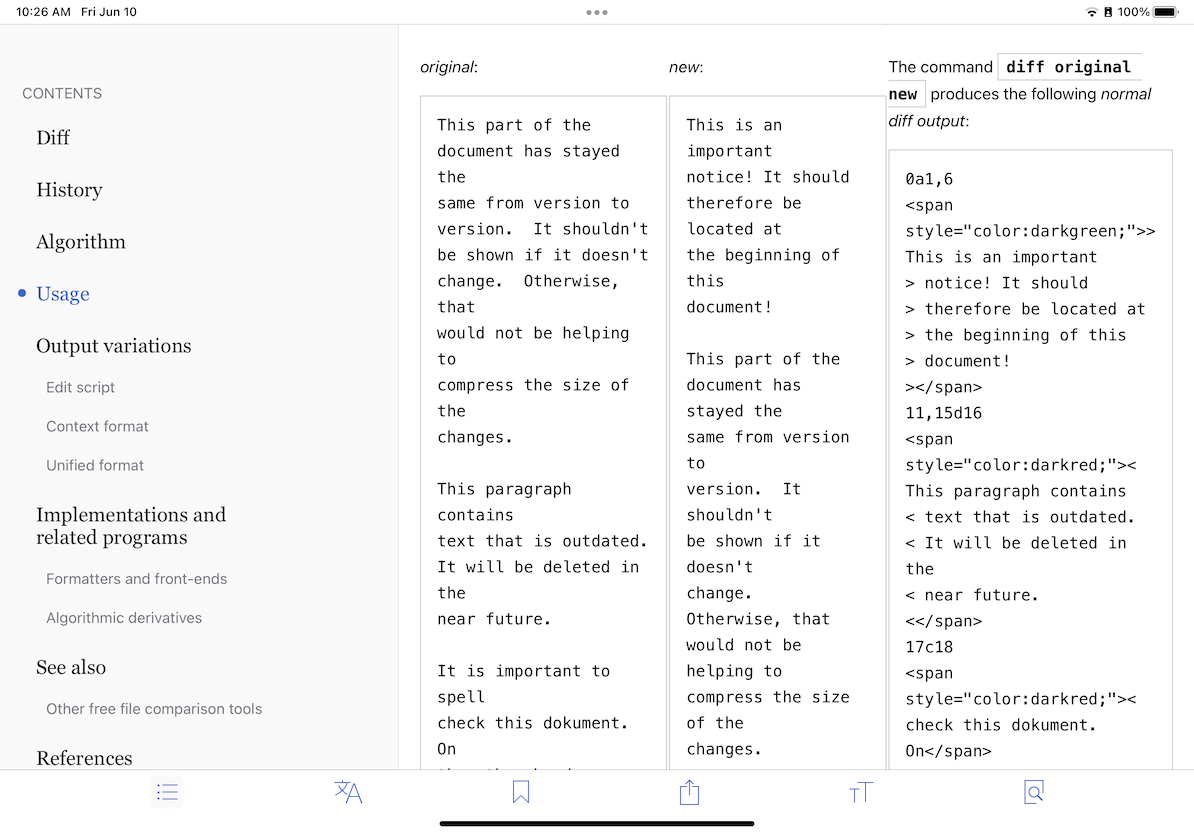
Steps to reproduce
- Go to article "diff" on EN Wikipedia
- Scroll to "Usage" section, observe the 3 column area of code
Expected results
Code section has syntax coloring
Actual results
Code section does not (later code sections in the same article do)
Screenshots
Environments observed
App version: 6.9.1 (1930)
OS versions: iOS 15.0.2
Device model: iPad Pro 2nd gen
Device language: EN
Affected articles?
- Diff on EN