Page MenuHomePhabricator

Slight overflow on iPhoneSE with Vector-2022 due to header
Open, LowestPublicBUG REPORT

Description

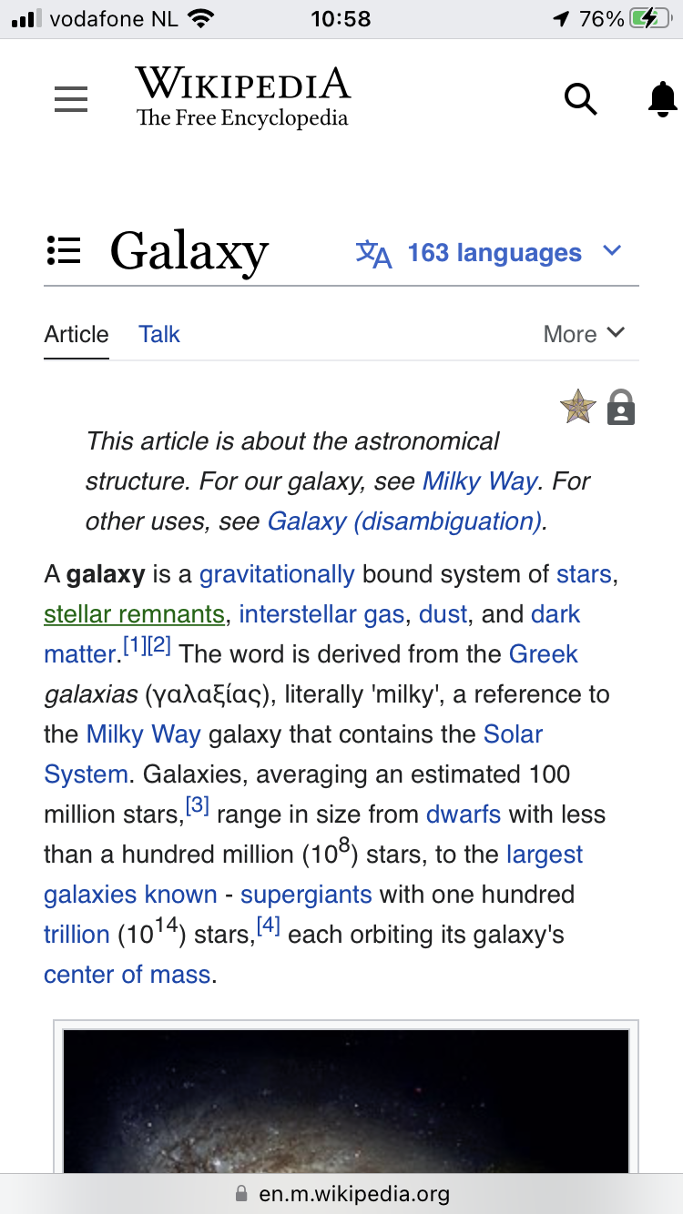
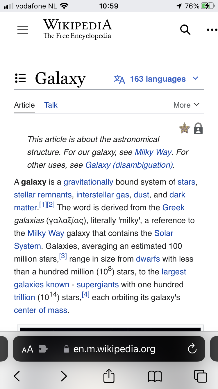
Steps to replicate the issue (include links if applicable):

What happens?:
The viewport slightly overflows. The contents of the top bar are just a nip too wide for the screen.

What should have happened instead?:
Should not have overflowed the viewport as this is still a pretty common phone.

Software version (skip for WMF-hosted wikis like Wikipedia):

Other information (browser name/version, screenshots, etc.):

BF42FAF2-1189-41ED-AD32-2390428CBBD4.png (1×750 px, 518 KB)

3F6FD360-93B5-4595-9BB1-BC18B8F47FFC.png (1×750 px, 664 KB)

Event Timeline

TheDJ triaged this task as Lowest priority.Jul 19 2022, 9:04 AM
TheDJ added a project: Mobile.

low priority, as currently not targeting mobile

Jdlrobson renamed this task from Slight overflow on iPhoneSE with Vector-2022 to Slight overflow on iPhoneSE with Vector-2022 due to header.Jul 19 2022, 3:23 PM
Jdlrobson subscribed.

Confirming that we know about this problem and that it is currently low. We also need to fix problems with large images and tables.

We fixed this in TDF wiki by adding this to MediaWiki:Common.css:

.mw-logo {
  min-width: 10rem;
}

The overly wide logo element was pushing the user controls element out when the page width was 360px.

This only impacts third parties for now (who set $wgDefaultMobileSkin = 'vector-2022';) as far as I'm aware as we currently don't have active plans to make the mobile default skin Vector (T106463 is currently unplanned). The issue is more than just the logo - for instance long titles are not particularly handled well with the current placement of languages and table of contents icon.