Page MenuHomePhabricator

Display alerts linking to Phabricator tickets for collections with access issues
Closed, ResolvedPublic

Description

We sometimes have access issues with specific collections, for example when our access has expired and we need to speak to partners to get it renewed, or when there is a proxy configuration issue we're working on.

Currently, the library interface does not communicate these issues to users, causing them to be confused when a collection doesn't work as intended. We could display some kind of alert symbol to users which links to a Phabricator ticket tracking the issue so that users are informed when a collection isn't working correctly, and have a ticket to follow to track our work to fix it.
Event Timeline

This seems like a good initiative. Perhaps have a symbol next to the field indicators - along the lines of 'Maintenance', 'Renovations' or, the classic, 'Technical difficulties'.

Show the panel but make the "Access Collection" button whitened out and non-functional. To the immediate right, display the alert symbol.

This is ready for a look. I'm not totally sure on the language I'm using "issue", "outage", etc, and I'm just implementing this as simply as I can by avoiding adding more logic to remove/disable the access button and sticking with the default bootstrap button colors.

Thanks @jsn.sherman!

I think Service Issue and Service Information are OK, but I'm less keen on "Service outage". The scope for that item is when we don't have any more access than an anonymous user, right? In that case I think something like "Temporarily unavailable" might be more descriptive.

Related nitpick, I think the text shouldn't be capitalised, e.g. Service information

Okay, I've taken another pass here:

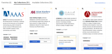
image.png (732×1 px, 246 KB)

That looks great! Just to clarify behaviour - is that message below always visible or does it show after you click the button?

Just realized the text is still capitalized; that's an oversight

That's expanded with a click. Would you like me to stick this on staging?

That's expanded with a click. Would you like me to stick this on staging?

Please!

I'll let you know when it's live!

It's live on staging. I can see I need to hook into the cache flushing there, which is not a big deal. For now, you'll need to favorite/unfavorite something to see a change.

Note that I've take a pass at streamline the help text in the collapsible element:
We're currently at:

502         # Translators: information about the current status of this partner
503         (INFO, _("Ongoing work may impact access")),
504         # Translators: information about a current issue with this partner
505         (WARNING, _("An issue is impacting access")),
506         # Translators: information about a current outage for this partner
507         (DANGER, _("Access is currently unavailable")),
508     )

I've implemented changes based on Susana's feedback and pushed them to staging

Flagged OUP collections, this is looking good!