Upstream issue https://gitlab.com/gitlab-org/gitlab/-/issues/386736
Our Gitlab announce has an announce banner showing from time to time. Currently one about a planned downtime next Monday. The text is very dark gray in front of a dark green which makes it unreadable to me:
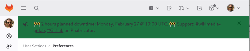
Hand picking the color used and passing them through an accessibility tool to check the contrast https://webaim.org/resources/contrastchecker/?fcolor=535158&bcolor=1C7441 it has a low 1.34:1 ratio and fails all the recommendations ;)
Either the background should be lighter, or the text should be turned to white.
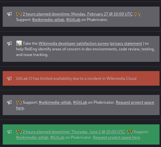
Early this week there was another message albeit I think with a different color, which was similarly not readable (to me). Since I am admin, I can list all previous banners from https://gitlab.wikimedia.org/admin/broadcast_messages
The sole I can read is the 4th one with a gray background, and even there, the contrast is a little low (at least to me). I have looked at each of the available themes, and they all suffer from the same issue: the text is too dark ;)