Original report: https://en.wikivoyage.org/wiki/Wikivoyage:Travellers%27_pub#Shrunk_banners
Steps to replicate the issue (include links if applicable):
What happens?:
Bug 1, for all users: There is a lot of space before the banner.
Bug 2, for all users: The items in de ToC are pretty small and hard to read
Bug 3, for Safari users. The banner seems to be only 20% of the required height
All of this has to do with modifications that desktop improvements has made.
Causes
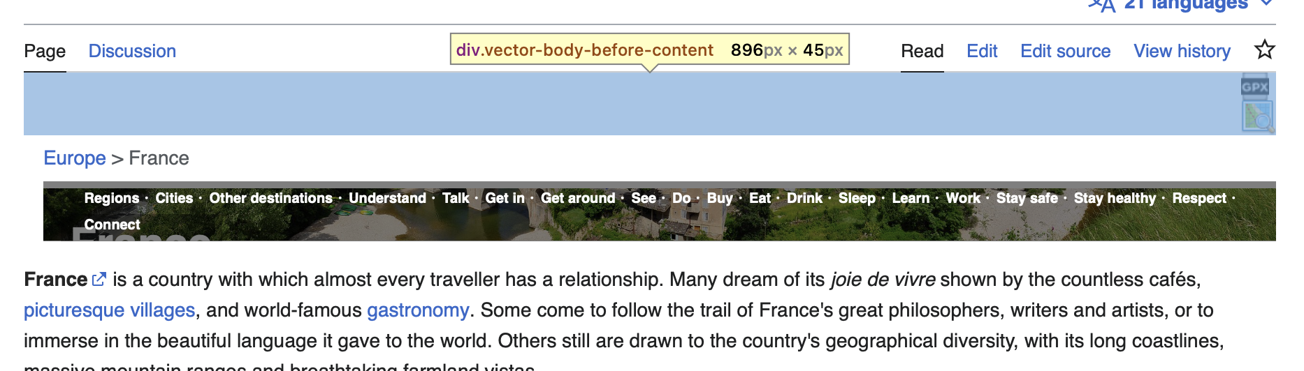
Bug 1: The vector-body-before-content is a display:block uses overflow:hidden, to create a new block formatting context, which negates the floate of the mw-indicators, which normally would take up 0 height and thus pushes the banner down.
Bug 2: The font-size of contentSub is overridden from 100% to 84% by specificity increase due to zebra-feature wrapping.
Bug 3: The font-size change somehow seems to trigger a subpixel sizing bug in Safari. The width of the image is set to 100% and height to auto, yet with the font size change, it seems that when the responsive sizing applies, it incorrectly pixel rounds the image dimensions. A height of say 126 pixels, becomes 126.24px when that font-size option is set. This causes the image to be larger than its container (this should not be possible, it's clearly a safari bug). Because the image is bigger than the container, it then triggers portrait detection, which in turn sets a margin-top, that causes half the picture to become way to small vertically.
Screenshots
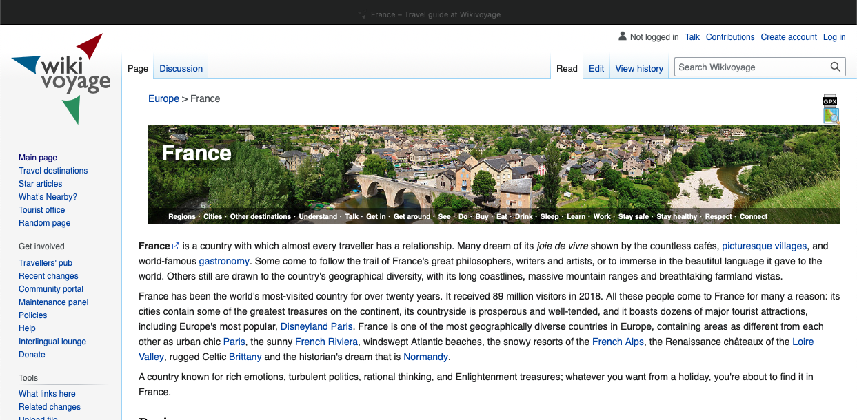
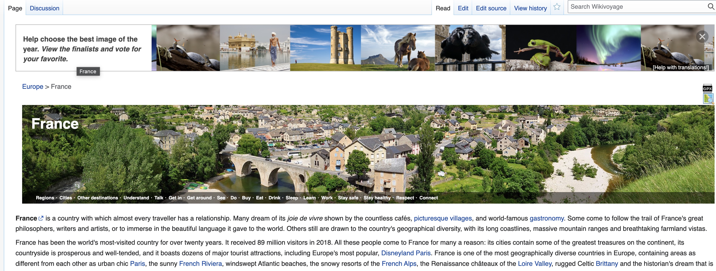
Original Vector:
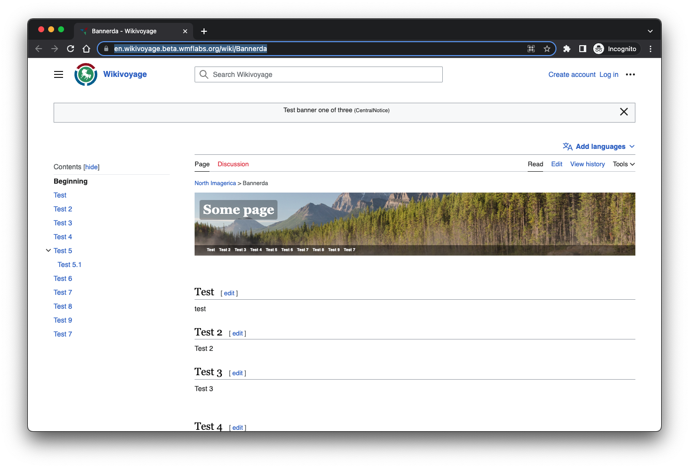
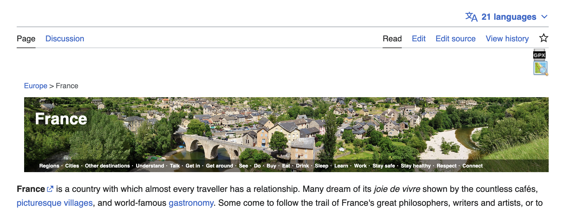
Vector 2022 Chrome:
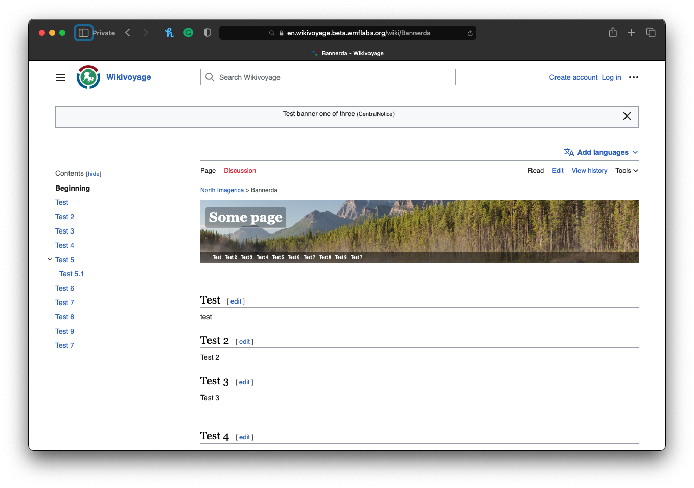
Vector 2022 Safari:
QA Results - Beta
| AC | Status | Details |
|---|---|---|
| 1 | ✅ | T336264#8857193 |
QA Results - Prod
| AC | Status | Details |
|---|---|---|
| 1 | ✅ | T336264#8871416 |