Background
Create the Toggle/Selection Chip in Codex.
Description
Chip that can be selected in order to filter information.
User stories
- As a user I need a chip than can be selected.
History
- Some discussions about this component in the Topic selection dialog in Growth T336161.
Known use cases
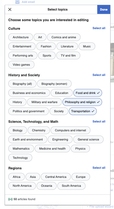 | Topic selection dialog in Growth T336161 |
Existing implementations
These artifacts are listed for historical context. The figma spec, linked below, is the source of truth for the new component.
Wikimedia community:
- Design style guide: -
- OOUI: -
- Vue: -
External libraries:
- Add links to any examples from external libraries
Codex implementation
Component task owners
- Designer: add the main designer's name
- Developer: add the main developer's name
Open questions
- Chip size: do we want to implement this new bigger size? Or do we want to use the 24px size used in Info and Filter chips?
- Check icon placement: on left or on right?
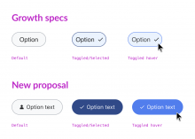
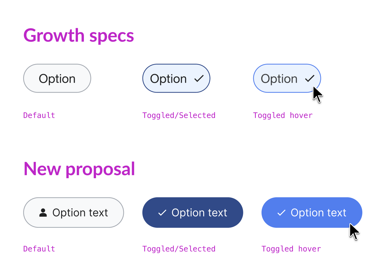
- Toggled/Selected state style: do we want to follow the Growth specs or do we want to use the background-color-progressive-active used in other toggle elements such as ToggleButtons?
Design spec
Once a component spec sheet has been created in Figma, remove the note stating that the spec is missing and link to the spec below.
A component spec sheet has not been created yet.
| Component spec sheet |
Anatomy
Designer should list the structure and properties of the component.
Style
Designer should list the visual features of the component.
Interaction
Designer should list interaction specifications.
Documentation
Designer should describe how the component should be documented, including configurable and standalone demos.
Acceptance criteria
Minimum viable product
This task covers the minimum viable product (MVP) version of this component. MVP includes basic layout, default states, and most important functionality.
MVP scope
- List all parts of the MVP scope for this component
Design
- Design the Figma spec sheet and add a link to it in this task
- Update the component in the Figma library. This step will be done by a DST member.
Code
- Implement the component in Codex
Future work
- If applicable, list future work that should be done for this component after the MVP is implemented as part of this task. You should open new, standalone tasks for all future work.