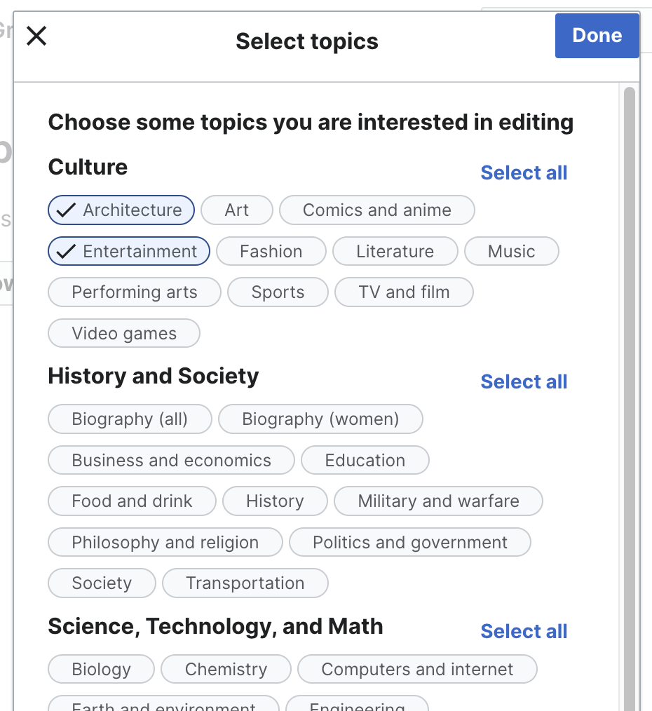
This is a dialog element that provides the user an interface to select topics of interest before starting a task.
By default, there is no selection of topics and all topics are displayed.
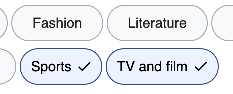
Topics are grouped by subject, and each subject includes a "Select all" button.
In the footer, the dialog displays the number of editions found for the selected topics.
Description
Details
Status | Subtype | Assigned | Task | ||
---|---|---|---|---|---|
Open | None | T340453 [Epic] FY 2023-24 Growth Maintenance Work | |||
Open | None | T325082 Eslint: configure browser compatibility | |||
Open | None | T367429 [Epic] FY 2024-25 Growth Maintenance Work | |||
Open | Sgs | T296646 [Epic] Migration of front-end modules to Vue.js components | |||
Resolved | KStoller-WMF | T329033 [Internship] Modernization of web interfaces using Vue.js | |||
Stalled | None | T336161 Refactor the "topic selection dialog" selection dialog to Vue | |||
Open | None | T340395 Add a Pinia store to manage state in filter dialogs |
Event Timeline
Change 927673 had a related patch set uploaded (by Viviana Yanez; author: Viviana Yanez):
[mediawiki/extensions/GrowthExperiments@master] Frontend documentation: Refactor the "topic selection dialog" selection dialog to Vue
Change 931561 had a related patch set uploaded (by Viviana Yanez; author: Viviana Yanez):
[mediawiki/extensions/GrowthExperiments@master] Frontend documentation: Refactor the "topic selection dialog" selection dialog to Vue
Topics inside this dialog are shown inside an interactive chip element:
To implement this with Vue and Codex, we created a <SelectableInfoChip> component, using the <CdxInfoChip> and adding CSS styles to it, to meet the design specs when a topic is and is not selected. As the existing Codex InfoChip component is a non-interactive component, we wanted to know if DST have any recommendation on how to approach this in a better way.
Also, if keeping this approach, we would like to take advantage of the icon prop in the InfoChip component. But the problem that we are facing is that it places the icon before the text:
So we want to know if this is something that can be revisited at design level or if we may add an icon element inside the InfoChip content, so it can be displayed after the text. @bmartinezcalvo @RHo
Thanks for the question @VYanez-WMF. I think this depends on if DST will work on this Selectable chip component any time soon, and when Growth wants to move on this work.
If this is something the Growth team wants to would like to proceed with now and DST has not yet prioritised/planned this selectable chip component, then I'd suggest refactoring per the spec of the existing filter design first. Else if it can wait, then a similar collaboration as the onboarding dialog could work well.
@VYanez-WMF @RHo I've created this new task T340110 in the DST board with this component, and I've flagged the following open questions we should solve in order to add this component in Codex:
- Chip size: do we want to implement this new bigger size? Or do we want to use the 24px size used in Info and Filter chips?
- Check icon placement: on left or on right?
- Toggled/Selected state style: do we want to follow the Growth specs or do we want to use the background-color-progressive-active used in other toggle elements such as ToggleButtons?
Anyway, I agree with Rita. Since we will need to explore this new Toggle/Selection chip in deep in order to solve the open questions listed above, I think the best solution now is to follow the Growth specs to avoid blocking this task.