Page MenuHomePhabricator

Mismatch Finder shows a blank page without Javascript enabled
Closed, ResolvedPublic8 Estimated Story PointsBUG REPORT

Description

Report

Steps to replicate the issue (include links if applicable):

What happens?:

The page is blank.

What should have happened instead?:

At the very least, there should be a message saying that Javascript is required.

Ideally Javascript shouldn't be required to only view the page, e.g. it should be possible to see what the tool is and what it does before deciding if you're interested enough to enable Javascript for it.

Solution

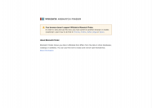
We'll display a clarifying message with some helpful links, and some introductory information about the tool:

Screenshot 2023-09-12 at 17.57.38.png (1×2 px, 125 KB)

Note: We'll use the Codex CSS-only version of Message, and Codex tokens to style texts and define breakpoints. We'll have to create custom variables in rem for spacing (these are not available in Codex).

Desktop logo (above 640px):


Mobile logo (below 640px):

Related task: T345066: Query Builder shows insufficient information when Javascript is disabled
Event Timeline

@Sarai-WMDE Do you have a simple copy/mockup for this? Then we could mark is as a good first task.

Designs/copy to improve this scenario need to be defined. I'll think of options and look for any potential previous approaches and share them here, so we make a joined decision.

Sarai-WMDE moved this task from Backlog to Next on the Wikidata-UX board.

Heads-up that this is the non-js message displayed by Wikidata Query builder at the moment:

Screenshot 2023-08-17 at 16.41.51.png (1×2 px, 107 KB)

We might want to update/improve this too.

Mock-up:

Screenshot 2023-08-28 at 12.19.20.png (1×2 px, 130 KB)

Attachment: Wikidata logo

WD_Logo.png (24×160 px, 1 KB)

Open question: should we use Codex styles and CSS-only components (message)?

Sarai-WMDE updated the task description. (Show Details)

I think it should be possible to load codex tokens using Blade's assets syntax, as codex tokens may be used as css custom properties.

Task Breakdown Notes:

Potential Plan of Action

  1. Add codex tokens and css to project
  2. Extend app.blade.php and implement the required design inside it (or in a separate template file that is included within)

@Sarai-WMDE I have 2 questions regarding the final design:
1 . How should it look like between breakpoints? I mean, with 550px width, should it look like tablet design or mobile design?

  1. How should it look like at breakpoints? For example; at exactly 320px width should it look like tablet design or mobile design?

Hey @HasanAkgun_WMDE! Thanks for the questions. I tried to reflect that on the specs, but this is always tricky to communicate. We're working with 3 breakpoints:

$min-width-breakpoint-mobile (320px): Where the horizontal margins of the page should be 24px.
$min-width-breakpoint-tablet (640px): Where the horizontal margins become a minimum of 32px. At some point between this breakpoint and the desktop one (precisely at 744px), the content will reach its max-width: 680px. Beyond that, the horizontal margins will increase in size, but the content's width won't change.
$min-width-breakpoint-desktop (1120px): Same as above, so the breakpoint might not need to be specified? The content keeps its max width and the margins grow in width to take over the rest of the viewport.

For all breakpoints, the top margin (space above the logo) should be 10vw (let's see how that feels once implemented, this spaccing might need some adjustment).

Please let me know if anything is still unclear or missing 🙏

@HasanAkgun_WMDE I cannot peer review if I don't know what is to be reviewed :)

@HasanAkgun_WMDE I cannot peer review if I don't know what is to be reviewed :)

@noarave It would be great to have a general review of the code and check if it applies designs on Figma for all screen sizes.

@HasanAkgun_WMDE gladly, but you need to link the code in the task for us to be able to do that

@HasanAkgun_WMDE gladly, but you need to link the code in the task for us to be able to do that

Haha so sorry! Here it is.

Design review done. Verification was done on Chrome 117, Safari 17 and Firefox 11. Everything appears to follow the specs to the millimeter 👍🏻 Funny enough, the only thing that needs fixing is an extra period at the end of the first sentence of the message. It should just be deleted:

Screenshot 2023-10-09 at 10.43.21.png (294×1 px, 64 KB)

Arian_Bozorg subscribed.

This looks good to me once the typo that Sarai pointed out is resolved :)

Thanks so much!

We have added the fix to the most recent code, but it's not on staging right now. Should we proceed anyways? @Arian_Bozorg

Thanks Hasan :)

All good then, the rest looks good to me