Page MenuHomePhabricator

[WtC-M2] Replace WiKit Button component by Codex's
Closed, ResolvedPublic5 Estimated Story Points

Description

Problem

The Mismatch Finder's user interface was composed using a combination of Vue 2 custom components and WiKit elements, such as Button. The WiKit design system is now on its deprecation path, as it has been superseded by Codex, the official Wikimedia design system. The utilization of WiKit components is not recommended, and they should be replaced in order to reduce maintenance costs and ensure consistency.

Solution

We have to replace the WiKit Button by the Codex equivalent: cdx-button (See demo). This will take us a step closer to switching to the new design system and deprecating the old.

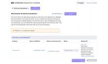
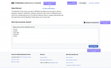
Main pageResults page
Screenshot 2023-09-19 at 17.49.32.png (1×2 px, 246 KB)
Screenshot 2023-09-19 at 17.51.37.png (1×2 px, 228 KB)
Acceptance criteria
  • All WiKit Button types in Mismatch Finder are replaced by their Codex equivalent
Event Timeline

Potential Plan of Action:

  1. Find all usages of Wikit Button
  2. Replace with the appropriate button configuration (flavor and type) from Codex

Hello @Sarai-WMDE : I have replaced the buttons and this is how it looks now. The icons are somewhat bigger and the buttons smaller and it looks a bit odd. What do you suggest we do in this case? The latest version is in https://mismatch-finder-staging.toolforge.org/

Hey @guergana.tzatchkova! At 20px, the icons included in the buttons are the right size. The buttons have the expected 32px height too. Do you see anything different? I checked Chrome, Safari and Firefox. I do see a misalignment issue: even if icons are middle-aligned, the look off-center in relation to the button's label. That's unfortunately a bug that the Codex team haven't been able to find an ideal solution for yet. See issue for more details: https://phabricator.wikimedia.org/T326900

Hi @Sarai-WMDE yes that's what I was referring to. The icons look misaligned. What is the best course of action in this case? Should we merge this as it is and wait for this to be solved by Codex in the future? Do we want to have the misaligned items now in the MIsmatch Finder production website?

I realized later that I should have provided more guidance here, sorry @guergana.tzatchkova: I believe that the best course of action would be to fix the misalignment in our domain and prevent the issue from being displayed in production. We are free to apply the solution that we find most appropriate.

Please check again @Sarai-WMDE , I have added a temporary fix for the misalignment issue: https://mismatch-finder-staging.toolforge.org/

Thanks for the fix, @guergana.tzatchkova! Looks like vertical-align: text-top; does the trick in our default 16px font environment 👍🏻
Users who have reduced the size of their browser font below 16px will still see a slight misalignment between the button icon and its label, but I don't think this is unacceptable. Apparently, none of the possible solutions explored until now stays optimal in all cases. Luckily, bigger font sizes are not an issue.
I checked our approach in our staging environment, setting different font sizes in Chrome 119, Safari 17 and Firefox 119.