Page MenuHomePhabricator

Vertical centering issues of text/multiline text and icons in several components
Open, HighPublic

Assigned To
None
Authored By
Volker_E
Jan 13 2023, 2:59 AM
Referenced Files
F36932537: Screenshot 2023-03-29 at 2.57.48 PM.png
Mar 29 2023, 7:59 PM
F36455369: image.png
Jan 23 2023, 6:54 PM
F36455376: image.png
Jan 23 2023, 6:54 PM
F36175455: image (4).png
Jan 13 2023, 2:59 AM
F36175452: image (3).png
Jan 13 2023, 2:59 AM
F36175449: image (2).png
Jan 13 2023, 2:59 AM
F36175447: image (1).png
Jan 13 2023, 2:59 AM

Description

Background

Exposed by the testing of new relative sizing of certain token categories and by that certain Components like Thumbnail or Icon, we're more clear than ever about vertical alignment issues between icons/thumbnails and surrounding text, for example in Message, MenuItem or ButtonGroups all with their own challenges: span.cdx-icon and text not embedded in a tag, span.cdx-icon and block level elements with surrounding text etc.

Potential resolutions

Exemplified caring about the button icons, there are few paths with pros and cons available:

  1. We could separate out rules for icon-only buttons for perfect rendering with Flexbox. But then we'd have different positioning of icon-only and icon + text buttons. Also we would have to invent an icon-only ToggleButton class. Maybe not a bad idea anyways, to be equal to Button. But the patch would grow and grow
  2. We could only have an approximation of positioning to perfect center on all font sizes with vertical alignment and Flexbox, that would at least have icons always slightly uncentered displayed in all button types
  3. We could add a span around the textual content to rule icon and button text separately, but that would mean a lot more code and customization either

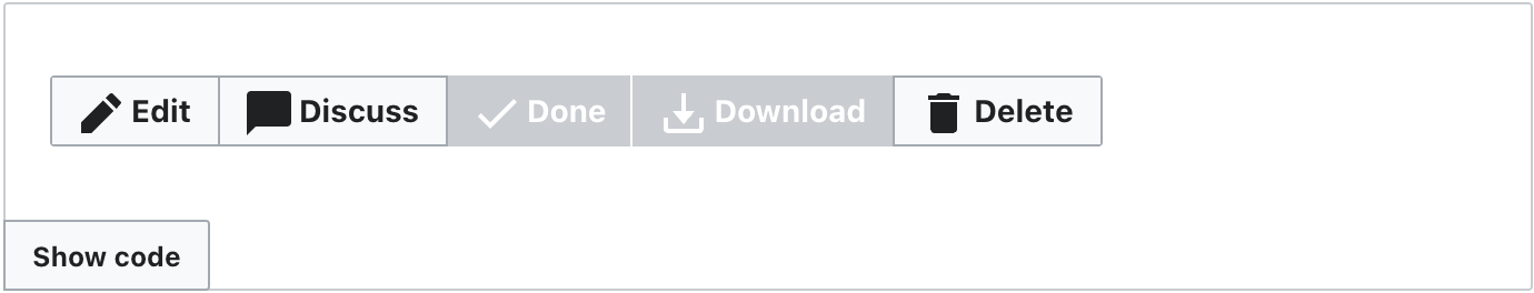
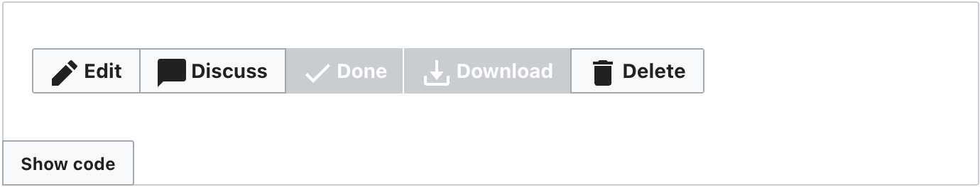
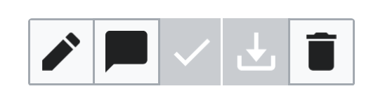
Screenshots exemplified on ButtonGroups

16px base
image (3).png (864×1 px, 106 KB)
vertical-align: middle (16)
image (1).png (844×1 px, 105 KB)
vertical-align: text-bottom (16)
14px base
image (4).png (804×1 px, 96 KB)
vertical-align: middle (14)
image (2).png (804×1 px, 96 KB)
vertical-align: text-bottom (14)

Developer notes
Note, that Flexbox is of no help here, cause going from inline-flex to flex would result in text being underneath icon without extra span.

Related Objects

StatusSubtypeAssignedTask
Resolvedegardner
ResolvedNone
OpenNone
OpenNone
Duplicate STH
InvalidNone
ResolvedVolker_E
ResolvedCatrope
ResolvedVolker_E
ResolvedNone
Resolvedbmartinezcalvo
ResolvedVolker_E
ResolvedVolker_E
ResolvedVolker_E
ResolvedVolker_E
Resolvedldelench_wmf
ResolvedVolker_E
Resolved EUdoh-WMF
ResolvedSarai-WMDE
Resolved DAbad
ResolvedVolker_E
Resolvedbmartinezcalvo
Resolved KieranMcCann
OpenNone
DuplicateNone
ResolvedVolker_E
Resolved DAbad
ResolvedVolker_E
Resolved DAbad
ResolvedSarai-WMDE
ResolvedVolker_E
ResolvedVolker_E
ResolvedVolker_E
ResolvedVolker_E
ResolvedSarai-WMDE
ResolvedVolker_E
Resolvedbmartinezcalvo
ResolvedCatrope
Resolved DAbad
ResolvedVolker_E
OpenNone
ResolvedCatrope
OpenNone

Event Timeline

Also we would have to invent an icon-only ToggleButton class.

FWIW, we do need this eventually, for T313835: Add icon-only support to ToggleButton

On 3. Having a span in a button is weird, but the layout need might overweigh the markup confusion. Noting that we could run in a number of problems with nesting text in spans as we don't have all control over button markup in every place.

Note that the used font is also responsible here, as different font families feature different letter boxes.

As brought up by @AnneT on the most recent patch on using text-top:
It would move the icons down by half a pixel or a pixel at 14px base (Chrome/macOS):

vertical-align: middlevertical-align: text-top
image.png (264×1 px, 24 KB)

Therefore I'd prefer middle.
Revisiting in Firefox/macOS, it does something completely different due to the Helvetica letter boxes.

@Volker_E using vertical-align: text-top compared to middle moves the icons up, not down

Sorry I'm missing a lot of context here, but whats the reason why we cant use flexbox? In my quick testing, something like this seems to look alright:

display: flex; // or inline-flex for the button groups
align-items: center;
justify-content: center;
column-gap: 4px; // arbitrary value

The only obvious case where this looks a little off to me is with certain icons that aren't symetrical i.e. the chat icon is technically perfectly centered, but it due to the icon it almost appears vertically not centered

Screenshot 2023-03-29 at 2.57.48 PM.png (160×528 px, 12 KB)

For completion, in a dev meeting we've compared what's happening on our very own machines, and there's no clear advantageous path with any of the vertical-align values right now including text-top. We'll make this a topic in future design/eng sync.

@lwatson FYI, this is the component-library-wide vertical alignment issue I was talking about

This problem has been around for a while now. I think that it's pretty glaring in Icon-only buttons in particular.

We could separate out rules for icon-only buttons for perfect rendering with Flexbox. But then we'd have different positioning of icon-only and icon + text buttons. Also we would have to invent an icon-only ToggleButton class. Maybe not a bad idea anyways, to be equal to Button. But the patch would grow and grow

I'd like to propose that we go ahead and do this – vertical-align: middle is simply not working for icon buttons (an extremely common UI element) and we can fix this right away using Flexbox.