Background
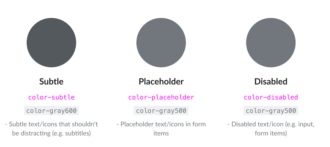
Current Codex Color tokens definition features color-subtle with value Gray 600 (#54595d).
In WikimediaUI Base that has been defined as #72777d
We've also need to feature disabled items with the lowest acceptable gray, currently Gray 500 (#72777d)
A special case are placeholders which are only used on White background and are also acceptable as Gray 500.
Quest
Do we need an additional accessory color in order to
- set apart certain text color combinations of disabled and
- provide an level AA conformant color when used on lighter grey backgrounds
Option 1
- Leave subtle as is with the slightly lighter Gray 500 or #72777d and add another accessory color with Gray 600
Option 2
- Change subtle to Gray 600 and unify on one token.
Decision of 2022-08-05
Coming out of T313502#8094922:
- accessory is replaced by subtle
- subtle remains Gray 600 (#54595d)
- Several use cases of current (legacy) accessory are replaced by disabled.
Further information
Current usage of lighter subtle
https://codesearch.wmcloud.org/search/?q=base--subtle&i=nope&files=&excludeFiles=&repos=
OOUI
VisualEditor
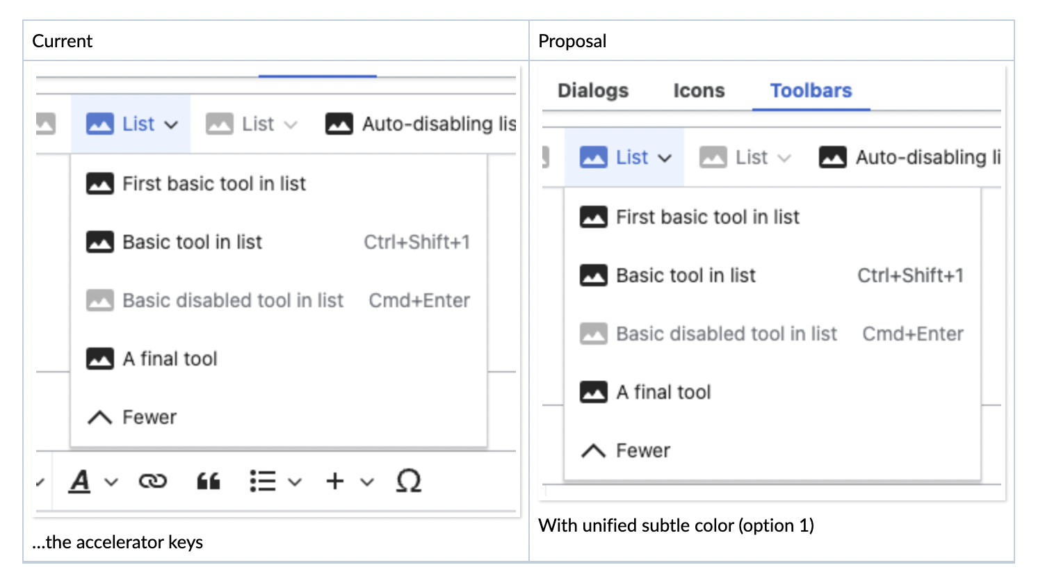
| Current | Proposal |
 | 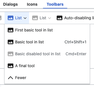 |
Somewhat acceptable, but harder to guide focus
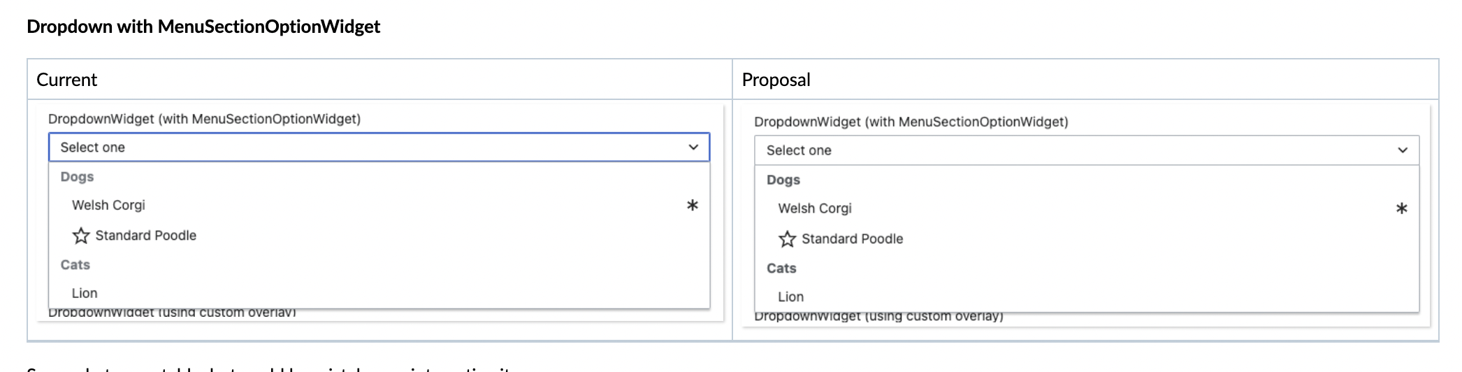
Dropdown with MenuSectionOptionWidget
| Current | Proposal |
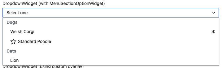 |  |
Somewhat acceptable, but could be mistaken as interactive items
Additional concerns tokens-wise
How to deal with T286851: [Search] Lighten color of search thumbnail placeholder icon?
Dev note
- Card and TypeaheadSearch icons would have color-subtle assigned instead of current color-accessory (done in https://gerrit.wikimedia.org/r/c/design/codex/+/820448)