Goal
Clarify what our breakpoints should be and document them as Codex tokens
Historically, most of the breakpoint groundwork was done in MobileFrontend and MinervaNeue.
User stories
- As a designer I need that the most used and relevant screens are covered with the breakpoints, to be able to design on those screens and know that my designs will work well on those screen sizes.
Considerations
Current breakpoints definitions in Codex:
Defined in 'codex-base.json', status 2022-03-31
A capable mobile device considered minimum available screen width.
Many older feature phones that were already able to browse the web have screens smaller than this value. As they weren't considered smartphones with real HTML/CSS rendering capabilities, this min-width mostly acted as sanity check to ensure something is a smartphone.
@width-breakpoint-mobile: 320px;
A tablet considered devices' minimum available screen width.
Tablet size was defined with first wide-spread Samsung tablet, Galaxy S5 mini and low enough to cover early generation iPads (768px):
@width-breakpoint-tablet: 720px;
A desktop considered devices' minimum available screen width.
Currently used (as @width-breakpoint-desktop) in MW core, MinervaNeue and Vector. Extensions GrowthExperiment, MediaSearch, Wikibase, RelatedArticles (CodeSearch).
@width-breakpoint-desktop: 1000px;
Wider desktop breakpoint.
Currently used (as @width-breakpoint-desktop-wide) in Vector. Extensions UploadWizard/MediaUploader (CodeSearch). As @large in Flow defined 6 years ago.
@width-breakpoint-desktop-wide: 1200px;
Extra wide desktop breakpoint.
Defined 6 years ago in Flow as @xlarge. Not in use anywhere.
@width-breakpoint-desktop-extrawide: 2000px;
Additional data point
[[ https://codesearch.wmcloud.org/things/?q=%40media&i=nope&files=&excludeFiles=&repos= | Codesearch after @media ]]
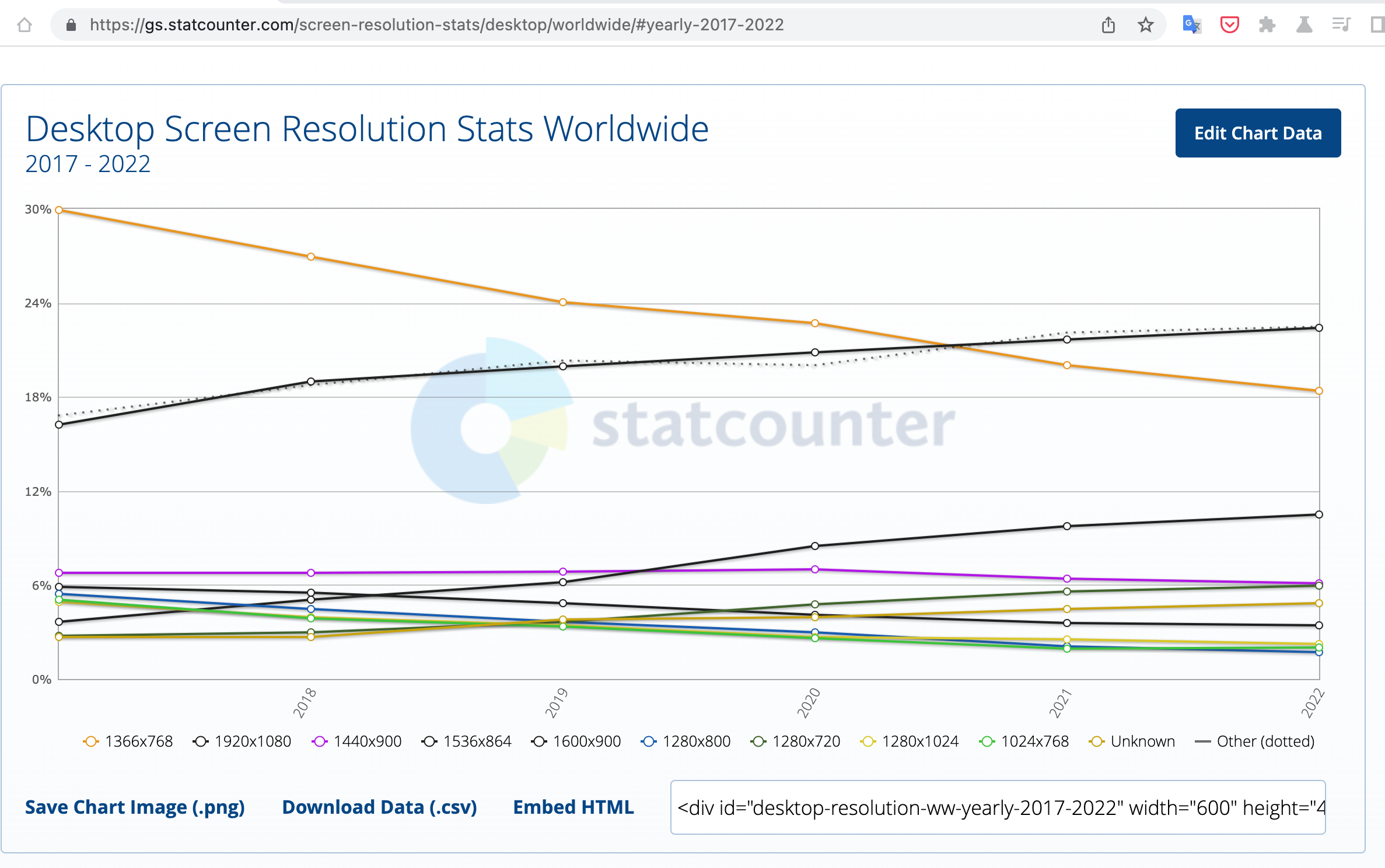
Most used screens during the last year:
Visit this web for more info.
Desktop:
- 1920x1080 (22.33%)
- 1366x768 (18.1%)
- 1536x864 (10.78%)
- 1280x720 (6.13%)
- 1440x900 (5.98%)
- 1600x900 (3.45%)
Tablet:
- 768x1024 (33.71%)
- 810x1080 (6.76%)
- 1280x800 (6.63%)
- 800x1280 (5.84%)
- 601x962 (4.8%)
- 962x601 (3.15%)
Mobile:
- 360x800 (8.83%)
- 414x896 (6.48%)
- 360x640 (5.69%)
- 390x844 (5.33%)
- 412x915 (4.75%)
- 360x780 (4.21%)
Decision record of breakpoints token naming of 2022-07-21
Status: accepted
Context
On Codex names (“nomenclature”) for breakpoint decision tokens different options were discussed:
- Provide an abstracted nomenclature like t-shirt sizes (@min-width-breakpoint-medium)
- Provide a semi-abstracted nomenclature with usage physical place (@min-width-breakpoint-lap)
- Provide a minimally abstracted nomenclature with device physics (min-width-breakpoint-tablet)
Considered token naming
Abstracted t-shirt size token definition
Advantages
- Abstracted from the device or use case and in alignment with other abstracted token groups like box shadows.
- Growing popularity in other design systems. (Although we haven't found documentation on why t-shirt sizes abstraction has been used. Assumption is that unifying on similar abstraction scale was behind the decision.)
Disadvantages
- When applied in code, specifically in selectors with several different designs per breakpoint, it's very hard to keep abstracted name in mind and remember what it means for devs implementing and debugging.
- If a new device type is becoming popular we would possibly have to add something in between an already existing small and medium breakpoint. T-shirt size abstraction hinders future naming flexibility.
Semi-abstracted usage place token definition
Advantages
- Semi-abstracted device and with that probably easier to quickly understand by pointing to physical use case location.
Disadvantages
- Still an abstraction layer, that isn't self-explanatory. For example, “lap” is targeted at iPads or laptops, but why would someone sitting not also put the “palm” device on their laps.
Minimally abstracted device type token definition
Advantages
- Simple understandable, common device type names.
- When skimming and writing code it's immediately clear in which group the breakpoint is.
Disadvantages
- Certain device types are not fully sufficiently describing the device.
- Possible that device types or type values are open to change in future with device capabilities shifting.
Decision
We've agreed to go with device type breakpoint size token decision names.
Providing breakpoint design decision tokens on device type names will provide best understanding
and simple application.
Developers notes
As the latest proposal changes two currently used breakpoints:
720 => 768
2000 => 1920
It seems reasonable to amend former with a workaround token as it seems possibly impactful, and latter by just using the new breakpoint value. Given how low usage of 2000 in our current codebase is and how small the differences would be projected.
It might be a helpful path forward, that we've defined breakpoint tokens so far with width, while in Codex and the future we're aiming for min-width/max-width.
Proposal
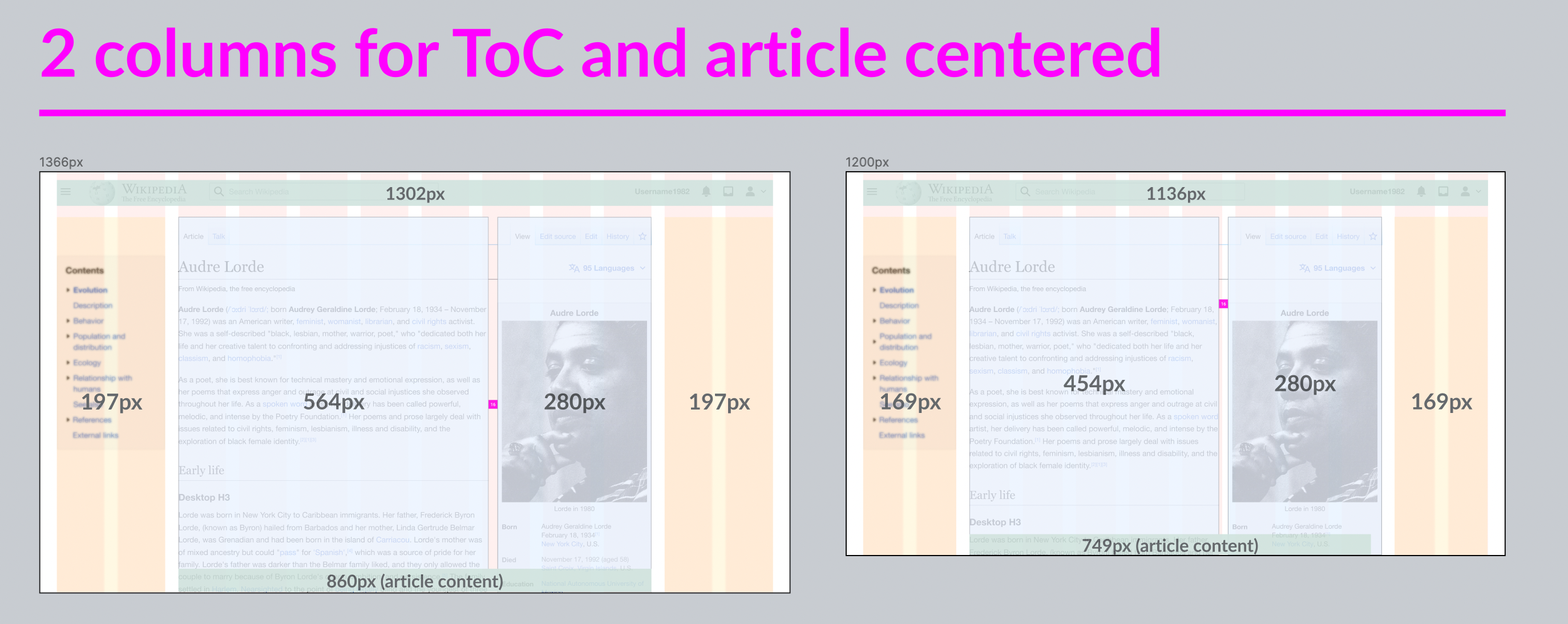
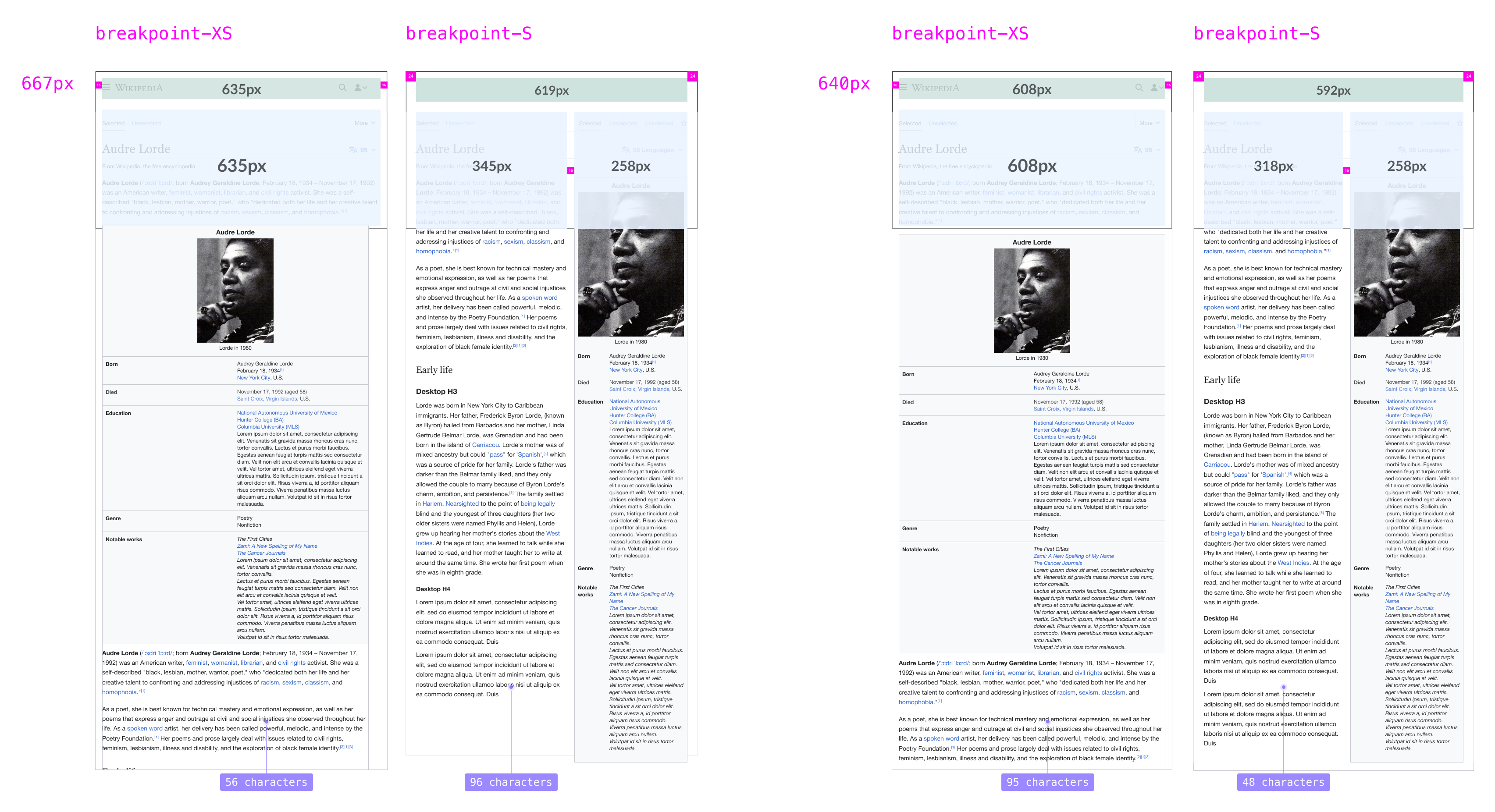
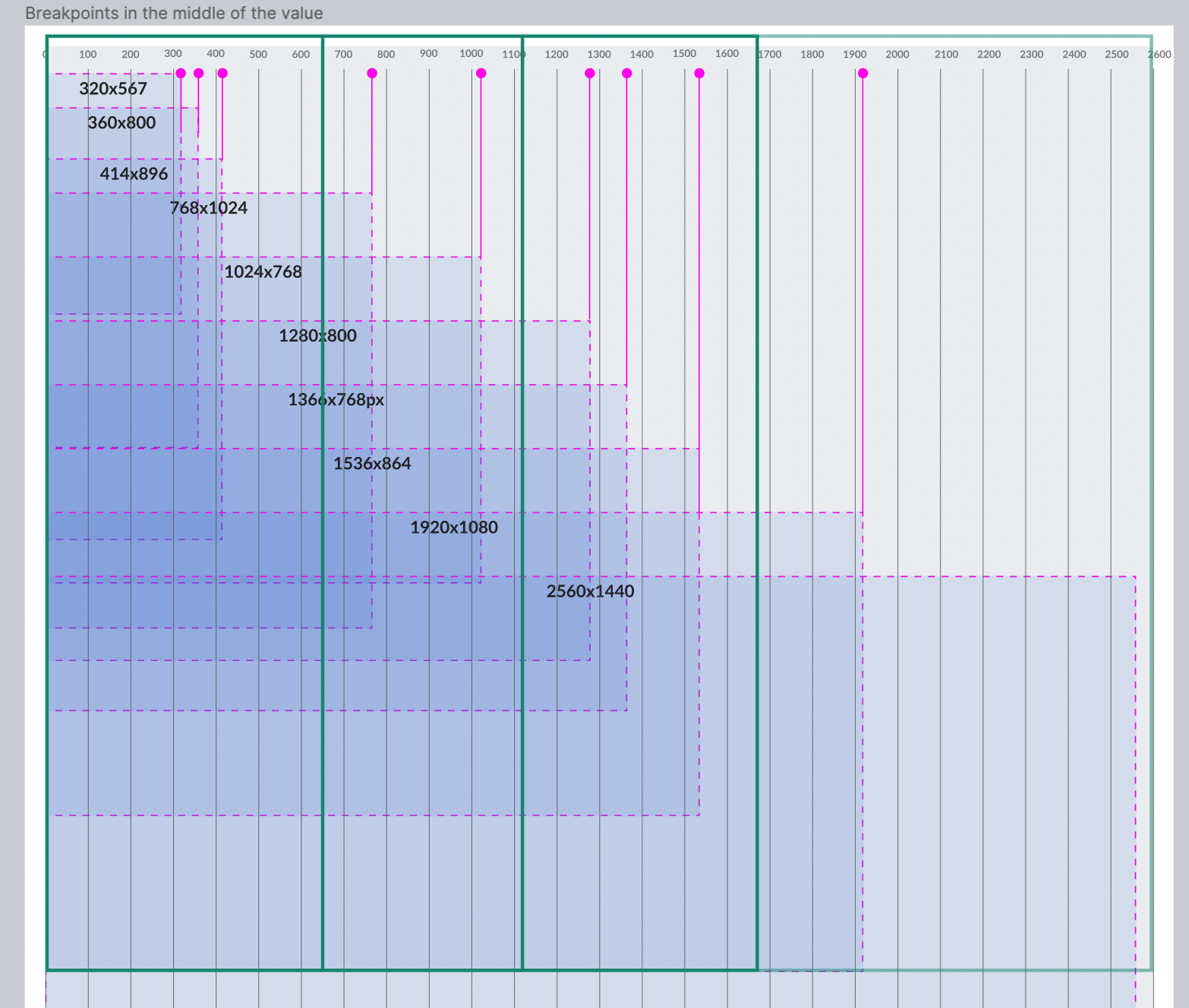
The new breakpoints will use the most used screens (read team above) as midpoints of each breakpoint (as explained in this article).
@min-width-breakpoint-desktop-wide 1680px and more
@min-width-breakpoint-desktop 1120px - 1679px
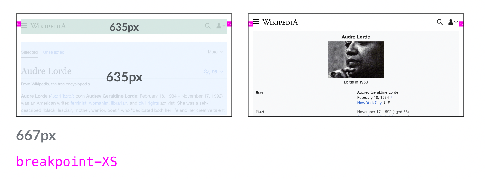
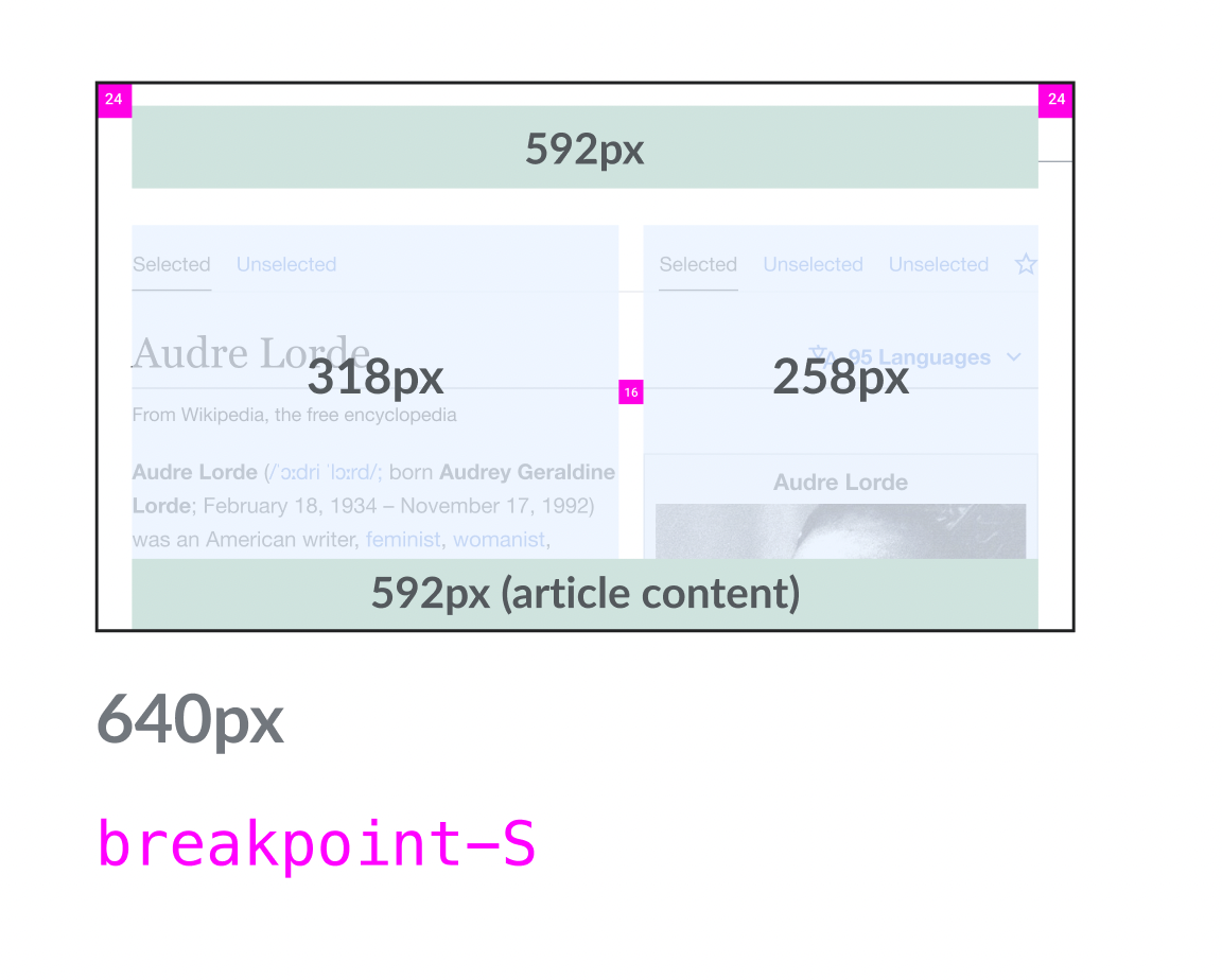
@min-width-breakpoint-tablet 640px - 1119px
@min-width-breakpoint-mobile 320px - 639px
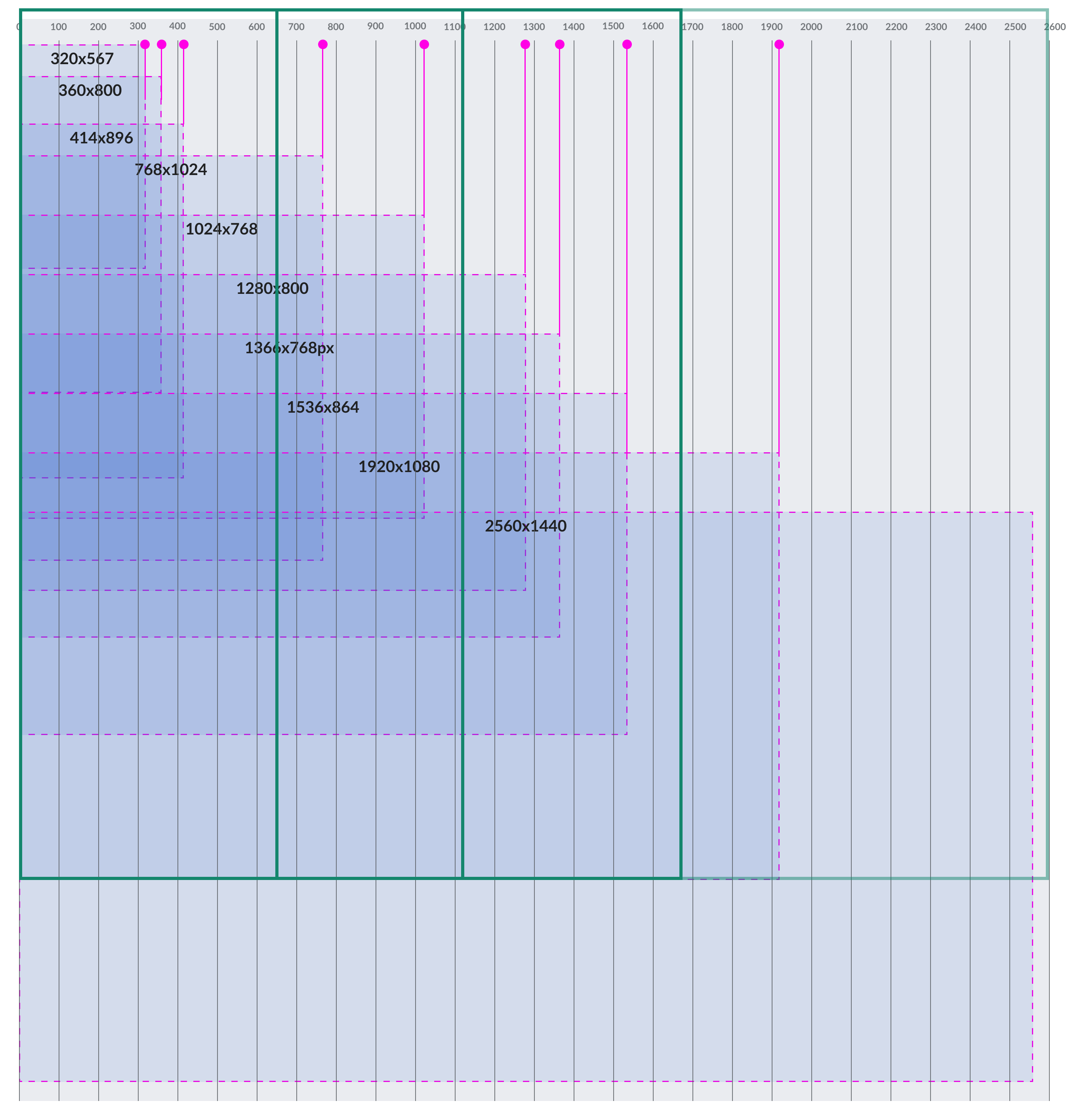
Advantages of this new proposal:
- We cover more screen sizes with fewer breakpoints.
- We cover a larger number of screen sizes as each breakpoint covers several important screen sizes.
- We don't have very approximate breakpoints.
- The most used screen sizes have been tested here with different projects and all them are well covered with these new breakpoints.
Acceptance criteria (or Done)
Design:
- Create Figma spec sheet documenting our breakpoints
- Add breakpoints in our Figma library
Code:
- Document breakpoints in Codex demo (we could add a table like this)
- Implement breakpoints in Codex