Page MenuHomePhabricator

Community configuration: design for scaling beyond GrowthExperiments extension
Closed, ResolvedPublic4 Estimated Story Points

Assigned To
Authored By
KStoller-WMF
Oct 31 2023, 11:05 PM
Referenced Files
F41699984: Success message.png
Jan 19 2024, 4:14 PM
F41699982: Preview and save changes (1).png
Jan 19 2024, 4:14 PM
F41699966: Configuration of a feature v.1.png
Jan 19 2024, 4:14 PM
F41699960: Dashboard v.1 scaling (1).png
Jan 19 2024, 4:14 PM
F41611730: ToC.png
Dec 18 2023, 8:27 PM
F41611725: Accordions first screen.png
Dec 18 2023, 8:27 PM
F41611723: Community Configuration dashboard.png
Dec 18 2023, 8:27 PM

Description

Follow up from T334312: Community configuration: design improvements.

User story & summary:

As an admin or experienced editor, I want to quickly find the configuration setting I'm looking for, so that I can check or change the configuration.

Background & research:

Our current designs focus on Growth configuration options (T334312), but we still need to decide how to present all configuration options together.

Design:

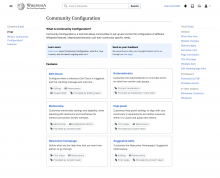
Dashboard as central place for features. Features will be divided in (for a first release):

  • Edit Check
  • Automoderator
  • Mentorship (which will include Personalized Praise)
  • Newcomer homepage
  • Suggested Edits (which will include Leveling up)
  • Help Panel

Dashboard v.1 scaling (1).png (1×1 px, 146 KB)

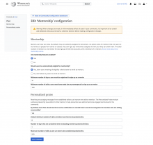
When users configure a single feature, another page will open (example for 'Mentorship'):

Configuration of a feature v.1.png (1×1 px, 139 KB)

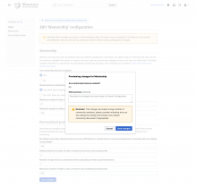
Users preview and save their changes:

Preview and save changes (1).png (1×1 px, 152 KB)

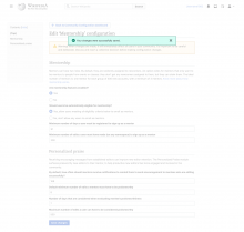
When changes are saved, users get a success message:

Success message.png (1×1 px, 141 KB)

Figma designs

Acceptance Criteria:
  • Review community feedback about designs
  • Run initial ideas by a Growth team engineer to understand technical constrains
  • Share designs with PM + Design lead + Growth team
Event Timeline

KStoller-WMF moved this task from Inbox to Backlog on the Growth-Team board.

Just adding a note more community feedback was added here:

It seems to me that the two designs need to be combined. Dashboard design is for the start page, and Accordion design is for when you go to manage a single extension

I'm adding designs here, but I don't think I'll close this task since we're back from holidays and can get an overall team opinion (+ one point on the Acceptance Criteria list is still not crossed out). Some things we may want to think about before resolving this:

  • Which one of the two options for configuring a single feature do we want to implement?
  • Do we think organizing by feature can work? Is this too WMF-centred? If yes, what are some other patterns by which we can organize this (e.g. activity: Editing, Reading?)?

Which one of the two options for configuring a single feature do we want to implement?

I think we need anchor links so it's easy to link to a specific section within the form. If that's not logical to do within the Accordion design, then I have a slight preference for the ToC design.

For either design I think there should be a Help link that navigates to:
https://www.mediawiki.org/wiki/Special:MyLanguage/Community_configuration_2.0
That way there is a clear place to learn more or ask questions.

Do we think organizing by feature can work? Is this too WMF-centred? If yes, what are some other patterns by which we can organize this (e.g. activity: Editing, Reading?)?

We might want to eventually organize into sections that are more user-centered, but perhaps that isn't needed for the initial release as there are unlikely to be more than a few menu options?

I added T354390: Community Configuration 2.0 dashboard as the follow-up engineering task for the dashboard view. Feel free to add/adjust the details and attach images to the task once the Figma designs are finalized.

Do we think organizing by feature can work? Is this too WMF-centred? If yes, what are some other patterns by which we can organize this (e.g. activity: Editing, Reading?)?

We might want to eventually organize into sections that are more user-centered, but perhaps that isn't needed for the initial release as there are unlikely to be more than a few menu options?

One inconsistency in the current design is that "Growth features" stands for several features while the rest of elements (eg Edit check) are mapping to a single one. If the top taxonomy level is a single feature we should be listing Mentorship, Help Panel, Newcomer tasks, etc. We need to clarify what do we want each item in the list to represent, a feature or a group of features? We could also use the extension name as an entry point and mix or list out all configurable features from that extension.

Thanks, @Sgs, I discussed with Martin today and passed along feedback to @JFernandez-WMF via Figma. I'm suggesting the dashboard should be more feature-centric than extension-centric.

Growth features are all so interconnected, that it's still a bit of a judgment call about how to break them up, but I've suggested:

Mentorship (which will include Personalized Praise)
Homepage (which will include Help Panel)
Suggested Edits (which will include Leveling up)

Does that seem reasonable, or do you think we should break up features even further?

Does that seem reasonable, or do you think we should break up features even further?

It seems reasonable, maybe Help panel could be factored out since users can enabled it without having the Homepage enabled.

KStoller-WMF raised the priority of this task from Medium to High.Jan 9 2024, 6:32 PM

Ah, that's a good point.

@JFernandez-WMF Thoughts on this level of categorization?

  • Mentorship (which will include Personalized Praise)
  • Homepage
  • Suggested Edits (which will include Leveling up)
  • Help Panel

Engineers hope to work on T354390: Community Configuration 2.0 dashboard this sprint, but we should have a final design for the dashboard before that's started, so I'm bumping this task up to high priority.

JFernandez-WMF updated the task description. (Show Details)