Background goal
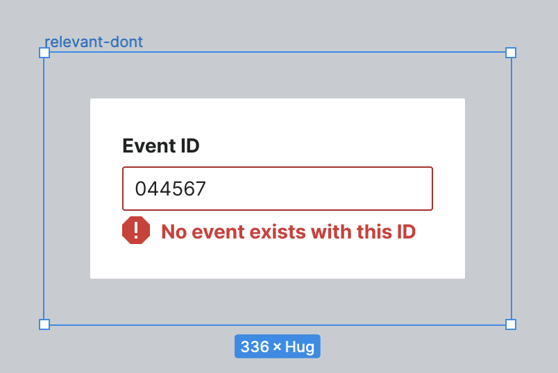
Currently, our Do's and Don'ts class styling looks like the screenshot below.
Ideally, we want these to work as such:
- each image would be exported from Figma as an SVG
- the Do/Don't container would contain this SVG image and text for the Do/Don't
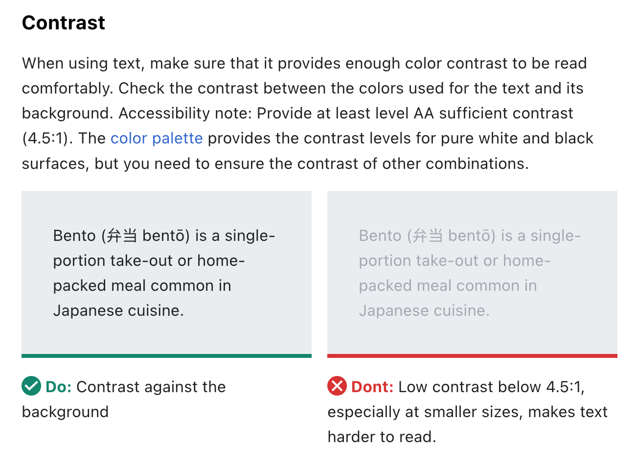
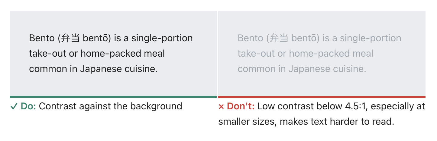
- the SVG image would have a background color [background-color-notice-subtle] and the container would be 100% of the image width and height (the SVG has built in padding as seen in the screenshot below)
- each image container should have a border-bottom of 4px, [color-success] for Do, [color-error] for Don't
- the text for each container should be prefixed by an icon, [cdxIconSuccess] in [color-success] for Do, [cdxIconClear] in [color-error] for Don't
- after the icon would come the text "Do" and "Don't" also in the same success or error color
- after that text would come standard paragraph copy either directly after as text or below as an unordered list (this should be customizable)
Design proposal
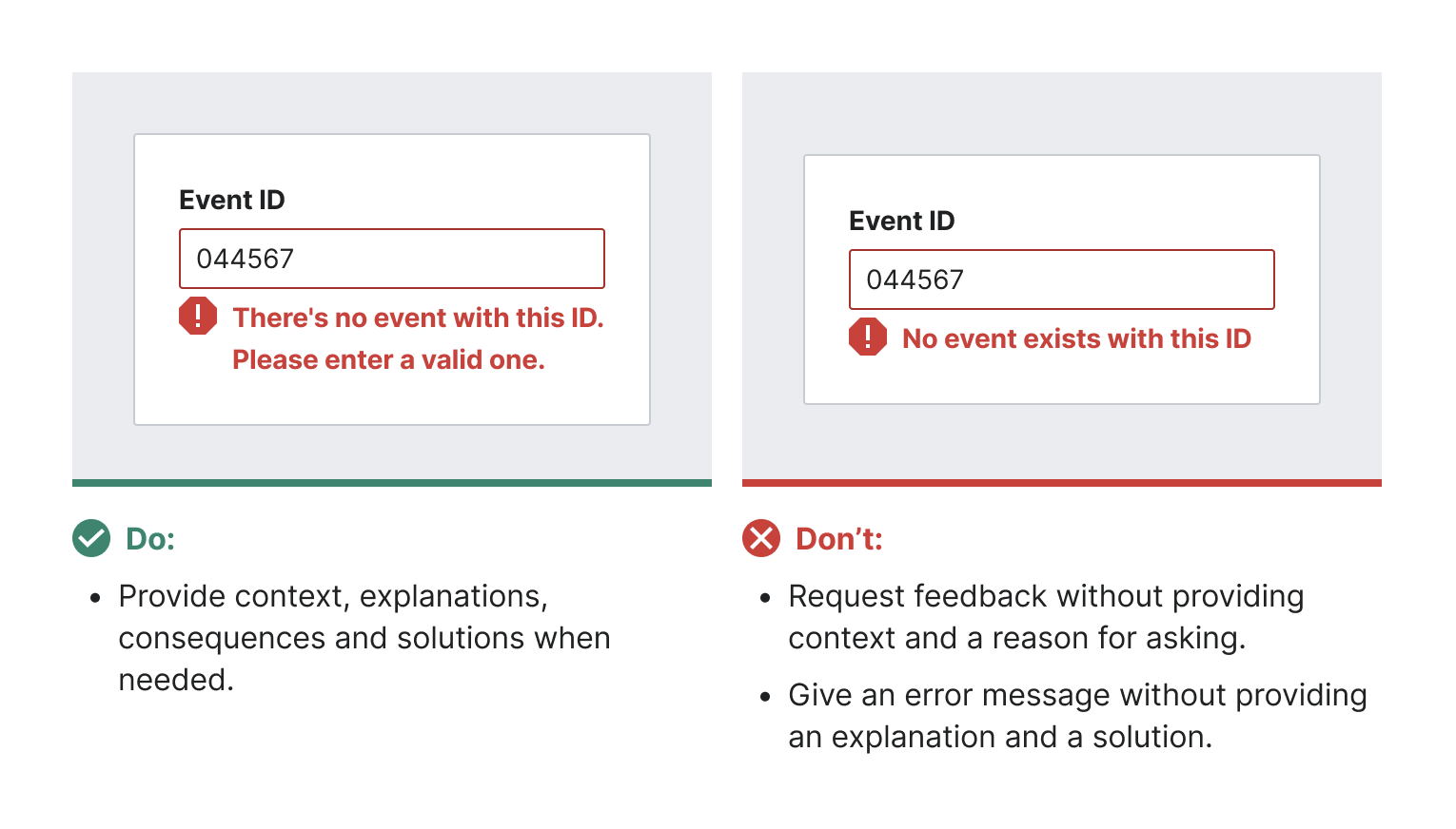
The final example should look like the screenshot below.
Figma for reference
Acceptance criteria
- Redesign all the existing Do and Don't images created for the Content guidelines with this new format
- Export just the content of each image to SVG and make sure it was successfully exported from Figma
- Add all the images in Codex, including a gray background and bottom border in code
- Revise the Do/Don't CSS to match new styling