Page MenuHomePhabricator

ZObjectSelector: remove the chevron icon
Closed, ResolvedPublic

Assigned To
Authored By
AAlhazwani-WMF
Nov 7 2023, 1:25 PM
Referenced Files
F58972869: CPT2504031430-598x292-ezgif.com-optimize.gif
Apr 3 2025, 12:31 PM
F58924186: Screenshot 2025-03-26 at 11.24.12.png
Mar 26 2025, 10:26 AM
F58924180: Screenshot 2025-03-26 at 11.23.16.png
Mar 26 2025, 10:26 AM
F41504865: image.png
Nov 14 2023, 1:33 PM
F41504861: image.png
Nov 14 2023, 1:33 PM
F41504744: image.png
Nov 14 2023, 1:33 PM
F41504544: image.png
Nov 14 2023, 10:37 AM
F41504507: image.png
Nov 14 2023, 10:37 AM

Description

During a research study on generic types in the function editor we observed how participants tried to open the ZObject selector by clicking on the chevron icon.

CleanShot 2023-11-07 at 14.23.39@2x.png (1,722×274 px, 49 KB)

This icon is non-interactive, leaving function creators confused.

Proposed solution
Remove the chevron icon
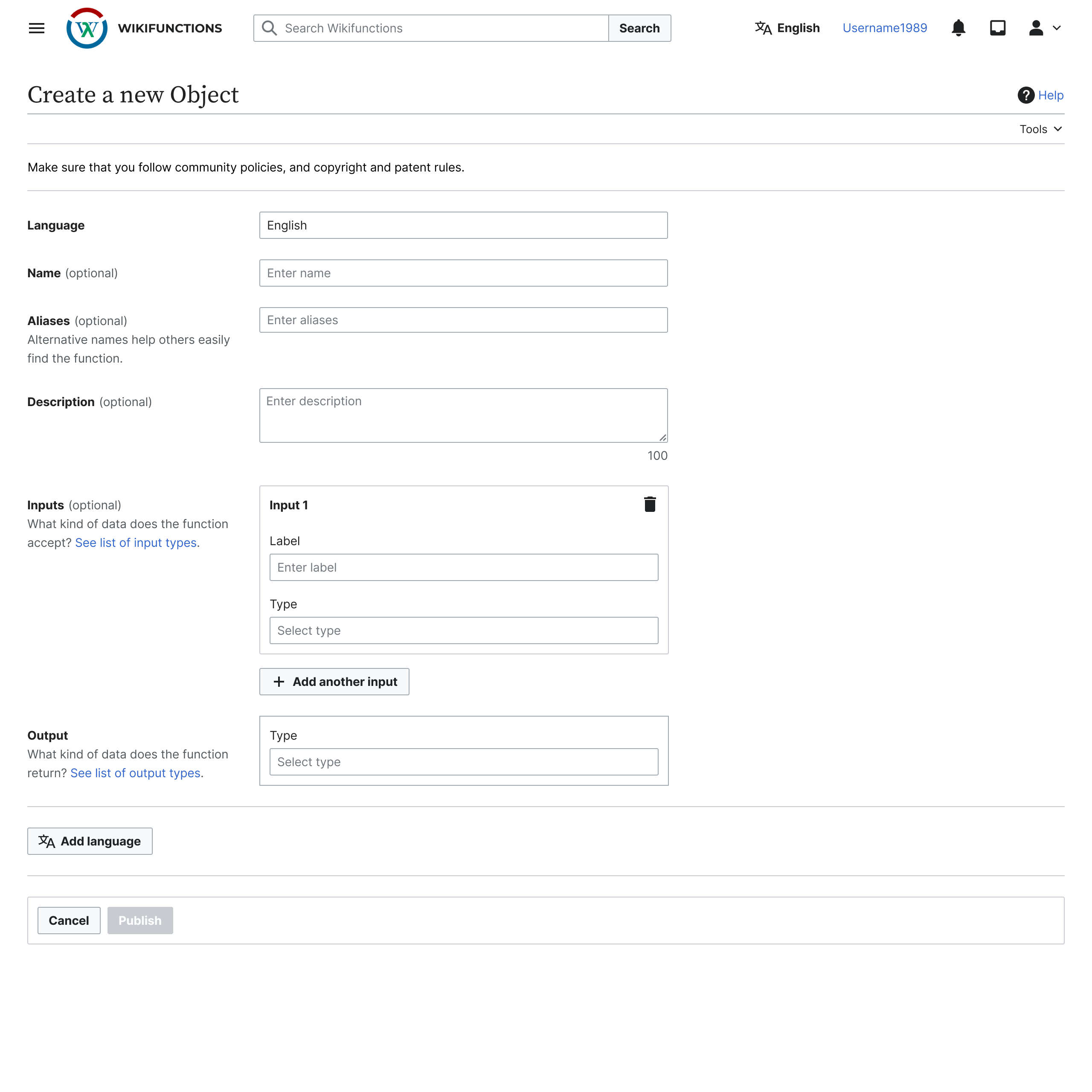
image.png (2,560×2,560 px, 235 KB)

(If possible) when escaping focus, auto select entry if the entered query is a valid match
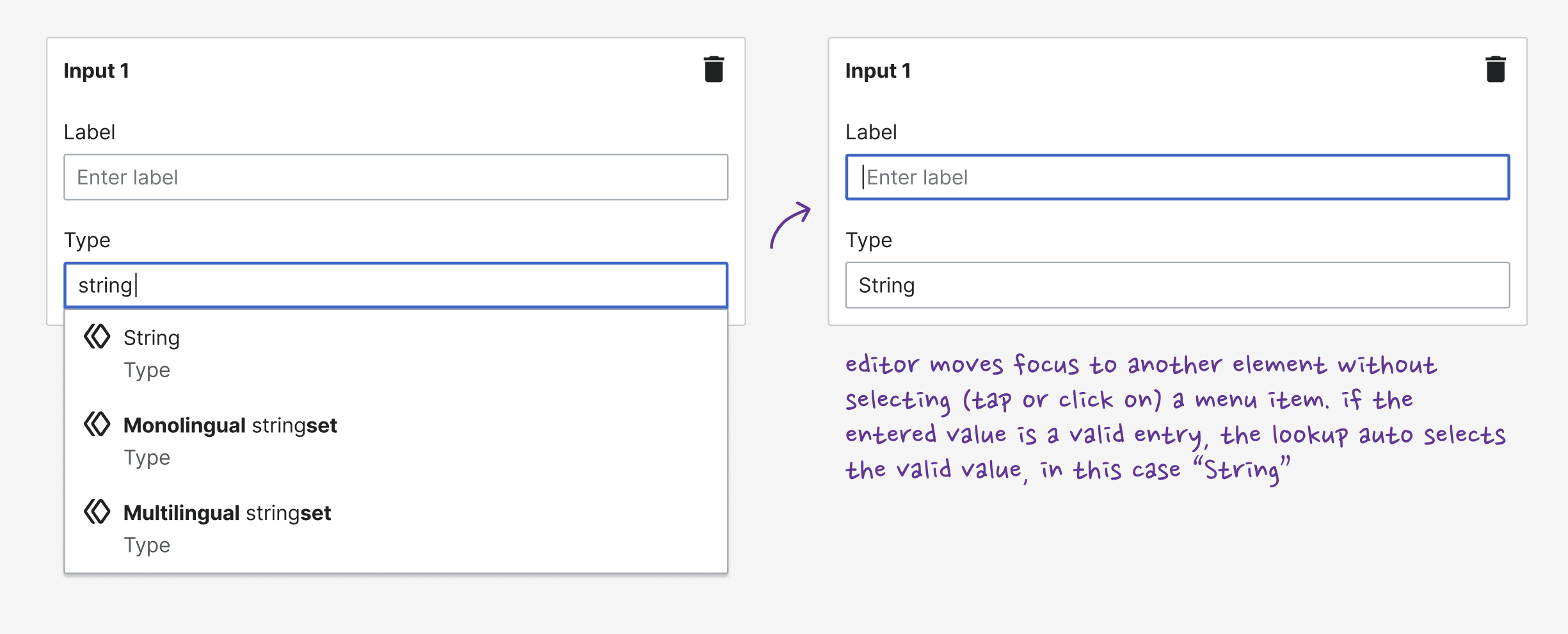
image.png (2,450×990 px, 170 KB)

(If possible) when escaping focus, clear the query if a non-valid entry
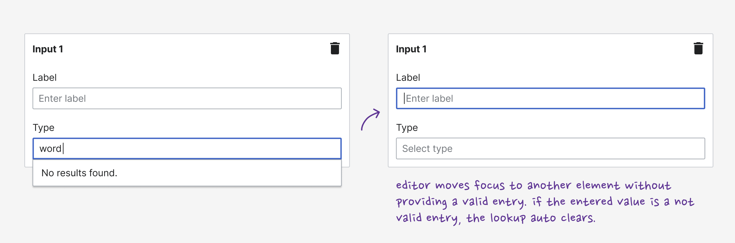
image.png (2,470×818 px, 122 KB)

Event Timeline

some early ideas that we might want to consider:

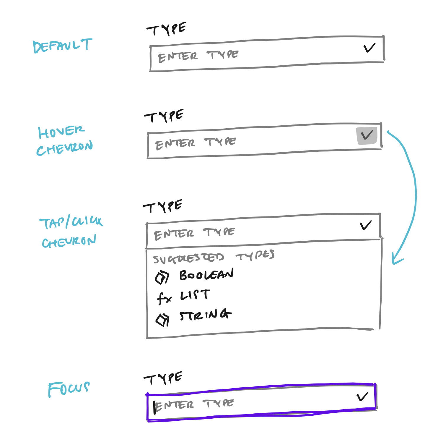
  1. separate the interaction between focusing/clicking the field, and clicking/tapping the chevron icon. focusing the field does not open the menu as long as you don't start typing. click/tap on the chevron opens the menu with suggested types
    image.png (1,510×1,478 px, 213 KB)
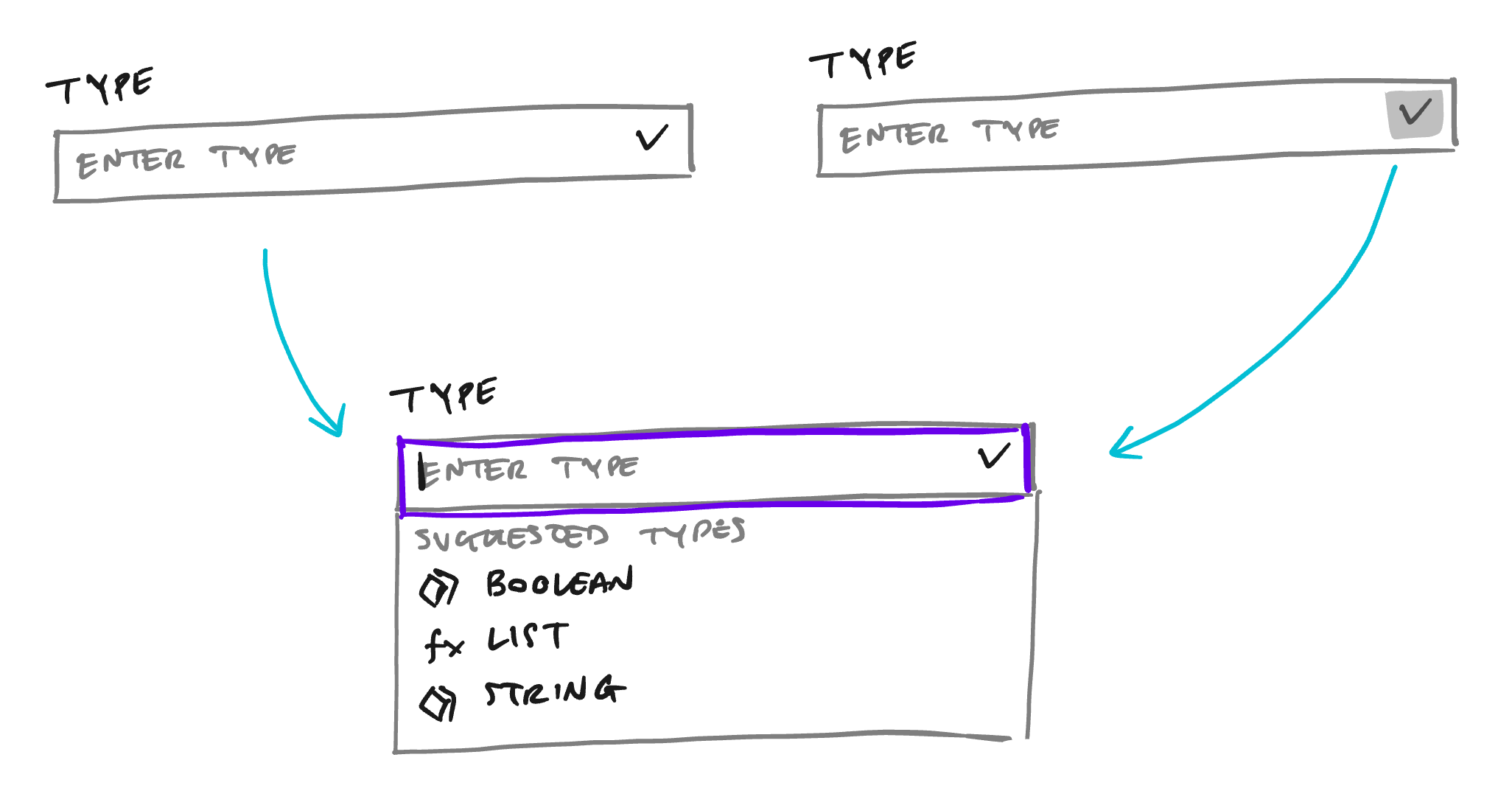
  2. keep the same interaction for both focus and click/tap on the chevron icon.
    image.png (2,052×1,092 px, 93 KB)
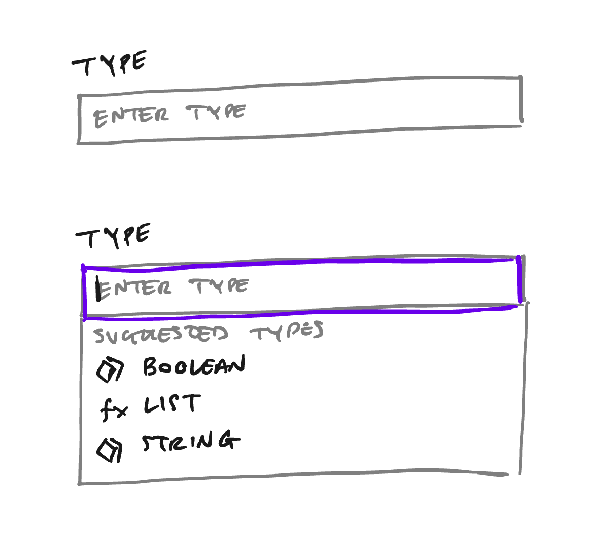
  3. remove the chevron icon
    image.png (1,197×1,085 px, 60 KB)
Jdforrester-WMF renamed this task from ZObject selector: make the chevron interactive or remote it? to ZObjectSelector: make the down-chevron interactive or remove it?.Nov 7 2023, 4:49 PM

another observation from the usability study: one participant typed very fast the input type "string" and then moved to the next input field via keyboard tab navigation. as a result they did not select the result the item "String" from the menu leaving the selection invalid.

play/open the gif below as a reproduction of this behaviour

CleanShot 2023-11-08 at 12.45.14.gif (800×130 px, 134 KB)

by opening the menu by default when the ZObjectSelector is focused could help minimize this edge case.

clicking on the chevron, and focusing on the lookup field is the same unique event.

The chevron is added as an end-icon attribute that's passed to the TextInput component (child of Lookup component)
https://doc.wikimedia.org/codex/latest/components/demos/text-input.html#with-icons

Currently, the TextInput can add icons at the start or at the end of the field, but does not listen to clicks on them, so we cannot react to those events to make the field focus when clicking the chevron. Also, currently we cannot display the suggestions when clicking the chevron, so I would simply remove it or change it for another icon that does not make the user think that this component might work as a dropdown selector.

I would simply remove it or change it for another icon that does not make the user think that this component might work as a dropdown selector.

agreed! we could remove the chevron, but then i'm unsure if we might loose the visual feedforward that could help function creators separate a text input from a lookup/select. without the chevron icon they would have to rely only on the placeholder text to discern the two input/actions, e.g. "Enter label" vs. "Select type".

image.png (2,560×2,560 px, 235 KB)

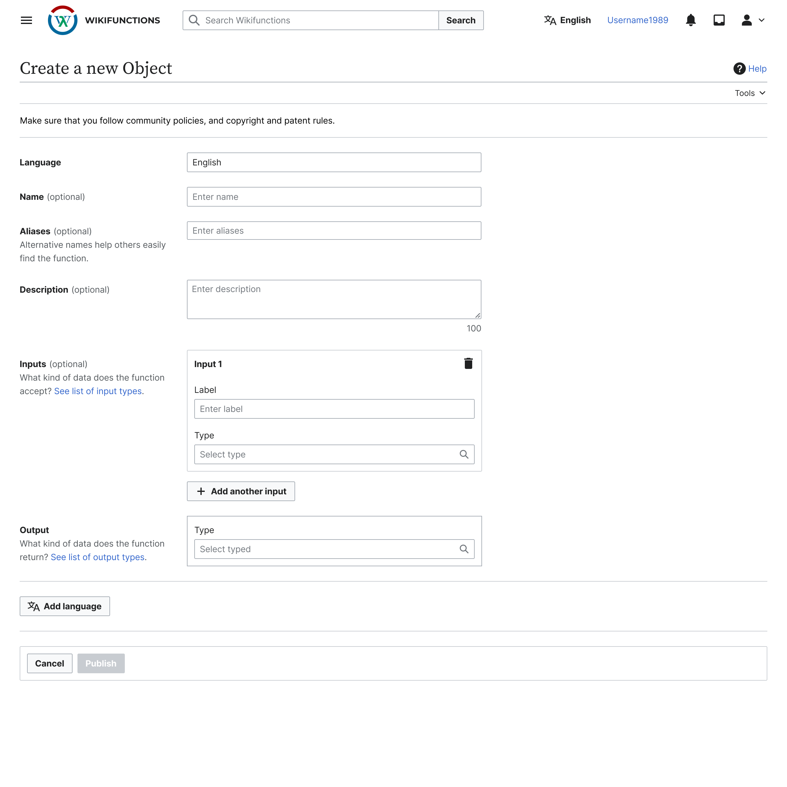
alternatively we could opt for cdxIconSearch set as end-icon with the icon fill set to color-placeholder. hopefully by making the icon the same color as the placeholder text it will not prompt function creators to click/tap on it.

image.png (2,560×2,560 px, 237 KB)

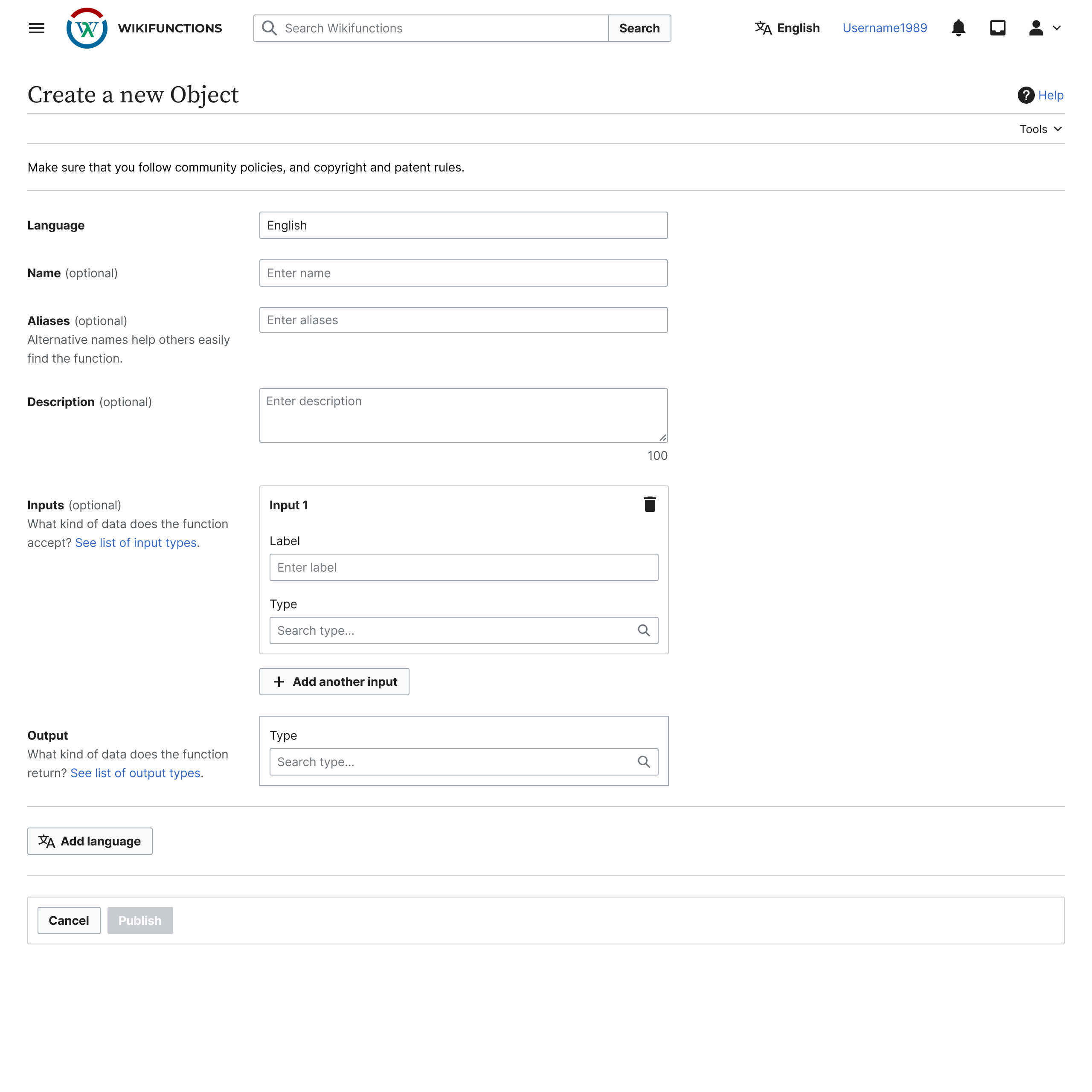
if we opt for the cdxIconSearch option i'm also wondering if the placeholder text should be changed. right now it says "Select type" but if we display a magnifying glass i would suggest to go for "Search type". Moreover, given that the lookup is a search and select, we could add "..." at the end of the placeholder text "Search type..." given that ellipses are commonly used to mark an additional action needed on the user end, in our case what is needed beside searching is the action of selecting a result from the menu.

image.png (2,560×2,560 px, 237 KB)

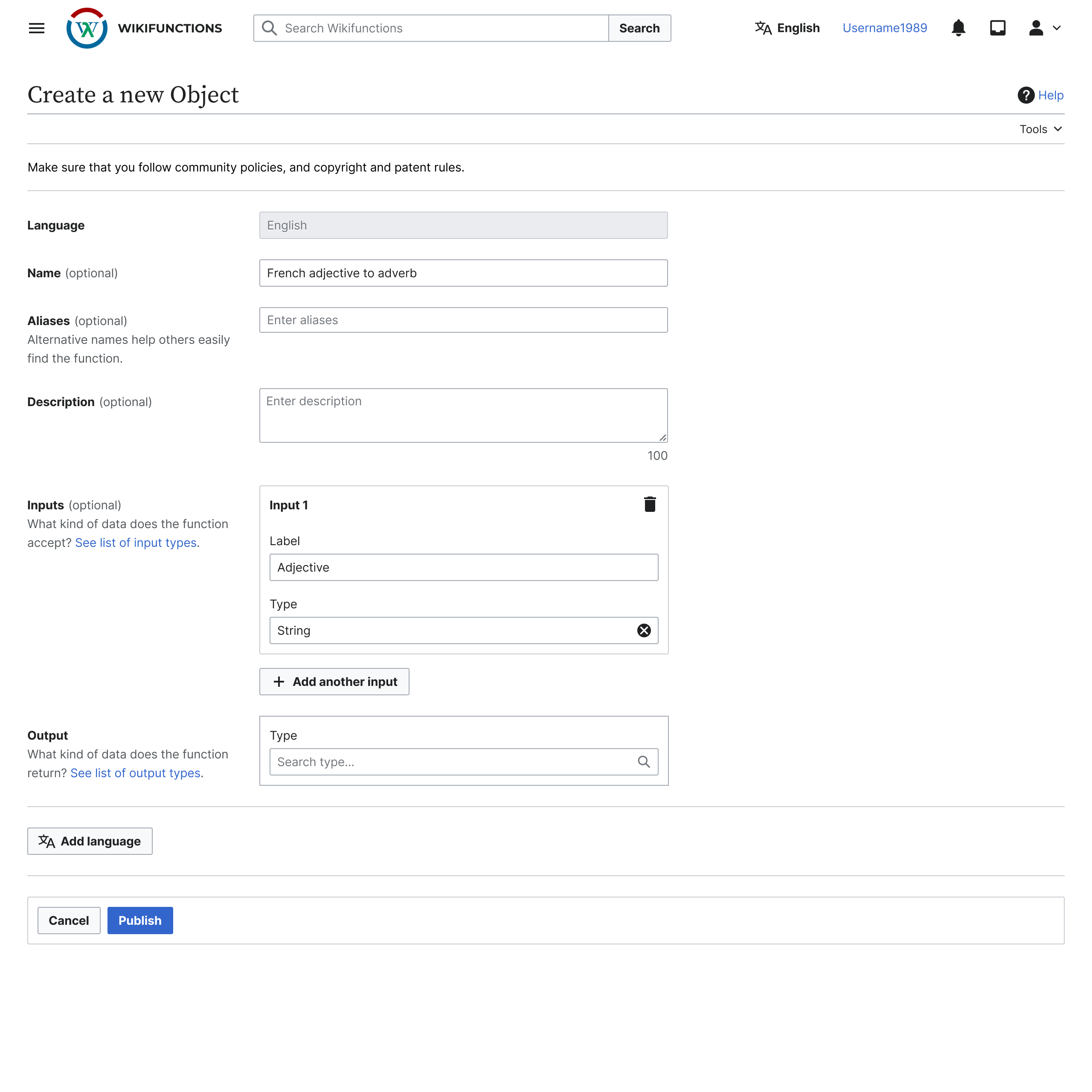
last but not least, if we would want to also better visually separate a filled in text input vs a lookup field we could also set the clearable prop when after a lookup selection.

image.png (2,560×2,560 px, 240 KB)

In summary, these are the possible options:

  1. hide the chevron icon
  2. use cdxIconSearch
    • a. (optional) change placeholder text to "Search type..."
    • b. (optional) make the lookup field clearable if filled in

what you think @gengh? i would suggest we go for 2b, or 2a if we encounter any unforeseen implementation complexity.

after a sync conversation with @gengh we decided to opt for the most simple approach, start learning, and iterate from there. the current issue is: "function creators click/tap on the chevron icon but nothing happens". so, we checked whether we can make that icon interactive, but it's currently not possible. so we're going to remove the icon to avoid confusing people.

moreover, in order to make sure that an entered lookup value is a valid entry we're going to:

  1. auto select a value if the entered query is the same as a result item. e.g. function creator enters "string" but doesn't click/tap on the "String" menu item below to confirm/complete the selection
  2. clear the lookup field if the entered query is a non-valid entry, e.g. function creator enters "word" and escape focus, but "word" is not an available type
AAlhazwani-WMF renamed this task from ZObjectSelector: make the down-chevron interactive or remove it? to ZObjectSelector: remove the chevron icon.Nov 14 2023, 1:33 PM
AAlhazwani-WMF removed gengh as the assignee of this task.
AAlhazwani-WMF updated the task description. (Show Details)
AAlhazwani-WMF removed a project: Design.
Jdforrester-WMF moved this task from To Triage to Backlog on the Abstract Wikipedia team board.

We've not actually made this change, but a fair number of changes have been made to the object selector workflow since this was filed. Can we declare this Resolved at this point?

We've not actually made this change, but a fair number of changes have been made to the object selector workflow since this was filed. Can we declare this Resolved at this point?

i would keep it open because the issue is still present. both when the lookup is empty, and when is (pre-)filled. on one side, the chevron is being helpful in giving a signifier to editors, but on the other it doesn't work as an affordance because when they click on it nothing happens.

wondering if we should scale this up to Codex? meaning, how might we make a lookup input, different from a text input? or should it be different at all?

i would keep it open because the issue is still present. both when the lookup is empty, and when is (pre-)filled. on one side, the chevron is being helpful in giving a signifier to editors, but on the other it doesn't work as an affordance because when they click on it nothing happens.

Sure.

wondering if we should scale this up to Codex? meaning, how might we make a lookup input, different from a text input? or should it be different at all?

By default Codex doesn't set an icon for Lookup components (except a clear icon when there's content); we're setting it (:end-icon in https://gerrit.wikimedia.org/r/plugins/gitiles/mediawiki/extensions/WikiLambda/+/refs/heads/master/resources/ext.wikilambda.edit/components/base/ZObjectSelector.vue#21); we could change that from a static value to a search icon, and change it to a down-chevron only when the menu is open?

Change #1131289 had a related patch set uploaded (by Daphne Smit; author: Daphne Smit):

[mediawiki/extensions/WikiLambda@master] ZObjectSelector: remove the chevron icon in favor of searchIcon

https://gerrit.wikimedia.org/r/1131289

My 2 cents:

  1. If we add cleareable + icon at end you get them next to each other.

Screenshot 2025-03-26 at 11.23.16.png (688×248 px, 18 KB)

  1. We could do this visually:

Screenshot 2025-03-26 at 11.24.12.png (660×582 px, 49 KB)

  1. we could still change the copy of the placeholder.

Moving the icon to before the cursor input seems reasonable; that's what the SearchInput does: https://doc.wikimedia.org/codex/latest/components/demos/search-input.html

The problem we have with the clearable is the following shown in the gif.
We have logic to set the value back to the previous selected onBlur.
So if you clear the field with the clearable button or manually, it will always reset to previous value on blur, which looks a bit strange. Do we want to keep that?

CPT2504031430-598x292-ezgif.com-optimize.gif (598×292 px, 1 MB)

The problem we have with the clearable is the following shown in the gif.
We have logic to set the value back to the previous selected onBlur.
So if you clear the field with the clearable button or manually, it will always reset to previous value on blur, which looks a bit strange. Do we want to keep that?

We probably shouldn't. Can't we make clicking on the clearable icon just clear the field without resetting it to the previous value? @DSmit-WMF

Yes that what it does. But we have behaviour that on :blur of the field that we put it back to the previous selected value. But maybe we should remove that logic then aswell.

Yes that what it does. But we have behaviour that on :blur of the field that we put it back to the previous selected value. But maybe we should remove that logic then aswell.

If there was no particular reason for this behaviour then we can remove the logic.

DSantamaria changed the task status from Open to In Progress.Apr 8 2025, 12:53 PM
DSantamaria assigned this task to gonyeahialam.

Generally speaking, there is no required feature to have a clear button in a lookup component.

The lookup is used to assign values to references, and an empty reference is Not Valid and heavily discouraged. When creating a new object, the fields are all empty, but once they have a value, they should only be changed if they are gonna be assigned a new value, but not an empty value. This is the reason why we never added a clear feature (and icon) to this field.

The strategy implemented makes sure that fields are not "accidentally" set to empty.

E.g. A field is set to "String", a user explores the lookup to see if there's a "HTML" type, and they don't find anything that fits. On blur, we should make sure that the value of the field is still "String", not empty nor the arbitrary search but unmatched input string "HTML"

The magnifying glass icon was also not very satisfactory in the past, because we don't feel the reality "selected value in input field" is very well reflected on selected fields. E.g. "English 🔍" reads more like a search field rather than a selectable element.

after a sync conversation with @gengh we decided to opt for the most simple approach, start learning, and iterate from there. the current issue is: "function creators click/tap on the chevron icon but nothing happens". so, we checked whether we can make that icon interactive, but it's currently not possible. so we're going to remove the icon to avoid confusing people.

moreover, in order to make sure that an entered lookup value is a valid entry we're going to:

  1. auto select a value if the entered query is the same as a result item. e.g. function creator enters "string" but doesn't click/tap on the "String" menu item below to confirm/complete the selection
  2. clear the lookup field if the entered query is a non-valid entry, e.g. function creator enters "word" and escape focus, but "word" is not an available type

After trying it out, it seems 1 and 2 have been implemented. What remains is the decision around the icons/chevron. I think for now we can start with the simple solution of removing the chevron cc @gengh @DSmit-WMF

You are correct. the chevron is left. But there has been so many chats above that the desired solution was still very much debatable haha. I am all for just the simple solution 💃
I am just happy if we can close this long standing ticket.

Change #1131289 merged by jenkins-bot:

[mediawiki/extensions/WikiLambda@master] ZObjectSelector: remove the chevron icon in favor of searchIcon

https://gerrit.wikimedia.org/r/1131289

@gonyeahialam Is this already solved in production? Can we close it?