Page MenuHomePhabricator

Choose font sizes for Minerva
Closed, ResolvedPublicDesign

Description

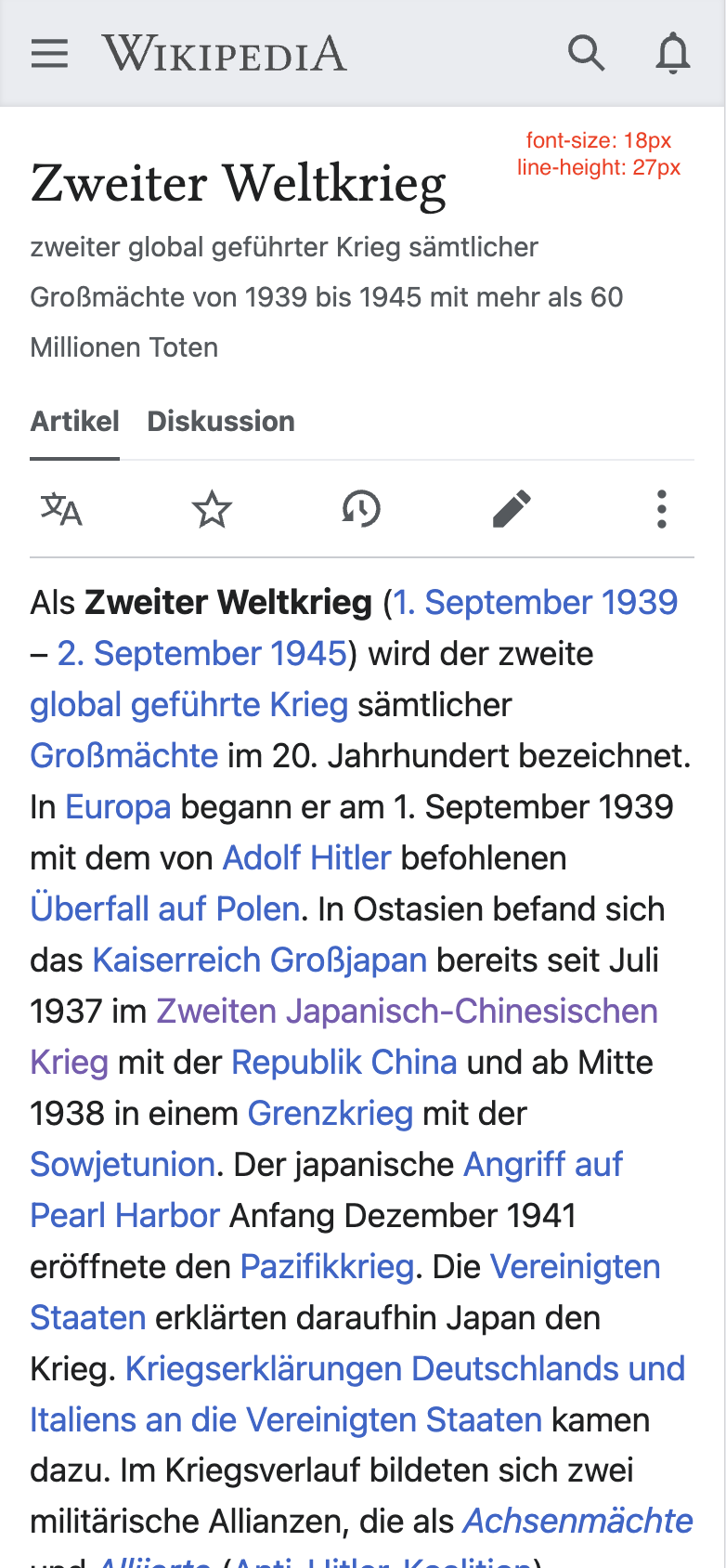
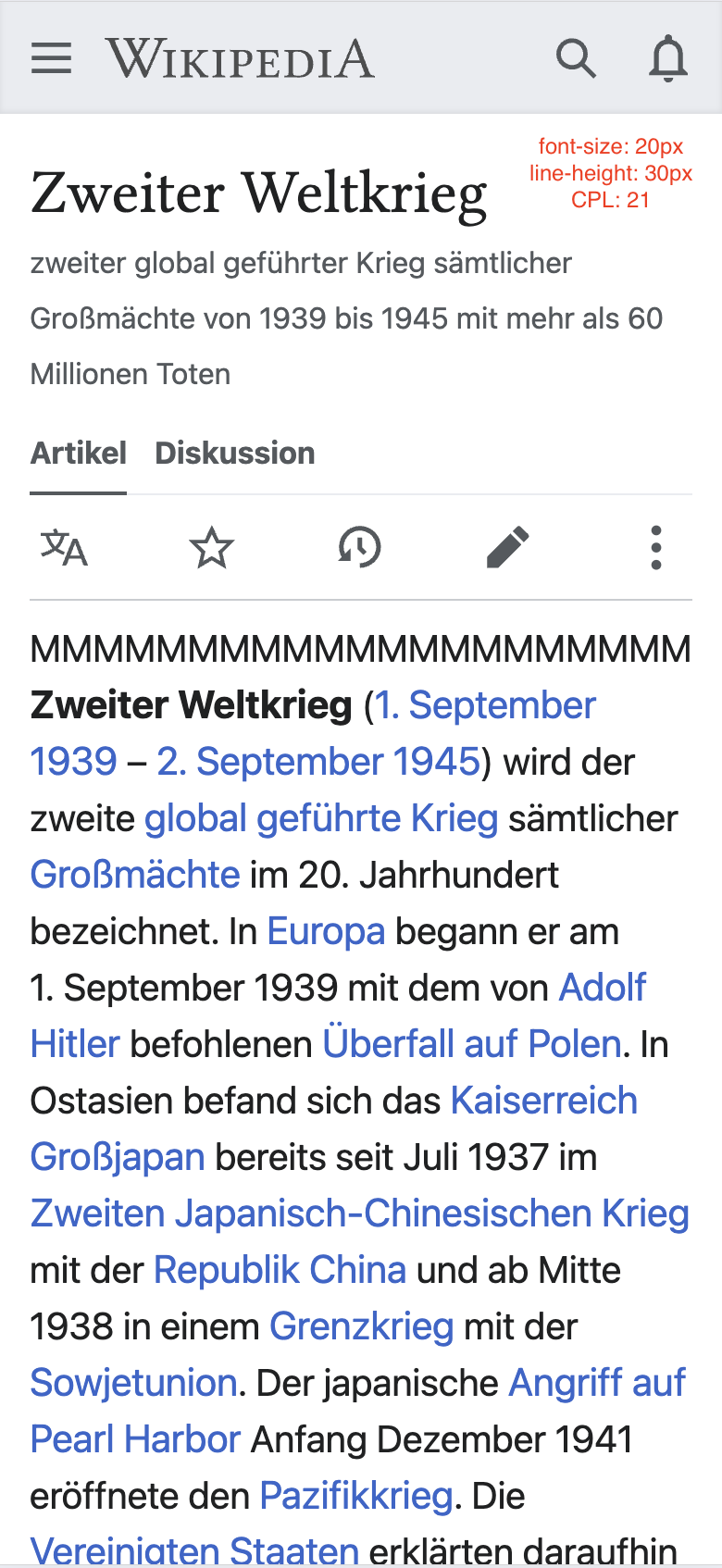
We want to bring Minerva's font-size choices in line with Vector for consistency's sake. This means choosing a small, medium, and large font size for Minerva.

  • Mock up Minerva pages with 18 and 20px font sizes to test how they work in the mobile interface on 5-10 pages in latin character languages
  • Try out other sizes above and below those thresholds
  • Decide on sizes
  • Review with internal stakeholders
  • Decide how existing preferences will carry over into the new sizes.
  • write up the specification for implementation

Event Timeline

Once this is done could you please link to the specification from https://phabricator.wikimedia.org/T349303 ? Thanks! (Seems like we committed to this without design input for some reason!)

I explored several variations for typography in Minerva. Took screenshots and compared them side-by-side. I also had a look at the CPL for each option.
As with Vector, there are 2 primary design decisions at play here:

  1. What font-sizes provide an optimal reading experience on mobile?
  2. Should we compress the line-heights on mobile to aid scanning in the same way as we have done for larger screens?

We did all of our community prototyping work in a desktop context, so we have less data to go on for mobile screens. As a result, my recommendation is falling back more on the HCI research that we've done, as well as usability/accessibility heuristics.

In keeping with the font-size settings on Vector, I want to propose 3 font-size settings. I have less conviction about the line-heights being somewhat compressed, but given that we know readers aren't reading articles line-by-line usually, and given the fact that scrolling and scanning on mobile benefits even more from higher information density because small screens already show less data in one view, I am going to recommend we follow the typography rule we established in the Vector interface: line-height = font-size x 1.5.

Minerva already has a 16px default size, which is a nice, readable size, so I think we should preserve that as the new default moving forward. So the "Standard" size on Minerva will be the smallest size. I am recommending that we have a "Medium" and a "Large" size in addition to that.

Standard: font-size: 16px, line-height: 24px
Medium: font-size 18px, line-height: 27px
Large: font-size: 20px, line-height: 30px

Note: photos are at 390px screen width

current default:

Screenshot 2024-02-02 at 11.39.59 AM.png (1×780 px, 345 KB)

New "Standard"

Screenshot 2024-02-02 at 11.20.09 AM.png (1×784 px, 352 KB)

New "Medium"

Screenshot 2024-02-02 at 11.56.57 AM.png (1×782 px, 316 KB)

New "Large"

Screenshot 2024-02-02 at 11.02.05 AM.png (1×780 px, 290 KB)

One thing to note: I wasn't able to mirror these to an actual phone. So we may need to refactor once this is built in a place where I can look at live code on my device.

I guess whoever picks up T349303 can sign this off!

New sizes look good to me. @Jdlrobson, @JScherer-WMF - do we still need an implementation ticket made?

No - this is done in T349303!

Hey, are the lines supposed to be compressed together? Politely, I find it unreadable, and would like a way to retain the ordinary line space width.

There is currently a VPT thread that shows that this change has a lot of opposition. Would you mind reverting it, or at least having an adoption RFC? I say this as a mobile editor.

@Zanahary @QuicoleJR could you share some screenshots and operating system/browser you are using? We are having some reports of unexpected rendering and that would be really helpful to help us understand what's happening here.

Admittedly, I do not know how I would share a screenshot. I use the Google app as a browser. Personally, I think that the new default text is too large, and would like it changed back.

@Zanahary @QuicoleJR could you share some screenshots and operating system/browser you are using? We are having some reports of unexpected rendering and that would be really helpful to help us understand what's happening here.

I included screenshots in my comment on T357724- they were taken on mobile Safari on iOS 17.3.1. The older screenshot is likely on iOS 17.3, but I doubt any rendering changes were made on the system-side.

@Jdlrobson

FAF497A9-B3A9-4116-8696-783CC5DD258E.png (2×1 px, 768 KB)

F9A28C12-FB9C-41EF-860E-DBD9297C2D48.png (2×1 px, 712 KB)
included are examples of the rendering difference between bullet pointed lists and plain text. Both are on Safari on iOS 16.1.1 and are "small" text size. I might add that the plain text version is atrociously difficult to read.

Thanks for your comments, everyone! We are trying to centralize a discussion about the line height change in T357770. I added a summary of the design rationale there and I'm looking forward to discussing it more. Thanks again!