Page MenuHomePhabricator

Evaluate rationale for line height changes in Minerva
Closed, ResolvedPublic

Description

NOTE: As mentioned in T357724, a font size increase being automatically applied for people; and the line height appearing squashed for some Apple users were bugs. These issues were fixed on the wikis on Monday 19th February.

Background

T357724: [Regression] Users are getting the incorrect default mobile font size introduced some changes to the line height of text in the Minerva skin. We would like to use this ticket to outline the rationale for these changes and centralize the conversation around any issues that may arise based on the new line height

Acceptance criteria

  • Summarize rationale for line height changes
  • Based on conversation, determine what if any further changes are required
Related Objects

Event Timeline

There are a very large number of changes, so older changes are hidden. Show Older Changes
ovasileva triaged this task as High priority.

The line height is indeed harder to read than the original. I would be in favour of keeping the original line heights.

As mentioned in T357724, a font size increase being automatically applied for people; and the line height appearing squashed for some Apple users were bugs. These issues are now fixed on the wikis.

Our intention in T349303 and T356339 was to have the font size remain the same and for the density of paragraphs to increase slightly by reducing the line height from 1.7x the font size to 1.5x. If your font size is the default size of 16px, that means the line height decreased from ~27px to ~24px. In addition we increased the spacing between paragraphs slightly.

Before I give the rationale for the design decision, let me just say thank you to all of the folks who have been giving constructive feedback on the change. I genuinely believe that your comments are a gift. So thank you.

This is the rationale for the change:

  • We know that the vast majority of Wikipedia readers spend less than a minute reading an article. The median reading time is 25 seconds.
  • We also know from a study of 2500 readers that most readers go to Wikipedia looking for a specific piece of information in context and skim articles to find it.
  • We also learned in our research that denser interfaces show more information at one time, which, assuming it's well structured, will also improve scanning and move important actions closer together.
  • I assumed that this pattern would be even stronger on the mobile site which shows less information on a page because of a smaller screen size.
  • When we were looking at the literature on web typography and accessibility, we read a study focussed on dyslexia that found that denser line heights lead to better comprehension.
  • Most studies found that line height had little to no effect on readability as long as it remained higher than 1.5x the font size.
  • We also learned that clear signposts aid scanning, which is why we slightly increased the spacing between paragraphs so that readers' eyes would have clearer breaks to guide them between sections on pages.
  • We also learned that people read best what they read most. Frequent readers have trained their eyes and brains to be effective with the previous typography and we knew that a negative transfer effect might happen when we made a change. Even though the change would make articles theoretically more readable, frequent readers would find it worse, even if just temporarily.
  • Finally, we reached out to 13 different wikis to help us prototype their ideal typography on Wikipedia. We received 632 designs. We found that the majority of participants wanted articles with slightly bigger fonts and slightly denser line heights. As fonts got bigger, the relative line heights became denser.

All of this research (read the report on wiki) and community participatory design (see the analysis) led to the follow design strategies:

  • Maintain the 16px font size on mobile web, and let readers customize their experience to have bigger sizes if they want.
  • Increase density slightly to improve scanning
  • Increase the spacing between paragraphs and sections to give clearer signposts for scanning.

We implemented these changes as a beta feature in desktop back in December, and there haven’t been any complaints about the relative density increasing. That being said, the density of the old default settings didn't change there. I realize that mobile and desktop are different and have different readerships, but we did not run another comprehensive study on mobile, so we extrapolated the findings from the desktop community design work.

All of this is to say that I have pretty strong conviction in the rationale for the slightly denser line-height.

Even though the new typography may be more readable in theory, that doesn't make it true in practice, as many of you have pointed out. Studies are imperfect, and they can't account for the billions of reading experiences on the wikis every day. However, I don't want to revert a well-thought-out design decision without giving folks the chance to get used to the change for a little bit. So I'm going to ask for your patience while we fix the rollout bugs and let things settle for a few days. I'm hoping to learn more about what you're finding difficult about the experience and whether or not it improves after you've had a chance to get used to it a little bit.

Thank you again for your involvement. I'm looking forward to discussing this further.

My issue with the line height is that it is cramped, visually overwhelming, and barely adds more info-per-screen anyways. It adds maybe one, one and a half lines of text to the mobile screen, and reduces readability by a factor that far outweighs the info density benefit. As for the research that says denser line heights are preferred, I can’t speak to that and I don’t understand it. To me it’s obvious that a small screen full of small text is more readable with lines further apart, and the case is that as soon as I (and many others users) saw the new interface, I clocked it and immediately went looking for an explanation and a way to revert it. I appreciate the thought that went into this, but the text on Wikipedia was readable, and now it is worse.

The more cramped line height is a serious issue of accessibility.
People who have visual processing issues, people who have dyslexia, etc - they're finding it harder to read and enjoy Wikipedia (as you can see in the various reddit threads, Discords, and other comments).
I'm autistic, with processing issues. I spend a LOT of time editing Wikipedia, and improving articles. Right now, I can't. Right now, with this squished-together line height, I can't read it. And I can't *change* it.
I'm my everyday life I've done work teaching about how to make content accessible: font choice, and yes, font spacing choice, is a HUGE issue.
I highly recommend looking into and considering this as an issue of accessibility and even potentially ableism. The current changes have rendered the site far less usable for many Wikipedians, and the rationale is not sufficient.
Additionally, as a researcher myself, I do not feel that a study of 2,500 users is sufficient to make such a massive change, which so deeply affects the site's usability.
Keep in mind, as well, that many of the people who are describing being negatively impacted by this change are the same people who do a lot of editing, writing, maintenance, etc. Neurodivergent people love sharing information.
Look, I understand the rationale, but I do not feel it is justifiable.
At the very, VERY least, you should make it completely easy to opt out of.
I used to spend literal hours a day working on Wikipedia. Now, I can't. As a disabled person, it is no longer accessible. It's a shame.

Additionally:

When we were looking at the literature on web typography and accessibility, we read a study focussed on dyslexia that found that denser line heights lead to better comprehension.

That study did not find that denser line heights lead to better comprehension. The study found that the largest line spacing in their study (1.8) had lower comprehension score than *the smallest* spacing (0.8). That's it. They say "we can only hint that small line spacing might make texts easier to comprehend" - that's the most they could even suggest, and frankly, as a researcher who has written my fair share or research articles, even *that* statement takes it too far. Not to mention this study is a) old, b) only involved 28 participants, and c) only looked at individuals with dyslexia. That is, in my opinion, very insufficient.

And:

Most studies found that line height had little to no effect on readability as long as it remained higher than 1.5x the font size.

This is largely based on both print text and desktop sites. We need to consider *mobile* text, which some studies suggest requires greater line spacing to stay readable: a lot of people access Wikipedia specifically on phones.
Additionally, Wikipedia's text has a difference compared to most typical text: citations. The presence of citations which 'jut up', making the line spacing feel smaller. Overall, the average Wikipedia paragraph is extremely cluttered - citations, blue text links, italics, etc etc, all of which reduce overall readability and create a need for more space and clarity.
Wikipedia isn't a regular text site. The lines need more space, to maintain accessible readability.
I understand why our protesting this might feel like a pain, but unfortunately it's a seemingly-minor change that's having a big negative impact on a lot of people.

XeCyranium unsubscribed.

As mentioned in T357724, a font size increase being automatically applied for people; and the line height appearing squashed for some Apple users were bugs. These issues are now fixed on the wikis.

Are you certain these issues are resolved? Text is still abnormally large for me on iOS 16.1.1 in Safari, fresh cache or otherwise with settings set to small. In the attached picture text appears normal starting in indented replies but overly large and tightly packed in top level posts.

5974FA93-750D-49F3-BEA1-7BE06E200403.png (2×1 px, 569 KB)

I have no idea why I've closed this task oh no I've really bungled that, sorry not used to this mobile interface.

XeCyranium changed the task status from In Progress to Open.
XeCyranium subscribed.

There that should fix it.

One issue is that the new line-height is only applied to .mw-body p, .content p, so the old value of 1.65 is still used e.g. in lists, divboxes like today's featured article on the main page, <dl> definition lists (read: talk page comments, exactly the issue @XeCyranium is pointing to above).

All of this research (read the report on wiki) and community participatory design (see the analysis) led to the follow design strategies:
[...] Increase density slightly to improve scanning

This is interesting, because in that analysis, you wrote:

The majority of designs have font-sizes and line-heights that are bigger than current defaults
[...] the majority of prototypes (329) had bigger font-size with more line height than we have today. This aligns with our research findings and the current academic consensus, which recommends larger fonts with more line height to improve readability.
[...] The new default typography for articles on Wikipedia should probably be slightly bigger with slightly more line-height than our current defaults.

I'm not sure how we got from that to... people want denser text!

We implemented these changes as a beta feature in desktop back in December, and there haven’t been any complaints about the relative density increasing.

Isn't that exactly what this person was talking about?

The improved density is way worse for reading and makes it uncomfortable. I'm pretty sure the prototyping was only done on desktop with no account for the mobile experience.

+1 to not liking the change.

However, I don't want to revert a well-thought-out design decision without giving folks the chance to get used to the change for a little bit. So I'm going to ask for your patience while we fix the rollout bugs and let things settle for a few days. I'm hoping to learn more about what you're finding difficult about the experience and whether or not it improves after you've had a chance to get used to it a little bit.

How exactly will feedback be collected after readers get used to it?

All of this research (read the report on wiki) and community participatory design (see the analysis) led to the follow design strategies:

And all of this research was done for desktop! It should be pretty clear that the two are very different. I don't remember ever seeing the design prototyping feedback for mobile.

aliu renamed this task from Outline rationale for line height changes in Minerva to Evaluate rationale for line height changes in Minerva.Feb 20 2024, 3:06 PM

The more cramped line height is a serious issue of accessibility.
People who have visual processing issues, people who have dyslexia, etc - they're finding it harder to read and enjoy Wikipedia (as you can see in the various reddit threads, Discords, and other comments).
I'm autistic, with processing issues. I spend a LOT of time editing Wikipedia, and improving articles. Right now, I can't. Right now, with this squished-together line height, I can't read it. And I can't *change* it.
I'm my everyday life I've done work teaching about how to make content accessible: font choice, and yes, font spacing choice, is a HUGE issue.

Again, thank you again for sharing your knowledge and experiences in this space. I also want to apologize for what seems to have been a frustrating experience for you. I have to admit that I did not expect the change to make things more difficult for folks with ASD. I'm trying to understand the impact more so that we can make a well-informed decision about this change and design changes in the future. I have been looking more into the research on information density and typography as it relates to ASD specifically, and it seems like a really under-researched area. In addition to double-checking WCAG, I've only been able to find 2 articles that address this issue, and they only make very vague recommendations:

reading comprehension is one of the difficulties people with ASD experience. Complex UI with many text fragments will reduce usability. It is important to organize the textual UI elements in such a way, that they do not impose reading difficulties.

Try to put one sentence on one line. If this is not possible, try to have separate clauses on separate lines or break the sentence into separate lines at the points where people would naturally pause.

The system should have elements that help with attention retention, such as dynamic stimuli, while not including elements that could be distracting or cause sensory overload.

Elements of the system should be measured/controlled to not cause hyper- or hypo-reactivity to sensory inputs, such as visual, auditory, and tactile inputs.

The system should be predictable so that it is not stressful or intimidating.

Your point below about how cluttered the text is with citations and blue links feels relevant to those points.

You mentioned that you have done teaching and training about accessible typography. If it's not too much trouble, do you know of any other articles or resources I can review about this?

[...]

Look, I understand the rationale, but I do not feel it is justifiable.

I think that's fair. A lot of the accessibility and readability research also recommends customizability, and it sounds from your feedback that more customizability for frequent readers is something we should look into more.

That study did not find that denser line heights lead to better comprehension. The study found that the largest line spacing in their study (1.8) had lower comprehension score than *the smallest* spacing (0.8). That's it. They say "we can only hint that small line spacing might make texts easier to comprehend" -
This is largely based on both print text and desktop sites. We need to consider *mobile* text, which some studies suggest requires greater line spacing to stay readable: a lot of people access Wikipedia specifically on phones.

I also really appreciate the feedback on the research. I agree with your points here. Most of the articles I read focussed solely on font-size. Very few of them mention line-height explicitly, and when they do it's only in a cursory way, as you rightly point out. The readability discourse I read frequently makes claims about how all human beings read on screens based on controlled lab experiments on latin-character languages with relatively small sample sizes. In this case, I drew conclusions from imperfect research, which I felt was preferable to ignoring the research completely. Nothing I've seen from the research community approaches the kind of scale and complexity that we have on the wikis. Most design heuristics about typography are based on recommendations from books over a century ago. I'm attempting to make inferences from imperfect data.

You mentioned studies that suggest that line heights should be larger on mobile to increase readability. Again, I would love to read those if it's not too much trouble to point me in the right direction.

Additionally, Wikipedia's text has a difference compared to most typical text: citations. The presence of citations which 'jut up', making the line spacing feel smaller. Overall, the average Wikipedia paragraph is extremely cluttered - citations, blue text links, italics, etc etc, all of which reduce overall readability and create a need for more space and clarity.

This is a great point. I hadn't considered this sufficiently. Thanks for bringing it up.

I understand why our protesting this might feel like a pain, but unfortunately it's a seemingly-minor change that's having a big negative impact on a lot of people.

To be honest, I don't see it as a protest, and it certainly isn't a pain. The diversity of reading experiences that people have on wiki is massively complex, and I took the job with the hope of collaborating with community members like you to try and find the best outcome for folks. Again, I'm genuinely grateful for the collaboration on this.

Has your reading experience changed at all now that the changes have been out for a few days?

Also: I don't want to derail the discussion about the line height on mobile here, but I'd love to get your thoughts on the readability improvements on desktop that we have in beta right now. This is the talk page for the feature.

Thank you again for your generous feedback.

barely adds more info-per-screen anyways. It adds maybe one, one and a half lines of text to the mobile screen, and reduces readability by a factor that far outweighs the info density benefit.

Thank you for contributing to the conversation here. Your point about the relative increase in information density made me want to look again at the number of lines on the view that you get with each type treatment.

Before: 16px, 27px (1.7x) line height -> 31 lines

Screenshot 2024-02-20 at 3.52.17 PM.png (1×784 px, 363 KB)

After: 16px, 24px (1.5x) line height -> 35 lines.

Screenshot 2024-02-20 at 3.11.08 PM.png (1×786 px, 407 KB)

So we get 4 new lines of text on the screen, which is a density increase of ~13%.
This week, the team and I are in the midst of working out how valuable this increase in density would be for scanning readers vs. the obvious preference some folks have for the old styles.

How exactly will feedback be collected after readers get used to it?

Thanks for raising this question. The answer is that it's complicated. We are relying on community feedback on the desktop beta to ascertain how the changes impact readability. The team has been discussing quantitative ways to evaluate readability, but the scale, complexity, and technical constraints involved make doing so extremely difficult. We're still looking into it, and we'll share any updates on this in the future.

[...]

I'm not sure how we got from that to... people want denser text!

We implemented these changes as a beta feature in desktop back in December, and there haven’t been any complaints about the relative density increasing.

Thanks for raising this. To explain a bit more about the prototyping initiative, we saw that line heights in the community designs did not increase proportionally with text size. As text sizes got bigger, the line-heights became relatively denser.

You're right to point out that the desktop and mobile reading experiences aren't 1:1, and this is another case where we are trying to infer the best possible design interventions from imperfect data.

Isn't that exactly what this person was talking about?

This person mentioned that a line height of 1.5x is a bit too dense for them, yes. This is great feedback. We're still monitoring responses to the beta, and if more folks feel this way after giving the new typography a try, we'll adjust it.

A question for the folks in the discussion here: How do you feel about the change now that it's been live for a few days? Has anything changed?

Also: if you haven't already, we would love to hear your thoughts on the type changes in the desktop beta. Thank you again for your all of your contributions to the discussion.

A question for the folks in the discussion here: How do you feel about the change now that it's been live for a few days? Has anything changed?

I can only speak for myself but personally while the changes aren't a tremendous issue the inconsistency with which they're applied is. I'm specifically referring to the way replies, bulleted lists, and indented text are all still in what seems to be the old format. Overall I still prefer the old style probably out of familiarity but I'm sure I could get used to the new way if it were universally applied.

Hi guys,

Please revert to the 1.65 line-height for mobile.

The text is cluttered and much harder to read.

Wikipedia for mobile is the most read text in the world. Readability is paramount.

I would like to suggest conducting user testing with a sample size of at least 20 individuals from all ages to gather insights and feedback regarding the proposed change.

A question for the folks in the discussion here: How do you feel about the change now that it's been live for a few days? Has anything changed?

Also: if you haven't already, we would love to hear your thoughts on the type changes in the desktop beta. Thank you again for your all of your contributions to the discussion.

People have been saying all week, across multiple platforms, how harmful this change is, and how unnecessary it is. It causes eye strain. It has made Wikipedia completely inaccessible for many users. Your rationale for this change has been directly refuted and disproven and shown to be based on falsehoods and ableist misunderstandings and yet you have continued on with your plans with total disregard for the usability of the site.

The font is still massive. It is too big to read comfortably. It is too squashed together and is therefore impossible to read. Wikipedia consists of lengthy text articles—people use the site to read and intake information. People need to actually be able to process the information they are reading and this change has made that impossible. Not only that, but the fact that it overrides (the appallingly low variety of) text preferences available on the site is, again, a big accessibility issue.

This change was unnecessary, harmful, and unwanted. Nobody actually likes it. Most people have been harmed by it and are actively avoiding the site or now having to take about ten extra steps to read an article by going into reader view or by requesting the desktop website just to be able to use the site. This should NOT be happening. Anybody else’s opinions are just ambivalent. Therefore, it is a bad change. You should not be actively making users’ lives harder.

Just revert it completely. Stop talking over disabled people and deciding what’s best for us when you do not have lived experience and do not understand the academic studies. Your intentions may have been good at first, but there was clearly pushback months ago that went ignored, and there has been a massive outcry all week that has been ignored. Deliberately excluding people from the website surely goes against everything that Wikipedia stands for?

Hi again,

The Reddit community has several threads about the line-height change.

Although the sample of opinions on Reddit might not represent the entire user base, the feedback indicates that the change could be problematic, especially for individuals with accessibility needs.

A significant number of comments suggest that the change is negatively impacting users' experience,

Here are the links to the threads where this issue is being discussed:

https://www.reddit.com/r/wikipedia/comments/1as7uua/i_thought_i_should_get_my_eyes_checked_but_it/

https://www.reddit.com/r/wikipedia/comments/1as457n/please_not_this_font/

https://www.reddit.com/r/wikipedia/comments/1arp52w/text_change/

I don't believe it speculative to assume that these users concerns are indicative of a broader sentiment that the recent changes may not be beneficial to all users and that reverting them should be worth considering, especially to accommodate those with accessibility concerns.

Can we have 1.65 back please?

I find it quite passive aggressive and insulting that the party line continues to be that the font size increase and the squashed line spacing were simply “bugs” when the developers here have been pushing their agenda to change those things over and over again and have succeeded in inflicting those things onto us.

The bugs have NOT been fixed. All that changed from the initial infliction was that instead of the font size being massive, it was made slightly smaller. That is it. You have NOT fixed the issue, and it is disingenuous of the developers to ignore users pointing this out and to claim otherwise. Particularly when proof has been given of the issue at hand.

The font size has been increased and the line spacing has been decreased. Revert the changes entirely. It is the only right thing to do. It’s incredibly ableist to enforce changes that actively exclude dyslexic, autistic, ADHD, and visually impaired users from Wikipedia.

I've verified the line-height change is still present by checking in an incognito window.

I would like commit myself to a respectful, end-user-focused dialogue on this change, informed by scientific data and actual user testing.
I'm also willing to carry out the user testing, provided we can reach a consensus on the methodology.
Additionally, does Wikipedia use A/B testing in any shape or form? If so, we could introduce the 1.5 line-height version to a segment of readers and analyze both the overall and detailed KPI's to see if there are any statistically significant effects.

I think this is a fantastic idea and thank you so much for volunteering to collaborate on it. Throughout this whole process, the team has been trying to find a more quantitative way to measure readability, but given what we know about scanning and other reading behaviours, we haven't been able to land on a methodology that would give us data that we're confident in. I've created a separate ticket for this work: T358491. I'll continue the conversation there. Thanks again.

Update:

  • We spent last week monitoring discussions about the line height change on the mobile site. We've been monitoring to see if the negative feedback is related primarily to the bugs or to the line-height. On places like Twitter or Reddit, the feedback has often been lacking in detail and/or hyperbolic. Within this context, it's really difficult to tell how much of the experiences described are permanent vs. just reacting to a new change. We knew the change would be strange for frequent readers at first because of negative transfer effects, and we wanted to see if folks still felt this way after a few days. Very few if any comments have arisen since the font size bugs got fixed on Monday.
  • As a few of you have pointed out, relatively few people have expressed a preference for the new line height. The negativity bias on public internet forums makes it so that we don't expect much positive feedback when changes happen. Based on what we've seen, most people haven't noticed at all, which was what we intended.
  • The handful of reports around reading difficulties from folks with ASD are the most concerning. There are not many of these reports, but I think it's fair to assume that these issues are more widespread than just a handful of people who have spoken up here and elsewhere. I had hoped that we would be able to find more research and/or resources on this topic to understand it more, but there is scant to no research on web typography as it is related to ASD and visual processing that we've been able to find. As a result, there are only really vague design guidelines about interfaces in general.
  • @Fluorescent_Jellyfish’s point above about Wikipedia text being much more cluttered with links and special formatting than most other text, especially compared to the lab based reading environments from the research we've seen, is a really good point that I hadn't considered when making the initial design decision.
  • I've also been re-reading a lot of the research that led to the decision in the first place and realized that the insight about density and scanning patterns was more focussed on maintaining density in the context of increased font sizes. In this case we increased density without increasing font size. This was a misapplication of the initial insight.
  • We also have no quantitative way to measure readability, and so we are left to make decisions based on imperfect desk research and reader feedback. We’re hoping to remedy this issue.
  • I'm thinking through the decision of whether or not to revert the change with two frameworks: Cost/benefit and risk/consequence.
    • Benefit
      • The potential benefit of the change is pretty slight: ~4 extra lines on a mobile interface, which scrolls by fairly fast. So the increase in density probably isn't creating a massive benefit for people who are scanning articles quickly. We already collapse sections in mobile articles by default as a scanning affordance, which may further reduce the positive effect of the line height change for scanning.
    • Cost
      • Risk
        • There is a high risk that some people with ASD and visual processing difficulties will find the line height much less readable.
        • There is a low to negligible risk that the vast majority of casual readers will experience either a significant positive or negative impact on readability because of the change.
      • Consequence
        • The consequence for the group of people who have experienced a negative impact on readability is very significant. They have reported finding the denser line height more or less unreadable. This has impacted their volunteering and reading.

Given the slight potential benefit and the significant negative consequences of the change for some people, we have decided to revert the change to line-height for the "Standard" font size on the mobile site for now.

We are planning similar changes to the desktop interface, and those changes have been in beta for months now. We will also review those changes in light of the learnings on mobile. If you haven't already, please try out the new typography on Vector and let us know what you think.

Thank you for finally seeing sense and returning the font as it should be. I hope that this means the font will no longer be extremely large too. Large fonts do not equate to increased readability.

This is definitely not a kneejerk reaction to change. The increase in font size and the decrease in line spacing did the precise opposite of your intentions: it made the site unreadable and unscannable. It forced my (and hundreds of other users) to either use a different website, or to take several extra steps just to be able to access the page (which often, in my case, had to be done per page and took about twenty extra clicks) like using reader view or switching to the desktop site.

What should have been a quick glance at a webpage to find out a fact thus took over five–ten minutes longer. Something that should have only taken seconds takes entire minutes with your new font, whether I try to force myself to read it or not. I cannot process the text. It is impossible. I would be stuck endlessly reading the same line over and over and wondering why I wasn’t intaking any new information. That renders Wikipedia useless, unless all I wanted to do was look at pictures.

The font changes affect a lot more of the demographic than just autistic people; it affects people with ADHD, dyslexia, dyscalculia, migraines and other neurological disorders, as well as users with visual impairments (that are frequently comorbid with the previous conditions) such as binocular vision dysfunction/vertical heterophoria, astigmatism, and convergence insufficiency. This should never have happened—and it should not have taken so long to revert such a harmful and ableist change. Particularly as the aims listed claim that users will be able to customise text density on the website, but this was not introduced at all, and in fact font size customisation was removed at the same time, thereby making it less inaccessible.

Do not dismiss people’s lived experiences and feedback as “hyperbolic”. When somebody tells you that you have made the website impossible to read, listen. Maybe ask why, instead of brushing off important feedback from people whom you actually caused physical pain.

With all due respect, this does not seem to be fully resolved at all? The font is still completely unreadable due to its massive size, and there is no way to reduce it to the correct sizing because there are no size customisation options on Wikipedia? Zooming out on my phone causes the size to be too small.

Can you please correct this bug ASAP and actually fix the font rather than marking things off as resolved/claiming bugs are fixed when they blatantly have not been.

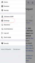
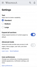
The default fonts on the mobile website have been restored now. It sounds like your interface is on the "Medium" font size somehow. If you go to the main menu in the top left corner, then tap settings, you should see the ability to change your font size back to "Standard" which should be the same as it was before the changes.

Screenshot 2024-03-01 at 9.04.59 AM.png (1×752 px, 240 KB)

Screenshot 2024-03-01 at 9.05.25 AM.png (1×750 px, 124 KB)

Screenshot 2024-03-01 at 9.05.47 AM.png (1×754 px, 136 KB)

Please let us know if you're still having troubles with this.

I checked that before even posting. I’m on “Standard”. It’s huge.

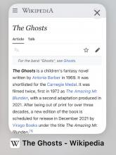
This is a screenshot of a thumbnail showing the site in a cached form before all the font changes:

IMG_4001.jpeg (772×581 px, 105 KB)

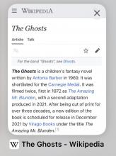
This is a screenshot of the same thumbnail after refreshing the page, after the bad font changes and alleged bug fixes (from Feb 17th):

IMG_4002.jpeg (772×577 px, 111 KB)

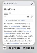
And this is a screenshot of the same thumbnail right now (Mar 1st) again after refreshing the page:

IMG_4043.jpeg (790×562 px, 107 KB)

As you can see, the font is noticeably much larger, to the point that three words have been knocked off-screen to the line below. The font size has been set to “standard”, I made sure of that. But it is enormous and completely unreadable. I do not understand why the size has been changed so dramatically, with no options for us to customise the size at all—only to make it even bigger, which serves nobody. The font needs to be fixed properly ASAP and reverted to the correct size, and there need to be font size customisation options to reduce the size of font somewhat.

This is a serious accessibility issue as it causes severe eye strain, migraines, seizures and panic attacks/overwhelm in neurodivergent users and users with neurological disorders or weakened eye muscles such as myself. The new, large font size is physically painful to read and I cannot focus on the page, my eyes skip about all over the place.

I checked that before even posting. I’m on “Standard”. It’s huge.

@Jdlrobson can you advise on the above? It does look like the font size has changed from the original even though the line-height has been reverted to the original spacing. Thanks!

This looks like @Sgurrdearg is still experiencing the bug T357724 so I can fully understand how that reading experience must be terrrible for them. From screenshots it looks like they are browsing logged out so that would make sense.

@Sgurrdearg do you have any other browsers or mobile phones you could try wikipedia on to confirm if you get the same problem there (I suspect the answer will be no)?

I would recommend clearing browser cache and site data (including cookies) for Safari. Safari can be overly aggressive with how it caches pages.

If that doesnt work I would recommend checking the operating font size:

https://sigmaos.com/tips/browsers/how-to-adjust-text-size-on-safari#:~:text=Safari's%20default%20text%20size%20settings,your%20preferred%20default%20text%20size.

I have tried it on other devices and browsers, and the text is still drastically larger. I’ve also never changed my text size in Safari or on my phone as a whole and I have not needed to. I will NOT be setting my text size to tiny across the board to accommodate one website that is malfunctioning, and it is not a fair suggestion. This larger font size is only on Wikipedia—no other site has been affected—and it only came about when the font sizes and spacings were mucked about with. When the site was originally broken, the font was actually much, much larger. It then became this, which is still much too large. I don’t have access to a non-Apple mobile device to see if it is affecting other operating systems or just iOS.

I am on iPhone, therefore it’s not possible for me to clear my browser cache without losing access to everything which I’m not willing to do, especially considering this is very much a Wikipedia issue, not my device, and I should not have to go through that on top of the severe pain and inconvenience that’s already been caused me these past two weeks. I have attempted to delete the Wikipedia website data from my other device and reload the page, and it is still the same, clearing the cache made ZERO difference. The font size is too large. Please revert it.

Also, tangentially related, I checked on my laptop to see if anything had been broken, and while the font does not seem to have been increased in size on desktop, the page layout has been destroyed, and there is now a huge and distracting sidebar on the left-hand side, which then disappears entirely if I hide it, and can no longer access it.

Why is the site so completely broken and unusable across the board now? None of these changes are helpful, they’re distracting, and they hurt my eyes and my head so badly. It has been a few months since I used Wikipedia on my laptop so my memory is hazy—I’m more used to mobile now—but there seems to be so much white space around the text which is distracting and overwhelming, and other changes I can’t put my finger on that make it so, so difficult to read, or even to scan and find information quickly. It is now impossible to focus on the text. The text is now floating in the middle of the screen.

I actually do vaguely remember this being an issue for me last year that impacted my work, but couldn’t put my finger on why it was so difficult to read. I’ve checked archived versions of different wiki pages using the wayback machine and can confirm that the site has become severely unreadable and inaccessible compared to previous versions. I’m not using hyperbole when I say that this affected my work—I often rely on Wikipedia to quickly research or double-check things when editing when I only need to do a quick check, and this did slow my work process down, and did induce migraines and feelings of panic and overwhelm that I could not explain. But having seen the proper version of Wikipedia using the wayback machine in comparison, it makes sense now. It isn’t right to inflict physical pain and inconvenience on users. It isn’t fair to lock the entire website away from neurodivergent people or people suffering with neurological conditions. I do not understand why any of these horrific changes were agreed upon. Can somebody please just fix the website and make it usable?

the page layout has been destroyed, and there is now a huge and distracting sidebar on the left-hand side, which then disappears entirely if I hide it, and can no longer access it.

There will be a hamburger menu on the top left if you hide the left sidebar. I actually think the desktop layout changes were mostly an improvement.

This still is not resolved? The font size is still way too big, and it is noticeably bigger than before all the changes. You’ve done absolutely nothing to fix it. As I stated, I have checked this on other devices and confirmed that this is persistent and not linked to my phone settings at all, despite @Jdlrobson’s incorrect assumption.

This still is not resolved? The font size is still way too big, and it is noticeably bigger than before all the changes. You’ve done absolutely nothing to fix it. As I stated, I have checked this on other devices and confirmed that this is persistent and not linked to my phone settings at all, despite @Jdlrobson’s incorrect assumption.

I can confirm that on my end, the problem appears resolved and the change appears to be reverted :) Please try clearing your cache as @Jdlrobson advised.

I have cleared the website data, but there is no way to clear cache on iOS without deleting every single tab and never getting them back. Which I cannot and will not do.

As I have stated: this is NOT to do with my device or my cache. I tested it on other devices and they showed the same issue.

Settings > Safari > Advanced > Website Data > Swipe websites you want to clear to the left

Settings > Safari > Advanced > Website Data > Swipe websites you want to clear to the left

And as I have stated, three times now, I have done this already.

This comment was removed by aliu.