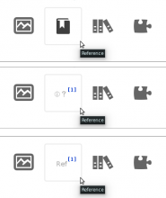
Original icon, and 2 suggested alternatives
The "Insert reference" icon is not very intuitive. I've made a sketch of two alternatives.
See attachment, or on-wiki at http://commons.wikimedia.org/wiki/File:VisualEditor_-_Toolbar_-_Reference-edit1.png
That image includes the current icon, and two adaptations that consist of: a snippet of grey text, and a blue super-scripted number [1].
The grey text could be made into abstract letterforms - squiggles - (rather than the letters REF) in order to make it usable by all languages.
Or we could use a grey "+" sign with the blue [number].
(The only problem is RightToLeft languages. Not sure how to solve that.)
The blue super-scripted [number] is universally recognizable and intuitively understandable as denoting references, both in Wikimedia projects and even beyond. I'd suggest this element, at the least, should form the basis for any replacement icon.
Version: unspecified
Severity: enhancement
See Also:
https://bugzilla.wikimedia.org/show_bug.cgi?id=53396
Attached:
