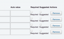
Screenshot of bug.
These labels are only one word long (in English anyway), but due to the compact layout, it is currently forced to wrap to the next line.
From a user point of view this looks like a bug. There's no reason for the label to be under the checkbox instead of right next to it.
Version: unspecified
Severity: normal
Attached:
