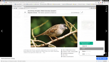
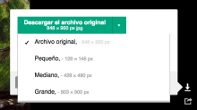
OOUI color defaults have changed and the resolution for the selected option in the download menu is barely readable now:
Description
Details
| Subject | Repo | Branch | Lines +/- | |
|---|---|---|---|---|
| Adjust Media Viewer download menu colors | mediawiki/extensions/MultimediaViewer | master | +4 -0 |
Related Objects
Event Timeline
Change 190621 had a related patch set uploaded (by Gergő Tisza):
Adjust Media Viewer download menu colors
@Gilles It looks good to me. Only one issue: It seems that the color has not been adjusted for the element which is selected. While the color for the other elements in the list is now dark enough, for the selected item it is still too light.
That screenshot shows some weird intermediate style (maybe your browser cached some styles which it wasn't supposed to?). See the top screenshot for how it should look. The selected color needs to be light because the background is now dark.
@Tgr, after updating core and refreshing I see a different picture now. I see two issues:
- When hovering the selected element, the row turns light gray makign the text also hard to read. I think that for the selected row, the background color should remain unchanged.
- I found the use of the dark gray to communicate the selection less clear than the former tick mark. But not sure if that was changed as part of the UI-Standardization. I have not found any recommendations on this, any thoughts @violetto?
The background color changes are all upstream, the only thing I changed is the color of the secondary text on the selected option, to better match the new background. We could override the upstream changes, of course - not sure if this is how a standard dropdown menu is supposed to look (can't say I love it) or it's a result of conflicting MMV and OOUI styles.
Thanks @Tgr and @violetto for the clarifications. I think it makes sense to use the standard styling for dropdowns, so that when it evolves MediaViewer does it too.
@violeto may want to consider the issue of the background colour when hovering the selected value which is not clear from the spec how it should be (and becoming light gray on hove felt a bit strange).
@Pginer-WMF, the changeset still has a -1 from you. Can you remove that or clarify what changes are needed?
@Pginer-WMF, when we iterate the design on this I'll keep you updated with the changes with what you commented in mind.

