Page MenuHomePhabricator

Make menu option look interactive
Closed, ResolvedPublic

Description

Screen_Shot_2015-04-20_at_16.41.44.png (504×468 px, 28 KB)

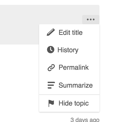
When hovering over some menu options, there is no clue that they are interactive. Items such as "history" remain gray when hovering over them, and triggering the actions requires the user to click over the existing label (e.g., not in the space next to it). Some details on how to fix that below:

  • When looking at T94947, I checked with @violetto and for menus, the expected style for hover is to use a grey background (#EEE). So I would expect the background color of the options to change to grey on hover.
  • The effective actions should be as wide as the menu. That is, the active region for going to the history should go from edge to edge of the menu item and not being restricted to the label.

Event Timeline

Pginer-WMF raised the priority of this task from to Needs Triage.
Pginer-WMF updated the task description. (Show Details)
Pginer-WMF added subscribers: Pginer-WMF, violetto.
Restricted Application added a subscriber: Aklapper. · View Herald Transcript
DannyH triaged this task as Medium priority.May 1 2015, 5:22 PM
DannyH subscribed.

I think part of the problem is the progressive/destructive color system. Edit is blue on hover, Delete & Suppress are red, but Permalink and Hide just stay as gray. I'm not that familiar with the color system, so I don't know if there's a color in that system that's appropriate for those choices.

If we use a gray background and we don't change the hover color of the links, we'll just need to make sure the gray-on-gray stays readable. :)

I agree that it's confusing -- I'm happy to do anything that would make it clearer.

I created an example video.
I think the grey on grey is readable, but it may not provide enough contrast with other colors (especially the blue of "summarize" in the video). What do you think, @violetto?

I just applied the following locally in my browser:

.flow-list li:hover {
    background-color: #ccc;
}

which does not solve the issue of having to click exactly on the label, but shows the background color change.

Yeah, the gray on gray looks fine.

Do we need blue and red on Summarize and Lock? Edit title is the same kind of action as Summarize, and Hide is more "destructive" than Lock.

I think every item should have a color, or none of them.

I think every item should have a color, or none of them.

That is an issue of the second part of the problem: currently you are only acting on the action when you are specifically over the text label, not the whole menu element. that is the reason why edit is not changing.
If we highlight the whole element, we need to make the whole element interactive if not it breaks user expectations which is the reason the behaviour when hovering over "edit" looks weird.

I don't think it's about how far the label goes -- Summarize and Hide have colors, and the others don't.

Right now, it's:

Edit title (gray)
History (gray)
Permalink (gray)
Summarize (blue)
Hide topic (gray)
Lock topic (red)

It looks weird to me that two of those links change color on hover, and the other four don't.

Edit title (gray)

You are right, but I'm sure I saw the edit link used to turn blue some time ago.

It looks weird to me that two of those links change color on hover, and the other four don't.

According to the semantics of the "progressive" (blue) color, it represent moving forward in a multi-step process (similar to the use of "..." at the end of classic OS desktop menus like "Save" vs. "Save as..." but more subtle). So the colors I would expect here are:

Edit title. Blue because is part of a process where you still have to edit and save.
History. Gray, just navigation to get the desired info.
Permalink. Gray, navigation.
Summarize. Blue, part of multi-step process to add a summary.
Hide topic. Blue, part of a multi-step process to change the status of a post.
Lock topic. Red, part of a process that will result in data deleted.

While the color system may not be obvious consciously (except for red as a warning), the idea is that color will help users instinctively build an expectation of the kind of action outcome (distinguish actions that have side-effects from those that do not). In that way we can encourage freedom of exploration and make users not to worry of possibly breaking anything when exploring links they perceive as safe.

Change 210648 had a related patch set uploaded (by Prtksxna):
Make menu option look interactive by changing background color on hover

https://gerrit.wikimedia.org/r/210648

@violetto has added:


  • It defines the color to be used when hovering over an option in a dropdown to be #eee. This is what .flow-list looks like with the change.

    menu.gif (310×430 px, 276 KB)

    (this is an animated GIF, open it in a new window to see)
    (the blue and red looks wrong because of compression, see F164243, for an uncompressed version)


    I have submitted a patch making this change. Feel free to hijack or abandon it as you see fit.

    Thanks for the clarifications @Prtksxna , and the menu spec @violetto.
    I have updated the ticket description with the right color.

    Change 210648 merged by jenkins-bot:
    Make menu option look interactive by changing background color on hover

    https://gerrit.wikimedia.org/r/210648

    Prtksxna claimed this task.