Page MenuHomePhabricator

As a user, allow me to better see article images by making them full width of the device
Closed, ResolvedPublic3 Estimated Story Points

Description

NOTE: this task will deviate from Android - iOS will go FULL edge to edge on phones - NO PADDING (Android likely to patch to do the same in the future).

Lets modernize the layout and improve usability

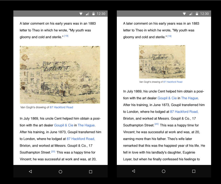
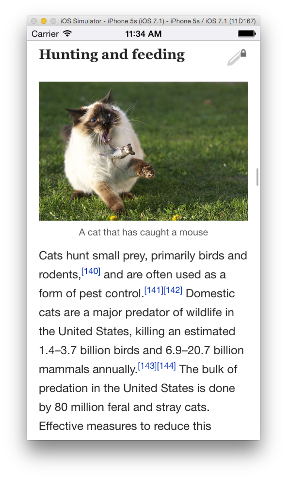
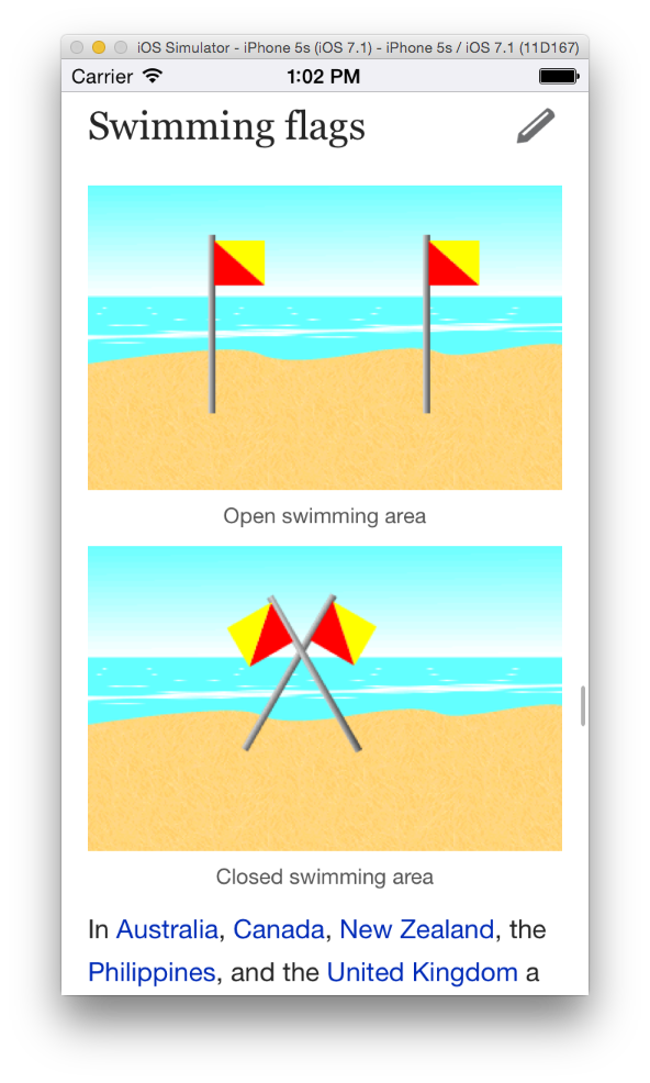
As a reader, I want to see larger images so that I can learn better through visuals along with text.

  • Make all article images full width of the page

Notes below on why this shouldn’t be done - we should always use the best variant for the device, regardless of network connection:

  • On WiFi (and 4G?) only, use the @2x image instead of the smaller variant
NOTE: Android has this built T94646 - so lets look at their js…

Only for phones for this 1st iteration

PortraitImages.png (705×844 px, 279 KB)

Event Timeline

Fjalapeno raised the priority of this task from to Needs Triage.
Fjalapeno updated the task description. (Show Details)
Fjalapeno subscribed.
KHammerstein updated the task description. (Show Details)

We might want to look into actually going FULL width if we can.

Its a more modern look (even if the text is still inset to the side). Also, for iOS, this keeps with the focus of "content first” - using all the available space to show what the user is interested in.

Some example screenshots of other apps:

IMG_4164.jpg (1×750 px, 184 KB)

IMG_4163.jpg (1×750 px, 282 KB)

IMG_4161.jpg (1×750 px, 205 KB)

IMG_4162.jpg (1×750 px, 248 KB)

Friends, I'd advise against spending time on this before we see what befalls T94646.

Ohh I'd like to work on this :)

Reminders:

  • see "hummingbird" article for low res gallery items
  • consider conditional XPath re-write of requested image urls so no js bs has to happen (another major benefit being if this happens just before WMFInjectArticleWithImagesFromSection the higher res images will automagically be requested *and* routed to the caching layer with zero additional work)
BGerstle-WMF subscribed.

Looks like Android is still going through design review, so I marked our task as blocked by theirs (T94646). Lots of iteration going on w/ edge cases for small images & alignment, so better to wait until they've figured everything out.

@BGerstle-WMF These edge cases are for tablet, which we will work on later. The android implementation looks great on phones and we can start implementing that on iOS now. :)

@BGerstle-WMF it is generally not recommended to adjust your fetching based on connection type. Usually what is recommended is to only use true throughput to adjust fetching behavior (like HTTP live streaming)

The reasoning is that you can’t know the true speed of the connection (nor the constraints of the network) by interrogating the connection type. Nor can you make assumptions about someones data plan. Just because we usually have unlimited bandwidth over wifi, doesn’t mean that is always true, also just because most cellular data plans are limited, doesn’t mean that all of them are (or that the user cares, either way).

If we want to adjust images because we think the user is constrained by the network, then that has to be a user setting/prompt (A setting for “Only download low resolution images")

Talked with @KHammerstein offline - for iOS we are going to do full edge to edge (no padding)… it should look better on iPhones (iPads are still out of scope and TBD)

@Mhurd mocks dont reflect this, so fair warning when you pick this up.

Also, Android will likely follow suit at a later date… but they are already kicking the first version of this out the door.

Bumping to 3 story points because we have to do more changes to the android code than we first anticipated. cc @KLans_WMF

I will upload screenshots tomorrow.

Screenshots and articles which demonstrate various things this patch influences:

enwiki > cat > fighting
The image is widened. ( * Note we do not widen edge-to-edge. Since we don't control the exact html structure, this is not even close to being easy to do. Doing so would require a ridiculously complex and fragile set of hacks - there are many non-obvious edge cases. Not recommended any time soon.)

Screen Shot 2015-05-20 at 11.33.41 AM.png (986×592 px, 475 KB)

enwiki > cat > hunting and feeding
The image is widened.

Screen Shot 2015-05-20 at 11.34.56 AM.png (986×592 px, 366 KB)

enwiki > cat > play
The image is intentionally not widened. This is a low-res screen grab for which no "srcset" is provided.

Screen Shot 2015-05-20 at 11.35.11 AM.png (986×592 px, 255 KB)

enwiki > cat > feral cats
The image is widened.

Screen Shot 2015-05-20 at 11.35.28 AM.png (986×592 px, 507 KB)

enwiki > goat > anatomy and health
Landscape. The image is widened, but to about 60% of landscape screen width. Going to full width in landscape (or on tablets in either orientation) results in images taking up too much vertical space - especially with images which are taller than they are wide. You end up scrolling past 2 or more screens of image and it interrupts the visual flow of the article dramatically. (Full widening on landscape or tablet is also problematic because the amount images are stretched is much greater, and not all images have sufficiently high res variants - more images end up looking blurry even if you request higher res.) Widening to about 60% in landscape and tablet avoids these problems and looks really nice as it makes image widths mostly consistent and the layout just looks better.

Screen Shot 2015-05-20 at 11.37.13 AM.png (614×964 px, 375 KB)

enwiki > right triangle > area
The "t = 1/2 ab" image is not widened intentionally.

Screen Shot 2015-05-20 at 11.39.36 AM.png (986×592 px, 145 KB)

enwiki > flags > shapes and designs
The little inline "E" and arrow symbols are not widened intentionally.

Screen Shot 2015-05-20 at 11.42.21 AM.png (986×592 px, 182 KB)

enwiki > flags > swimming flags
Both images widened.

Screen Shot 2015-05-20 at 1.02.22 PM.png (986×592 px, 270 KB)

enwiki > historic counties of england > southern england
The large image is purposefully not widened by this code even though it appears full width. It was already too wide for the screen and has been made side-to-side scrollable by other code. It also has a links overlay. We purposefully leave untouched any images which already have side-to-side scrolling.

Screen Shot 2015-05-20 at 11.43.22 AM.png (986×592 px, 191 KB)

enwiki > san francisco > lead section
We leave untouched any images appearing within tables. Often tables have multiple columns or otherwise complicated layouts. Widening images within tables breaks all the things. Of note in the image below are the two side-by-side images - they are intentionally not widened. (The bridge images is also not widened, but was already about full width.)

Screen Shot 2015-05-20 at 12.31.43 PM.png (986×592 px, 308 KB)

Following up, I added @Mhurd's screenshots & descriptions to the "Page images" section of the iOS Test Cases spreadsheet

Signed off by Design.
Separate Fresh ticket filed for minor whitespace issue around captions.