Description
Details
Related Objects
- Mentioned In
- T103788: Android Production Release 2.0.105
rAPAWf8688b5524c4: Fix image widening for images that intentionally overflow the column width
rAPAW1ba787f77965: Use larger and higher-quality images where appropriate
rEMOBb70d9218d318: Update Less files to accommodate updated image resizing approach
rMEXTcaf38430c55a: Updated mediawiki/extensions Project: mediawiki/extensions/MobileApp…
rEMOB4b56703b9aa4: Make images larger and higher-resolution
rMEXT09f0e8b8be08: Updated mediawiki/extensions Project: mediawiki/extensions/MobileApp…
T97782: As a user, allow me to better see article images by making them full width of the device
T96311: Gallery in an article displays too much white space above the img's caption
T87066: Handle image map links in-app
Event Timeline
Change 205649 had a related patch set uploaded (by Mholloway):
[WIP] Use a higher-res image if available and set it to the width of the column text.
An APK would be great so @Etonkovidova and I can do some edge case testing and help you with this.
@Vibhabamba I'll probably want @bearND to have a quick look at the code first but I'll get you and @Etonkovidova an APK shortly. The changes so far are simple code-wise but it seems like there will be some wonky issues to address.
While testing today, I found that certain images edited with a fairly obscure previewing template, "CSS image crop," display incorrectly in fairly unpredictable ways. The template is apparently meant to be used to preview the effects on a page of cropping an image without actually having to download and crop it, with the original image to be replaced with an actually cropped image if the results are satisfactory, but the images as transformed with CSS image crop are nonetheless committed as edits in some cases. CSS image crop has apparently caused problems on mobile for some time, and was at one point nominated for deletion due to its complexity and the tendency to use it incorrectly. It's still around, though @Deskana did some digging and found that only ~0.01% of pages are affected.
Examples of pages with images altered with CSS image crop:
https://en.wikipedia.org/wiki/Tomb_Raider#1996.E2.80.932003:_Tomb_Raider_to_The_Angel_of_Darkness
https://en.wikipedia.org/wiki/Stone_of_Scone
https://en.wikipedia.org/wiki/Seated_Liberty_dollar#Gobrecht_dollar
This is a problem with the underlying content itself and not the app or my changes to it. I understand that @Deskana has or will ask @Moushira to spread the word using CSS image crop correctly.
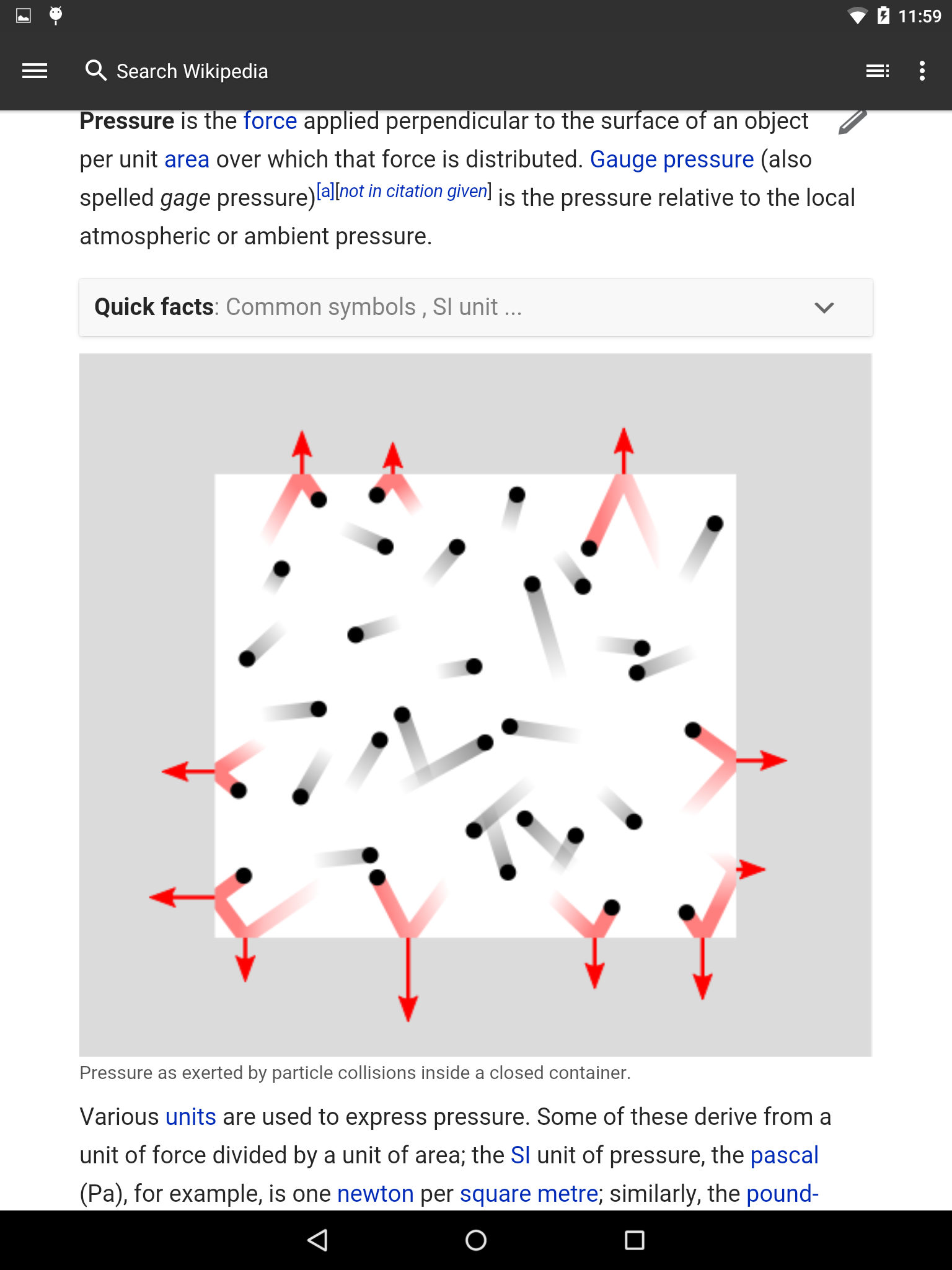
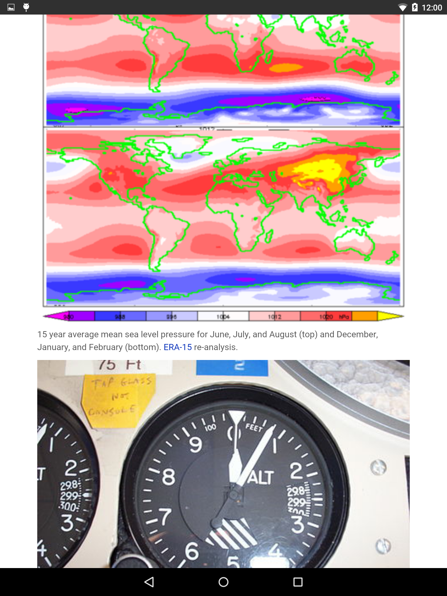
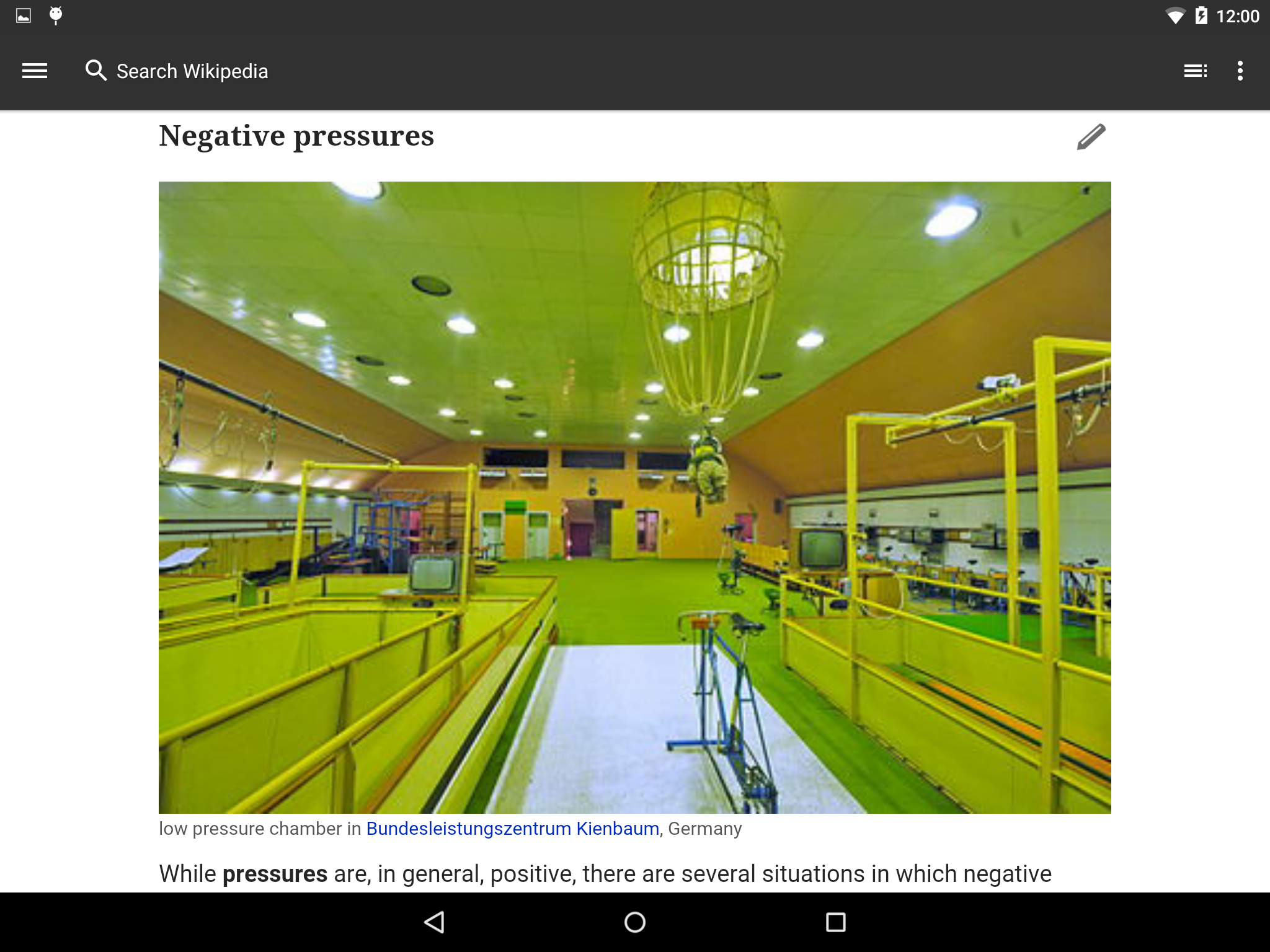
Please check science articles such as 'Pressure' for the small images being resized, so they are hugely pixellated.
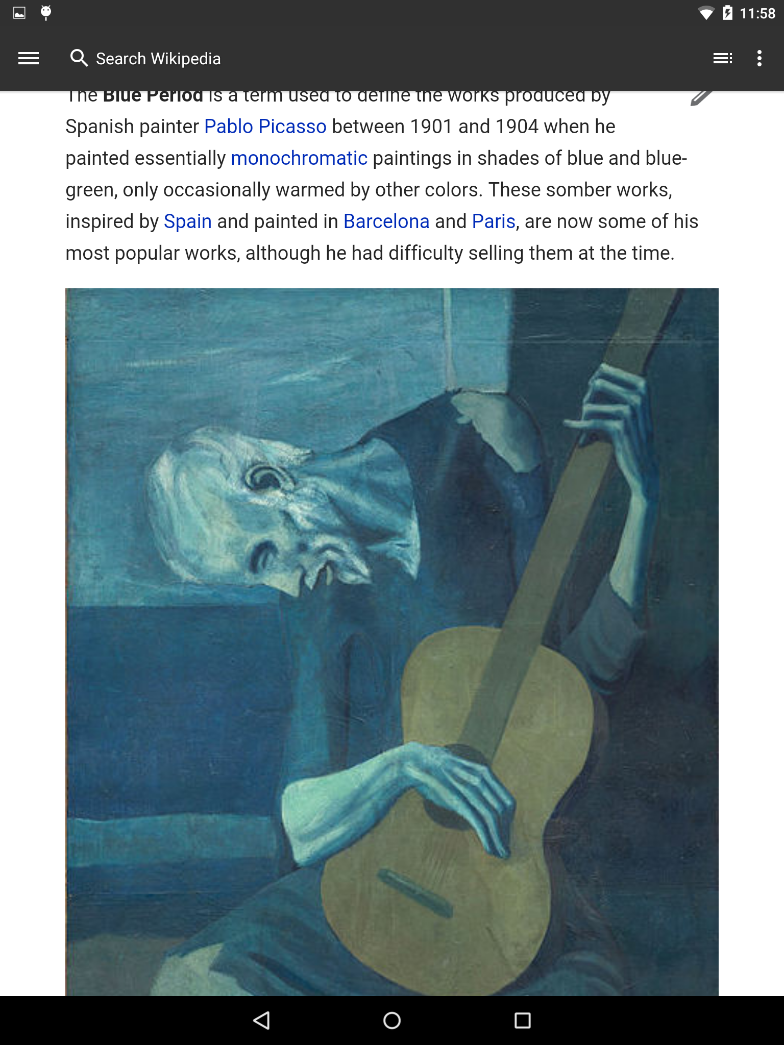
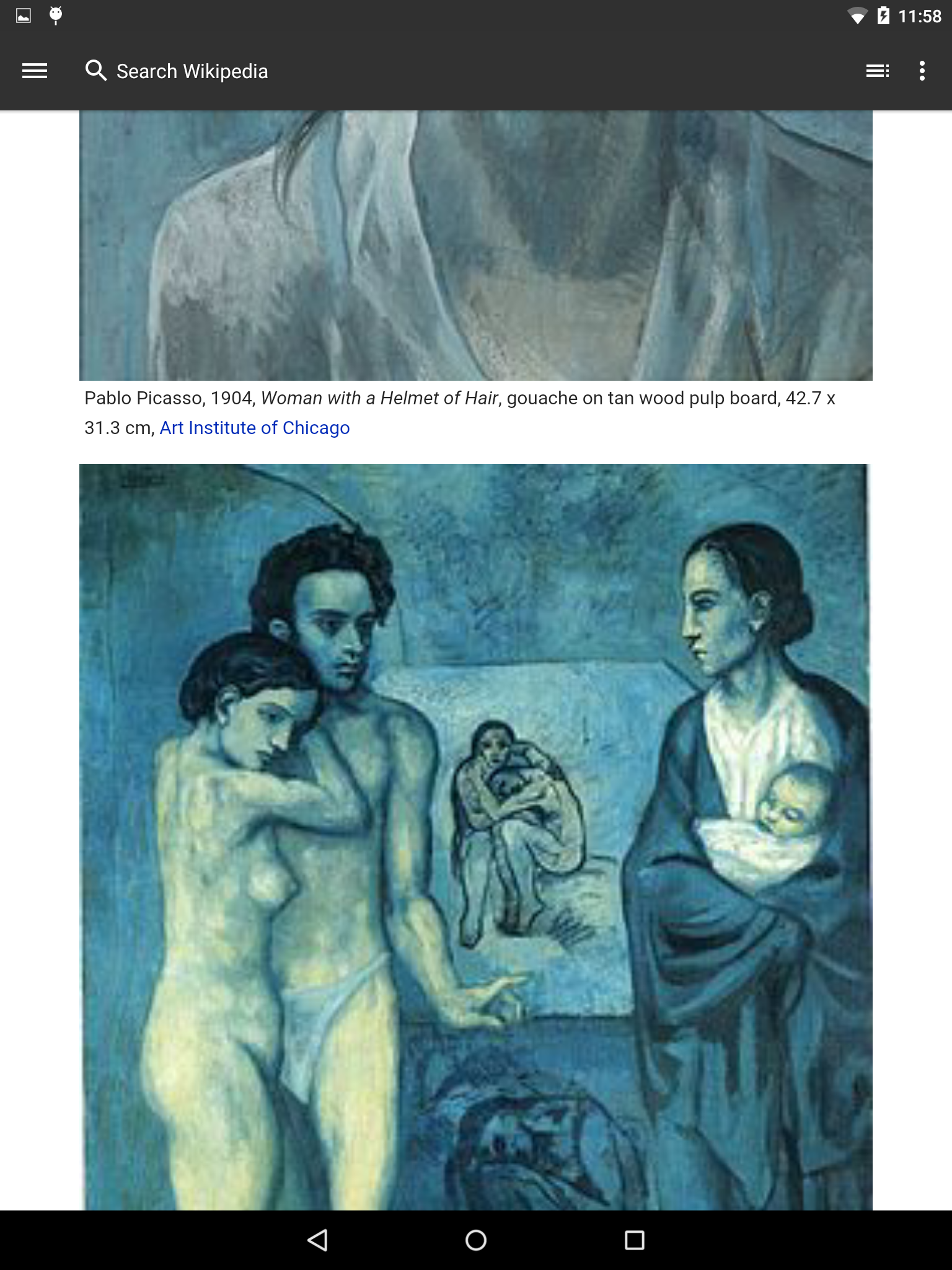
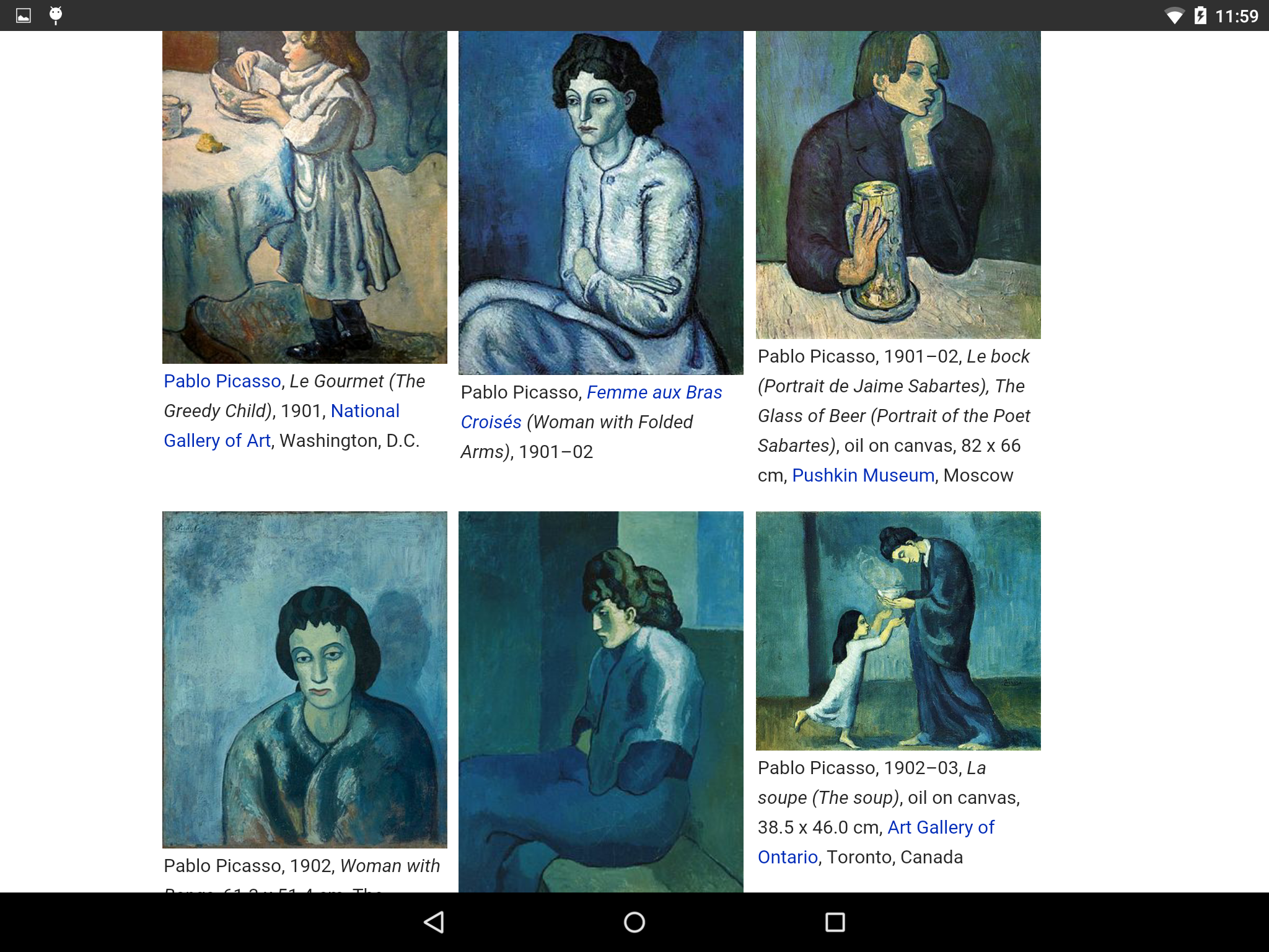
Mholloway, when the images are high resolution, the experience looks great.
Thank you so much for working on this.
It will have big impact on the UX.
Checked it too - looks good.
Filed two issues - not related to this task.
https://phabricator.wikimedia.org/T97194
https://phabricator.wikimedia.org/T97197
I just sent Vibha & Elena an updated APK for testing. This version correctly rendered all of the pages I tested on, but because of the many different ways images can be handled in the HTML that the API sends over, it's likely we will just have to handle edge cases as we find them.
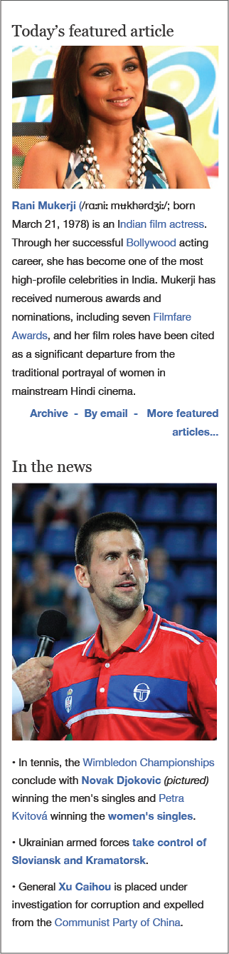
@Mholloway lets do full-width images on the main page too, even in the news section. Here's a mock:
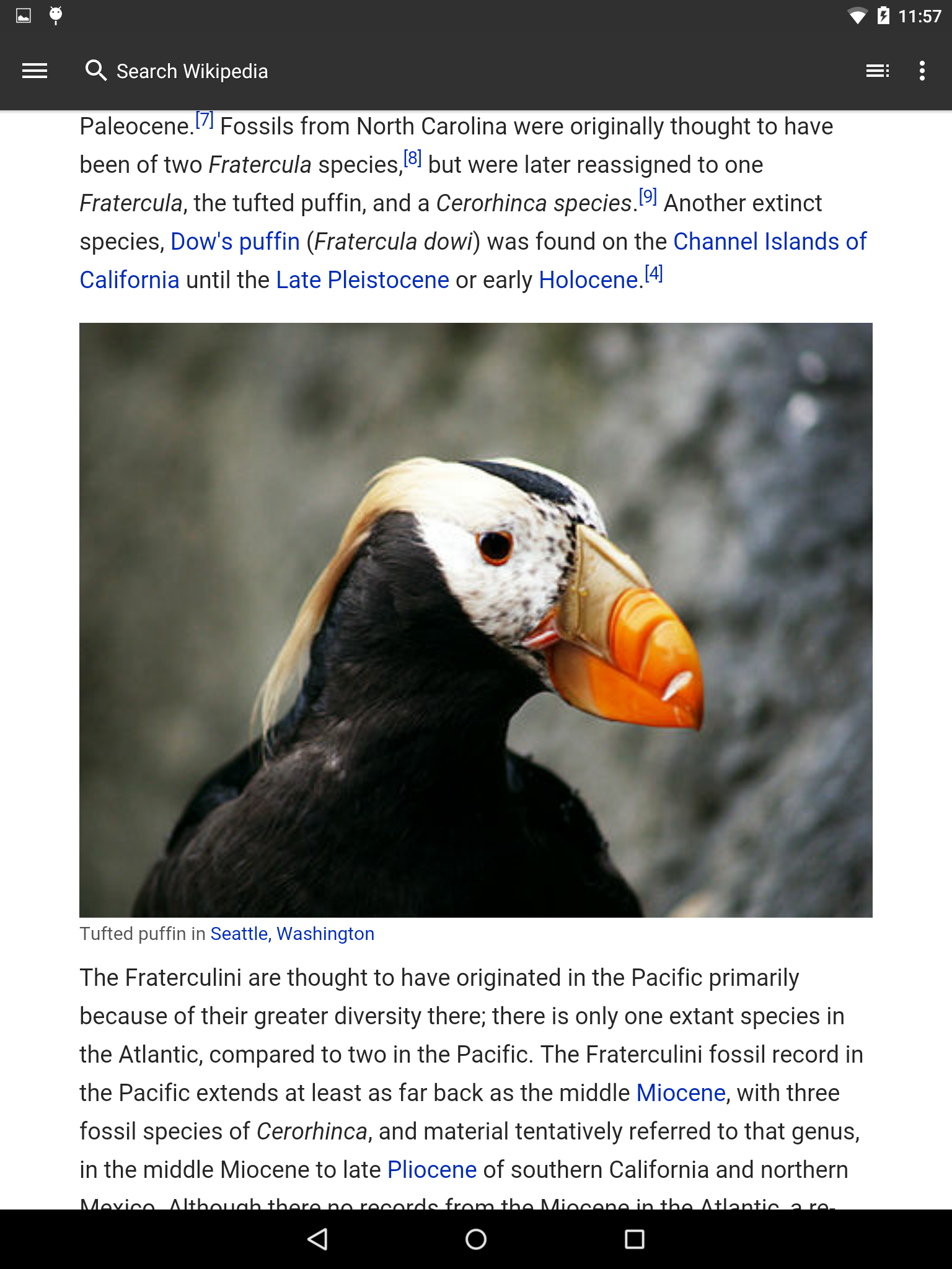
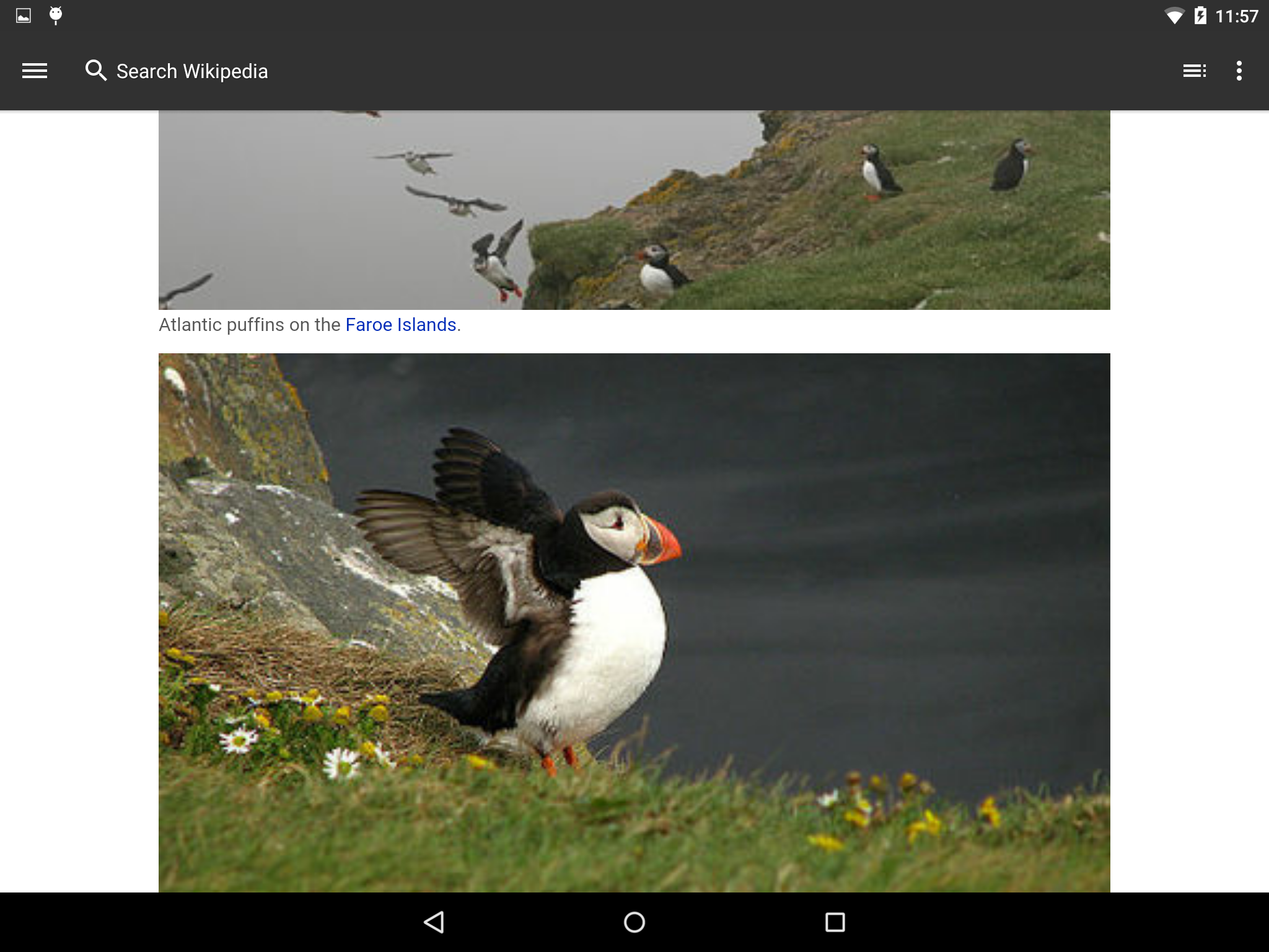
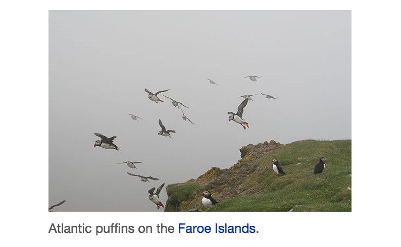
@Mholloway Some images still looking fuzzy - for example this in the Puffin article. Is it possible to fix?
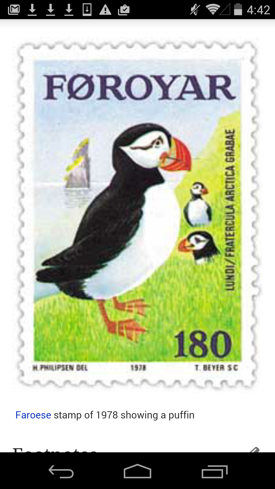
Yeah, we should be leaving small images like the puffin stamp alone; that's fixed now.
As for the main page, I've made the change to make those images full-screen as well (and can easily do the same for the featured articles archive), but it seems that main-page thumbnails are sometimes cropped, making them look fuzzy and pixelated when stretched to full screen with; for example, see the screenshot below with today's "in the news" image. If we're sure we want to stretch them, one possible solution would be to fall back to the original image if the image has been cropped for use on the main page, although that would mean diverging from the web in content as well as form.
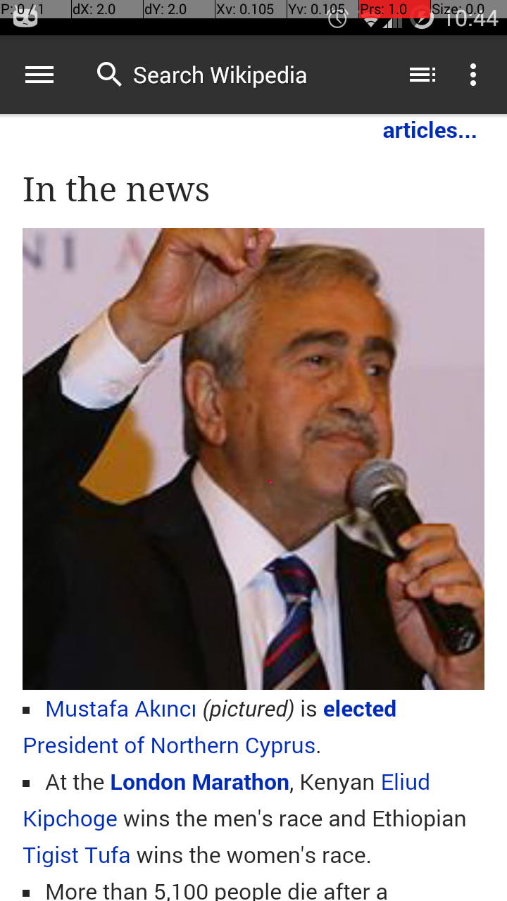
Original image:

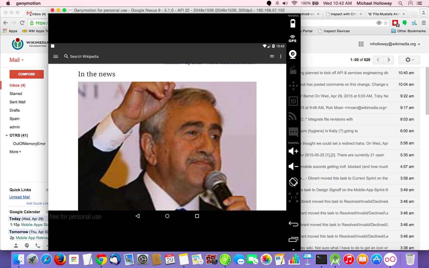
I have a physical tablet coming today but in the meantime I've been using a Genymotion-emulated tablet (see, e.g., second screenshot above).
Here are a bunch of screenshots from the new tablet (Nexus 9). As you can see, some images when stretched look better than others. Let's talk about how to handle images on tablets.


@Mholloway For images that are less than 100 px, leave small as discussed, but lets left align them.
Lets increase the space between images and captions by ~5 pixels, so that it has spacing more like on mobile web
Current android:

Mobile web:
Also, can we increase the spacing between image+caption divs and the next element? (Wether it is another image or a paragraph).
If so lets increase by ~5 px.
Lets jump on a hangout tomorrow to look over the spacing. Thanks!
New APK sent, with comments from @KHammerstein addressed. This version just takes the larger thumbnail and sets it full-width if it already fills the column, left-aligns it otherwise.
I'm feeling somewhat more optimistic in principle about main page images than yesterday but I want to propose we make that a separate issue/Phab task since it presents additional concerns and seems a bit out of the original scope.
@Mhurd had some good thoughts on this so I'm adding him.
@Mholloway
On tablet, text should wrap around in-article images.
Like this,

Other than that, looks good!
@Mholloway on desktop and mobile web, some images are aligned left, some aligned right. Can we keep those same alignments for text wrapping?


Should I be looking into using something like https://developer.android.com/tools/debugging/systrace.html to analyze the performance impact? Based on my development experience, the impact is very modest.
If there are no objections I'm going to move this to design review since that more accurately reflects its status than "doing."
Change 209588 had a related patch set uploaded (by Mholloway):
Make images larger and higher-resolution
@Jdlrobson, I'll address your comments here so we have the benefit of screenshots. Basically, I agree with you that this task would have been better coordinated with all the mobile platforms up front, and I'm not wedded to any of my code in particular, but at this point I have an essentially completed patch that gives Design what they want on Android and results in an improved user experience, I think, so in that spirit:
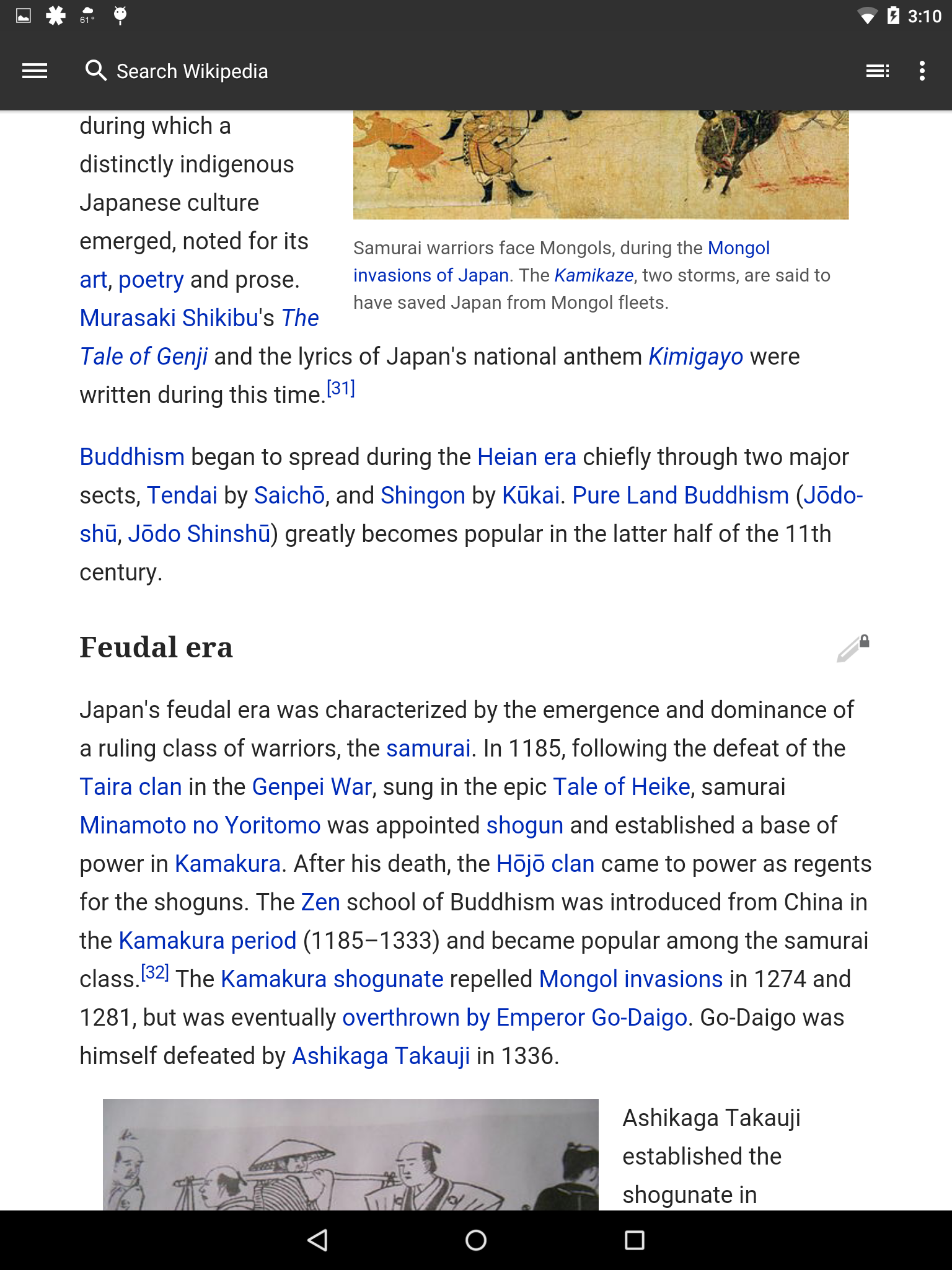
The main directive from Design, as I understand it, is to always use the highest-quality images available, and to make them larger (full column width for a phone in portrait orientation). The js hack to force grabbing the 2x image from the srcset attribute is essentially to cover the app on phones, where the Android WebView doesn't take the higher-quality image from srcset even though that's what we want (and indeed what happens on the mobile web). On tablets srcset works fine on both platforms. Here are screenshots showing the enlarged image on my cell phone without and with the hack (with a screenshot from the current app production release and mobile web for reference):

The existing CSS/Less changes are just to accommodate miscellaneous effects of enlarging the images.
Following up from comments on the Gerrit patch mentioned above...
@Jdlrobson makes a good point that MobileFrontend might benefit from this patch.
And in fact, since @Mholloway's implementation turns out to be purely CSS and Javascript, this task could have simply been assigned to the MFE team from the start, with the Apps inheriting the change in the usual way.
@Vibhabamba @KHammerstein @JKatzWMF Do we want this functionality in MFE? If so, it would indeed make more sense to push this change upstream.
So just a note - you probably only want to do this on WiFi or 4G and this is somewhere the apps can excel (on web you can't tell difference and I should probably ire us on side of caution until we know what increase in bandwidth this would cause (cc @phuedx) - create a card Kaity if you want us to work on this.
But Apps team - this is easy. If you look at an image you'll notice srcset. The url is in there where it says 2x! Just extract it and replace the existing url with it when you do your parsoid transformations.
<img alt="Gary Cooper, 1936" src="//upload.wikimedia.org/wikipedia/commons/thumb/7/7d/Gary_Cooper_1936.jpg/100px-Gary_Cooper_1936.jpg" width="100" height="133" srcset="//upload.wikimedia.org/wikipedia/commons/thumb/7/7d/Gary_Cooper_1936.jpg/150px-Gary_Cooper_1936.jpg 1.5x, //upload.wikimedia.org/wikipedia/commons/thumb/7/7d/Gary_Cooper_1936.jpg/200px-Gary_Cooper_1936.jpg 2x" data-file-width="451" data-file-height="600">
Just extract it and replace the existing url with it when you do your parsoid transformations.
That's just what the other half of the patch does: https://gerrit.wikimedia.org/r/#/c/205649/
@Mholloway A couple things:
Some images not left aligned
Looks weird with small images next to large, not sure what to do about this though. Any thoughts?
Text overlapping image.
@Kaity these are fixed in changes since the last apk (which i'll send shortly) For #2, though, the pic is still small (though in line with the rest now) because it doesn't meet our minimum size threshold for enlarging.

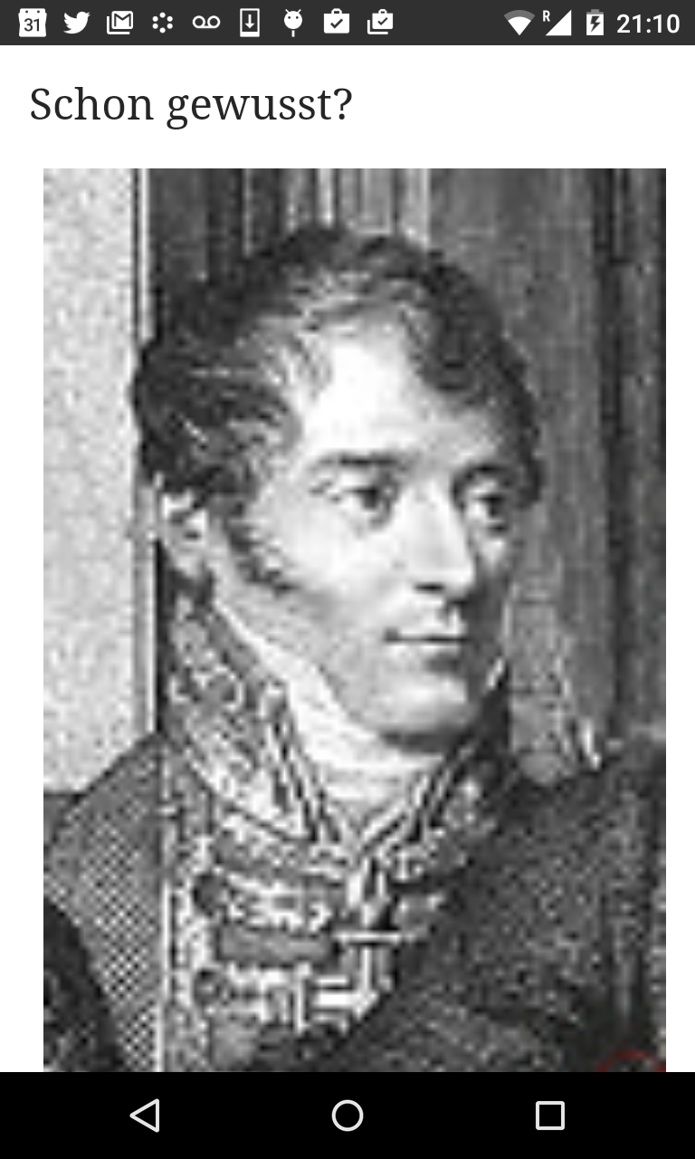
@KHammerstein I am concerned about full width images on the main page. Here are examples from today's dewiki main page:
Picture at top of page: You have to scroll down quite a bit to get to text.
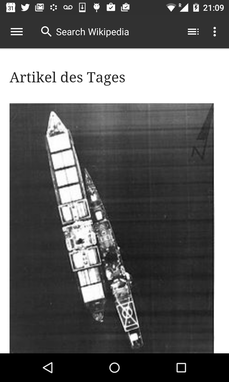
Some pictures are very pixelated. I doubt it makes a lot of sense to have full-width images on main pages.
@bearND agreed. Main page images are more difficult and should be handled, if at all, as a separate task; we shouldn't be enlarging them here. I've updated the patch to fix this on all wikis.
Change 215506 had a related patch set uploaded (by Mholloway):
Update Less files to accommodate updated image resizing approach
Change 215506 merged by jenkins-bot:
Update Less files to accommodate updated image resizing approach
Change 205649 merged by jenkins-bot:
Use larger and higher-quality images where appropriate
@bearND It looks like we decided not to do this on main pages. (Based on latest alpha)
@bearND It looks like we decided not to do this on main pages. (Based on latest alpha)
Glad to hear that :)
Checked examples(samples) given in the ticket - all look good. The issue https://phabricator.wikimedia.org/T102296 still is in place.