Page MenuHomePhabricator

Radio Buttons
OpenPublic

Authored By
violetto, Jan 9 2015
Referenced Files
F163731: sizeGuide.png
May 11 2015, 9:55 PM
F163728: Screenshot 2015-05-11 14.57.21.png
May 11 2015, 9:55 PM
F163725: sizeGuide.png
May 11 2015, 9:53 PM
F163722: Screenshot 2015-05-11 14.48.10.png
May 11 2015, 9:53 PM
F108200: radio-checks.png
Apr 2 2015, 7:11 PM
F108008: Screenshot_2015-04-01_18.14.32.png
Apr 2 2015, 1:16 AM
F27091: Screenshot_2015-01-09_00.35.26.png
Jan 9 2015, 8:36 AM
F27088: Screenshot_2015-01-09_00.32.43.png
Jan 9 2015, 8:33 AM

Mock History

Current Revision1
1
3
1

Mock Description

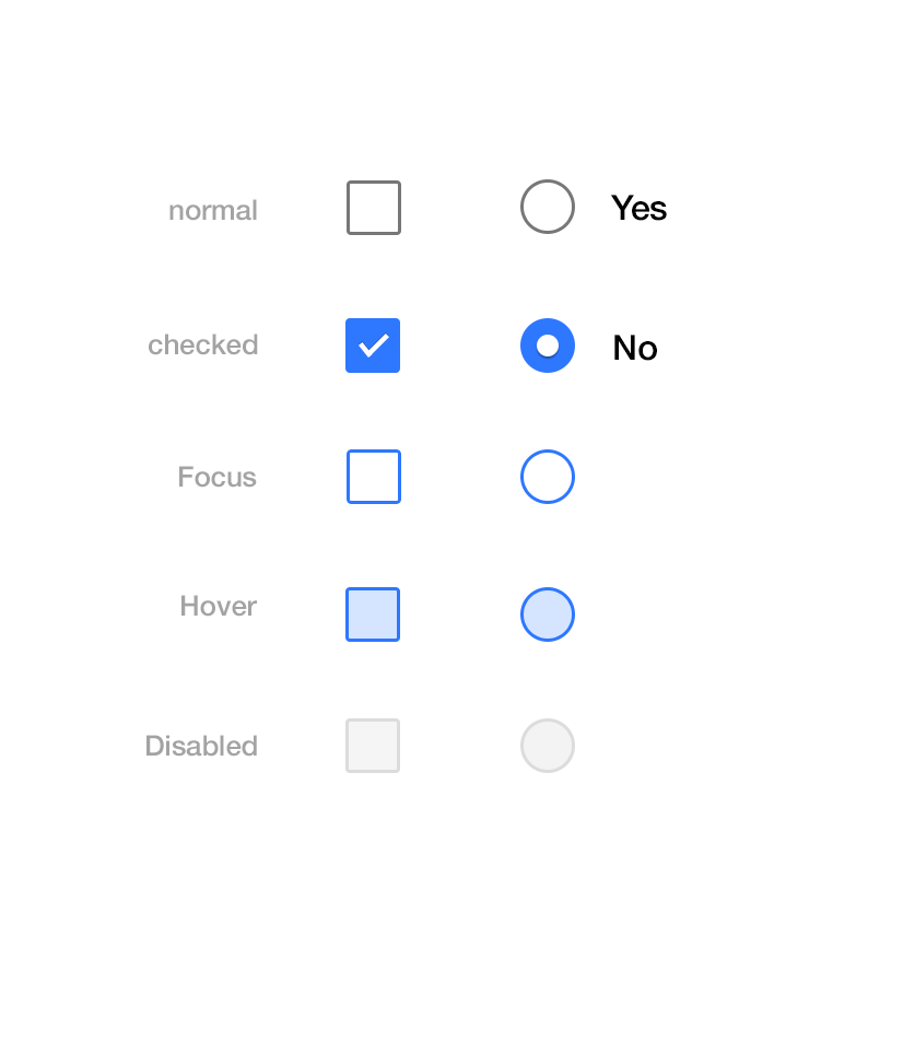
To whomever implementing this, when it's done to spec let me know so we can see how it feel when interacted. This mock up serves to be a starting point. When interacted, I'm already expecting it to be different. We'll keep working on this until it feels right.

Event Timeline

violetto opened this mock.
violetto added an image: Radio buttons.
violetto added a subscriber: Prtksxna.
Prtksxna added inline comment(s).
Inline Comments

:FOCUS

@Nirzar mentioned that we'll be using a different color for the :focus state of the button.

Should we do that here as well to maintain consistency?

Is that a drop shadow? I am not sure if I can see properly on this screen. Do the other states have shadows too?

Yeah dot drop shadow, applies to every dot. 1px bottom #000 0.1 Opacity

@Nirzar, what did you mean by different color?

um... i don't know what @Prtksxna is referring to... all i had was this

radio-checks.png (953×837 px, 21 KB)

Ok sounds like we're on the same page with focus state.

violetto added a subscriber: Volker_E.
This comment was removed by violetto.
Inline Comments

sizeGuide.png (192×239 px, 11 KB)